
A simple design that used my own typeface which I think gave it more meaning and personalization. Gave the basics of the articles title and I gave no hint as to how the article would be and I thought that was exciting.
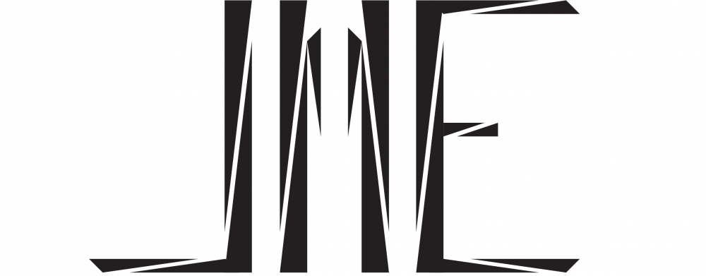
A simple design that used my own typeface which I think gave it more meaning and personalization. Gave the basics of the articles title and I gave no hint as to how the article would be and I thought that was exciting.

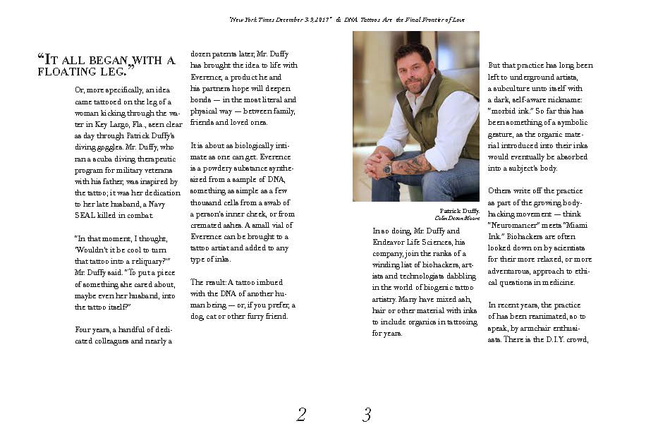

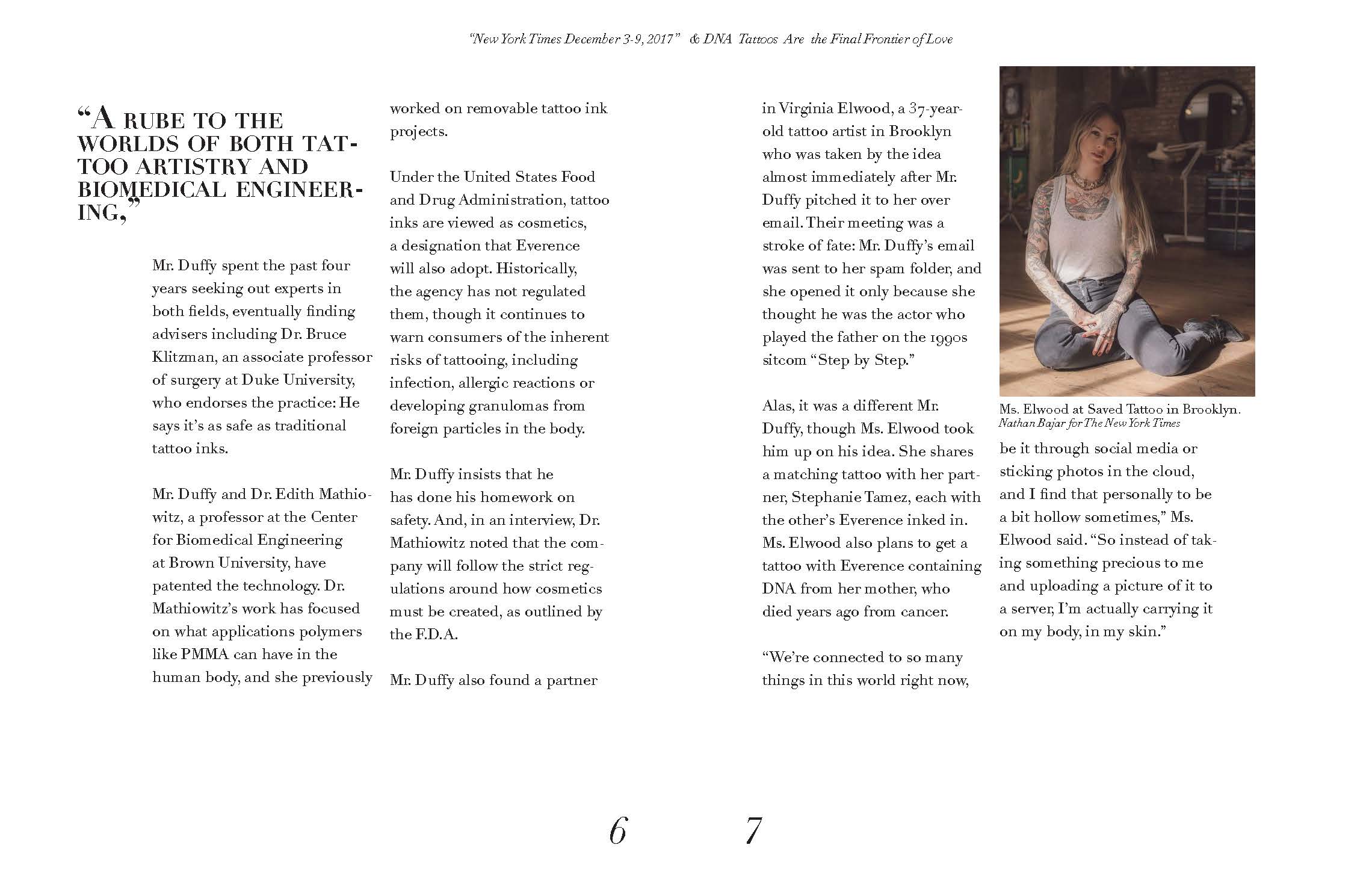

Redesigning a NY times article into our very own pamphlet was a thrill, I wanted my designs to have a pattern and the same feeling on every page as you flip through the article in my own format. It helped to bring attention to everything that was important and gave the article more life by the way it was laid out.

The poster connect to an idea that this was one of the strongest ways my typeface could be used in everyday life. Having the capability of being turned in different angels and scaled to different sizes and still be held in one simple image.

Inspired by the quote “I cannot understand you tis because you lean over my meanings edge and feel a dizziness of the things I have not said.” Which led me to create a not fully connected typeface that held edges with disconnected pieces of each letter and with these two main components it reflected the idea from the quote that there is an edge and a dizziness entangled within it.
. 
To create a monogram it requires your full initials and I had never made a monogram or had a want for one before so this was a new experience. I wanted to stick to creating a more symmetric and straight edged design since that was not usually what you see with monograms or even with the letter J.