Sequence Inkjet Print

I had a lot of issue with this printout and was unable to get my whole book to print. Only the first two odd pages would print, and the lab assistant at the time could not help me figure it out. In my document, I changed the position of the text on the back cover so that it feels more like an ending, I plan to make the text on the front and back cover a little larger.

Sequence – Nov. 6th

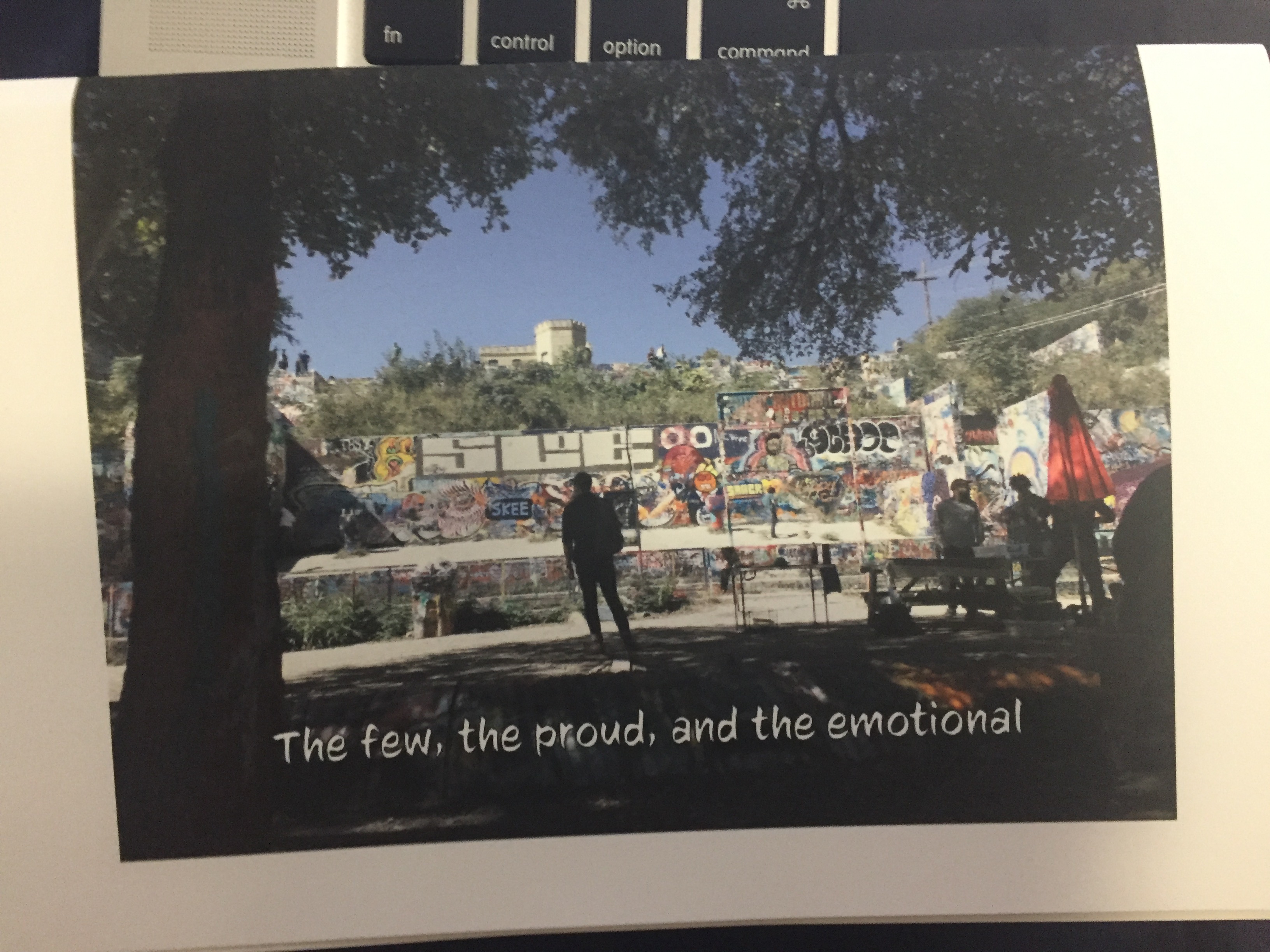
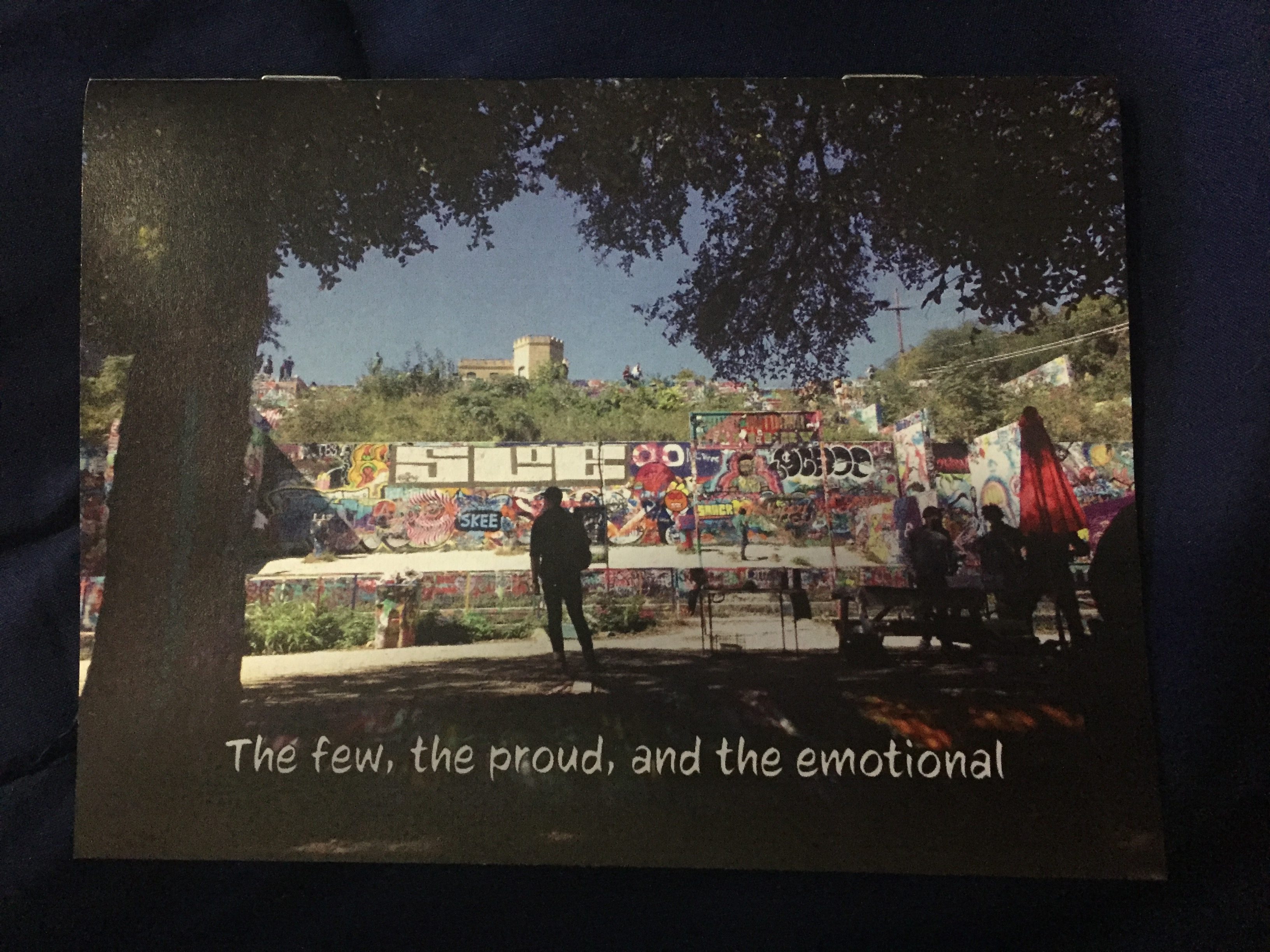
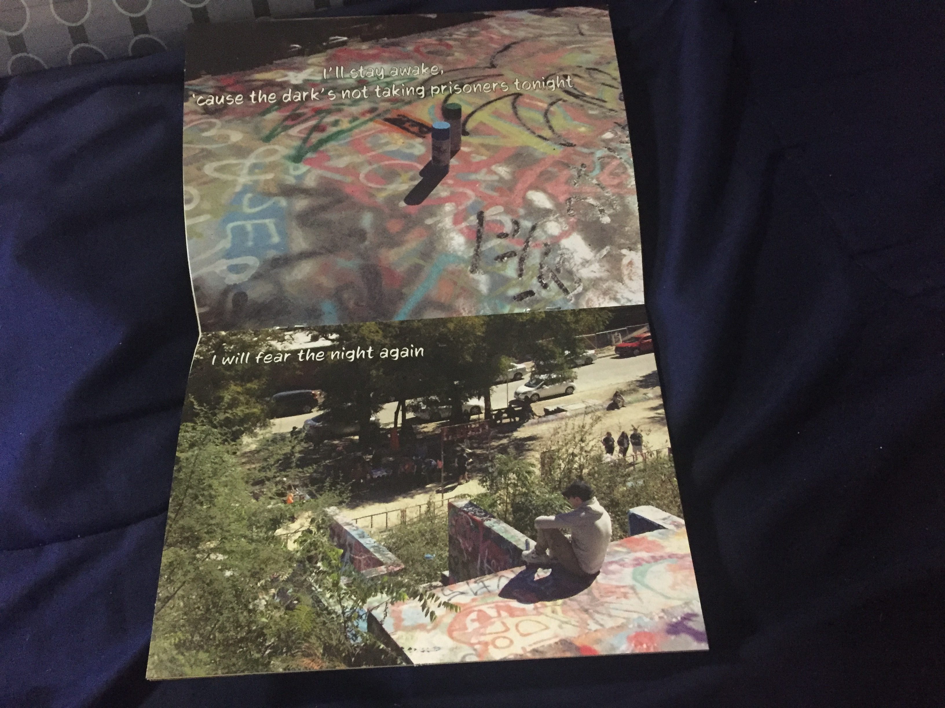
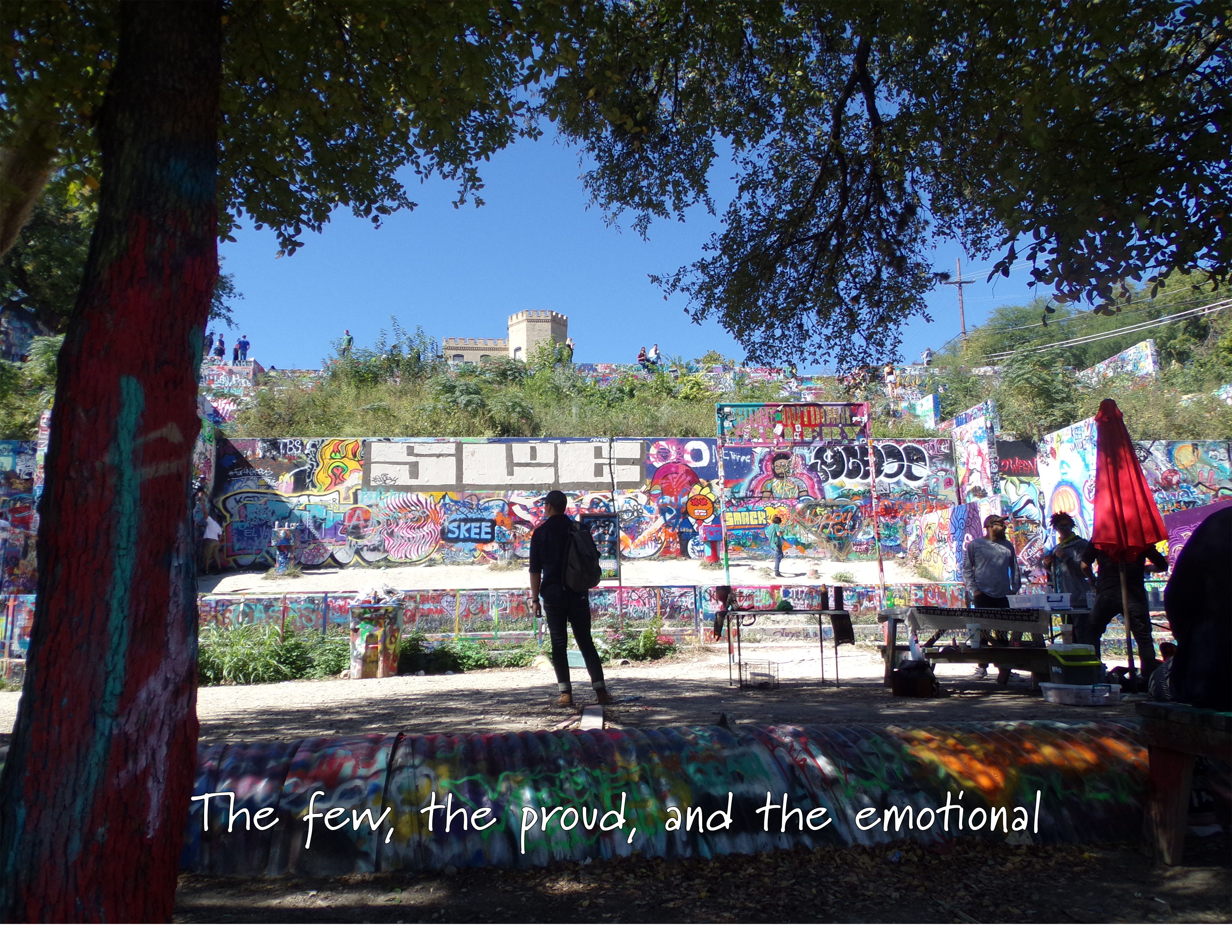
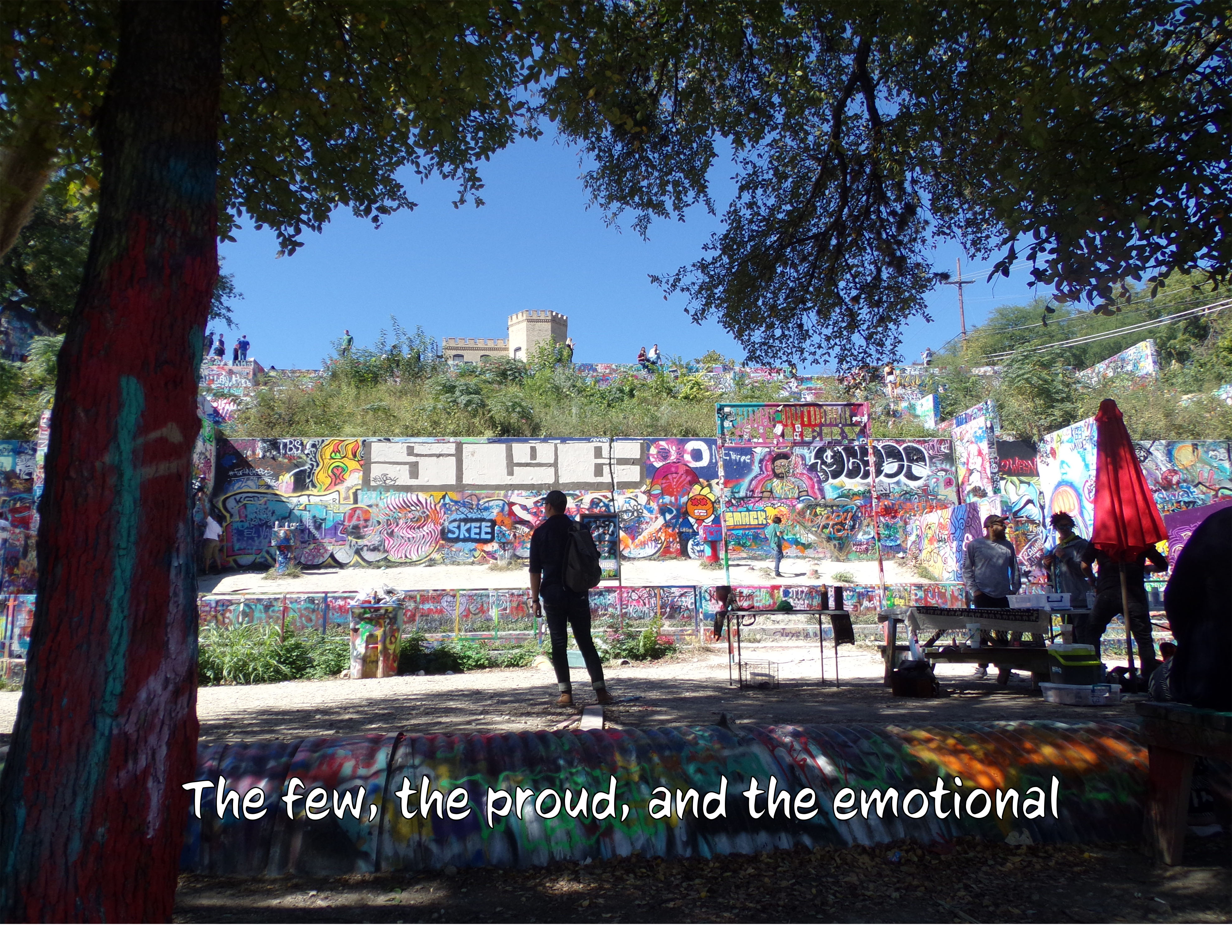
I plan for my book to be in landscape format. I’m going to be putting text on each page, and each line is a different line from multiple Twenty One Pilots songs that I put together to form a short story. Originally, my book was going to be about openness, but after putting the lyrics together I’m making it about hope. The story starts out grim and as pages turn the story turns out hopeful, that is why I decided to have the final page be the sun through the tree branch.

I do not know which of the three fonts to use, but I chose these fonts because I want to go with a handwritten look to make it look slightly like a handwritten letter. I also included examples of what the cover would look like with each font

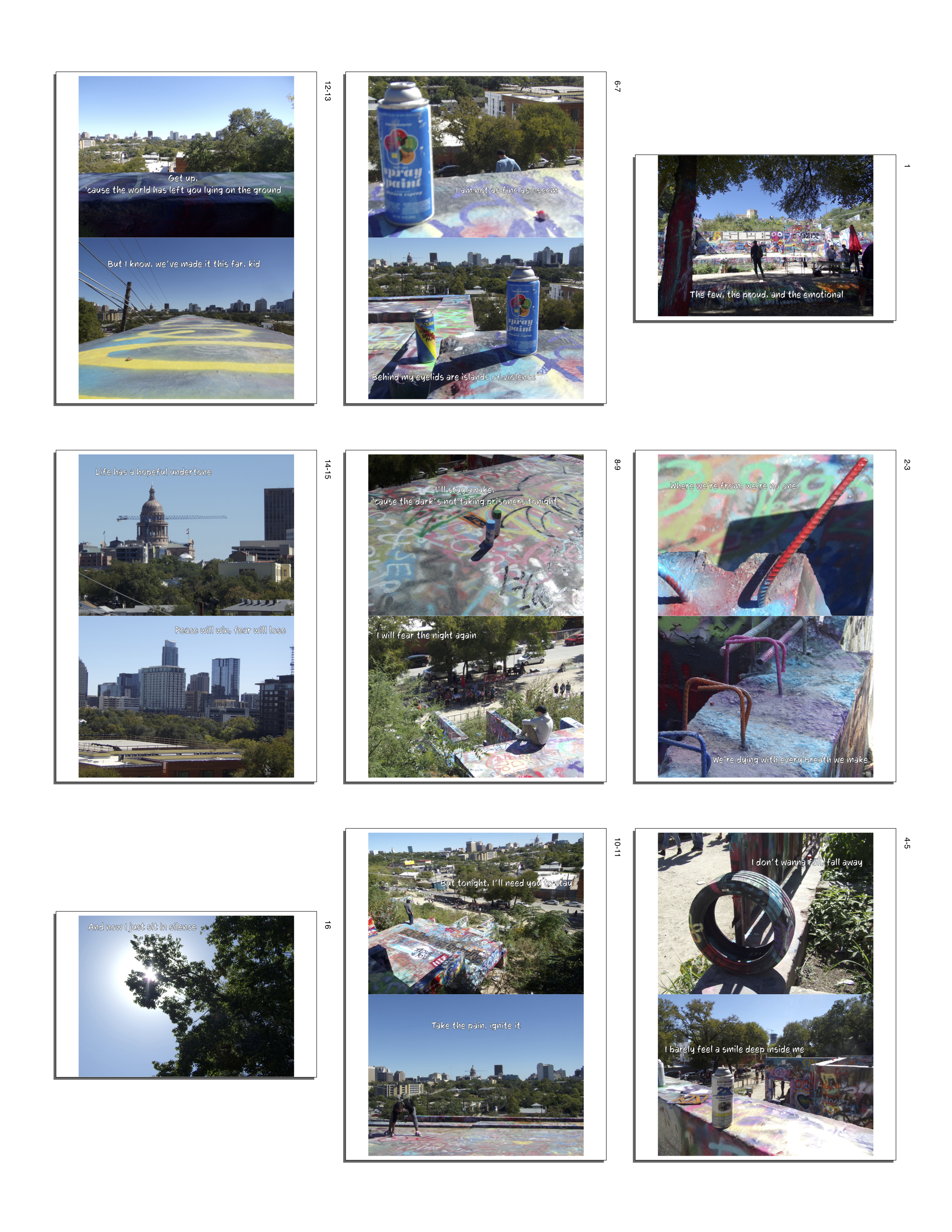
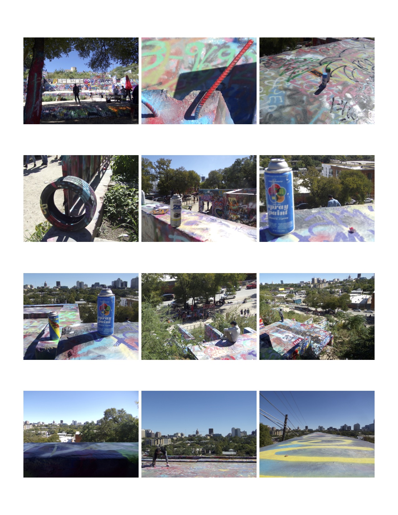
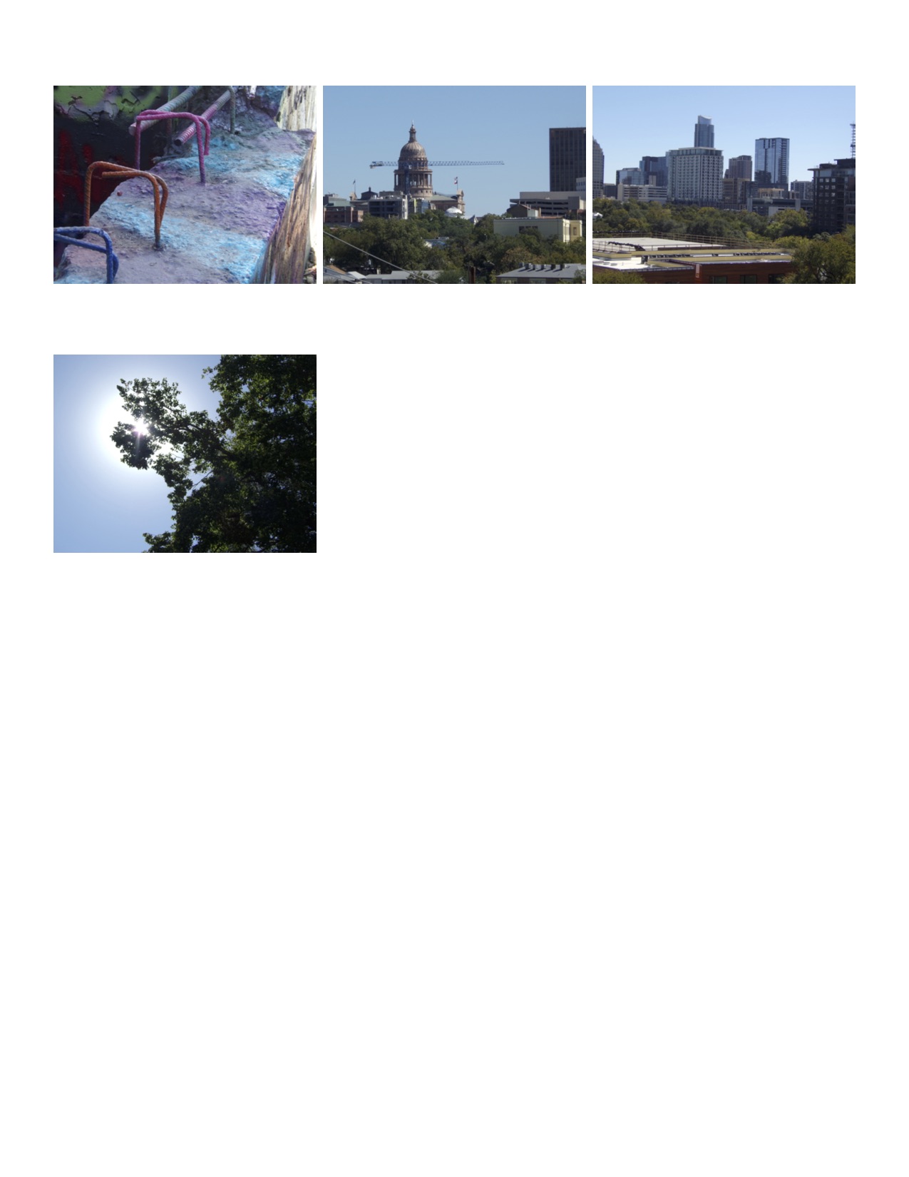
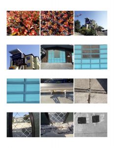
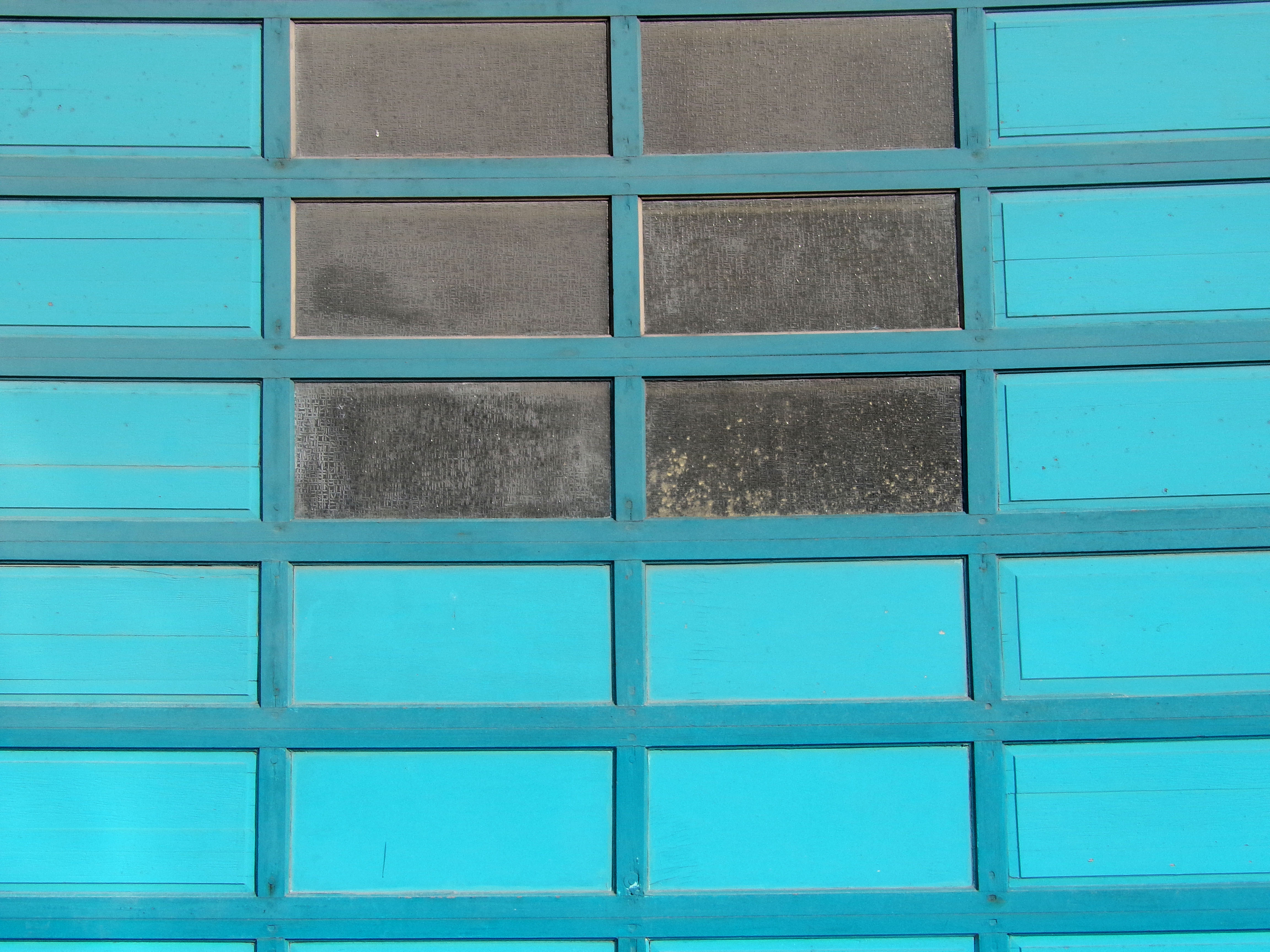
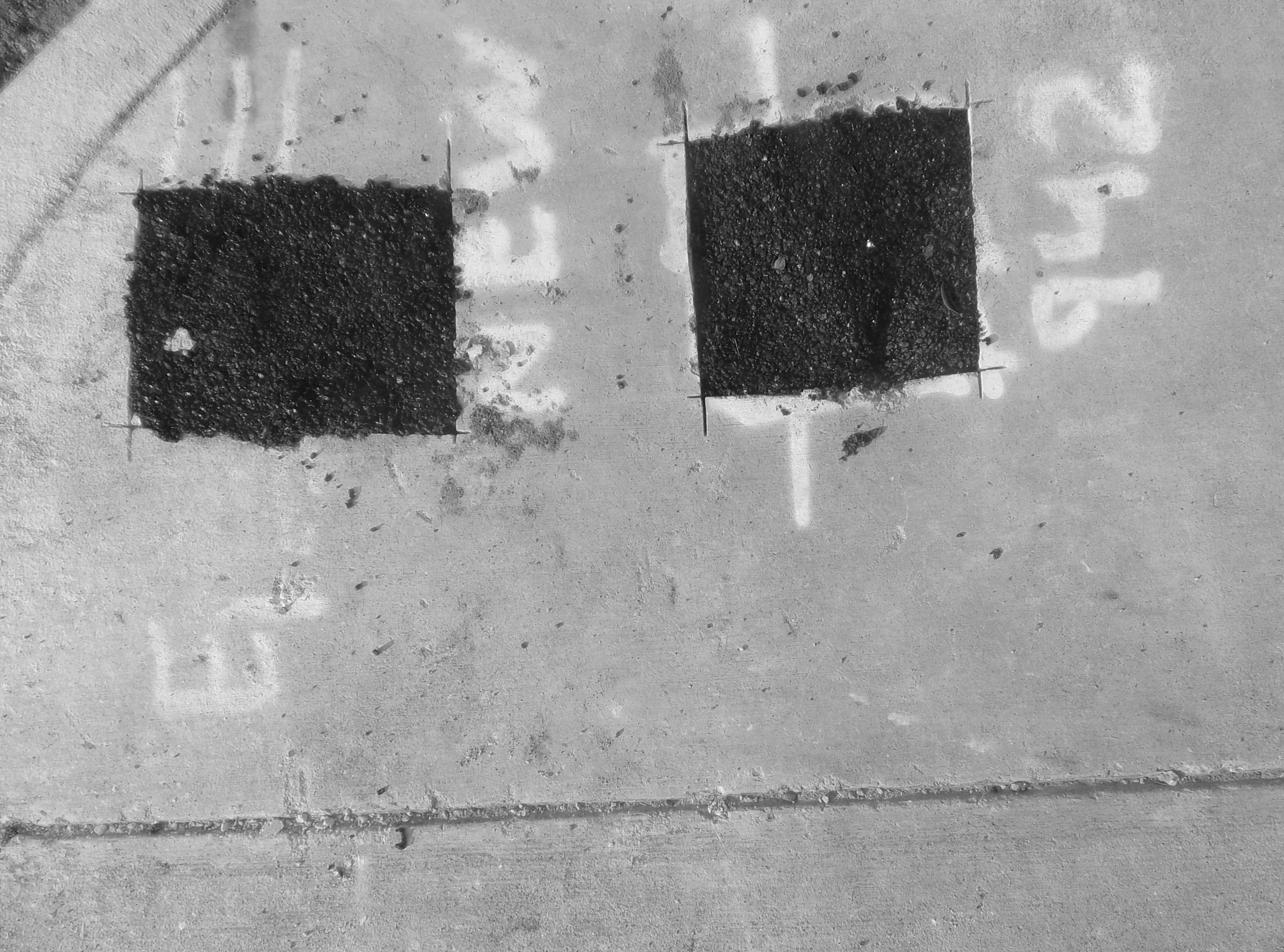
The pictures in the contact sheet are in the order they would be in the book.


PreSequence

I choose the second movie. Sequence is shown in the very beginning of the movie, by the object swinging and the tempo of the clock increasing. This is also done in one shot. The movie uses smooth transitions between one shot and the next, and it uses repetition frequently. Clocks are shown repeatedly through out the film to show the real time past, and it used the long running sequences to show implied time. The movie shows multiple outcomes by going through the characters eyes and into the next shot when they die.

Harmony – Digital

For these digital collages, I only used pictures I took for the Gestalt assignment. I tried to focus mostly on shapes for each collage, and for two I really tried to focus on the colors. I tried to create other collages, throughout the process of making these, that didn’t work well at all. On those I believe I didn’t focus enough on the shapes. I believe these collages worked because of the focus on shapes.

Harmony – Analog

For my analog collages, I decided to use two different magazines to create a rainbow/color wheel, and used a newspaper to show the story of two DACA Dreamers. I wanted to create rainbow because we talked about the color wheel and once I found a sort of color wheel in the newspaper I found, I had to use it to make a rainbow. I used DACA for my second collage because it has been a huge topic here and before moving to Austin I had not heard much or paid much attention to DACA, but I thought showcasing the story would be a good chance to learn more about it and create something interesting.

I kind of used Austin and SoCo as inspiration for both of my collages. Both Austin and SoCo are really colorful places, so that helped inspire the rainbow piece, and DACA is a big topic here and it affects many students on campus.

Gestalt Phase 3

For this phase of pictures, I continued my focus on infrastructure but this time I took close ups. Each image is a part of a bigger setting. Some are taken in the same place, but you can’t tell by the picture since you can’t see the whole area. I wanted to do close ups because I like how they look and you can see more detail in the images.

Gestalt Phase 2

For this phase of pictures I focused on more accidental street art. I was taking care to look out for things that worked with Gestalt. I feel that the image that looks like a face is the best representation of what I wanted for these photos. I wanted pictures of things thatwere man made, and had a specific reason or function.

I wanted to stray away from street art because I want to focus on different kinds of art. Art is everywhere and can be seen in everything, so I wanted to change the focus and then change it again for the third round of pictures to maybe focus on people or the buildings.