These symbols were produced over the span of a few weeks. I made these symbols combining the idea of a Cyclops, cream, ice cream, cotton candy, and rabbits. These symbols remind me most of the kind of style and aesthetic that I want to present in my creative life. The second symbol even includes my initials, and I’ve decided to use it more often when it comes to presenting a symbol for me. I like the way swirly and curvy graphics look, so I tend to use them in my designs as often as possible.
Wikipedia Reader
For this assignment we were to create a grid and display information from Wikipedia. I chose mermaids because at the time they reminded me of my roommate who had long hair and sang a lot. I went with a teal/green color because it made the most sense for creatures of the sea. I also went with a larger page number at the bottom because I felt it balanced out the weight of the text.
Proportional Grid Booklet
This booklet was a first look into creating documents with a grid. I like the way the lines come together to make an interesting structure for a page. After the grid is set up, it’s easier to put together the rest of the style.
Type Specimen Poster
For this assignment, we made posters for our display typefaces. For mine, I wanted to focus on the space aspect of the typeface. I used quotes that hinted towards space, stars, or aliens. The poster focusing on the Os is intended to focus most on the planet aspect of the typeface. The pink and blue ink combines to create a purple color, which I related to space.
Display Typeface
The purpose of this assignment was to create a display typeface based on a quotation. We used fontstruct to assemble the type.
I wanted to create a space/future style typeface that also had an ethereal feeling to it. There are orbs floating in the middle to encapsulate the “planet” piece of the name “Ethereal Planet”. I like the idea of rounded, light typefaces to indicate the future and space. I also made parts of the typeface look “drippy” sort of like water drifting in space.
Monogram
The assignment was to create a monogram out of a series of pieces affixed to a grid. We could rotate the pieces, but we couldn’t move them off of the grid. It was a way for us to learn how to work with the pieces we’re given.
I wanted to emulate a brush script since at the time I enjoyed brush script quite a bit. It was a little difficult with the pieces we had, and it wasn’t the easiest to smooth everything out. I also made sure to link the different letters because it’d seem more like cursive, but I also made the serifs sharp because I got a caligraphic feel from them.
This is a test post
shhhh don’t look at it don’t worry about it
Mystery Project
I think that the mystery project might include making a voiced video using after effects. Alternatively we could make a booklet explaining the events that are described in the word files. I feel that the booklet would be good practice since the last real booklets we made were in type 1.
Mid-term Assessment Essay
1. Where are you in your hours that you declared earlier in the semester? Looking at your work now, are your current accumulated hours enough?
I’m at around 30 hours, and I think I need to put more time into everything I do. I can get the barebones down, but I don’t focus on the actual designing aspect. Most of what I concern myself with is accessibility and design keeps taking a backseat to that. I need more hours to work on balancing the two out.
2. Has your definition of “sophisticated” work changed from last semester? If so, how so? What is sophisticated in your weather report?
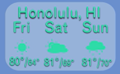
Yes, I think sophisticated work is well thought through from font choice and color to movement (when it applies) and other graphics. It doesn’t necessarily mean something minimalistic or “fancy” or even pretty in some cases. As long as the common thread of consideration is there I feel it counts as sophisticated. In my weather report, I thought through the main colors of the states based on pictures of the places, and my font was picked because when I think of the future I think of light sans serif typefaces.

3. Describe how the new things you’ve learned so far connect to what you already had coming into the semester.
My understanding of after effects has greatly improved since the last time around, and I feel I only got to this point because of using the program constantly. It gets easier and easier the more I use it, but it’s also a little frustrating to find a solution to a problem I had that took me hours to solve earlier but now I’m not pulling my hair out over problems I didn’t know the answer to.
4. What are somethings you are still unsure about in this project that you would like to know more about?
I want to go back into this project and iron out all of the kinks that I ran into while working on it. At the same time I’m curious what parts are issues I had with the program because of a weird fix I did or if it was something else. I also think that there’s much easier ways to fix the problems I had but I wasn’t aware of them at the time and I still don’t know just quite yet.
5. Assign a level of value to this project. Identify two other projects in your creative life and place this weather report relative to them. How close or far are they from one another? What qualities did each project have that the other’s didn’t that would rate them higher/lower?
If I compared this project to two others, I’d pick the portfolio app assignment and my symbols from last semester. I like this project a bit better than the portfolio app assignment because it was considerably less frustrating and I liked the movement side of things a bit better this time around. However I feel like the app video and my symbols were more personal to me, whereas this one wasn’t as personal. It’s mostly because I don’t feel much emotional attachment with cities or idolize countries.

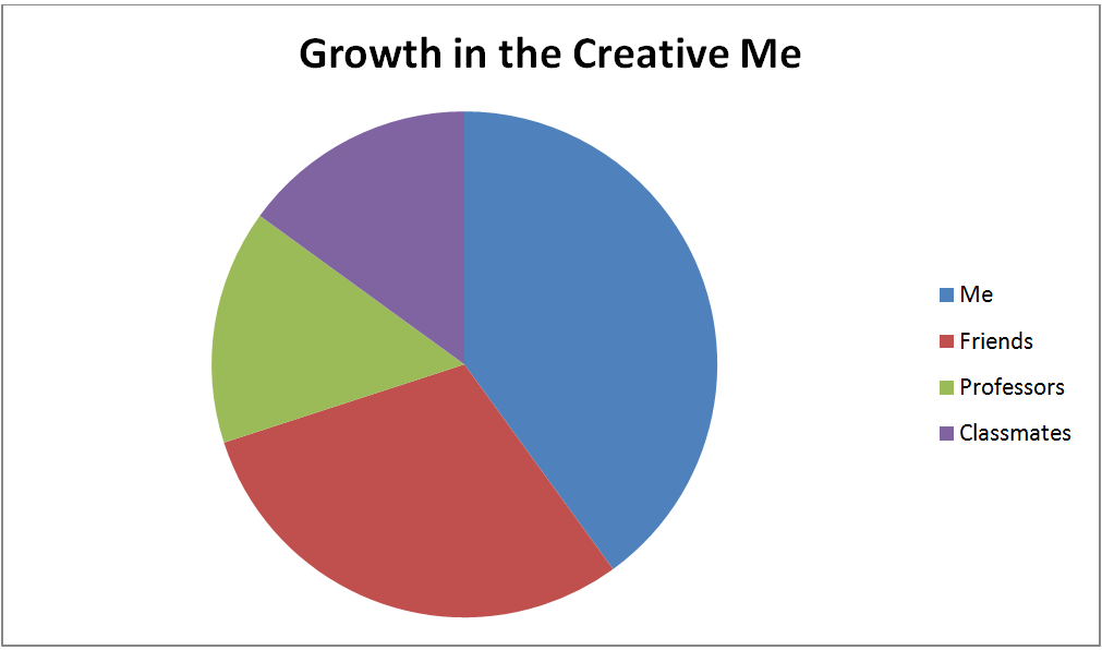
6. Break down the percentages of what entities are responsible for creating growth within the creative you. Am I part of it? Part of it is on you, right? Do you consider your classmates/friends as influencers on the course of your trajectory for success? At the end of the semester you will be evaluating me, but right now within your own pie piece, how much have you brought to the game? How did it end up that you brought that much?

I always feel that I have to push myself hardest to grow in any creative means. This also means that I’m extra hard on myself whenever I feel that I’ve failed in some way. However, this happens all the time, so I try to take a step back and look to my friends and classmates for inspiration.
Goal Expert Hours
My plan is 4 hours of outside of class each week.
So by midterm I should have 28-32 hours, and by the end of the semester I should have 60 expert hours.


