Visu 1100 Extra Blog Post: Jeremy Mann

The contemporary artist I chose to research is Jeremy Mann. He received a BFA from Ohio University and an MFA from Academy of Art University in San Francisco. Mann is 37 years old and currently resides in California.

He is a painter known for his painterly, impressionist-inspired style, cityscapes, and figurative works. Although his figurative works get less media attention compared to his cities, I still find that his style translates in an interesting way when it comes to the figure. He is strong in areas where I am weak, such as uses looser styles to convey form and feeling. Therefore, I find that his work really helps me think through problems I have while creating works. I also am drawn to the color palettes he chooses to work with in each image. I mentally group his images by color.

Oil on Panel

Jeremy Mann. Fawn. Oil on Panel.

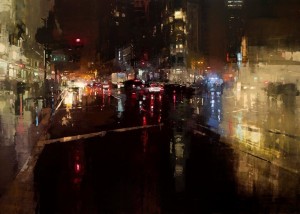
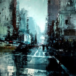
In his cityscapes, he tries to capture the city, in many cases San Francisco, as dramatic and moody. He puts an emphasis on wet pavement in his city images. In a documentary about him, he talks about how the number of cars on wet pavement he painted is sickening, but that all those years of training led him to be able to make the right mark for each painting now. I always get attached to artists that openly talk about the time spend training and learning when it comes to their craft.

Jeremy Mann. Oil on panel. 48x48 inches.

Jeremy Mann. New York no. 11. Oil on panel. 48×48 inches.

I find his techniques interesting. He uses loose brushstrokes, will wipe off materials, and also will roll paint onto the canvas. He does things with paint that I would not think to do and did not think would yield the results that it does. I think his style is great, although one person has gone through YouTube videos involving him and claimed that he just copies everything from images edited with a specific Photoshop tool. Mann also works slightly large with most works (in regards to his cities) being around four and five feet wide.

Oil on panel. 60x43 inches.

Jeremy Mann. Evening Storm on Market Street. Oil on panel. 60×43 inches.

Blog Post #9

I got a lot out of Matt’s presentation. It was nice to hear from an alumni who chose not to go to New York to pursue work. I am planning on staying nearby for family reasons, and hearing from a successful alumni who stayed close makes me feel less stressed about post-grad prospects.

The internships question is very annoying. I’ve been trying to get an internship for a long time now. My main problem is that for the summer I have to intern in Houston, and many of those internships are not advertised or I am not qualified for them. When I ask others how they got their art-based or studio internships, they always say it is because they knew someone. I do not have family or family friends involved in the arts at all. I’ve been trying to do some networking while at St. Edward’s, but it hasn’t worked out too well for me. I feel like I have fallen behind on the professional front.

The Contemporary in Austin has a few internships I am interested in. Online it requires more hours than possible for me to go during the week due to classes, but I talked with the director. She said they are flexible on time and that the website needed to be edited.

Internships

The second internship I looked at was the Development Internship for the Zach Theater. The intership involves working with fundraising and the non-profit aspects of the theater. I think this could be a beneficial program in that it would teach me non-profit managing skills and special event management experience for the visual/performing arts. I feel like an internship such as this one could give me practical skills and networking opportunities needed for me to find a job post graduation.

http://www.zachtheatre.org/about/internships

The third internship I looked at was the Development Internship for the Long Center. This internship is similar to that of the Zach theater, but requires more technical ability and has the opportunity to do some basic design work. I chose this location, because I talked to the volunteer and internship director when she can to St. Edwards. She told me that the job descriptions for internships are not completely set in stone, and that if you have other skills or interests, they will try to utilize them. I enjoyed my time talking with her, and think I could get something out of the opportunity.

Careers


Blog Post #8

This week’s presentations were fun. I did not get much out of the academic presentation, but that is because I’m an upper classes who has signed up for classes multiple times. I liked the study abroad presentation. I am planning on going abroad in the summer, and any information I can get on scholarships and what to expect is helpful. I’ve been having trouble navigating the scholarship stuff online, so her comments really helped. Ysenia’s presentation for Cabra was good. I did not know they had a website. I just knew they were relatively popular on Instagram. Learning about how they go about electing officer positions in their organization was helpful, because I am trying to figure out how other organizations go about that process. The Command G presentation was good. I’ve been meaning to go to some of their workshops but haven’t had the chance to yet. I have always had scheduling conflicts. The best presentation may have been mine (I’m lying. I only had one slide and basic information). Since I did not have as many cool images, stories, or a website to share, I tried to give some basic information on why it’s important to get involved. I have no idea if anything I said came across – I think one person may have been sleeping – but I hope everyone learned something from it.

Blog Post #6

For each class ask yourself the following:

  1. My greatest strengths in Visu 1 include: My organization
  2. For greater success in this course, I need to: Spend more time on the class. Because I am in upper division classes, Visu 1 work is low on my totem pole, and I often put off the projects/studio time
  1. My greatest strengths in Modern Art History include: My note-taking abilities, study guides, and attentiveness in class.
  2. For greater success in this course, I need to: Start studying identifications much earlier to give me time to go over big concepts and terms.
  1. My greatest strengths in Sculpture 1 include: My work ethic/studio time and my attempts to push myself
  2. For greater success in this course, I need to: Be more intentional in my work and ideas
  1. My greatest strengths in CULF 3330 include: My scheduling, attending of class, ability to get work done
  2. For greater success in this course, I need to: Spend more time doing my honors contract project for the class
  1. My greatest strengths in Painting 1 include: Technical ability, time spent in studio
  2. For greater success in this course, I need to: Spend less time focusing on tiny details and work on big picture things instead, such as overall values

Computer skills:

  1. My computer skills include: basic photoshop, microsoft word
  2. I still need to learn: Basic coding, various adobe programs

Research & writing skills:

  1. My greatest strengths as a researcher/writer include: Grammar/Organization skills, the ability to use library and internet resources successfully, organization of research, able to figure out which aspects of research is important to the paper/project.
  2. I need to work on these aspects of research and writing: My work ethic. Because I am good at researching, I often will put it off. I also procrastinate between the researching process and writing process.
  3. I learn best & accomplish most when: I get choice in what I am doing/writing/researching and when I have a decent amount of allotted time at the beginning in order to schedule myself. If I feel there isn’t going to be a decent amount of time to work on a project, I will choose an easier/less interesting topic or rush myself to finish.

ACTION PLAN

Choose one class that you are struggling with or are not doing as well as you could: Modern Art History
Now make a list of 10 ways you could improve your performance in this class:

  1. Make flashcards in the first week after getting ID packet
  2. Type class notes and synthesize with book notes after each class (or at least during the week of the class)
  3. Learn ID cards as we do each chapter in class
  4. Review old cards as I learn new ones
  5. When synthesizing new class notes, read the old ones
  6. Print the chapter identification sheets and keep the relevant chapter out and in class
  7. Fill out terms for each chapter while reading the book. Highlight the ones that do not have adequate definitions  in order to use them for class notes
  8. Create timelines to organize evolution of artists and to group all the images together.
  9. Find at least one important fact about each image, separate from how the image is its style
  10. Keep style list updated with examples

Blog Post #5

I am currently working on the inflatables project in Sculpture 1. The assignment was to create a large size sculpture by welding plastic together. Students had to think of designs using a concept that utilized the material as light and see through. I chose to do an abstracted piece and push what the material can be my trying to create something that appears harsh and heavy. I started by making a few brainstorm maps. I started with childhood and settled on nightmares as my topic. I struggled with nightmares as a child, and decided to encompass those feelings. My original idea was to do an abstracted sleeping head, but after presented in class, that idea was morphed to the nightmare itself. In my notes, I wrote that strong lines and large mass encompassed certain feelings associated with nightmares, such as fear.

img_3330 img_3329 img_3396

Part 2: Self Critique

For part 2 of this post, I chose to critique the above work as it is almost complete.


What is the strongest aspect of this work?

  • I think the strongest aspect is the form itself. I chose to try to push the material and make a soft, light material have a harsh element. Right now, that attempt is successful in two of my panel through the use of cones coming out of the main structure.

What is the weakest aspect?

  • There are a few craft issues with the structure due to patches being used to plug various hole that appeared while building.
  •  I am worried that the purpose of the sculpture may not come across. The original design went through a few renditions before being settled on the current look. I have rarely work with abstract figures before, and am not really sure how to judge the success of this work before it is inflated and set up.

How can the project be strengthened conceptually?

  • There are two sides of my structure that wish I approached differently. I was not nearly as intentional as I wanted to be when designing the pyramid structure for one panel. Looking back, I wish I was more consistent with my motifs and had continued the cone designs down the sides of the structure on all sides.

How can the project be strengthened technically?

  • I made a few mistakes welding early on. I did not know that I could use cardboard to cover areas of the plastic I did not want the iron to touch, so some areas I welded are not as clean as others. I also ripped a few holes in the structure and had to add a couple of patches that are very normal. I think that they may end up taking away from the form itself.


Blog Post #4

Presentations

Faith’s presentation was pretty cool. I liked how she slightly emphasized different campus resources and study abroad as a way to gain experience. She talked a lot about doing what you like while doing projects for classes. I think that is a great way to view your work and how I should be approaching my own studio classes.

I really enjoyed Mary’s presentation. Graphic Design is one of the visual studies programs that I know very little about. I do not personally know anyone in the program, and, oddly, just don’t run into many graphic designers while in the art building. I found the projects she did interesting. I like using projects other majors here and art majors at other universities to test my own abilities and to design personal projects for myself. Thus, I enjoyed that aspect of her presentation.

Although I did not get as much out of Diana’s presentation, I still enjoyed it. She spent a huge portion of her presentation talking about how Drawing II really helped her. I totally agree, but I took Drawing II with her. Because I am an upperclassman here, a lot of what she experienced and said to do, I have already experienced. Therefore, there wasn’t a lot of helpful information for me to relieve. I do think that her presentation was helpful for others in the class.

I am really interested in the interactive game studies curriculum. It is a really different and specialized major, so it is always cool to see what kind of classes they are taking and what things they are making. I had no idea they got the chance to work on so many different platforms. I thought John was a good choice for the presentation, since he is slightly branching out beyond the gaming aspect of his major. I know a lot of students in the major are not sure what to do with it, so I think showing how the skills you learn can be applied different ways is useful.

Websites

http://danigarreton.com/

As far as a site for an artist, this is one of the best ways I think you could set one up. The artist’s name can easily be seen and read. Examples of work are exhibited on the front page. The site itself is clean, organized and can be easily navigated. She has links for different kinds of works, and ways to contact. The downside is that although her artist statement is on a blog that she links to, it is not on her website. She also has links to various social media accounts. I think social media is very important today, especially for a working artist who needs to advertise themselves. Therefore, such links should be easy to find. Her site is user friendly and involves clicking very few times to get to where you want to be.

http://jacolby.com/home.html

I chose this website as an example because it is a decent example of a website that uses a template-based service. Although I find the color and fonts a little bad, I think the general setup is good. His site has easily viewed examples of art, current exhibitions, and a portfolio. His artist statement is on the front page and can be easily found. His site is easily organized and includes a pdf link to his full CV.

http://www.sallysmart.com/

Although this website is a little cluttered and breaks some of my web design pet peeves, I wanted to include it because Sally used the website to showcase her own artistic style. Therefore, her website give the viewer an idea of what her art is like right off the bat; it very much mirrors her personality as a creator. The way the photos of her work show up is a little annoying and could be done better, but I still like how easily navigable her site is and how all the necessary information is easily available.

https://www.artsy.net/

This is not an artist’s site, but I included it for a number of reasons. First, while looking for artist’s websites, I realized many of them just have profiles on larger sites like this one. When looking at the individual artist profiles, I can find good examples of what artist statements can look like. I also think it can be beneficial for an artist to be part of organized databases like this. I, personally, have an account on this website to track artists I like and save works that I find inspirational. It is what I use to do artist research for various studio projects. My dream website would be like an artist page on this site but on a smaller, more personal scale.

 

Blog Post #2

img_3307

This week my schedule is slightly different from how my usual week is, because my Modern Art History class was cancelled two of the days. In general, I need to slow down and take more breaks. I worked myself too hard this week and was exhausted by the weekend. I always felt like I wasted time during the day, but when actually seeing how much time I spend in studio and doing written homework, I think that I can afford to take a few extra hours to myself during the day. When I wrote Chilling on the sheet, I mostly meant reading or browsing the internet. I definitely think it could be work cutting back an hour of sleep just to give myself a break to work on more personal projects or to be social, instead of just the small internet breaks I take now. In the end, I think it would leave me less stressed and less exhausted.

2013. Ink Pens on Bristol Paper.

Untitled. 2013. Ink Pens on Bristol Paper.

This drawing was done for a drawing class in high school. The assignment required using ink to show the transition between two objects. I chose to draw a figure and transfer a braid into water.

Pencil in marble notebook. 2009.

Random dude. Pencil in marble notebook. 2009.

I drew this when I was 11. I was inspired by the lyrics to a song by an emo band. I find the image hilarious, especially considering the amount of time it took me to draw this. I posted it online under the title “Random dude.”