Zine Lesson
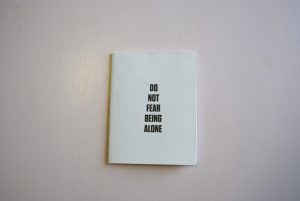
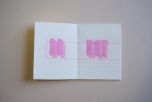
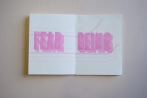
The zine project forced me to think introspectively to find a central belief that I could share through the format of a zine. My belief that I based my zine off of came to me rather than myself to it. I pulled from the art deco style and its typefaces as the inspiration for the type I created for my zine. The lines inside of the letters, almost like a base skeleton, are meant to harken back to art deco. The image for the background went through several iterations before I settled on what is in the final. The lines in the background image tie back into the designs in the letterforms. They suggest movement and bring the reader to the final spread where they form an echo/spiral form.


