Going through the process of compiling all of my past projects and looking back on what I have done since I have joined the GDES program has made me realize how much I have grown as a designer and how much I have learned over the four semesters I have been here. I feel that I am at a point right now where I can look back at my first few projects and notice my mistakes that were not as obvious to me then while I was making them. I think this shows an amount of growth in understanding the different elements of design and how to properly put them to use. My early projects are not where my best work is, but they were essential in getting me to where I am currently. The projects I do find that I have excelled in are my cognitive map, my visual identity mark, and my weather report. Each one is something I am proud of producing, mainly because it took a lot of work and problem solving to get them to a point that I was satisfied with.
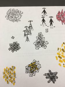
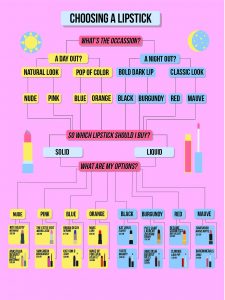
The cognitive map, I feel, was sort of the precursor to the weather report in terms of taking elements that we have learned throughout the semester and using them all in one project successfully. There was a lot of build-up to this particular project and it encompassed the symbol making we did in the beginning of the semester and also the things we learned in typography 1 about typefaces. I feel that my most successful part of this project was my symbols that I made for each lipstick and to differentiate between day and night. It was while making them that I felt I was employing what Tuan taught us with the symbol project and making my project more complex and interesting. In addition, I believe that I successfully chose a legible typeface for the amount of information that my poster was providing the viewer. However, I feel that I didn’t employ type as well as I could have. Looking back I would have varied my typefaces and would have chosen multiple ones that complimented each other instead of just italicizing or bolding the same font throughout the piece.
The weather project had sort of the same idea behind it as the cognitive map. In this project, however, it was not just symbols and type choices it was also motion and layout. This felt like a big project for me because it forced me to look back on what I have learned so far and use the skills I currently have to create a successful motion graphic. Type, my icons, and the layout all sort of came together nicely and I would definitely say that those aspects were my best. The motion in my video feels like it’s getting there, to a point where it is satisfactory. What I particularly learned in this project was time management. The turn around for each part of this project felt fast and often times I felt that I was struggling to make the deadlines. This is great because now I know what not to do and to work on my projects a bit at a time instead of all at once.


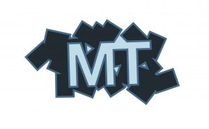
My visual identity mark project introduced me to a whole different way of thinking and employing design. I learned about the messages that certain choices in design could send out to the public about a place or a company. This project is where I began my journey in learning how to think in terms of identity and what I want to say with my graphic design. I chose the moon towers as the public space that I would give an identity to. The moon towers are a rather identity less group so coming up with my own take on them was not hindered by any preconceived notions of the structures. My identity for them, I feel, is original albeit a little strange. I wanted people to see the moon towers as a beacon of inspiration and that it fosters creativity. The process was probably the biggest lesson I learned from this project. Instead of jumping right into making a mark, I spent time hand drawing images and sketching things out before going into Illustrator. I find that I definitely prefer this method of going about designing something. I feel that I excelled in going through the process of making my mark, but in the end, my mark didn’t translate what I was saying in my drawings well enough.
My growth as a graphic designer has taken leaps forward and I feel that I am beginning to grasp what it is that makes up good design. I still think I have much more to learn in the coming semesters and I am ready to grow more. In the three projects I talked about I felt like I was successful in different aspects in each one and learned new processes and methods to approaching design.
