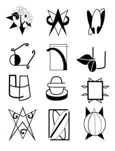
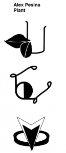
These symbols came about through many iterations of different designs. The first idea I had was creating symbols for planting and gardening. I started off by creating literal symbols of a shovel, watering can, and a flower. Then moved on to creating symbols for ideas. Which then lead me to creating my final symbols by combining symbols together to create something totally new. All through creating these symbols I was learning how to combine paths to create one solid image
Author: Alex Pesina
Wikipedia Reader
The wikipedia reader was another project that dealt with the grid system. This was on a more larger scale because it was much more text based. In order to get all the text organized I had to go through the original Wikipedia article and categorize the text by captions, body paragraphs, references, header, titles, and images. While creating the grid system I created one with two columns because that would fit as much as possible into one page, making the book shorter than if I just used one column. The grid helped with creating legibility by having enough space between lines of text. I used red to point out new paragraph topics, captions to images, and excerpts. The choice to put the images in the background of the book was to cut down on the amount of space the images take up by creating a second layer of depth.
Proportional Grid Booklet (Graduation Speech)
This project was used as an introduction to the grid system. This was my first time working with a grid system to layout text in a book setting. While creating the grid for this project it made me really think about typeface and point size like I never have before. I realized that when it comes to legibility the grid helped me with the layout of the text and with what typeface to used to make it easier for the viewer to read.
Type Specimen Poster
Creating the type specimen poster was meant to show off our typefaces we created and also getting the chance to print them on the risograph. For the type specimen poster, I wanted to show the different ways that my typeface could be used. Since my typeface is more of a decorative typeface I created posters that were not meant to be taken seriously. The fist poster consists of the entire alphabet, some punctuation marks, and the type face name. They are over lapping for printing purposes. For the second poster, I wanted to single out one letter that showed my idea of movement the best. The third poster was to show how my text worked with a more word based setting. The final poster was more to show the overlapping color printing that the risograph can do.
Display Typeface
The inspiration behind creating this typeface was based on series of photographs named “She kneels on a heavily framed mirror placed flat on the floor. Her head and upper body are in motion”. The photos were of a person in motion making the person blurry in each image to convey the idea of motion in a still image. I wanted to convey that idea of motion in my typeface. By adding the serifs on the top of the letters I created this indication of constant motion on the top of the letter and I kept the bottom half fixed to keep the legibility of each letter.
Monogram
For this assignment, we had to create a monogram using pieces that were given to us in illustrator along with rules about how we can’t rotate or duplicate certain objects. While creating my monogram, I had to work around the limitations. I realized that my initials where made up of straight lines and no letters with curves, besides the P. I decide to embrace the lines and make a monogram that exaggerated the sharpness and rigidness of these letters.
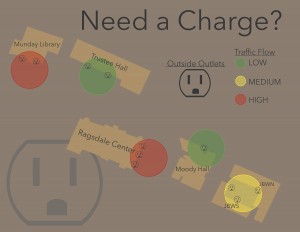
LATCH Weather Project
Mid-Term Assessment Essay
1 Where are you in your hours that you declared earlier in the semester? Looking at your work now, are your current accumulated hours enough?
My hours are at a good place right now. For this project I spent I good about of time on it, not too much and too little. I think having a schedule helped me keep on track with this project. Without it I think I would have waited till the last min to put everything together. Also getting feedback on each LATCH helped me move forward after each critique.
2 Has your definition of “sophisticated” work changed from last semester? If so, how so? What is sophisticated in your weather report?
I think my definition of sophistication has stayed the same since last semester, but working with motion has made my definition change a bit to fit the criteria. While working with motion I think what makes it sophisticated is if objects move clearly across the screen and not in one big jumble mess.
3 Describe how the new things you’ve learned so far connect to what you already had coming into the semester.
Working with after effects I knew some of the basic features and haven’t had the time to explore more of the program. While working on this project I was able to learn new things like easing objects as then move on and off the screen.
4 What are somethings you are still unsure about in this project that you would like to know more about?
I think I understood this project pretty well.
5 Assign a level of value to this project. Identify two other projects in your creative life and place this weather report relative to them. How close or far are they from one another? What qualities did each project have that the other’s didn’t that would rate them higher/lower?
This project has value of 8 out of 10. It made me work with a new program that I haven’t really worked with before and I was able to learn something new, but at the same time I think some of the criteria could have been changed, like having everything on the screen at all times. This project relates to other projects I have done like the portfolio interface I made last semester because we worked with after effects. It’s also different because in the interface project the movement consisted more of slides and not too much variation.
6 Break down the percentages of what entities are responsible for creating growth within the creative you. Am I part of it? Part of it is on you, right? Do you consider your classmates/friends as influencers on the course of your trajectory for success? At the end of the semester you will be evaluating me, but right now within your own pie piece, how much have you brought to the game? How did it end up that you brought that much?
With this project I think about 70% is myself, 15% is you, and other 15% is classmates. Along with myself and the 70% it also includes things I do outside of the class that inspires me and things I can draw ideas from. You also play a role in the growth of our creative process because you can critique us and offer up a certain kind of feedback that classmates can’t offer up. I also think classmates play a role because we can draw different ideas from one another and relate to each other more because we are all working on the same project at the same time.
End Term Assessment Essay
I would consider working on the same project every day for more than 5 hours excessive. If you don’t give yourself a break you could find yourself getting stuck and not being able to come up with new ideas. Also working on a project once a week for an hour is not enough time to create something sophisticated. I find myself spreading out my work time throughout the week while still giving my self some time to step back and take a break from work and allowing some breathing room between projects.
“Sophisticated” work includes something that is cohesive and fulfills the purpose of the assignment or goal of the project. It also includes how the physical work looks. I think the parts of my maps that are sophisticated are that they are clearly laid out and organized. They connect back to the assignment. Also I feel like my maps look cohesive for what each map is about.
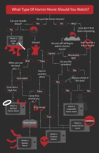
Some meaningful feedback I got back was that I should include images for the decision map. I didn’t want to make it only words cause I felt like that would have left the project too boring. So I added images in a way that didn’t clutter up the map but make it a little more visually interactive.
The hardest part for my was trying to figure out how I would map out the school but still have it look like a real map and not having it look too cartoony. I was also able to learn some illustrator through this project witch helped out. The easiest part off this project was coming up with ideas on what to map out, especially for my decision map. Creating that map took the longest, but it was fun getting up come up with different outcomes and seeing where each choice will take you.
When I went back home for thanksgiving break I was able to go check out some studios of local artist during their open studio times.
My life outside of school hasn’t really been an issue with my schoolwork. I do try to balance out schoolwork and my life outside of school.
The most ideal classroom environment to me is everyone getting to share their ideas and students helping each other out and giving useful feedback.
Mid Term Assessment Essay
CONSISTENT
Coming into this project I was a little hesitant because it was my first time working in illustrator. During this project I learned a lot about all the different components of illustrator through the time I spent in class and out of class. Whenever I wasn’t sure how to do something in illustrator I would Google it and or watch YouTube videos, they helped out a lot.
MEDIUM
The process that you made us go through I felt like really helped me understand where we were going with this project and the steps we took in each iteration of symbols all came together in the end. Talking about what makes an icon an icon and what makes a symbol a symbol helped with knowing what we were shooting for in the end. When trying to decide what I wanted my symbols to be based around I automatically thought of plants and gardening, because there is so much little details that goes into taking care of a garden that I though it would be a good idea to crate symbols that represented each part.
USEFUL
During the critiques of our work I paid attention not only to what people had to say about my work, but what people had to say about others as well. I felt like critiques were really good to learn from others and my self. I also used that time to examine other people’s work and try to pull some ideas out of what I saw and incorporate it into my own work.
MEDIUM
I really tried pushing myself to create symbols that where somewhat complex, especially for the last 3 that we made into stickers. I also worked on each symbol outside of class time and tried to perfect it as much as I could. When it came to combining the paths into one whole image, I think that was the hardest part of the processes illustrator wise.
LOTS OF EXTRA STUFF
Other expert expertise comes from going to art shows and creating some of my own artwork outside of class. I recently went to the Texas Contemporary Art Fair where I was able to draw a lot of inspiration. Going to art shows and museums helps whenever I feel stuck or uninspired. I recently have been slacking when it comes to creating my own artwork, but I plan on getting back into it and just messing around with whatever comes to mind.
MATURE
I feel like I am pretty mature. I am able to get all my work done and turn it in on time. Over the years I have learned how to work in a stressful environment and how to balance out schoolwork and fun. I know how to balance out my time so I won’t overwhelm my self in the end.
WARM
The classroom climate consists of everyone participating in the different exercises. Everyone including my self pays attention in class and offers up insightful feedback when asked. I feel like it is a comfortable place to be in to grow as designers together and learn together. Since I haven’t had much experience in using illustrator, I felt liking other peoples work pushed me to work harder and see what I was capable of doing.


