Coming into the graphic design program I had no prior knowledge of the programs being used, but I knew this was something I wanted to peruse and challenge myself to learn and gain the knowledge I needed to be successful. Over the past two years I have learned how design incorporates much more than just type and how things look on a layout. Design is being able to create something that influences culture and how people interact with each other. As a designer, I have grown in the way I view my surroundings and in the way, I think about how design can influence people. I think the pieces that show my growth are my cognitive map and weather report.
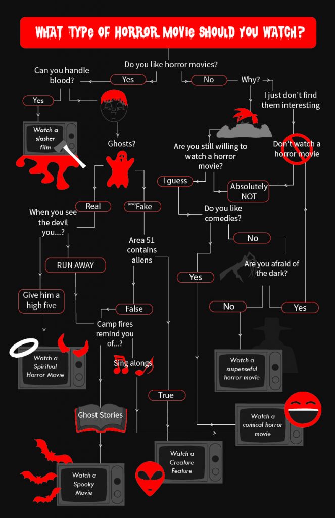
For my cognitive map, I created a map that told you what horror movie to watch based on a series of questions. The answer you got would be the movie that would essentially scare you the least and would be the one you would most likely be able to finish and sit all the way through. I used what I learned in the icon project and incorporated those skills into this map through some of the illustrations and icon choices. For some of the answers I used illustrations instead of only text because I wanted to make the map more interesting. Like using the tv’s for the final answer places. Some of my strengths in this work include color choice and keeping the map cohesive with the information provided. In order to keep the horror element within my map I stayed with dark colors and used white and red for focal points within my map. Also, adding in icons to show more of a graphic side to the map. After I was done with the map something I thought I could improve on was making the illustrations of the two people more cohesive because at this moment they seem to look like two different ways or styles of drawing people and it loses that connection with the other icons.
My weather report project took some time and patience to organize out all my work and to get things to work in after effects as I was still learning the program. For this project, I feel like I used my knowledge to type effectively. I wanted the two typefaces to be distinctive and still easy legible by the viewer. For the name of the cities I chose a typeface that reminded me of roam times in Italy without being to decorative. Then for the typeface of the weather information I thought about how this weather map was meant to be in the future and was something we could project right in front of ourselves when we asked a program like Siri what the weather was like anywhere. So, with this information I chose a typeface that was simple and complimented the icons it was being used with. A place I through I could grow was when it came to the last LATCH. For my last scene, I did category, and I thought I could have made it more interesting by the layout of the different categories and how they looked all together.
Through all my projects so far I have gained more knowledge of the programs and the overarching aspects of design. I now appreciate type and view it in a way that makes me think about the choices that go into choosing a typeface for a specific setting. I have grown since my first projects and I am able to relate new information I gain into the new projects I am now working on.