The Fulbright Conference booklet was a project in which I took a lot of information about the annual event, including author and speaker information, location info, and event schedules, and organized it. The goal of the project was to take a lot of information and design it efficiently. I tried to incorporate the idea of connection throughout the booklet, but mostly focused on organizing.
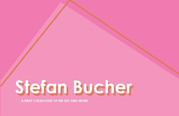
Stefan Bucher Catalogue
For our class catalog project, everyone had a choose a designer and create a catalog of their work. I chose Stefan Bucher because he does a lot of his own type work, and a lot of the work that he does has a very fun and lighthearted quality to it. True to the spirit of his work, I cataloged one particular exhibit that he put on called “Everything is going according to plan”. The premise is that it’s a show from the future, cataloging both his past work, and the work that he created up until his mysterious disappearance in the 2070s. I included bright colors and manipulated my typography to mimic the kind of handwritten type that he includes on a lot of his posters. I also tried to create a visual timeline throughout the catalog, guiding the reader through each of the decades.
Flyer
The flyer was a very brief project that required me to create an invitation to an event at the Austin Toy Museum, and I chose Spiderman Day. I decided to create a handout invitation, that could be picked up at the museum itself, since those interested in the event would have visited the museum already, and as an online flyer that could be shared amongst parents of small Spiderman lovers. I tried to take a more illustrative approach to the flyer, since it had to appeal to both children and adults. Given more time I would definitely add color and different typefaces, as well as more information about the event.
AR Experience
This project had my classmates and I choose an archival photo taken of parts of St. Edward’s in the past, and attempt to find the spot where they took that photo today. We then used an augmented reality app called “Aurasma”, that activates a projected image of the archival photo when it recognizes the new picture in the camera screen of the app. I took a little time to line up the two images, and it was really fun to see it work in real time. This didn’t require a lot of design, but it was a good peak into AR design, and some of the possibilities that it affords.
Luminescent Oceans Website
This website was based off of one of my favorite topics, bio-luminescent animals of the ocean. It was originally going to be a website following deep sea animals, but I found that within the three weeks that I was given for this project, the scope would have been just too large. Using one of the Wix website templates, I structured my bio-luminescent animals into four main groups: fish, jellyfish, octopus and squid, and other. I also included an about section on the very top of my website, giving a large summary of bio-luminescence in the ocean that covered almost all of the species. I chose videos for my home screen because I feel like capturing the audience’s imagination is the first step in getting them to learn about something that they otherwise wouldn’t care about. Given more time, I think I would have structured the menu bar differently, but unfortunately the Wix editing platform wasn’t as intuitive as I would have liked.
The website can be found here.
Art Feud Book
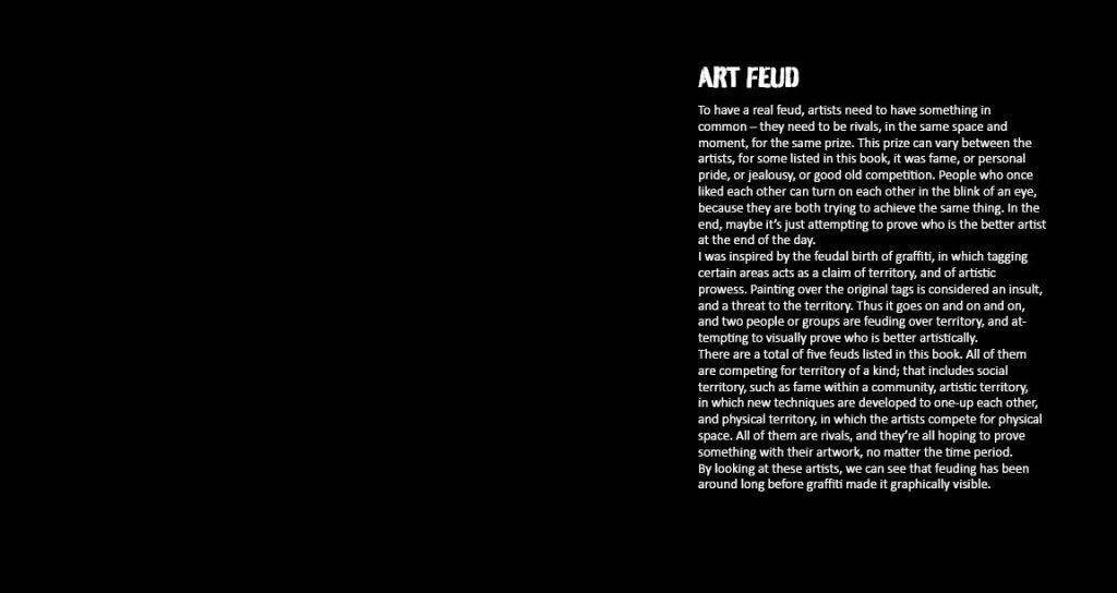
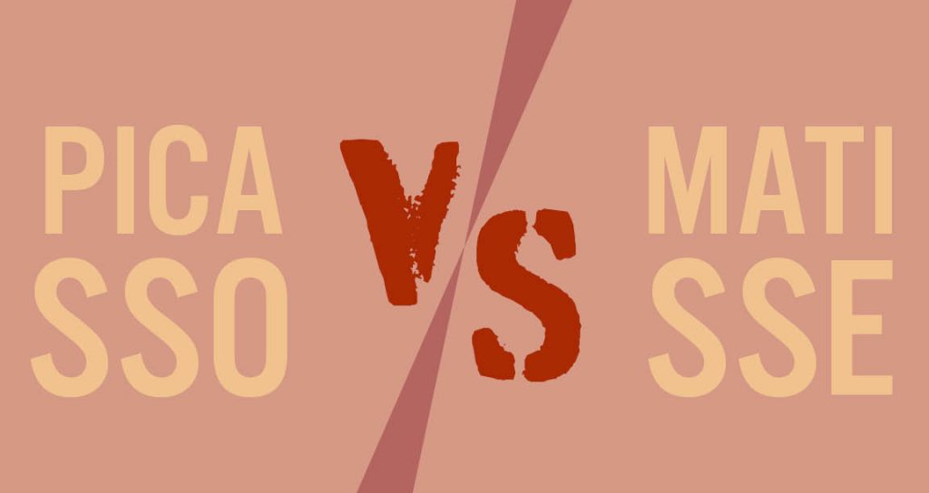
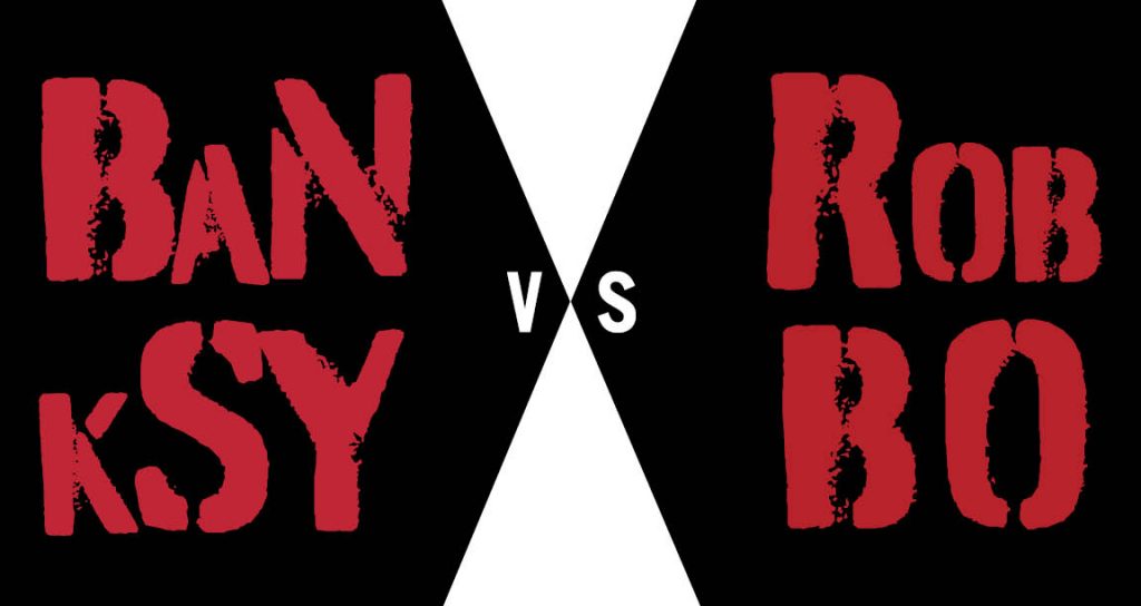
“Art Feud”, while it seems to not have any connection to my HOPE Outdoor Gallery projects, was actually inspired by them. I took the idea of street art being at its base, a place for rivalry, since it’s considered to be a personal diss to an artist if someone paints over their work. This happens all the time at the gallery since it’s so open to the public, but in every city there’s a code of honor for how street art works. As I said in the beginning of the book, feuds occur because people are competing for something, whether that be territory, fame, or artistic dominance. To show that this is not a contemporary phenomenon, I decided to take five famous art feuds throughout history and design the book to teach about them. I used typefaces that followed the graffiti aesthetic, in keeping with the inspiration of the book, and based the system of the book off of each individual feud.
HOPE Website
The HOPE Outdoor Gallery website that I designed is meant to be a challenge because the three pages required for the project had to all be typographically driven. No images allowed. I had to include a home page, an about page, and another page of my choosing. Since the HOPE gallery has such a strong connection to graffiti I chose typefaces that resembled and complimented that style. I also kept the colors to a minimum; since graffiti can come in all shapes and colors, I decided to stick with black and white, and chose red as an accent color to show typographic hierarchy.
Posters
This poster project was the start of a longer project based on the HOPE (Help Other People Everywhere) Outdoor Gallery project in central Austin. My job was to create two posters, over any part of the Gallery that I chose, including advertising for an event, informing viewers about the Gallery, or displaying an artistic expression of the site. A little background on the gallery: due to cramped spaces and the site’s popularity, the HOPE organization has decided to move the gallery to a more accessible space. Based on that information, I created the “HOPE is moving” poster, which in application would be posted all over the Gallery to let people know that they could find information about it online. I also created a poster to be posted at other places around town to get everyday vandals off of the streets and into a space where they could practice their graffiti skills in a more accepting environment. Both of these were stenciled out and spray painted on poster board, in order to hold true to the spirit of the Gallery.
Greenbelt Brand Film
The continuation of my Barton Creek identity project ended with a big finale: the brand film. The purpose was to convey in a little over two minutes the identity that I had developed for the Greenbelt – a place for exploration – and to not only create a narrative for it, but also to demonstrate basic brand visuals. I actually based this video off of another part of this project, an AR app that would visually guide the user to places in the Greenbelt based on categories, including climbing, swimming, and hiking. I based the narrative off of these three categories, adding visual elements to the trails that follow each person. I used them to both designate which category of trails the person is following, and to make my visual brand of the Greenbelt clear to the viewer. Given more time I probably would work out some jumpy camera work and animation, but I feel like this film follows a fairly clear narrative and easily demonstrates the Greenbelt’s visual identity as a place to explore.


