VISU 1100: Blog Post #12

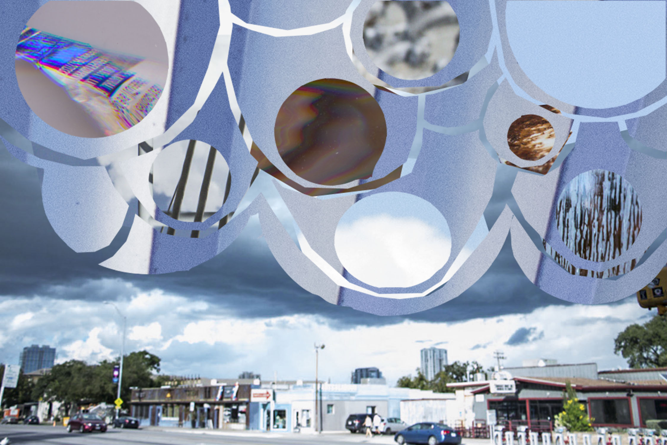
Kim Garza was the graphic designer who showed us how her app “Eventurist” evolved from its beginning to its end, as a result of user stories and research that she and her team did to figure out what clients would be looking for in a travel app. She was also working on a personal project called “Till the Clouds Roll By”, and I thought it was really interesting because she decided to make a whole bunch of new footage, and music to go along with this scene in a musical. I’m not sure if the song itself had any emotional value for her, but the whole idea was really cool.

Tammie Rubin(?) worked with the idea of the chimera, a “thing that is hoped or wished for but is, in fact, illusionary”. She began taking all of these objects and turning them into these mystical pieces of ceramic artwork that keeps the viewer wondering about what the object is, since it is made up of recognizable objects, but is not recognizable as a whole. I really liked this idea of putting objects together to give each of the pieces more power than was their previous function, and it kind of makes me want to pursue ceramics, just to see what I could do with it.

Shuren(? I’m not sure what his name was) took a whole bunch of images that all focused on the idea of coincidental accidents. He doesn’t take his time to frame a shot or to put everything up just right; he looks for the random happenstances of everyday life because those single moments are what demonstrate how people choose to live, what they put up with, and how they deal with life. All in all it channels the subconscious humanity in the viewer. I really liked his comparison of his photography to ‘spandrels’ in architecture: something that is always there, but is overlooked because of the ornate arches and domes that the spandrels support as a background figure.


I really liked this course! It gave me a lot of opportunities to look at my own work, get advice from previous graduates in the same field, look at what my teachers are doing, and think about what it is that I want to go into after I graduate. I also really appreciated all of the chances that the alumni gave for students to contact them if they were interested in an internship.


VISU 1100: Blog Post #11

Tuan’s work was focused primarily on the practical side of design, and tried to rethink things that are typically taken for granted. I think my favorite example of his work was the moving boxes, where he remade them in order to be used again, instead of thrown away or tossed to the side.

Hollis has a lot of works that tend to focus more on memory, particularly her own biography that describes her childhood. She also creates images of natural disasters and waste, pointing out the huge problem that is American consumption, and its consequent mass production of waste. These natural disaster and waste works also result from memory, of the places and things that have been destroyed by the fury of nature. Her sculptures also embody this idea, and emphasize some of the paintings and drawings that she did beforehand.

Bill’s photography went through a lot of phases, and the experimentation with his photography eventually led him to the abstract side of it. His Photoshop works were particularly interesting to me, because they took the entire image and pretty much just summarized it using two or three primary colors. I really liked his transition from “narrative” photography to “lyrical” photography over the years.


Five Year Plan:

The next 3 years will go along the lines of the suggested plans that St. Edward’s offers for graphic design, because the structure of the whole plan is pretty inescapable. However, I’ve got a lot of elective credits, so I’m going to try and take as many other courses in a whole bunch of other majors too. Primarily digital media management and interactive game studies, and maybe a little marketing, because I want to learn all about those. The next 2 years after graduation really depend on whether or not I’m offered a job within the first year; if not, then I’ll either continue my education  at ACC, studying engineering or architecture, or go up to Washington to major in Digital Art and Animation. Or maybe I’ll do both! I really just want to continue learning for as long as I can, but the big issue is money.


VISU 1100: Blog Post #8

Instances in life often seem random, out of focus, and confusing. However, all of these small, seemingly unrelated parts work to develop into everyday life, a phenomenon that Martin Lam Nguyen is fully aware of, and takes advantage of in his work. Originally from Vietnam, immigrated in 1979, Nguyen paints incredibly detailed and tiny portraits of numerous people, and connects them all via lines that run through the portraits. In this particular work, all of the portraits are lined up on one wall, half depicting a huge number of different faces, and the other depicting one little girl 365 different times. The half with the little girl are all done in graphite, with no color, and are done with incredible detail to shading and lighting. The other half, with completely random and different faces, are done with different mediums; many are done in light watercolor, and vary from many different ages and genders. However, a few are done in black and white, and stand out among all of the other colors. All of these faces include hair, but not the rest of the body. There is a lot of negative space between all of the portraits, but that seems to make all of the faces pop just a little bit more, and gives them a distinct feeling, despite all being up on the wall together.

The thing that catches the eye the most, I think, is the amount of portraits that are actually up on the wall. The repetition of the faces, all within precise and equal lines, creates both a pattern with the faces of the different people, and of the faces of the little girl from the whole year of her life. Obviously the pictures of the little girl are sequenced according to specific days, but the portraits of all of the random people aren’t sequenced at all it seems. The various, and few, black and white faces that are a part of the second sculpture don’t seem to have any rhythm or pattern either, which probably contributes to the whole idea of life’s random and seemingly unconnected moments.

I think that Nguyen is trying to convey the idea that all of the moments in life are connected, if only by a single thing: the fact that one person is experiencing these moments in their lifetime. In particular, the portraits of all of these random people seemingly have no relation to each other, and are spread amongst each other randomly. However, they are all connected by the lines along the wall, and by the fact that Nguyen at some point took their picture and recreated their portrait for his sculpture. Perhaps some of them met during the duration of his project, and found that they connected in more ways than that. I personally get this feeling of nostalgia from both pieces. I think about how all of the people in these portraits will have changed in some way by now, and how these portraits only capture one moment within their small universe that they’ll never get back. Maybe they don’t want to get it back. Who knows? I think Nguyen might feel that same nostalgia, because he left his homeland so early in his lifetime. He’ll never get back to that same Vietnam, but perhaps in the portraits, he has found a way that he can capture that one moment in time. It personally reminds me of this part in one of my favorite books. One of the characters is an artist who believes that she should never try to paint or draw the people who are the closest to her, because she believes that it wouldn’t capture them perfectly. She was aware of the fact that the picture can only capture so much and that people constantly change, and she didn’t want to figuratively imprison the people she loved by the portrayal in a painting. Nguyen just has the opposite philosophy. I also think that the black and white portraits are important, since they were taken from the very last photographs of that now deceased person. It makes people think about how these dead people are connected to us, even when we can’t talk to them. We’re all related via the technology that took the pictures of these people.

I think that the whole piece is very effective in showing the connected fragments that make up all of our lives. I also think that Nguyen succeeds in making the viewer think about how they’re connected to all of the portraits, even if they may never speak with each other. It’s certainly unique in its setup, although I have seen plenty of skilled portraiters out in the world. I certainly don’t think I could have drawn these portraits as skillfully as Nguyen. I think I’ve learned a little more about how Nguyen tries to relate to his viewers, and it’s something that I’ll try to think about when reviewing my own artwork.

VISU 1100: Blog Post #10

These were all pretty much an experiment on how far Photoshop selection could take me, and I think that they turned out pretty well. The first two ended up being my final images, even though I really liked the last collage with all of the light posts. It just didn’t fit in with the water theme that I had with the other two images.

VISU digital collage

VISU digital collage

20150924-_MG_5210 copy

VISU digital collage


VISU 1100: Blog Post #9

Miranda Petrosky’s presentation was the most useful for me, even though Lynne and Dustin Meyer’s presentations were both really interesting. The different categories of design really blew me away; I realized just how many options I had, but that I could only access these options if I really hone my skills throughout the next four years. I know that at the beginning of the year I was thinking about working at an advertising agency, and while that is still definitely an option, I may also try to get into a design agency such as Arts and Recreation, or Helm’s. Another idea that I took away from that presentation was to pick one or two things, and get really good at them, because specializing in a whole bunch of things will just make it harder to be thorough.


http://volunteer.sxsw.com/internships (the graphic design internship)

https://www.looksharp.com/internships/aspen-heights-partners/graphic-design-intern?&s%5Bcity%5D=Austin&s%5Bcountry%5D=United+States&s%5Bfilters%5D%5Blisting_type%5D=Internship&s%5Blat%5D=30.2671&s%5Blng%5D=-97.7431&s%5Blocation%5D=Austin%2C+Texas%2C+78701&s%5Bpage%5D=1&s%5Bper_page%5D=10&s%5Bq%5D=&s%5Bradius%5D=&s%5Bsort%5D=relevance&s%5Bstate%5D=Texas

https://www.looksharp.com/internships/alva-amco/graphic-design-internship-summer-2016–2?&s%5Bcity%5D=&s%5Bcountry%5D=&s%5Bfilters%5D%5Bcategory_ids%5D=47&s%5Bfilters%5D%5Blisting_type%5D=Internship&s%5Blat%5D=&s%5Blng%5D=&s%5Blocation%5D=&s%5Bpage%5D=1&s%5Bper_page%5D=10&s%5Bq%5D=&s%5Bradius%5D=&s%5Bsort%5D=relevance&s%5Bstate%5D=


VISU 1100: Blog Post #7

1. I think that I definitely related the most to Alex Roka, and not just because we share the same name. First of all, he was a graphic design student, like me, and he began to discover the different areas that he wanted to go into while he was in school: the illustration, and the graphic lettering. I definitely want to be able to narrow down my passions into that category that I am the most passionate about, and to pursue it in my career the way that he did. I really liked looking at the different designs that he made too.

2. The lady who came from Pump project…? She probably surprised me the most. She talked about doing all of these really cool things with all of these Austin artists, and she ended up where she was because of the hard work that she put into it. It wasn’t even paid at first, but she put so much time into it that at some point they began to pay her, and the obvious enthusiasm that she had for her work felt contagious. I guess she just surprised me with the idea that the longer you work at something, the more likely it is that you will be rewarded. No doubt she had a measure of talent to go with that, but the way she talked, she didn’t seem to rely on her talent too much, which also surprised me.

3. The most valuable piece of advice that I got from the alumni was probably that I should just try to learn as much as possible, because that’s what this time is for. I should try new projects by myself, even without a teacher telling me to do it in a project. I should also network while I can, and put my name into the world so that I’m not completely anonymous when I graduate.

VISU 1100: Blog Post #6

  1. My greatest strengths in Rhetoric and Composition II include: creation of pretty solid content, good analytical skills, contribution to class discussions, and fantastic critiquing skills if I do say so myself.
  2. For greater success in this course, I need to: Work more on connecting my ideas instead of reintroducing old content, and articulating the overall idea.

1. My greatest strengths in Foundation Art and Design include: creating new ways to view lines and circles in the projects, turning the projects in on time, adjusting to the critiquing done by my fellow classmates.

2. For greater success in this course, I need to: take more time to review my projects so that they result in my best possible work.

1. My greatest strengths in Samurai Secrets include: following the conversation and asking good questions.

2. For greater success in this course, I need to: practice the meditation that the class teaches more often, so that I can understand the material that we cover more fully.

1. My greatest strengths in VISU 1100 include: finishing all of my blog posts! Paying attention to the classes.

2. For greater success in this course, I need to: participate a little bit more in the huge class discussion parts.

1. My greatest strengths in VISU 1300 include: taking compositionally beautiful photographs of South Congress.

2. For greater success in this course, I need to: work on the grouping of my photos, and attempting more of the stuff shown in class that we never get to practice.

1. My greatest strengths in Theologies of Community include: participating in the discussion, paying attention to the important points that are brought up during discussion, and enjoying the overall fun of the class.

2. For greater success in this course, I need to: try to focus on a deeper reading of the assigned reading for class.

1. My greatest strengths in the Honors’ seminar include: paying attention to the particular points made by each weekly speaker.

2. For greater success in this course, I need to: ask more questions of the speaker in order to clarify their intentions or ideas a little more.

Computer skills:

  1. My computer skills include: a lot of Microsoft experience, and a basic understanding of how IP addresses work. Also I’m pretty skilled with PC/Dell shortcuts.
  2. I still need to learn: ALL OF ADOBE. And Mac short hands, because that stuff’s completely foreign to me.

Research & writing skills:

  1. My greatest strengths as a researcher/writer include: finding sites that really pertain to the argument that I’m trying to make, and that can be really useful in formulating large parts of my argument. I’m also really good at putting my ideas into words.
  2. I need to work on these aspects of research and writing: connecting all of my ideas into a cohesive whole, and finding articles that go against my argument, that can help me prove its validity.
  3. I learn best & accomplish most when: I do the thing that is asked of me, and then have someone critique it right next to me, telling me what could be improved, and why.

ACTION PLAN

VISU 13111:

1) Attempt the things we try in class more

2) Give myself more time to look over my whole project

3) Have more people critique my photos

4) DO EVERYTHING EARLY

5) Ask more questions during class

6) Pay more attention during lessons

7) Turn blog posts in earlier

8) Double check to make sure presentation is correct

9) Reflect a little more on the assigned reading

10) Ask if more revision is possible before the final grading

VISU 1100: Blog Post #5

Part One:

_MG_9508.CR2


This first picture from a project that focused on how to actually take a picture, focusing on the ideals of Gestalt. Containment was a huge element to the picture above, and I really liked how clear the picture came out in the reflection, and how the actual ground remained so out of focus. I tried to look at the different elements of Gestalt separately, finding images that contained more of one thing than another, and that clearly happened with the above.

_MG_4025This second picture came from my Foundation Art and Design class, where we had to study the different element of line, and play around with the effects that line could have. This was the finished product, although the beginnings of the project can be seen behind it. I mainly focused on the negative space that could be achieved with the multiple lines that I was given, and experimented with the sheer chaos of overlapping those lines.


Part Two:

1) The strongest aspect of my work from the Gestalt project was probably the actual composition of all of the images that I put together. I think that post-production turned out really well.

2) My weakest aspect is by far the images that I ended up grouping together in the final product. I definitely did not give myself enough time to properly edit myself, and I think my selections have suffered because of that.

3) I think if the final product is going to be a grouping together of images to demonstrate one compositional aspect, then I need to take photos whose compositions are all fairly similar. I don’t think that the pictures I chose were very similar in that regard; they all demonstrated the same principle, but in different ways, which draws away from their similarity.

4) Conceptually, it really could have used better grouping. That would prove my understanding of the Gestalt principles, and would have made the whole gallery of photos make more sense in relation to one another.

5) Technically, I think that the individual photographs themselves need more explanation. The layout of the gallery felt rather limited to me, but I don’t know enough about how the blog site works in order to change that.


VISU 1100: Blog Post #4

Part One:

I particularly liked the work done by Caelan Navarrete, and the artists that she reviewed on her blog. There’s a lot of depth that she looks for in artwork both her own and from others that I can empathize with. The experimentation that Rachel Broussard puts into her work was also really interesting to see, particularly her “human presence without human form” project.

I really liked Shelby Savage’s sort of design style, because that’s a style that I feel like I produce much of the time, or think in when I’m trying to design in my head on the go. Her type work especially was pretty interesting, because of the certain ways that she thought about the type before and during the actual making of it. It’s always interesting to see how other people would design something, versus how I myself would. Paul Young’s design work is also really interesting; the floral patterns with the gradation in the background is something that I’ve never thought of, and the idea of putting together a surrealist book based on one’s dreams is a really cool idea. The composition and finality of his work is really impressive and professional-looking.

Crissy Smith and Juliana Isabel are two very different photographers with really good concepts behind each of them. The portrait style that Crissy Smith exhibits really has the air of deep thought on how the pictures ought to be portrayed, but there are several spontaneous photos among her collections that I think are really engaging, just because they were so spontaneous, like the birds flying in Ireland, or the sudden snow. Juliana’s compositions are completely different, and interesting in a totally different way; at first they were really confusing to me, but as I looked at them more and more I began to like them better. The comparison of materials in each photograph, and the actual composition and contrast between all of them made for some really interesting pictures, almost like looking at optical illusions.


Part Two:

http://www.axentwear.com/

This is a pretty basic website that advertises a particular type of headphones that I’ve admired for a long time, and the whole feel of the site has always appealed to me. The dark background makes all of the pictures stand out even more than they already did. The entire design is fairly simple, and is extremely easy to navigate.

https://www.tumblr.com/

This is a really well known website, and I personally really like its whole design. It’s fairly simple when one looks at the overall structure of the webpages; the complexity comes from the individual bloggers themselves, and the uniqueness of every page is what makes tumblr so fun! Also, the setup is really easy to follow, and it’s not hard at all to make every single post pretty.

http://www.starbucks.com/

This website also has a really easy setup that can be navigated pretty easily, and the things that I like the most about it are the color schemes and the graphics. There’s a lot of space between the pictures and the text, which keeps it simple, and easy on the eyes. I also chose this site because of the layered format; every new idea is kept within its horizontal section that separates but also combines into a really appealing layered cake.

http://www.deviantart.com/

The cool thing about Deviantart is the layers and layers of thumbnails that make up the different links around this huge database of artwork. While at first the number may seem rather chaotic, when one looks closer, they are able to see the method in the madness. If one ignores the thumbnails entirely, the setup for the rest of the page is really rather simple, and so is fairly easy to navigate. There’s so many resources for artists of all different kinds, and literally thousands of communities that all come together around one focal point that they all share. The idea of all this sharing and collaborating and teaching of art in this setup is definitely the thing that appeals to much to me from this website.


Blog Post #3

My contemporary artist is Artem Chebokha, an impressionist/surrealist painter who typically uses scenes from nature to construct his paintings. Unfortunately he doesn’t tend to release a lot of information about himself, other than the fact that he comes from Southwestern Siberia, which likely was a heavy influence on him to create so many nature-themed paintings. He tends to post his paintings without much description, leaving the meaning of the image up to the interpretation of the viewer. I personally love how much detail and color is put into every single one of his paintings, and the imagination that he uses to warp clouds into completely new shapes and ideas. I believe that he uses his artwork to help spread a sort of wonder for nature, and is trying to get viewers to become more interested in the nature around them, as he is. Of course, that may just be me. He really inspires me to think along these same lines though.

Nature Salvation, by Artem Chebokha


Beautiful World, by Artem Chebokha


Pierian Spring, by Artem Chebokha


Tenkhariis by RHADS

Tenkhariis, by Artem Chebokha


Cloudcatcher, by Artem Chebokha


Dreamkiller, by Artem Chebokha


The Old Man and The Sea, by Artem Chebokha

Sorrow for Whales, by Artem Chebokha