
29
Sep
2017
Sep
2017
Blog Post #4 Part I & II
categories: Blog Posts

Herb Poster, 11×17 in”
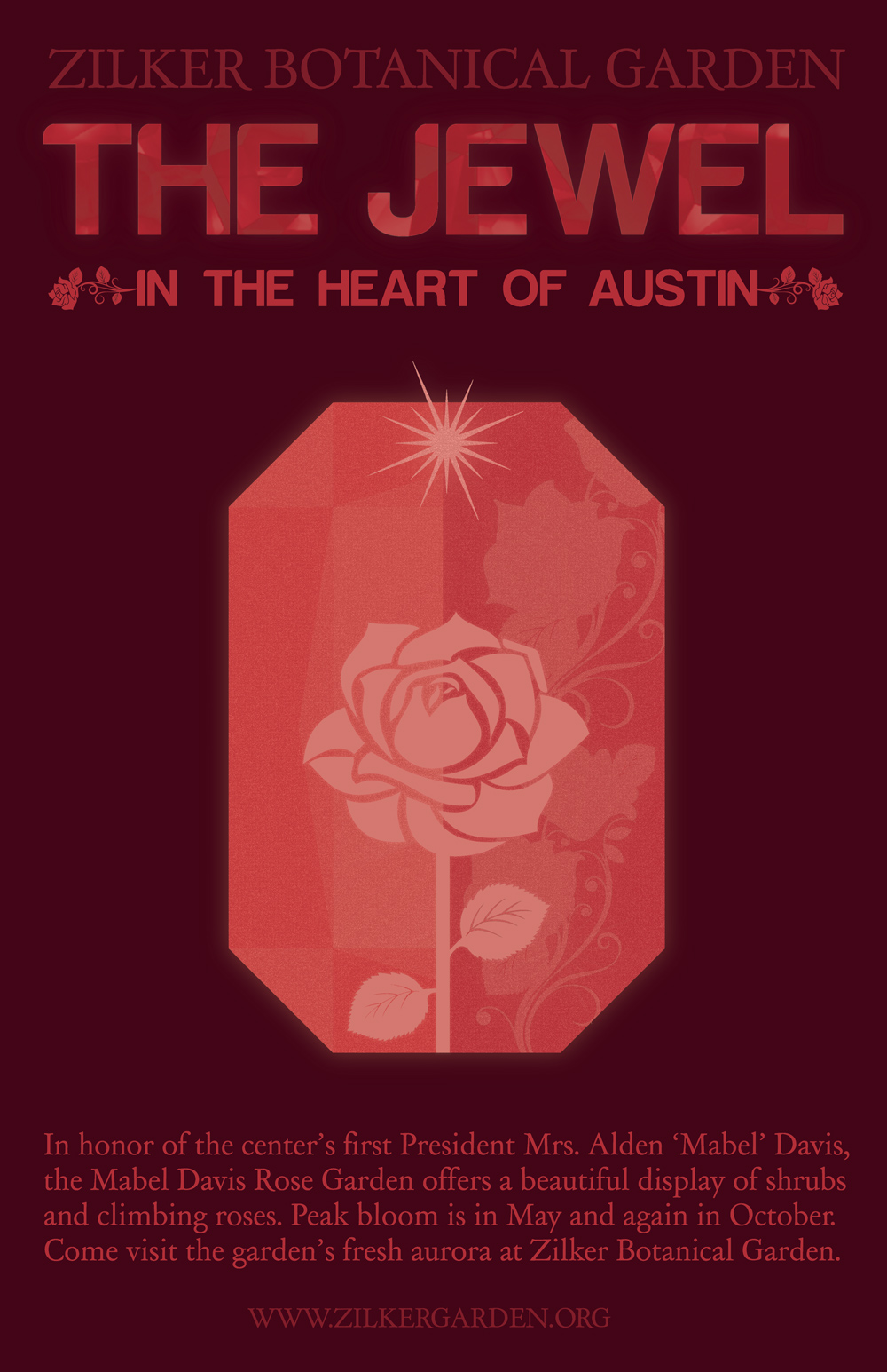
Rose Poster, 11×17 in”
PART ONE
- What was the goal of the assignment? Or what was the question posed by this assignment?
- How did you go about reaching this goal or answering this question?
- The Assignment: Develop 2–3 poster designs inspired by your site. They can be photographic, illustrative, typographic, or a combination. The Proposed Questions: Think about what your posters should say and can be used for. Do they advertise your site or an event at your site? Are they an artistic expression of your site? Are they informative? Do they work together as a system?
- Answer: I rearranged my recent findings over my site (Zilker Botanical Garden). I wanted to come up with a concept that would showcase the generalization of the garden, using the slogan “The Jewel in the Heart of Austin.” I knew I wanted the two posters to correspond with each other, but also portray different visuals. I came up with the idea of using a jewel in one poster than highlighting a specific garden in another and my professor simplified my idea to using jewels in both posters to form a continuum of series.
PART TWO
- What is the strongest aspect of this work?
- What is the weakest aspect?
- How can the project be strengthened conceptually?
- How can the project be strengthened technically?
- Additional notes.
- The strongest aspect of this work I would say is the concept. The concept of nature being as precious and beautiful as a materialistic item; it is straight-forward and simple which allows consumers to digest the design, then step towards finding more information online or visiting Zilker Botanical Garden.
- The weakest aspect I would say is the formatting. It is a typical vertical format to showcase the hierarchy of the design but I feel I could’ve found an unorthodox layout to make the poster more whimsical/dream-like.
- Thinking conceptually, the project could of dove deeper into the significance of each plant/flower. For example, the rose could’ve presented a sense of “love” or “feel the love at Zilker Botanical Garden.”
- Thinking technically, I could have strengthened the opacity of the items in the jewel. Also, I could have filled more of the blank space around the main pictorial element of the poster.
- Overall, I love how the final product of the posters. I usually love to form a complex design, so it is definitely a nice change to see a simplified design still give me the feeling of accomplishment. I can always feel the need to work more on my projects but sometimes I have to get comfortable with putting the pencil down and yearning towards the next project.