Elements and Principles of Design
The Elements of Design
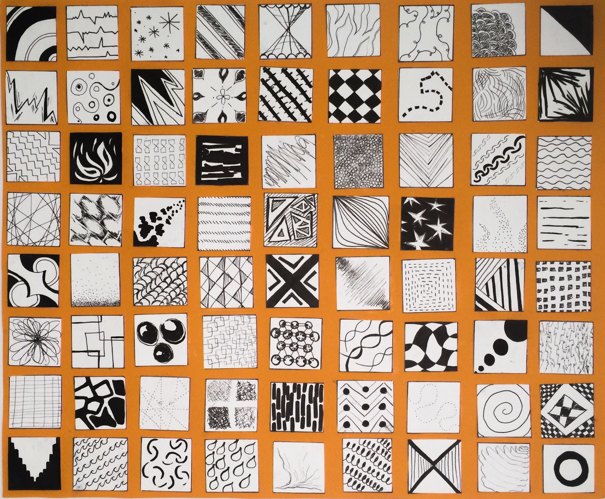
Line
Line is the element of length as a mark connecting any two points. Lines can organize, direct, separate, be expressive, suggest an emotion, or create rhythm. They can join elements or divide them.


Shape
The external outline of a form or anything that has height and width. An example would be the three basic shapes: the circle, the square, the triangle, considered to be the fundamental shapes of design.


Texture
The look and feel of a surface. In two dimensional form, texture is essentially visual and adds richness and dimension to the work. Texture can also refer to pattern, which is visual texture.


Value
The relative lightness or darkness of an object. Value adds dimension by creating the illusion of depth in design.


Color
Color creates a mood within the piece and tells a story about the brand. Every color says something different, and combinations can alter that impression further.


Plane
Three dimensional form that has length and width but with minimal thickness.


Volume
An enclosed area of three dimensional space.


Mass
Solid three dimensional form.


Space
Distance between shapes and forms, but it is best understood in designs as white space or negative space, terms used to refer to the empty but often active areas that are void of visual elements.


Light
Can enhance or obscure, affect emotions, entice us to enter, create mystery, can even be the sculptural medium


Time/Motion
Any word or image that moves functions both spatially and temporally. Can be implied as well as literal.


The Principles of Design
Unity/variety
When all design elements relate to one another and project a sense of completeness. A viewer will always seek unity in a message. Without it, the viewer will lose interest. Designers use ideas drawn from Gestalt theory to help their designs.


Balance
When all the design elements are equally distributed through the design. There are essentially two types of balance: symmetrical and asymmetrical. Symmetrical elements are arranged equally on both sides of a composition to suggest a stable or static motion. Asymmetrical elements create a deliberate imbalance to suggest variety or dynamical movement.


Scale/Proportion
Scale is the comparative size of an element of art or object in relation to other objects and expectations about what is normal. Proportion is the relationship of the size of parts to each other and to the whole artifact or image.


Rhythm
Pattern created by repeating elements. Rhythm denotes the movement in the way that elements direct our gaze to scan the message for understanding or information. The term sequence is used to refer to the viewing order of the elements and to determine the order of multipage publications such as a magazine or book.


Emphasis
Indication of the most important element on the page based on the message. It’s the element that stands out and gets noticed first. The most emphasized visual element in design is called a focal point because it attracts the view