Author Archive
The experience of critique was something I don’t think I was entirely prepared for. I went into the first day confident in my project, but nervous about how my presentation would go. I was definitely taken aback by how quickly everything went (I know it seems silly, considering the entire process took three days). We’ve been working on this project pretty much from the beginning of the semester and it seemed like just a few minutes couldn’t possibly give it justice. I noticed the strengths and weaknesses of my classmates presentational skills and that definitely had an impact on the way I saw their work. I definitely realized how important it is to be able to talk about your work.
Hearing Alex and Joe talk about each project was very helpful. With so many people presenting, it was easy to pick up on common critiques that were given. I definitely plan to take the critique to heart and work to improve my coming projects. Here are some of the critiques that appeared consistently…
- Stay consistent, find an overarching theme to your photos and stick with it
- Be intentional about how you order your photos for presentation
- EDIT EDIT EDIT
- Pay attention to how your photos work together, some photos that don’t work alone work as part of a collection
- Careful with your post production, don’t be too “photoshoppy” (I need to super careful with this one)
I don’t feel the need to make any changes to my photos, but I would like to add that I put a lot of effort into my actual blog post and I would love to have you all take another closer look at it. I feel like my presentation didn’t do it justice.
SKILLS INVENTORY
For each class ask yourself the following:
- My greatest strengths in Drawing I include: a lot of practice in drawing, control of the materials used, and OCD tendencies
- For greater success in this course, I need to: go back to the basics, focus on the structure of my drawings, and do my best not to be bored by the assignments
- My greatest strengths in Rhetoric & Composition II include: comprehension of the materials provided and writing skills
- For greater success in this course, I need to: get things done earlier so I have an opportunity for more teacher feedback and a more refined writing style for academic papers
- My greatest strengths in Theologies of Community: Who is my Neighbor include: background knowledge in the subject area
- For greater success in this course, I need to: take better notes during class discussion, find a way to be more engaged in the reading, and not dominate the conversation in class
- My greatest strengths in Visual Studies I include: an eye for design, the ability to follow directions, and note taking
- For greater success in this course, I need to: develop more of my own voice and manage my time more effectively
Computer skills:
- My computer skills include: a rudimentary knowledge of 3D printing software, Microsoft Office, online blogging sites, Mac OSX operating system, beginning knowledge of Adobe Creative Suite
- I still need to learn: more advanced Adobe Creative Suite
Research & writing skills:
- My greatest strengths as a researcher/writer include: a good memory, the ability to make connections between disciplines, and a prominent voice in my writing
- I need to work on these aspects of research and writing: better identifying which sources will be useful and which are merely interesting, skimming abstracts to find clues, not letting my thesis guide my research – getting a full view instead
- I learn best & accomplish most when: I am motivated to complete the task, I know why I am doing the assignment, I wait for a burst of productive energy within a time period and do the bulk of the work on a project in this time
ACTION PLAN (for Drawing I)
- Learn how to draw straight lines
- Set up a proper work space on the desk in my dorm
- Draw in my personal sketchbook more often
- Do all the exercises at the end of the chapters, even ones that aren’t assigned
- Re-read chapters we’ve covered and write down important tips
- Create a flashcard glossary of art terms I need to know
- Work with others on assignments, don’t just sit and do it alone
- Sustain my drawings, even the ones that aren’t for class
- Look at the drawings of famous artists
- Make more time for art
Reflection: Dan Phillips Ted Talk
Dan Phillips builds houses for a world that isn’t afraid of waste. It’s incredible the things you can do when you don’t have a preconceived notion of how things are supposed to look. He makes a very compelling argument that we should change the way we look at the materials in our lives.
Phillips’ incorporation of the gestalt principles into his mission is really interesting. He talks about continuity and how people like to see what they have always seen. This leads to a lot of waste. He uses an example of a broken window pane. Our response to a broken window pane is to replace it and through the cracked one away. Phillips says, why not break all the windows? I think it’s really interesting that we can change the flow of continuity. If it’s possible to do this in the physical world, I want to explore the control I have over the gestalt principles within my own work.
The idea of a spectrum from apollonian to dionysian is really captivating. Phillips says that apollonian perspective requires perfection and that this perfection produces a lot of waste. I know I’ve thrown away pieces of paper because they weren’t pretty enough. On a large scale, this perspective creates a lot of waste. Phillips suggests a dionysian approach to creating instead. This is much more natural. It encompasses the organic nature of human beings and allows for a much more productive creative process.
Phillips also proposes that the vanity of human beings causes our compulsion to force environmental resources to accommodate our ideals. I agree with Phillips that more beautiful and organic work can be produced when we work with what we have, rather than forcing our materials into what we want them to be.
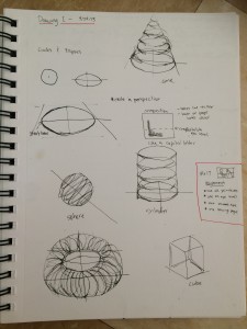 I am so very tired of drawing cubes. I don’t think I can articulate how fed up I am with cubes. I’ve drawn more cubes in the last six weeks than in my entire life. I know how important it is to have a solid understanding of the primitives, but wow I am tired of cubes. Thankfully, we have just progressed past cubes in Drawing I. You can see from my notes that we’ve taken on spheres, cones, cylinders, and the elusive torus.
Our first assignment incorporating all of these shapes is a 14×17 inch drawing. We are required to use at least of of each primitive. They are all required to be transparent. At least one form has to be outside the sheet boundary, one must be below the horizon, one above, and one spanning the horizon line. We were told that the most important part of this assignment is the composition we chose.
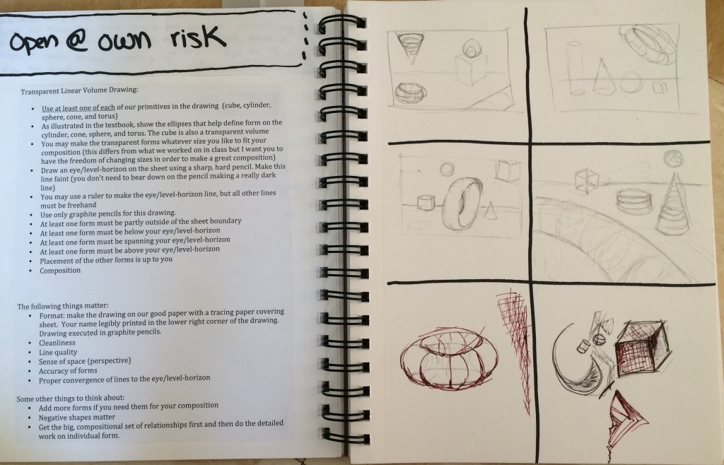
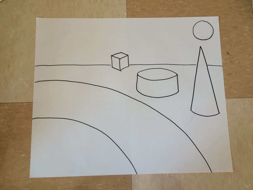
I started by drawing thumbnails of a few possible compositions. After settling on one composition, I took sketch paper and drew out the shapes in sharpie, just to make sure that I liked the composition. Seeing it on a larger scale, I was sure that I met all of the requirements of the assignment and that the composition was “happy,” as Michael Massey puts it.
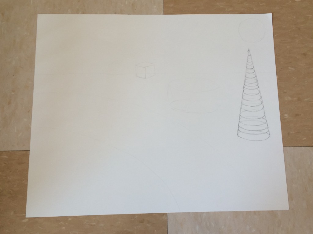
I’m now in the process of completing this project. Over the next couple days, I’ll carefully draw the details of each shape, like I’ve already done for the cone. Before turning in the piece, I’ll sign and date it and cover it with tracing paper, as per my professor’s specifications.
What is the strongest aspect of this work?
I think that the composition of this work is very strong. I really like how I chose to place the primitives. They lend to a sense of continuity moving from the bottom left to the top right.
What is the weakest aspect?
I think the weakest aspect of this piece is going to be keeping the primitives true in form. I’m not very good yet at showing the ellipses on these primitives to give them form.
How can the composition or form be improved?
I would love to add color, but sadly, that’s not up to me. I really like using color as a compositional element. However, I think it’s really good practice to have to do it with just line, as difficult as it is proving.
How can the project be strengthened conceptually?
There isn’t much to this piece conceptually. The requirements of the assignment were pretty straightforward and didn’t really leave much room for individual concepts or branching out.
How can the project be strengthened technically?
I think that the technical strengths, especially in a piece that is so intensely technical can only come with practice. It’s definitely difficult to draw primitives accurately and I’m aware that there are a lot of small inaccuracies in my piece.

-
-
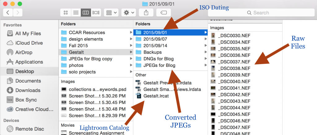
2015. Helaine A. Bach. CONTINUITY,
Photograph 4608 × 3072 pi
-

-
2015. Helaine A. Bach. CLOSURE,
Photograph 4608 × 3072 pi
-

-
2015. Helaine A. Bach. GROUPING,
Photograph 3072 × 4608 pi
-

-
2015. Helaine A. Bach. PROXIMITY,
Photograph 3777 × 3014 pi
-

-
2015. Helaine A. Bach. CONTAINMENT,
Photograph 3072 × 4608 pi
-

-
2015. Helaine A. Bach. REPETITION,
Photograph 3072 × 4608 pi
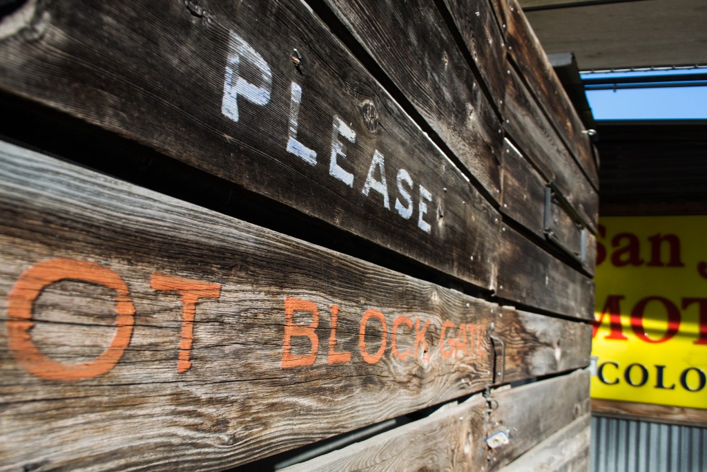
While I was shooting on South Congress, I found that my common theme was getting really close to my subjects. Uncomfortably close. I was on the ground a lot of the time, underneath the legs of chairs and sticking my camera in a flower. I really liked the way that getting close to objects helped me view aspects of the composition as shapes and values, rather than literal objects. With this perspective, I was able to see the principles of Gestalt working all around me.

Responses to Upperclassmen’s Presentations
Rachel Broussard
I really enjoyed Rachel’s advice for art students. As cliche as this is, hearing it all from someone who’s made it to their senior year of the program is really encouraging. Sitting in Drawing I, sketching out what seems like the 500th cube, the prospect of studying art for four years can seem daunting. Rachel gave me tools – taking advantage of the art around me, setting up studio space, and making time for my art – that will help me make my education in art extremely engaging and successful.
Caelan Navarrete
Caelan made me realize the importance of making outside work. I think I’ve gotten really caught up with making deadlines and driving myself crazy to try and complete projects to my professors liking. I need to make an effort to put time aside to do what I love – make art. Another thing Caelan emphasized was the importance of an internship. I’m really excited to learn by doing and really get my hands dirty in the real world of design.
Shelby Savage
I was really interested in the places that Shelby drew her inspiration from. She put an emphasis on using the past as a pushing off point. I really like the idea that the conversation around any topic is just that – a conversation. In order to form an opinion, or a piece of art, we have to see what other voices, or artists, have said about the subject. Another striking aspect of Shelby’s presentation was how pretty it was. While all the upperclassmen’s work and message was beautiful, I was most impressed by the way that Shelby presented her work. I could see the intentional choices behind the design of her slides. I really liked that.
Paul Young
Paul’s work was really interesting to me because I could see its real life application. I really enjoyed seeing the work that he has been commissioned to do for music events. Thinking about how design work is applied in the real world is really interesting. The impression that I was left with from Paul’s presentation was the need to make time, make work, and make connections.
Crissy Smith
Crissy emphasized the importance of knowing how to present yourself as an artist. This makes me think a lot about the conversation we had about the relationship between artist and entrepreneur. It’s so important to know how to talk about your work and to have a portfolio that presents you and your work accurately. If you can’t talk for your work, it won’t matter that your work speaks for itself.
Juliana Ramirez
I learned a lot from Juliana’s presentation. I really appreciated her emphasis on keeping a sketchbook. I like the idea that a sketchbook is full of lists and ideas that can be used later on when you have the dreaded “artist’s block.” I think I need to revise the way I use my sketchbook. Often, I focus too much on making each drawing look like professional work, but a sketchbook should be a more natural flow of ideas and concepts.
Design Smart Websites
*click on images for analysis*
-

-
http://scitech.urjcamps.org
-

-
https://www.pinterest.com
-

-
https://stedwards.app.box.com/files
-

-
http://apple.com
Reflection: The Medium is the Massage
When I first opened the link to the audio for The Medium is the Massage, I was beyond confused. I had no idea what I was listening to and for the most part, it made me wonder what on earth I’m doing studying art. The media we have explored for this class is unlike any other content that I have been asked to read or listen to for any of my other classes. However, if I interpreted the content correctly, I think that may be the point of The Medium is the Massage. It’s not about what you’re saying, but how you say it. After trying very hard to understand what I was listening to and looking at, I plugged the title into google and found a more comprehensive analysis of what the creators are trying to say. It just so happens that my preferred medium is a little more straightforward than the medium utilized by the creators of this particular project. However, I do strongly agree that the medium that we choose to portray our message has a lot of significance in how art can be interpreted. I’m very interested in our role as visual artists and our ability to manipulate information to change our relationship with that information. We have the power to change how others see what we see. Not to be too cheesy, but with great power comes great responsibility. We have to be very conscious of the decisions we make regarding our manipulation of elements of design and intentional about the medium we use in order to portray our messages most effectively.
The Line Between Abstraction and Figuration
I had a little trouble beginning this assignment. I visited the sites that were recommended and I even put “contemporary artists” in the search bar of google, but I couldn’t find an artist that I felt compelled to write about. I was annoyed and feeling a little stuck, because I have my first real college paper due on Monday and art homework is generally more fun. And so, I did what so many college students do to procrastinate and I turned to social media. I wasn’t very far down my dashboard on Tumblr when I came across a post that caught my eye. I’d found my contemporary artist.
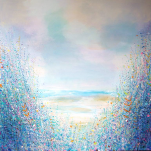
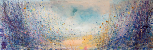
Sandy Dooley’s work originally caught my eye because of the vibrant colors she uses. I looked closer and was amazed to find a landscape scene being formed by all of that color. I was reminded of artists like Van Gogh and Monet, who take what they see and make it a world of color. I clicked the hyperlink attached to her name in the post (thank goodness the original poster knew a thing or two about crediting artists) and was taken to an interview where Dooley discusses her work with Saatchi Art, an online art carrier. I read through the Q and A and fell in love with her description of “exploring the line between abstraction and figuration.” She put words to what I had noticed initially, the emergence of a landscape scene from a sea of color.
I found Dooley’s blog and read more about her life and what brought her to make art like this. Dooley went to St Martin’s School of Art in Central London. I was very interested to find that she is based in the United Kingdom. When I think of landscapes in the UK, dull colors and dreary rain are what come to mind. I hadn’t pictured vibrant colors like the ones that Dooley uses in her paintings.
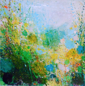
Sunshine Summer
Sandy Dooley
United Kingdom
Painting
Size: 11.8 H x 11.8 W x 1.3 in
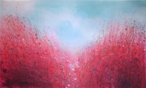
Red Path
Sandy Dooley
United Kingdom
Painting
Size: 43.3 H x 70.9 W x 1.3 in
Beach
Sandy Dooley
United Kingdom
Painting
Size: 43.3 H x 43.3 W x 1.3 in
Winter Beach
Sandy Dooley
United Kingdom
Painting
Size: 11.8 H x 35.4 W x 1.3 in
Making the effort to track my time over the last week has told me a lot about myself. I noticed that on days when I ate at regular times, I felt much better. For example, on Thursday, I felt really unhealthy and my energy that day showed it. However, on Friday, I ate three square meals and I felt a noticeable change in my attitude and how I felt. I think it’s also interesting to note the differences between “chilling w/ friends” and “chilling alone.” I’ve known for a long time that one of the biggest causes of personal stress is that I am an introvert who enjoys leading an extroverted lifestyle. However, in order to feel well, I need to remember to take time to myself, to recharge. I didn’t do that as much this week, and I think that really showed in the way I interacted with others. By Friday night, I felt extremely burnt out. I made the effort to spend more time resting over the weekend and now I feel recharged and ready to take on the next week. Click here to view full time tracker sheet.
Click images for more info.
More often than not, I begin a piece of art in an explosion of emotion. An idea pops into my head and suddenly, there is nothing I can do to keep from grabbing the closest writing utensil and recording my thoughts on whatever is available. Some of the work I am most proud of began scribbled on the back of my hand or a napkin, even my calculus notes. I am not in control of my creative process. I am constantly at the liberty of my impulses, wherever and whenever they chose to create. I simply do my best to oblige. While my art often begins in chaos, it quickly comes under the control of my compulsively organized mind. From primal passion to an intellectual process, my artwork begins to take form. I am most proud of my ability to transform this raw emotion into a message that is clear. I consider my process a translation from the initial chaos to a final product that shows the rest of the world what is going on inside of
The human form in motion, is among the subjects I enjoy exploring the most. I have always been mesmerized by the images of people dancing. I imagined that I could touch their form through the page, and I longed to create that movement myself. It was through my practice of acro-yoga that I began to excel at recording the human form in motion. After experiencing for myself what it felt like to truly move in beautiful ways, I found myself able to better portray that in my art. I want to further explore my skill in this subject and evoke the same feelings in others that I feel myself when I see beautiful movement.
Reflection: Dan Brackage, Stellar


