Blog Post #4
Part I:
I liked all of the older students dedication to their respective fields. I really liked Faith’s photographs, because, despite the fact that they were black and white, they seemed to have a lot of colour in them. Mary’s website was very interesting and I liked how it flowed. I even chose that as one of the websites I was looking at for the second part of this post. I enjoyed watching the two Video Game majors going through their previous works and I particularly enjoyed watching them play the rage quit game. That was an enjoyable thing to watch and I still feel a tad bit mean for laughing at them playing it.
Part II:
The thing I like the most about this website is how the menu bar that is at the top of the page follows you down as you scroll. This feature is a really nice one that I would love to duplicate(as soon as I learn how).
For this one, I like the design of the website the most. I really just like the design of the website and how it flows through to the bottom, with the most important pieces having the more elaborate designs.
Continuing from what I talked about up in the first part of this post, I really like the design of Mary’s website. It’s short and simple, and yet still feels fancy and in some way professional. I also like how she has divided her work and has interesting pictures and simple titles, because it seems to make you want to find out what everything is about.
I like Polecat’s design for it’s website. It’s a simple design that explains what the company does and gives examples, links, and contact information at the way end. I like how it’s all concise and simple, yet still looks professional.
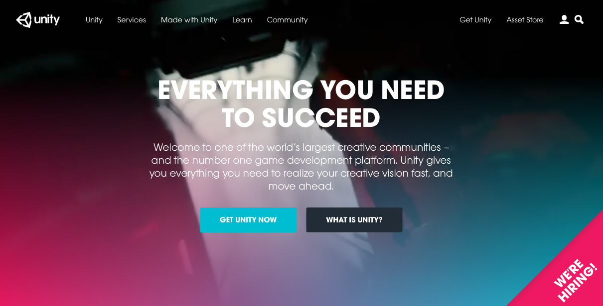
Unity Website front page.