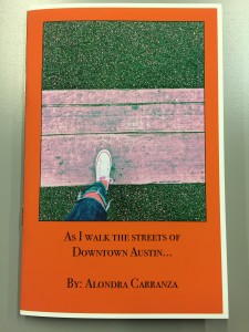
Critique Protoype 2 (Inkjet Printout)
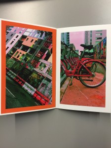
The printing instructions/ pictures were very helpful when adjusting the printer settings. However, the first time printing I realized I messed up on the sizing of the booklet. Instead of setting the size to 5.5 X 8.5, I had it set to 8.5 X 11 so the images came out cropped and uncentered. I had to resize the entire booklet to 5.5 X 8.5 inches when printing out the second time. Also, I had to reprint because I places the paper in the wrong way when printing out the even pages— so the text came out backwards. For the final book, I need to reposition the photographs because one or two of them came out a bit more cropped than I had intended. Other than that, I really like the quality of the double sided printing paper. The images look a lot clearer and smoother than on the LaserJet with regular paper. I’m satisfied with the placing of the text and images. I’m ready to print out the final book.
The Sequence
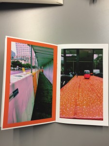
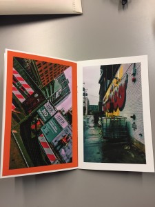
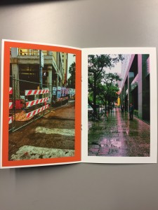
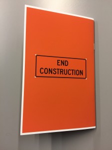
The sequence in my book has been finalized. Aside from the “I spy” theme, I decided to have an everyday image/ scenery next to an image that has construction or renovations around the city. Images on the right side of the book have a photograph of an everyday setting (sitting at a lunch table, walking past an alley, walking past a building on your way to work, etc.) Images on the left side have photographs of construction sites, or places that will soon be renovated. The idea behind this is to demonstrate Austin’s modernization and booming urban development. If you were to take out the left sided pages, the “walk through downtown” would indicate an overall peaceful and quite stroll down the streets of Austin. If you were to take out the right sided pages, the book would indicate a chaotic, noisy contruction-filled setting that disturbs the cool Austin setting. With all the renovations and urban development occurring in the city, people fear that Austin will lose its cultural identity. My book also has a color pattern consisting of white and orange pages (orange, white, orange, white, etc.) Part of the sequence is that all of the photographs in the book were taken on a rainy day to indicate a gloomy setting—roads, sidewalks, and tables all appear wet.
