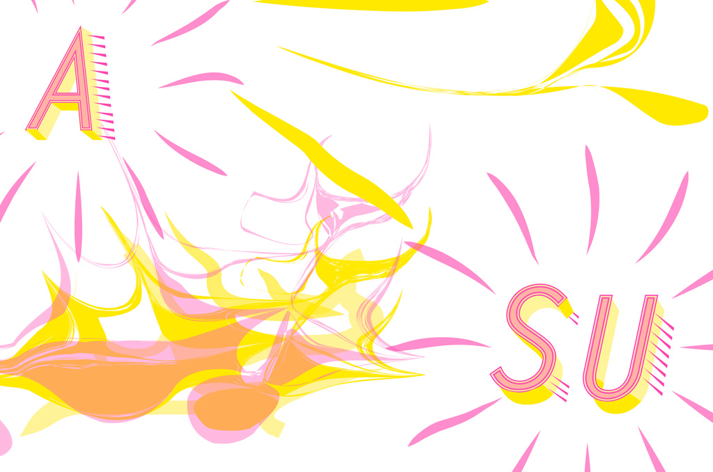
The zine truism was one of the most rewarding projects in my opinion, creating our own chromatic type and having so much creative freedom was very benefitting. I think that the fact that a we got to choose our truism and include it into our design made this project all that more personal. The process I went through with this project included a lot of detail work on my typeface and making sure that all the words and letters matched one another. Some decisions I had to make included selecting colors from the risograph inks and then layering them in a way that the two colors complimented each other. The idea behind the shapes in my design came from my overall concept of time. There are 12 transformed lines that represent a clock but they are bent and repeated for more emphasis. And the flowing shapes that continuously run throughout the rest of the spreads represents my concept of unpredictability and how somethings in life come when you least expect them. The design and flow all the elements have enhances my content by complimenting the shapes and the way the zine is read because all the flowing shaped lures you onto the next page.
Zine Lesson


