Weather Report Assignment

Link to the video, the .mov file is too big for this site to store.

This one was particularly time intensive. My goodness, the hours I put into this, my first real after-effects animation with complicated effects and tweening in it, not just the puppet warp tool.

I forgot to make the big waves move at the end, and the dino’s animation is a little stiff. Parts jump here and there instead of smoothly transitioning from position to position. These are things that jump out at me just watching it again. I’m not oblivious to the numerous technical errors in this piece. During it’s making, I had to change the way the building’s were shaped, the colors and locations of letters, all to try and smooth the transition from one major segment to the next, and even so I still would have probably liked to try more fancy animations here and there, had I the technical skill yet in the program to attempt it.

I probably would have like to have the days swoop in more dramatically, or even animate the individual weather icons to pulse and move by themselves. Still, I put a lot of work into it, and I’m not unhappy with the outcome.

L.A.T.C.H assignments

“L” animation link

“A” animation link

“T” animation link

“C” animation link

“H” animation link

The “LATCH” series was five assignments that served as exercises to teach us various aspects of animation, as well as the tools of AfterEffects. We were given a series of shapes or names for each one, and were to arrange them by:

Location

Alphabetical order

Time

Category

Hierarchy

While these may have been long and tedious to do as a first-timer at AfterEffects, I love the idea behind these assignments. I really feel like I became much more confident with AE through these.

You could definitely charge me with a bit of laziness with these, as I do feel guilty with treating a few of them more like exercises than assignments. This is especially obvious in some of them, such as the ‘A’ video. It simply didn’t occur to me to add much of a creative flair beyond simply putting the terms in order, and I still regret this.

Backpack Poster

bigdocument

This assignment was more thoughtful than the more straightforward ones I was heretofore used to. The idea was that we would show what we keep in the bag we carry around with us, in the hopes that the arrangement would reflect, in some way, who we are.

This is not an entirely accurate portrait, however, as my purse at the time was too small to hold all the things I carry (I normally haul a lot in my arms.) To remedy this, I temporarily brought a backpack I used in high school.

I really enjoyed cutting out all of the objects, repetitive as it was, as I like making the disorderly orderly. Further, I’m fairly proud of how this piece turned out. The order is easy to understand, and the objects are clean and easily identifiable, as was in the criteria.

However, I do think that this would have done better on a patterned or textured background, rather than a plain white one, as the assignment required. The white void seems to suck the presence out of the objects.

However, i do think that this would have done better on a patterned background, rather than a plain white one, as the assignment required. The white void seems to suck the presence out of the objects.

Buttons Assignment

wondertag joytag joyicon Print

This was a sort of mix between a visualization exercise and an advertising assignment. The class was to visit somewhere that evoked a certain emotion for us, and write instructions, like on a product, which would allow the user to feel that emotion. When we had done that, we constructed the focus of the piece, a series of buttons, (or in my case, stickers) that would act as a sort of merit badge for completing the task.

My chosen emotions were wonder and joy, and I’m honestly really pleased with the designs themselves. I really got to flex my painting skills again to make the illustrations on the tags. The ‘joy’ sticker was originally going to be a vector, but I had to change it when my teacher advised me to make a piece that better suited the mood, because we both thought vector was too for the mood I was trying to evoke. I also changed the vector illustration for ‘wonder’, because it was originally coming out too Halloween-like, because I was adding all these creepy things in the little underground passage, and they didn’t match the feeling of ‘wonder’.

The biggest problems with the final piece are not visible here, because they are printing issues. The printer I used was of poor quality, and left spotting and darkened colors. Further, I could not find a way to pre-cut the sticker sheets I printed the images out on, like commercial stickers are, which kind of ruins the presentation.

“Critical Mass” Assignment

This was my very first time working with AfterEffects. The assignment was to take a metaphorical prompt (mine was combustion) and abstract it into a simple story, animated through AfterEffects.

I attempted to use hand-drawn images imported from photoshop, to mixed results. While frame-by-frame animation would have probably looked much better, I did not have the knowledge to pull that off, nor would that be feasible given the time constraints. Thus, I used the puppet tool for nearly all of this.

Unfortunately, the models deform unnaturally at several points in the animation, and some of the movements really feel stiff and awkward. Further, the metaphor does not come through as well as it probably could have. The greatest strength here is probably the cute drawings I did, but those alone will not make this a great product. This is a first try, nothing more, I suppose.

Personal Geography: Artifact Map

sam_mapThis was the first “Personal Geography” map I created, and is thus probably the weakest. We were to map our way to school (if we did not live on campus), and one of the bigger problems I kept running into was the simple fact that I have no sense of direction. I don’t drive, myself, and I can’t very well describe how I even get to school. I just sort of understand my way as a series of images. I tried to present this idea, but the map overall came out sort of sparse and confusing.


Personal Geography: Cognitive Map

PrintI was having a bad month at the time, finals and all, and given the title I wouldn’t submit this for any kind of showing. The idea was to organize something using a time element, as well as aspects of the events we were organizing chronologically. I chose my finals, which were fierce, and their relative difficulty.

I believe this project needs more space, vertically. I wish I had, in retrospect, put a key for the various symbols, and maybe even made a sidebar that showed all of the days these things were due, so that I may have had more precise placement of the items on the bars.

Personal Geography: Perceptual Map

Print 
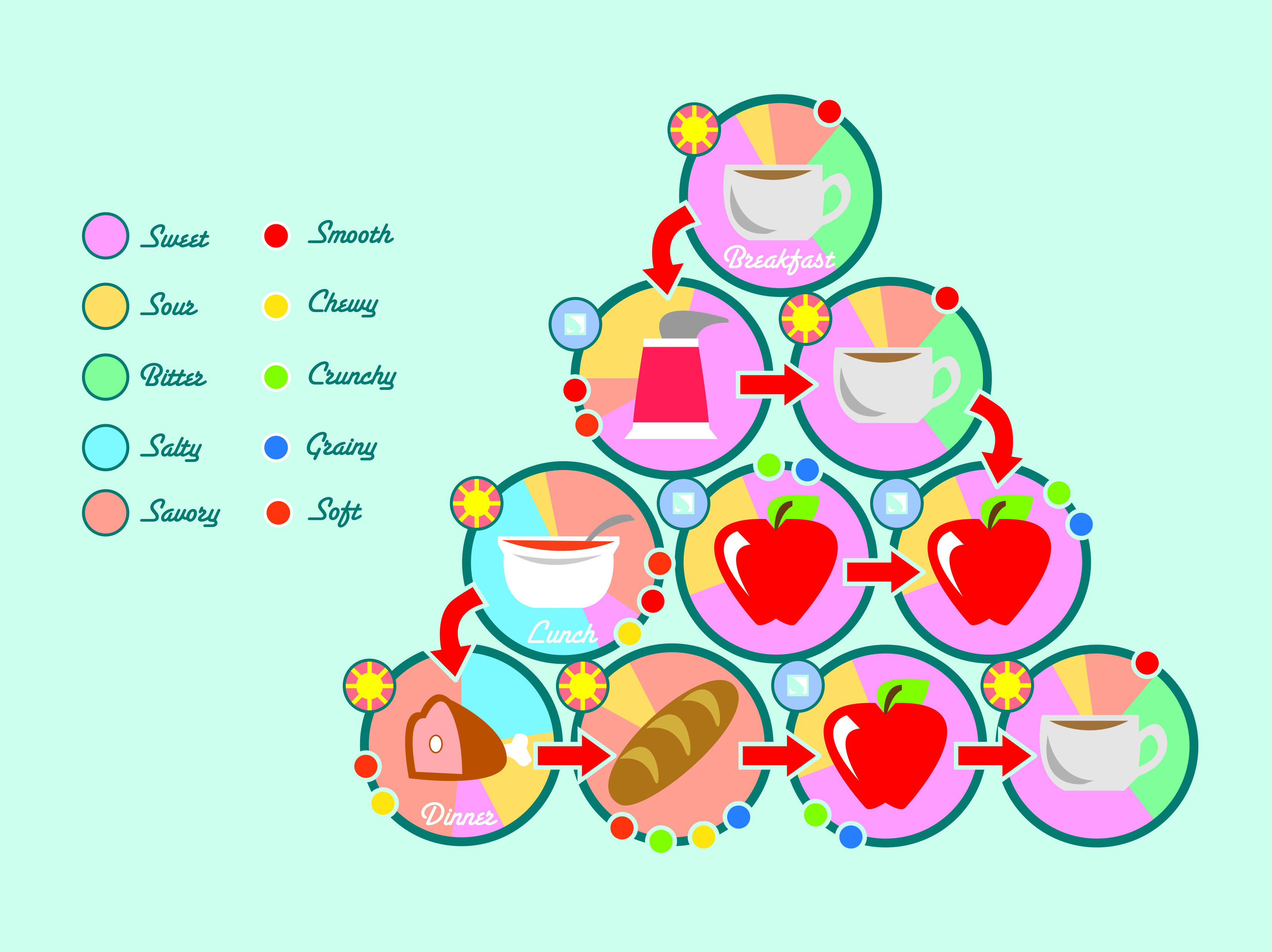
“Personal Geography” covered a series of map projects; Some were literal maps, some more metaphorical or based on your own perspective. This is based on the things I eat throughout the day. My diet doesn’t have a lot of variety from the usual schedule: bread, 2 meats, 3 coffees, 3 fruits, a yogurt. Here, I mapped out the ways the foods taste and feel, as well as their temperature. I’m extremely happy with the way this one turned out. I’m still in love with my choice of a soft, friendly color palette, and though I struggled with deciding whether or not to include a stroke on the objects, I feel it was the right decision to go with none. All the objects are now recognizable, even yogurt, which had to be edited somewhat to be easily seen, and the “map” is nice and orderly. I wondered whether or not to use bars to convey the flavors on the chart, but eventually settled on a pie chart to better add to the order of the design.

Scales: Combine

collageThis was a collage assignment, using various objects we scanned, at different angles, in different ways, to convey an image bigger than the subject matter, both literally and metaphorically.

While the rose may be a sort of clichéd image, I’m very happy with how this turned out. An assignment in photoshop was a refresher, and it was good to be in my comfort zone again for a little while. The blurb concerns a girl I loved once. It was fun to revisit those feelings, if a little sad, too.

Material Studies

experiment

Alternate link

  • Concept: I would like to call my typeface Pent Up (*I have since changed its title to On Edge). I think razors are a very striking and visceral image, and i would like to use them to reference various types of emotional pain, though not just the suicidal, as razors might first imply, but using a quiet voice. Ideally, i hope to use lowercase, soft letters, contrasting the harsh medium of the razors.
  • Names: razor blades, razors, square razors, single-edged razor blades
  • Common Uses: Though razors like these are mostly used by mounting them into a handle to cut cardboard and other softer substances for construction purposes, in popular media they are usually shown as a tool of choice for suicide by wrist cutting.
  • Properties: gray, light, smooth, metallic (taste and smell), small, geometric, steel, threatening, sharp (on one side), blunt (on the others)
  • How It’s Made: The blades are made by forming and pressing steel into a thin sheet, which is then cut into a rectangular shape, and sealed with more metal on one side.

The material studies project was based, again, on finding letters in the world around us. This time, however, we were to prepare a poster, and a considerable amount of documentation on the typeface as we conceptualized it.

I tried working with cocktail umbrellas, these strange snake earrings I own, and finally, razor blades. I chose the blades not only because of their simple shape, which worked well to create larger letters, but also because of the visceral reaction people have to them. I wanted to convey a dark, neurotic image with On Edge, and i really think i achieved that.

Still, I believe that the final poster needed further editing in Photoshop than what I gave it. I like the dirty sink I used, but I think there is just too much orange, and not a high enough resolution to the image. Keep you camera in focus, people, it helps. Clearly i’m still working on it.