Elements Scavenger Hunt

Link

http://myweb.stedwards.edu/sperkin3/sw_web/sw_project1.html

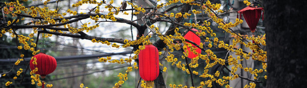
The above link is the culmination of quite a few photos, actually.  For the ‘scavenger hunt,’ as it were, we were assigned to take over 200 photos demonstrating the Elements of Art: Line, shape, color, value, texture, and space. Afterwards, we were to pick photos that demonstrated more than one element, and arrange a transition between them all in a series.

The above is meant to demonstrate: texture, texture to line, line to shape, shape to color, color to form, form to value.

I am really fond of the fourth and fifth photos especially, and am mostly happy with my demonstration of the elements, but I believe that a few really lack some technical skill and control of the lighting, and the third has a lot of issues with poor composition.

Scales: Look

scales

There is not a lot that can be said about this project. We were to make a word out of a series of photos of the naturally occurring letters around us. I chose ‘cat’, but I wasn’t the only person who chose that word. I think it’s one of the most popular short words.

Type Specimen Book

Alternate link

My first book! My first experiences with InDesign! I really enjoyed this project, as I had to do some serious research and meditation on just one font (Ms. Eaves) for the book. However, I still feel that some of the pages lack polish I could have lent them had we another week on the project.

I’m most proud of the spread highlighting the uppercase Q, because of the elegance I tried to put in it, highlighting the overall elegance of the letterforms of the typeface, and overall, I still like the color scheme I chose. Still, regrets are aplenty here.

Design Culture Now Poster

designculturenow

This was a fairly challenging project for me, because not only was it the first time I had ever made a poster for a design course, but I had to draw attention to the content through words, not images, as I was previously accustomed to in my illustrative background. The poster’s topic was a fictional design showcase and seminar event, which presented the need for short bios for each artist, (big text, small text, and it all had to flow together.) In the end, I’m not sure I scored big with this one, as though I enjoyed the high-contrast aesthetic, I was informed it was rather garish, and since then I have come to agree that the color choices get in the way.


Iterations

font

This was an opening assignment for Typography I, and a sort of exercise just to get the students in the mindset of working with letterforms. We were given a simple grid, and asked to make a typeface based on that grid. I mostly experimented, seeing how few squares I could use to make a letter, and how much I could leave black before the letter was unidentifiable. Also, I made a cute little font out of squids.

Hello world!

Welcome to your brand new blog at St. Edwards University Sites.

To get started, simply log in, edit or delete this post and check out all the other options available to you.

For assistance, visit our comprehensive support site, check out our Edublogs User Guide guide or stop by The Edublogs Forums to chat with other edubloggers.

You can also subscribe to our brilliant free publication, The Edublogger, which is jammed with helpful tips, ideas and more.