


This entire project was an experiment on the nature of symbols, and how an illustration can become abstracted over time to become something simple, but recognizable. It was actually an extremely fun exercise, because of the translations we had to make between abstract concepts and the logos we were attempting to use to describe them.
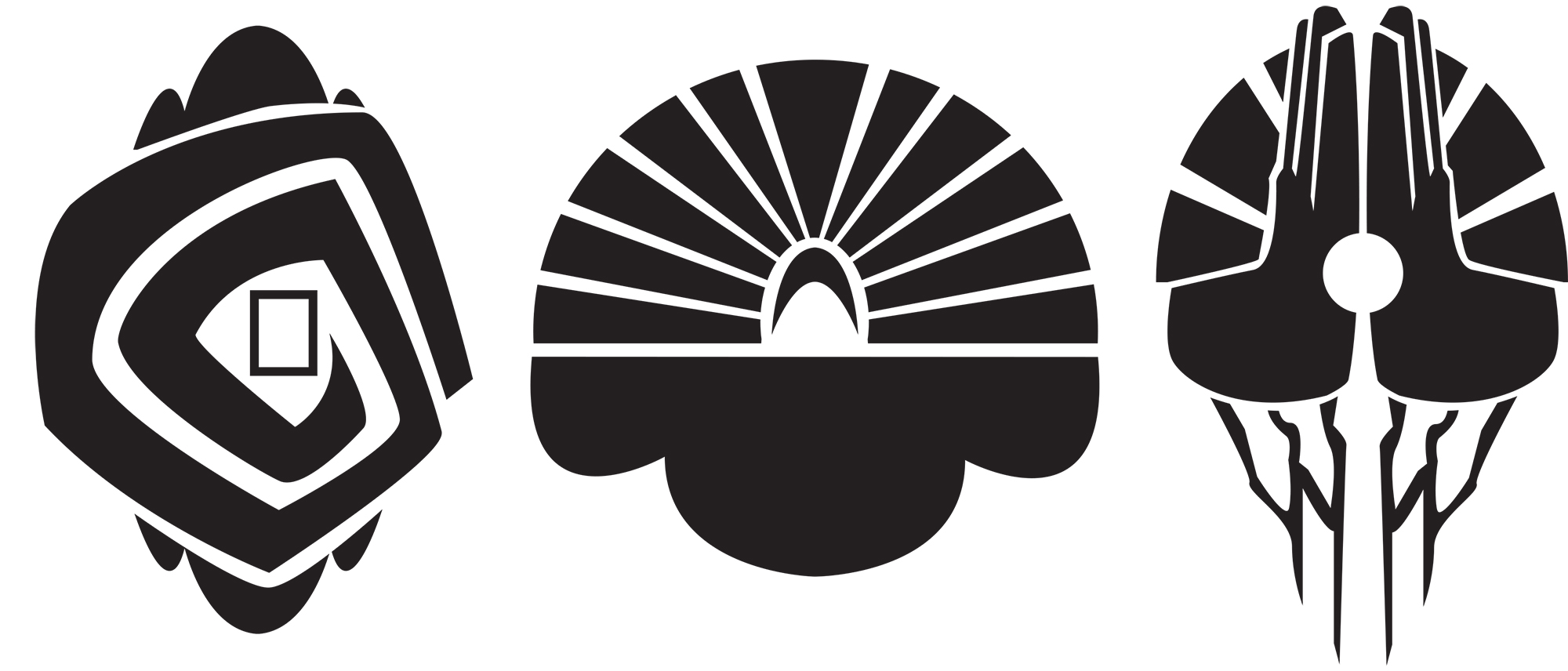
For mine, I tried to represent 3 eastern religions: Shinto, Buddhism, and Hinduism, and made symbols for different aspects of their mythos, combining them and abstracting them further to make the final 3 on the bottom.
I’m fairly happy with this one, especially because of all the steps I put into it. The symbols each, in some small way, even contain elements of the iconography I could find online of their worship. Shinto, for example, has a picture frame shape, like those used in shrines to deceased relatives adherents use, in the second-to-last iteration, and it becomes simplified to concentric circles in the final board. I did, however, have some trouble deciding when it was better to use a stroke, or a fill of black for the shapes, because I couldn’t decide if I wanted my logos to be elegant and complex, or utilitarian and dark. I settled on the latter.
A very fun project, and I really like my designs.