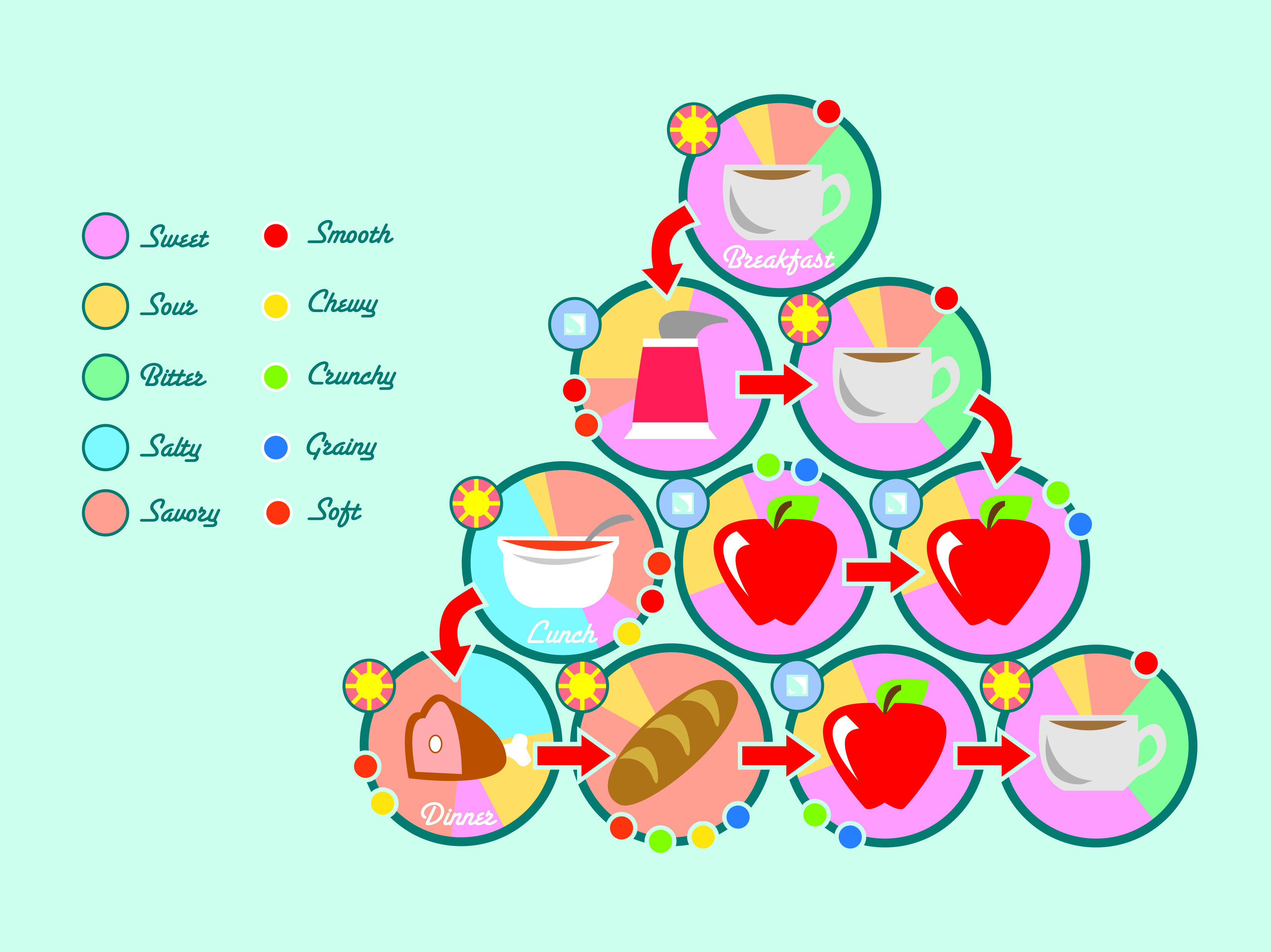
 “Personal Geography” covered a series of map projects; Some were literal maps, some more metaphorical or based on your own perspective. This is based on the things I eat throughout the day. My diet doesn’t have a lot of variety from the usual schedule: bread, 2 meats, 3 coffees, 3 fruits, a yogurt. Here, I mapped out the ways the foods taste and feel, as well as their temperature. I’m extremely happy with the way this one turned out. I’m still in love with my choice of a soft, friendly color palette, and though I struggled with deciding whether or not to include a stroke on the objects, I feel it was the right decision to go with none. All the objects are now recognizable, even yogurt, which had to be edited somewhat to be easily seen, and the “map” is nice and orderly. I wondered whether or not to use bars to convey the flavors on the chart, but eventually settled on a pie chart to better add to the order of the design.
Monthly Archives: March 2014
Scales: Combine
 This was a collage assignment, using various objects we scanned, at different angles, in different ways, to convey an image bigger than the subject matter, both literally and metaphorically.
While the rose may be a sort of clichéd image, I’m very happy with how this turned out. An assignment in photoshop was a refresher, and it was good to be in my comfort zone again for a little while. The blurb concerns a girl I loved once. It was fun to revisit those feelings, if a little sad, too.
Material Studies
experiment
- Concept: I would like to call my typeface Pent Up (*I have since changed its title to On Edge). I think razors are a very striking and visceral image, and i would like to use them to reference various types of emotional pain, though not just the suicidal, as razors might first imply, but using a quiet voice. Ideally, i hope to use lowercase, soft letters, contrasting the harsh medium of the razors.
- Names: razor blades, razors, square razors, single-edged razor blades
- Common Uses: Though razors like these are mostly used by mounting them into a handle to cut cardboard and other softer substances for construction purposes, in popular media they are usually shown as a tool of choice for suicide by wrist cutting.
- Properties: gray, light, smooth, metallic (taste and smell), small, geometric, steel, threatening, sharp (on one side), blunt (on the others)
- How It’s Made: The blades are made by forming and pressing steel into a thin sheet, which is then cut into a rectangular shape, and sealed with more metal on one side.
The material studies project was based, again, on finding letters in the world around us. This time, however, we were to prepare a poster, and a considerable amount of documentation on the typeface as we conceptualized it.
I tried working with cocktail umbrellas, these strange snake earrings I own, and finally, razor blades. I chose the blades not only because of their simple shape, which worked well to create larger letters, but also because of the visceral reaction people have to them. I wanted to convey a dark, neurotic image with On Edge, and i really think i achieved that.
Still, I believe that the final poster needed further editing in Photoshop than what I gave it. I like the dirty sink I used, but I think there is just too much orange, and not a high enough resolution to the image. Keep you camera in focus, people, it helps. Clearly i’m still working on it.
Symbol Methodology
Gallery

This gallery contains 2 photos.
This entire project was an experiment on the nature of symbols, and how an illustration can become abstracted over time to become something simple, but recognizable. It was actually an extremely fun exercise, because of the translations we had … Continue reading
Scales: Construct
Gallery

This gallery contains 4 photos.
I’m not very happy with these. The idea is to make sculptures out of stuff, any stuff you might have, to demonstrate the different elements, (from top: earth, fire, water, air) and the photos would be what you were really … Continue reading
Elements Scavenger Hunt
Link
http://myweb.stedwards.edu/sperkin3/sw_web/sw_project1.html
The above link is the culmination of quite a few photos, actually. For the ‘scavenger hunt,’ as it were, we were assigned to take over 200 photos demonstrating the Elements of Art: Line, shape, color, value, texture, and space. Afterwards, we were to pick photos that demonstrated more than one element, and arrange a transition between them all in a series.
The above is meant to demonstrate: texture, texture to line, line to shape, shape to color, color to form, form to value.
I am really fond of the fourth and fifth photos especially, and am mostly happy with my demonstration of the elements, but I believe that a few really lack some technical skill and control of the lighting, and the third has a lot of issues with poor composition.
Illustrator Exercise: Duck
 This was one of my very first assignments. There isn’t really an artistic message or goal here. We just traced a duck to practice with the pen tool.
Scales: Look

There is not a lot that can be said about this project. We were to make a word out of a series of photos of the naturally occurring letters around us. I chose ‘cat’, but I wasn’t the only person who chose that word. I think it’s one of the most popular short words.
Type Specimen Book
My first book! My first experiences with InDesign! I really enjoyed this project, as I had to do some serious research and meditation on just one font (Ms. Eaves) for the book. However, I still feel that some of the pages lack polish I could have lent them had we another week on the project.
I’m most proud of the spread highlighting the uppercase Q, because of the elegance I tried to put in it, highlighting the overall elegance of the letterforms of the typeface, and overall, I still like the color scheme I chose. Still, regrets are aplenty here.
Design Culture Now Poster

This was a fairly challenging project for me, because not only was it the first time I had ever made a poster for a design course, but I had to draw attention to the content through words, not images, as I was previously accustomed to in my illustrative background. The poster’s topic was a fictional design showcase and seminar event, which presented the need for short bios for each artist, (big text, small text, and it all had to flow together.) In the end, I’m not sure I scored big with this one, as though I enjoyed the high-contrast aesthetic, I was informed it was rather garish, and since then I have come to agree that the color choices get in the way.