After choosing to use a Topperette (St. Edward’s Dance Team member) as my symbol, I began to write a list of words that I thought of when a Topperette came to mind. I tried to keep these words as distinct as possible and avoided as many synonyms/repeating ideas as I could.


After I had done this, I chose the top 9 words. These words either stood out to me the most or I felt best described my symbol with the process of elimination.
Once I picked these top 9, I first put them in no particular order into the 9 circles. After doing this, I moved a few words around based on how I thought I could best represent them visually. For example, I originally put “skill” as a traced symbol but after thinking about it, I felt it would prove to be difficult and that it served a better purpose in the abstract symbol group. Therefore, I switched “skill” and “student”.

My Pinterest board inspired me to look for clear and clean symbols that took a very minimalistic approach. I took a liking to negative space and image balance. As I thought more about my first grouping of symbols, I thought more about how they would look as icons and in different settings (print, screen, etc.).
I began looking for images to represent my traced symbols on Google and saved them in a separate Pinterest board in order to collect them.

Creating my own stylized symbols was a much more difficult process seeing as I only briefly sketched ideas and then proceeded to re-create them digitally without anything to trace over. This rushing and skipping over the process definitely hurt me, in my opinion. I am not a strong drawer so I thought that I could skip that part of the process and be fine, but those symbols ended up being my ugliest and with the most negative feedback from the class. They were unrealistic, unshapely and overly busy.

I learned from my mistakes in that round of critiques and began to flesh out as many of my ideas on paper as I could for my abstract group of symbols. I drew as many as I could think of and proceeded to pick three. After picking these three, I began to recreate them on the screen.


That round of critiques showed me I needed to work on my negative space, stroke weight, and massaging my curves but my process had improved my work.
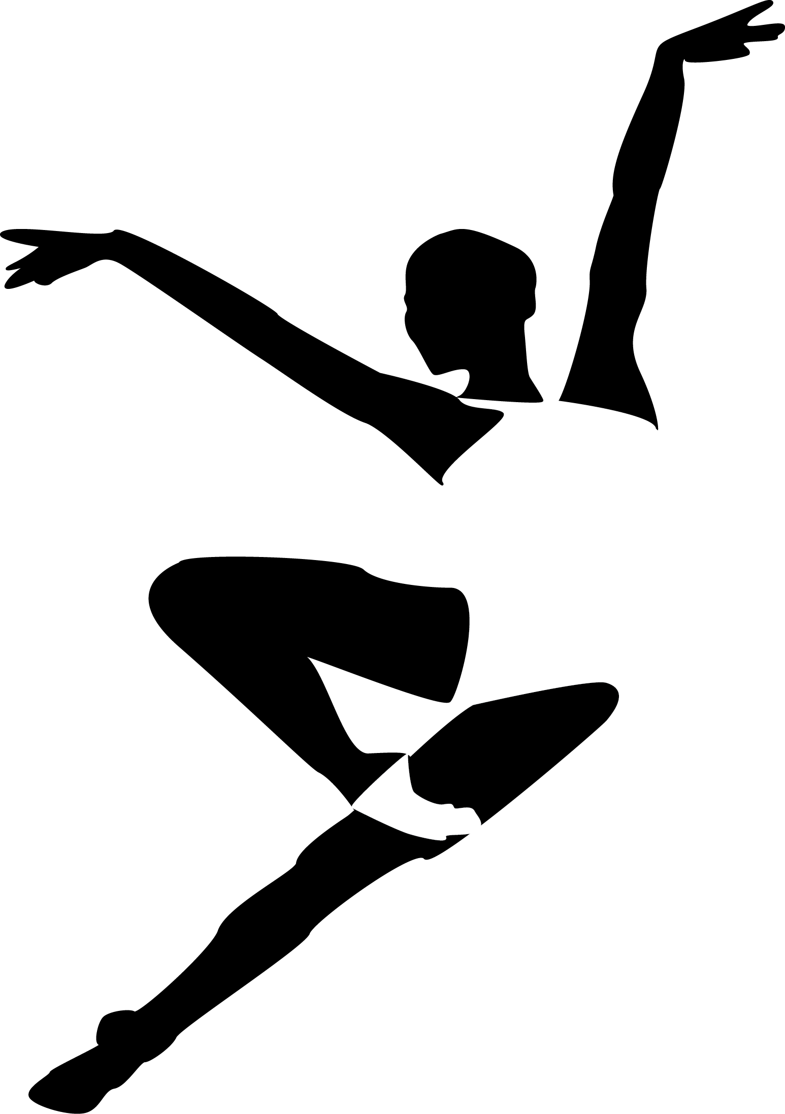
I struggled while creating my hybrid symbols because some of my favorite symbols, such as the dancer, were so elaborate and hard to merge. I chose to attempt my dancer anyways, elaborate my “skill” symbol and break up my “student” symbol while keeping in mind my last critiques.
I chose my three favorites based on the following criteria:
1. minimalistic
2. good use of negative space
3. balance
4. harmony of curves
5. craft
Overall, I believe my symbols to be on the average side of the student spectrum. I don’t find my symbols completely eye-catching but I have seen much improvement from when I first began the project. They meet my criteria set personally and by the project.
