Locating Place Book
As with our GIFs, the purpose of our book, was to examine a particular aspect of the Cesar Chavez neighborhood. I chose to focus on graffiti and street art because I have a background in these areas.


As with our GIFs, the purpose of our book, was to examine a particular aspect of the Cesar Chavez neighborhood. I chose to focus on graffiti and street art because I have a background in these areas.
The goal of this assignment was to explore the Cesar Chavez area by documenting various aspects of it. To do this, we took several hundred photographs of the homes there and then made GIFs that were representative of our experiences there. My first GIF refers to the many snow cone trucks that are present in the Cesar Chavez area. The second, which shows a mustache being combed, is supposed to refer to the ever-growing hipster population in the neighborhood, a major indicator of gentrification. The third GIF, which features illustrations of several houses, speaks to the timelessness of many of structures and homes in the area.


Initially, I had an extremely precise set of instructions. After creating my designs and receiving feedback from various class members, I came to the conclusion that perhaps my instructions were too precise. My instructions are now more consistent with my designs, which have a rather mellow, soft look to them. I changed the instructions to allow the reader to experience the given location as they desire. The text from the design on the left is rather serious looking, as though it were a hotel logo, and is consistent with the background shapes, which have a rather uptight feel. Additionally, the sharp edges of the letter forms are fairly similar to those of the background pattern. The background design on the right consists of rounder shapes which convey a more laid-back feel. This laid-back feel is also evident in the text which is exceedingly playful and does not take itself too seriously. The color schemes of both designs are playful and play nicely off of the instructions, which could also be considered rather loose and unrestricted.


The goal of this assignment was to introduce us to woodblock type and have us further explore its form. We were to choose one weight of the woodblock font, Knockout, and alter it in two different ways. The initial letter forms were extremely conducive to alteration and I quickly knew just how I wanted them to look. The extremely straightforward curves of the letter forms lent themselves to ornamentation. I did not want to ruin the forms and so I added the rounded bumps, which in my opinion do not compromise the structure of the forms, on the tops and bottoms of the letters. Additionally, I added an outline to the text and made the upper half of the text a different color than the bottom, an extremely common style for woodblock type.

The LATCH Weather project was one of the more challenging projects we have done thus far. However, it was also a major turning point in my graphic design career, as it represented major improvement in my illustration ability. Unfortunately, because I spent so much time illustrating my project, I ran out of time and was unable to finish with the motion animation. It ultimately ended up being one segment too short. It was also the most extensively I have used After Effects, which I found to be both incredibly challenging and useful.
This project was the first time that I used After Effects and it I think that, all things considered, it went pretty well. My video project highlighted several aspects of my everyday life in Houston. While the footage may not be particularly meaningful, I avoided being in any of the shots to keep it from being too straightforward. For the text I opted for a less traditional transition, in which the text appears to be being written on the screen. I thought this would be a far more interesting method of presenting the text than just having it fly onto the screen. My font choice of Edwardian Script seems consistent with the title of the video, “A Day in the Life” which implies luxury. Edwardian Script is a very regal looking font that also appears fairly luxurious.
Before I was at all interested in graphic design, I was extremely interested in graffiti and my Pinterest definitely reflects this. The disorganization of my Pinterest boards is somehow reminiscent of the chaotic form and colors of a lot graffiti/street art. Additionally, I really enjoy sharp lines with very contrasty colors, which is also very evident from my Pinterest posts.
https://www.pinterest.com/txsteelersfreak/
Much like my Information Map, my Artifact Map is fairly simple in both color and design. The font choices are the same as that of my Information Map and the layout is essentially a simplified floor plan of my apartment. The gradient key in the upper left hand corner flows very softly from one color into the next and, therefore, compliments the light gray text very nicely; it also compliments the simple style and colors of the piece.

It seems like working with muted colors is extremely popular in this day and age, and, therefore, that is often what I do. This sense of “muted” is not just present in the colors I have chosen for this piece, but also the design, which I chose to keep fairly simple and straightforward. The font choice and muted colors are also vaguely reminiscent of some early (70’s) TV shows, such as the Brady Bunch. Such familiarity can be comforting to the viewer but does not feel forced.

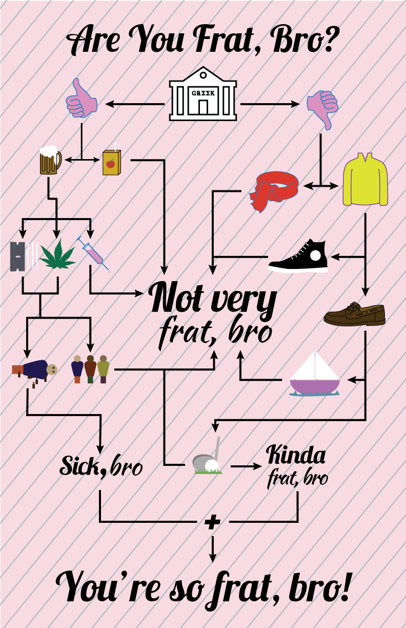
I like to incorporate humor in many of pieces, including this one. For the cognitive map project I chose to poke fun at college Greek life, whose members typically act and dress very similarly. My symbols, wording, and font choices reflect the playfulness of my project’s concept. The color and design of the background, while also playful, reflect those of certain clothing articles that may be considered “fratty”.