Graphic Design I Self Evaluation

Target & current expert hours: 500 hours per year for 2 years/ at 281 hours
Expert experiences: none


The social emotional development of my work over the semester should be scored as young. Social/emotional development is defined as the combination of learning diplomacy and truthfulness to interact with individuals or groups in a manner that contributes positively to members of society. Based on these standards, I believe my social/emotional development has improved since the start of the semester.  Since this is my first class focusing on introductory graphic design I didn’t know how to effectively interact with others in relation to the scope of my work at first. However, I’ve learned that social emotional development within the setting of a design graphics course is heavily focused on being able to maintain a perspective of critical thinking towards feedback provided from critique after critique. Efficiently transitioning from the exchange of ideas that will benefit one’s work from student to student is the social aspect pertaining to development. Being able to sustain a clear rationale and an open mind towards any kind of advice relates to emotional development. I found that I’ve learned how to approach classmates and professors about relevant questions pertaining to my work that will guide my social growth. In terms of emotional development, I’ve always been good about keeping a calm and collected demeanor. Thus, I look forward to critiques in that I’m able to make an informed decision about how to proceed with my work by analyzing all suggestions, ideas, issues, etc. that are brought up.


The sophistication of my work is adequate, but it has remained relatively steady throughout the semester. As a result, I have kept up with good consistency of work quality throughout this semester. I maintain that I exhibit a high level of sophistication in the process of my work, rather than in the actual final product. In my opinion, the end result of my work is only of medium sophistication. It is the minor things such as kinks in symbol designs, misuse of negative space, or lack of proper font usage that prevents my work from reaching its full potential. Therefore, in order to improve I would have to be more meticulous throughout my design process.


Using feedback has not only helped improve my assignments, but it has also helped me grow as an individual. For example, Maria’s feedback on my final three symbols allowed me to envisage the possibilities of where my assignments could go, giving me the motivation to add the finishing touches. Gaining feedback in Graphic Design I has allowed me to recognize that my designs have no limits, and that there is no finality. However, my use of feedback has been sparse. I haven’t effectively used suggestions from other class mates to disinter the full potential of my projects. For instance, I acknowledged and even implemented some of what Maria suggested toward the design of my symbols, but I could have reached out to her to get a more complete picture of how to improve them overall. In other words, taking advantage of my classmate’s perspectives is something I would do to holistically improve my utilization of feedback.


I have challenged myself moderately throughout the semester so far. Getting acclimated to the Illustrator program has been extremely difficult for me, but I’ve managed to get used to some aspects of the program. However, I do challenge myself when it comes to managing deadlines. If I set a deadline in my head, I will make sure the assignment is done by that deadline no matter what. This forces me to manage my time even more wisely. Over all, I can challenge myself more by not playing it safe when it comes to the complexity of my designs. Taking risky chances and trying new techniques over the course of my design process is essential.


I contribute moderately to the class room environment. I’m not afraid to ask questions or share my ideas with others, but most of the time I’m so invested in my own work that I miss out on opportunities to contribute. For instance, sometimes I don’t acknowledge group discussions or critiques because I’m focused on my main project; I tend to pay attention to only one thing at a time. Even though I don’t contribute much, when I do contribute, it matters. I’m receptive to other’s opinions and when I speak I take that into account. I also speak with conviction, providing worthwhile information that I’m actually passionate about. When critiquing Emily’s symbols, I made sure that she understood what I was telling her while reflecting on what I had learned in class. I got really in-depth with her critique just to prove a point. Later, I discovered that she took my suggestions and she actually understood how I was trying to help improve her designs. Hence, I believe that when I do choose to contribute, I can be influential. Despite this, my contribution is sparse and I would rank it as room temperature. Paying attention and developing what to say at a quicker pace would help improve my contributions significantly.


I’ve gone through minimal practice time, but my use of practice time has been consistent. I don’t get as much time to practice Adobe Illustrator as I would like due to a busy, hectic schedule. However, if I’m working on a project for three hours or so outside of class in the library, I’ll dedicate about thirty minutes of those three hours to practice time. This is a system in which I can manage my time efficiently, learn a little about Illustrator, and get work done simultaneously.


I’ve changed profoundly through this class. Because of the diverse environment, I’ve become a better communicator, a better artist, and most importantly, a better designer.  Now that I know more about graphic design, I’m that much more respectful of it. I’m more aware of its implications and have a greater understanding of its accidence. My work in this class has improved, but only slightly. My skills still need work. If grades are based on work quality, I wholeheartedly believe I deserve a B in this course. However, if based on learning (which I believe should be so), then I deserve an A. The benefits of learning are invaluable. Every professor’s top priority should be to help students learn something new. I have done just that in Graphic Design. I’ve learned perspectives different from my own, allowing me to understand diverse opinions. I’ve learned about specific design techniques. I’ve discovered intriguing terminology that can only be applied to the vocabulary of a graphic designer. I’ve gained so much through knowledge. Hence, I believe having learned something is best “grade” of all.


My Symbol Methodology

IMG_20141015_001750

It all started with an idea, or rather a series of ideas. These ideas were splayed across concept maps, lists, and web branches all at random. From then on it was all about process of elimination. However, even with all these concepts, I still struggled to envisage the motivation that would characterize my own symbol.

I then tried a different approach – one that took the opposite direction of my initial procedure. Instead of generating motivation from a plethora of possible ideas I reversed my methodology, elaborating from from one solid theme. This process was guided by my motivation, stemming from what I could use a custom created symbol for in the first place. But, how did I arrive at this motivation?

I approached this from a practical perspective and began thinking of what I could literally use a custom created symbol for in the real world. Of course, this required me to examine my own world. I had to think about my own hobbies, my interests, what I spend a lot of time doing, and what I don’t spend alot of time doing. I enjoy writing, and as a student I am writing all the time, so it seemed logical to create a symbol based on the theme of writing. Settling on the theme of punctuation just seemed like a natural progression, so I went with it as my motivation.

I thought it would be interesting to create punctuation that represents feelings or emotions not typically conveyed through the written word. Unlike emoticons/emojis (which tend to be light and playful),  I wanted to create something more formal and official – something that I would actually use as I’m writing on a piece of paper.

At first, I established nine solid words that ideally represented each symbol. I then illustrated several variations of a symbol that belonged to each word. This approach kept my options open as I was able to experience more than one interpretation of any concept word. I then proceeded with process of elimination. I stuck with the symbols that were bold and could hold their visual integrity even if they were scaled down in size. Throughout the weekly process of making my symbols I discovered that the punctuation concept did not lend itself well to the combination of the nine originals. The fact that I had such a focused plan for my initial original symbols made it difficult to weave together concepts and visuals symbols in a way that made sense. Eventually, everything became really convoluted.

I had intended for my punctuation concept to be translated through different mediums such as by hand, through multimedia messaging, and as font on computers. However, once I crossed over into the possibilities of the electronic frontier, I realized that my punctuation set would have to conform to aspects of typography. Thus, I had to take size into account when crafting my symbols. Since fonts across the electronic medium tend be very small I had to sacrifice complexity and busy design. Too much complexity and you lose the impact a larger symbol had once it’s scaled down. I also modeled some of my symbols after present type faces like Helvetica, providing for realistic implications.

I believe that my final three symbols came out well. The symbols look bold, sharp, and clean. I also think you’d be able to get some semblance of their intended meaning just by looking at them. As a result, I believe I achieved my goals in regards to creating something that could go along with proper grammar. I feel that I do lack creative use of negative space in my symbols though. The actual construction of my symbols is a little sloppy and could have been executed better. Also, compared to other beautifully balanced and detailed symbols, mine just aren’t that exciting to look at. Where do I belong on the spectrum?

I belong right in the middle: nothing special but not too shabby either.


"Beautifully balanced/detailed symbol"

“Beautifully balanced/detailed symbol”

"Beautifully balanced symbol"

“Beautifully balanced symbol”

"Beautifully balanced symbol"

“Beautifully balanced symbol”

Mexican Visions in Clay: The Sacred, Secular, and Fantastical

Sacred, fantastical, and secular themes are all present within this St. Edward’s Fine Arts Gallery. The gallery showcases figures meant to represent folk tales. These pieces are also designed to evoke a sense of freedom as well as primitive aspects of superstition and make-believe.

Most of these pieces are derived from Mexican culture. While at the exhibit I noticed that these pieces incorporated the essence of Aztec influences ranging from sculptures to paintings. I believe the main idea here is to highlight folk art that captures the interpretations of various religions, events, and common values.

Bruno Maag the Typographer

  • “Bruno Maag, Creative Director & Chairman.”

http://www.daltonmaag.com/people/Bruno_Maag.html


  • “I am trained as a typesetter, in metal, photo and digital, and soon found my   passion in designing type. As the company grew I naturally drifted towards running a business and working with my talented team to produce the world’s best fonts.”

http://www.daltonmaag.com/people/Bruno_Maag.html


  • “He is the co-founder and owner of Dalton Maag, possibly the largest independent studio in Europe specializing in custom type design.”

http://www.myfonts.com/newsletters/cc/201209.html


  • “His company recently developed a huge plurilingual font system for Nokia and has presented their bespoke font for the 2016 Rio Olympics.”

http://www.myfonts.com/newsletters/cc/201209.html


  • “My background has always been in typography, starting with a typesetting apprenticeship and followed by a typographic design degree at the Basel School of Design.”

http://www.myfonts.com/newsletters/cc/201209.html


  • “After my work at Monotype, both in the UK and the US, I startedDalton Maag with Liz Dalton, my wife… The company has grown steadily and organically over the last twenty years, and today Dalton Maag employs over forty people, most of us based in London but also in Boston, Brazil, Vienna and most recently in Hong Kong.”

http://www.myfonts.com/newsletters/cc/201209.html


  • “Born in Zurich, 1962, Bruno Maag graduated from Basel School of Design, Switzerland, with a degree in Typographic Design and Visual Communications.”

http://www.identifont.com/show?3WF


  • “His studio designed typefaces for clients like British Telecom, BMW, Hewlett Packard, and many others.”

http://www.identifont.com/show?3WF


  • “In my whole career in typography, starting with my apprenticeship, I have never used Helvetica. Being a Swiss typographer, it’s always been Univers. Even in my apprenticeship we didn’t have Helvetica in the printshop.”

http://www.creativereview.co.uk/cr-blog/2010/july/the-helvetica-killer

All about Bubble wrap!

http://www.todayifoundout.com/index.php/tag/bubble-wrap-history/


  1. Two engineers named Al Fielding and Swiss inventor Mar Chavannes invented bubble-wrap in 1957
  2. The material was discovered in Hawthorne, New Jersey.
  3. Bubble-wrap was originally conceived as wallpaper and then as greenhouse gas insulation material.
  4. The two engineers noticed how bubble-wrap could be effectively used as a packaging material for computers.
  5. Eventually, the IBM Company started buying bubble-wrap to protect their 1401 variable word length computers, as well as other fragile product they sold and shipped.


http://houston.culturemap.com/news/city_life/01-31-11-the-real-history-of-bubble-wrap-appreciate-the-pop-of-this-glorious-holiday/


  1. Bubble-wrap Appreciation day is on January 31st
  2. Located in Bloomington, IN, “Spirit radio 95” created Bubble Wrap Appreciation day in 2001


http://www.dailymail.co.uk/news/article-2059678/How-bubble-wrap-invented-unlikely-stories-brainwaves-granted.html


Exactly how was bubble-wrap invented?


  1. Chavannes and Fielding connected two pieces of shower curtains in order to trap layers of air bubbles between them.
  2. Sales of bubble-wrap wallpaper and bubble-wrap insulation did not go well at first due to the fact that neither product would sale.
  3. Chavannes came up with the idea to use bubble wrap as a cushioning material during a flight.
  4. It seemed that clouds were cushioning Chavannes’ plane’s descent.
  5. In the end, this is what helped the two engineers come up with modern day bubble-wrap.


Francis Bacon’s “Screaming” Pope

Diego Velazquez Pope Innocent X 1650. Study after Velazquez's Portrait of Pop Innocent X 1953 © The Estate of Francis Bacon. All rights reserved.
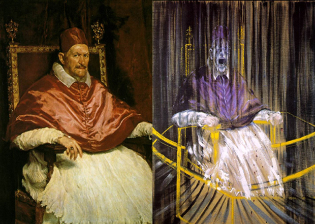
The main focus of the painting deals with a Pope on a chair. Facial expressions are solemn with the look of a terrifying shriek. There are two lines of bright gold that go across the painting and bleeding lines run down  the paper.

The entire piece comes off as a disturbing perception of horror that represents the Pope/Church.

The colors and techniques used to evoke a sense of disruption convey themes of corruption in the Catholic church. this is a successful piece because it properly conveys a clear message through effective art technique while embodying intriguing perspectives.


What do I want to be when I grow up?

The funny thing is that I had a clear idea of what I wanted to do when I was just a kid. At first, working with Pixar Animation Studios was my calling. The movie Toy Story got me hooked and I was just so interested in how animation worked along with the amazingly creative stories that had made the movie come alive. Next, I wanted to be a comic book illustrator. I spent most of my intermediate schooling days coming up with new concepts and drawing illustrations that eventually all came together to form my own comic books. However, just recently I had wanted to be a graphic designer believing it would be the appropriate field for me to express my creative and technical aspects. Now I’m in college, looking to find my future career even though I don’t even know what I want to be when “I grow up.” My views have constantly been changing and I’m still trying to explore other possible options for my future. At least, I know that I want to graduate form St. Edward’s some time soon and that I’ve still got time. Hopefully, I end up successful doing what I really love.

Dream Spring Schedule

My dream schedule for the Spring wouldn’t consist of any early morning classes. Anything ranging from noon to mid-afternoon each day would be ideal. I would then be able to enjoy a large a portion of the day doing exercise, work, etc. I also wouldn’t mind taking courses outside of my major’s specifications. This way I could explore other areas of study in order to really get an accurate idea of what i want to do in life.

Time Management

I’d like to say that my time is used wisely even though most of the time that’s not the case. 60% of my time is productive while the other 40% is  consumed by procrastination. However, over time I’ve learned to manage time more efficiently through organization, prioritization, and determination. Creating a mental list as well as a physical list of what I need to do one day at a time keeps me on track. While monitoring how I use my time over a week I’ve come to realize that my time mainly revolves around school, meals, workouts, and work. School comes first throughout the week followed by time allotted for homework and an hour of exercise. I work on Fridays and Saturdays; about 4-6 hours a day. Sundays are then used to catch up on sleep. homework, chores, or anything else that needs to be done. for the most part I believe my week is used constructively.