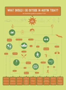
Our third and final map was to create a mental map showing the cognitive thought process of a decision. Similar to a flow chart, this map depicts the flow of thought to make a particular decision. One hindrance of the project was that the use of symbols to denote a question was favored over the use of text. The completed poster had to be printed on 16×20 enhanced matte paper.
I created a decision map displaying the decision “What should I do outside in Austin today?” I led the reader through a series of questions (mostly depicted by symbols) to help them determine what they should do outside in Austin on a sunny day. My completed poster was printed 16×20 and turned in on time.
Initially, I was going to portray the decision of “Should I buy these shoes?” but found it incredibly difficult to use symbols as questions. Before I did any work in illustrator, I mapped out by hand a couple drafts of the decision process. It was harder than I thought to map it out, so I wanted to have an idea of what I wanted my map to look like prior to transferring it to the computer. I researched things to do outside in Austin and categorized each activity with similar ones. Once I began designing my map in illustrator, I spent a lot of time figuring out how I wanted my map to look. I chose colors that complemented the outdoors theme, and chose to make rounded arcs and circles for the changes in line direction and questions, respectively. I then started to create symbols that would take the place of each question. There was a lot of adjustment of lines and rearranging of the flow of decision even after I had all the information laid out. It took the most amount of time to figure out what worked well in what position compared to the rest of the flow chart.
The first thing I had to determine was what decision to dissect and break down. The first things I thought of were the decision whether to go out or stay in on a Friday night, my personal decision to quit soccer, and whether or not to get a dog. Once I picked a topic, I had to think of the question I ask myself when I am deciding what to do in Austin. From there, I had to determine the different responses to each question and how that would affect their final destination on the chart.
As mentioned above, I chose to use sunny colors and rounded objects to embody an easy-going, relaxed, sunny day outside in Austin, TX. My design enhances the content because it entices readers to go outside and enjoy sunny weather, or perhaps even adventure to a new place outdoors.
