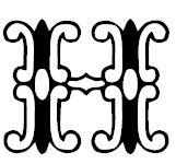
The purpose of this project was to take the letterforms we captured in real life and find a font that was visually similar. I used font searching programs to begin my search but for many of the forms, I just had to look through pages and pages of fonts. I decided a font fit if it embodied the same feeling or visual weight as my found letterforms. Some of the letters like the H were very intricate and I wasn’t able to match the form and typeface exactly but I used something similar in its creation and use. The H was ornate and I found a font that had wide parts and skinny parts in the same places, enough to see a connection.


