Hathaway’s “Man in the Hathaway Shirt” Campaign

We are all familiar with the Dos Equis “Most Interesting Man in the World” campaign. The campaign has been running for over six years now and has reportedly increased Dos Equis sales more than 15% while our nation’s economy continues to struggle. However, before the suave fellow was lapping opponents in drag races, counting backwards from infinity, and encouraging us all to, “stay thirsty, my friends”, the advertising world was interested in a different man.

In the early 1950’s (about 55 years before the Dos Equis man won a lifetime achievement award…twice) “The man in the Hathaway shirt” was intriguing consumers and inspiring men to wear Hathaway dress shirts. After 116 years of making fine shirts, the C.F. Hathaway company approached Ogilvy & Mather about making a print campaign to boost sales. David Ogilvy came up with the an ad that featured a man with an eye patch wearing a Hathaway shirt and Ogilvy’s signature informative copy.

The Big Idea was that the eye patch would give the man “story appeal” by making consumers wonder how he had lost his eye. The campaign was a success and Hathaway’s shirt sales doubled in less than five years. And yes, you read that correctly. The shirt sales for a  company that provided shirts for soldiers in the civil war doubled in less than five years.

Have a look at the advertising industry’s original most interesting man in these classic Hathaway ads.


So what do you think? How did the man in the Hathaway shirt lose his eye?

Advertising in the Skateboarding Industry

Advertisements are a very important component of the professional skateboarding industry. Ads that are featured in skateboard magazines or on skateboarding websites have several purposes. They let consumers know which companies are sponsoring which professional skaters. They create buzz for upcoming skate videos, and most importantly, they promote new products.

Skateboarding is one of the few advertising markets that is primarily print based. In a world in which Newsweek no longer prints its issues, skateboard magazines like Thrasher are thriving. Two things that most skateboard ads usually share in common are minimal copy and the fact that their target looks at them for longer than the average consumer. It isn’t uncommon for amateur skaters and other fans of skateboarding to decorate their room with ads cut from their favorite magazines. Brands like Axe and Ray Ban have had successful print campaigns in recent years, yet it is lesser known brands like Supra Footwear and Deathwish Skateboard decks whose ads are adorning the walls of their target consumers.

Many modern ads for products within the skateboarding industry follow a similar formula. An ad typically shows one of a companies sponsored riders doing a trick while utilizing the product being advertised. Others simply feature a prominent product shot and a logo.

Skate ads are almost always done in-house by a small team of designers. They usually follow a fairly simply formula, and yet, according to this infographic, they seem to work.

Could this model be applied to other industries? Imagine a Nike ad feature a photo sequence of a popular NBA player performing an impressive dunk in an empty court. There could be something to be learned from an advertising market in which its companies perform their intended goals so well with so few resources.

So what’s the big idea?

Fun and Clever Ads Celebrating Lego’s 55th Anniversary

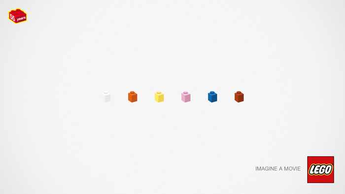
I stumbled upon a series of fun visual riddles made using Lego’s. Considering some of the pop culture based answers, many of these clever little ads function as brain teaser games for adults. Lego is a perfect product for really fun and imaginative advertising, like this, this, and this. I think they do a great job of showing us how for 55 years, Lego has been providing us with the tools to create what’s in our imagination or to recreate things from the imaginations of others.

Here’s one that I particularly liked:

*(Check below for the answer)

Check out this link from Toxel for the whole list!

Lego Riddles


*Reservoir Dogs.


The World’s Most Successful Big Idea Campaigns

Upcoming posts from this blog will feature Big Ideas. Below are a list of successful ad campaigns from over the years and the agencies behind them. Much like the ideas themselves, I have kept this list short and sweet. Check out this post by D. Drew Design for a more comprehensive look.

Avis: “We Try Harder” by Doyle, Dane, Bernbach

Nike: “Just Do It.” by Wieden & Kennedy

Volkswagen: “Think Small” by Doyle, Dane, Bernbach

DeBeers: “A Diamond is Forever” by N.W. Ayer & Son

California Milk Processor Board: “Got Milk?” by Goodby Silverstein

These phrases have entered the cultural lexicon and are, in some cases, rarely even associated with the client who originally commissioned the campaign. Their longevity and widespread success serves as a standard by which any existing or potential advertising can be measured. These are the Big Ideas.

Volkswagen was thinking big when they told the world to think small.