


VISU1311 Project #2 Collage 5, Different Perspective Shelby Charette
I took one photo I shot from congress that was not particularly interesting, and cut and combined the shapes in order to make the photo more exciting to look at. I made this one by hand, and scanned it, although the texture is better understood in person.

Congress
VISU1311 Project #2 Collage 4, Outside Looking Outside, Shelby Charette
I crafted this piece by hand, and used a photo of a window surrounded by foliage and cut the windows out, then I layered another photograph behind it. Also I added some black and white foliage photographs to the corners.

Outside Looking Outside
VISU1311 Project #2 Collage 3, Austin Guitar Man, Shelby Charette
Before hand, the photo was very colorless, and despite being a very visually appealing photo, it lacked character. I used different colored layers in photoshop in order to subtract and add shapes to the photo.
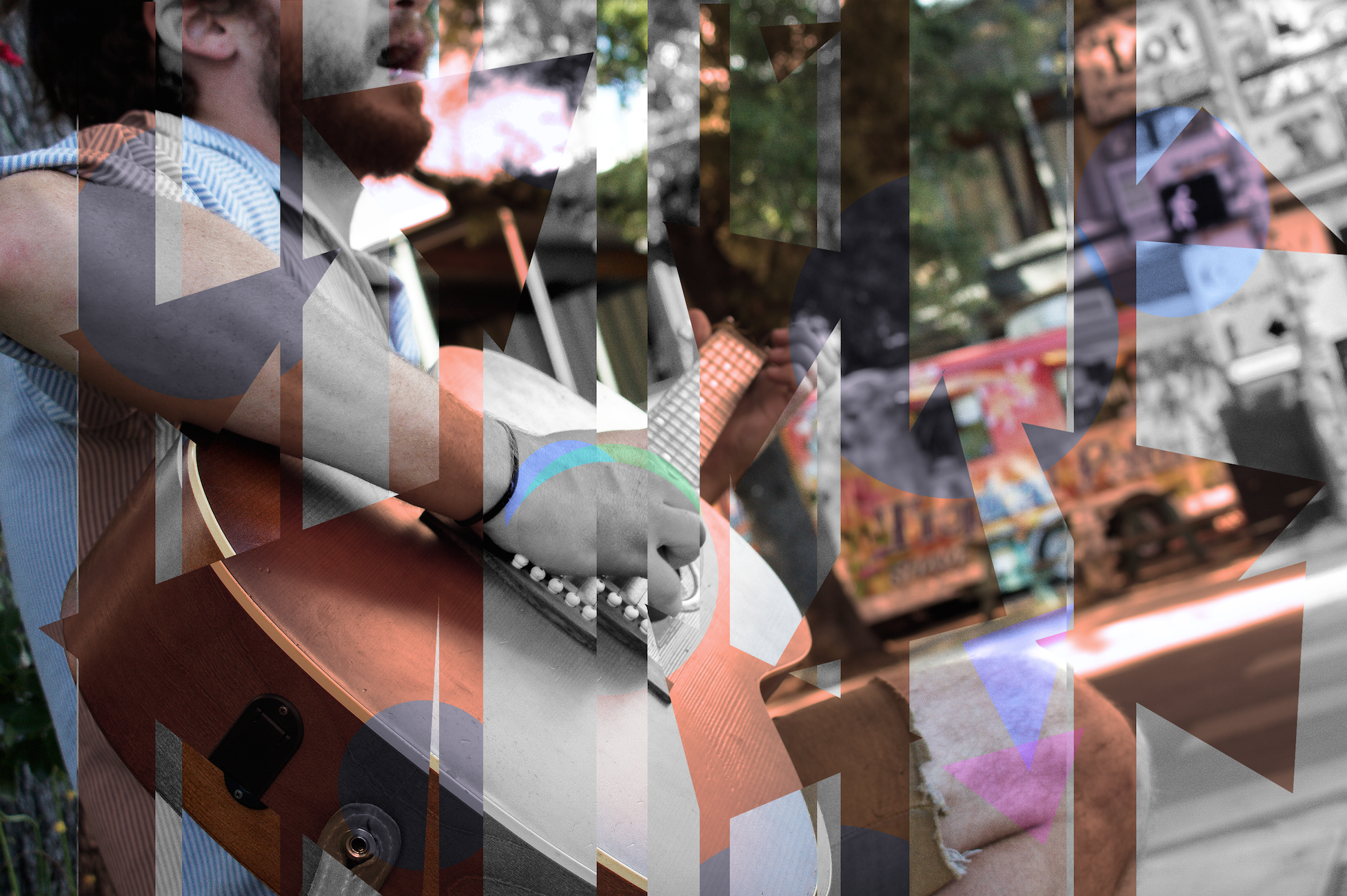
Austin Street Performer
VISU1311 Project #2 Collage 2, “Portrait, Milla” Shelby Charette
The photo is a portrait of one of my friends. I used scans of a page of a book, and things I found on South Congress, along with a photo of foliage and some colorful stones in order to create this image. The paper in the background makes the image seem as if it is textured, yet it is printed on normal matte paper.
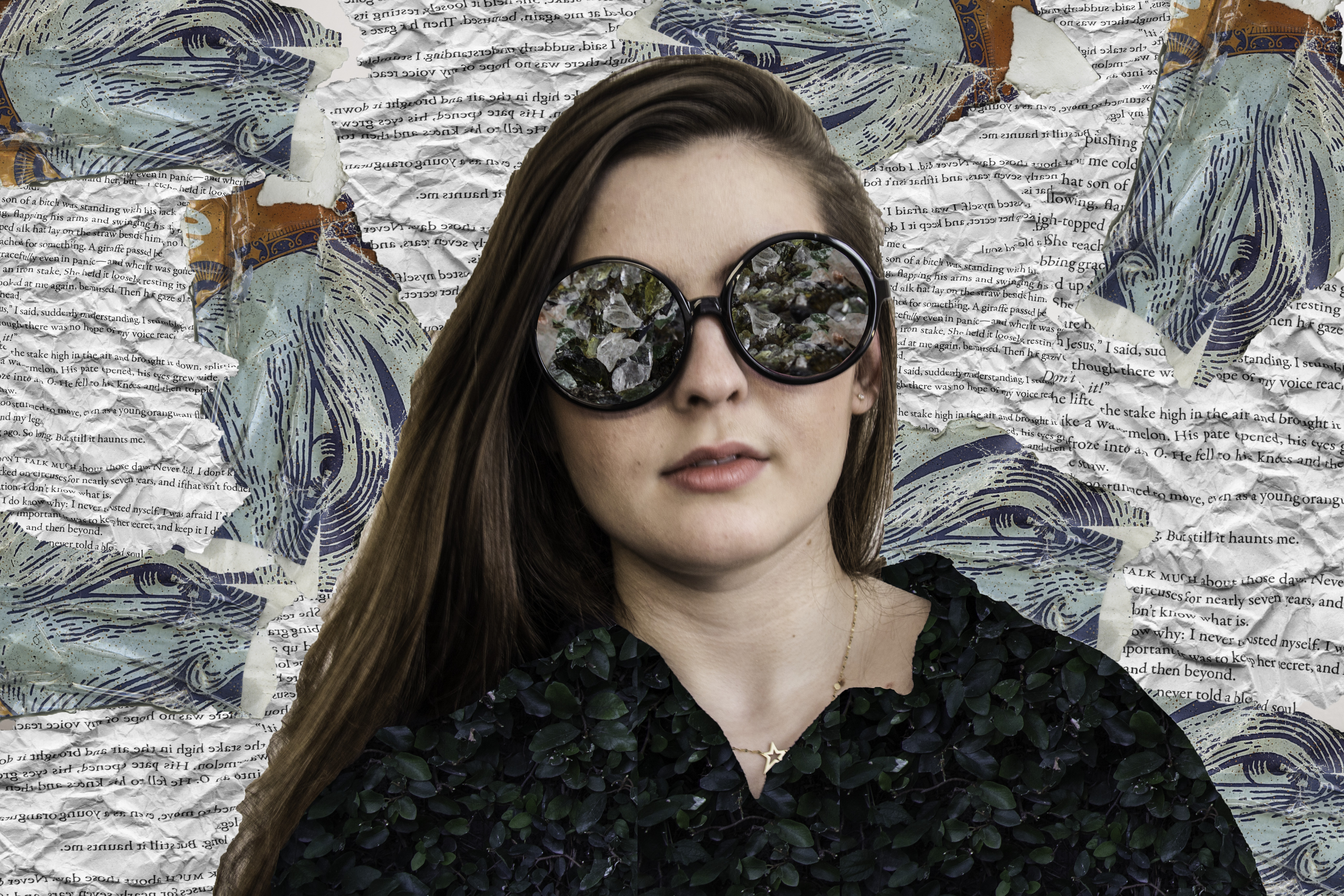
Portrait, Milla.
VISU1311 Project #2 Collage 1 “Lucidity” Shelby Charette
Below is a photograph I took of a woman in a store. I caught her in mid-thought and used photoshop to include several other parts of images to create a sort of daydream-like state.

Lucidity
Blog Post 8 VISU1100-01
Shelby Charette
Visual Studies Seminar
Hammonds
October 25, 2015
Feldman Critique Over Father Martin Nguyen’s Exhibit
When looking at Nguyen’s artwork, one cannot help but be overwhelmed by the many faces staring back. His exhibit consisted of numerous close up pictures of faces only consisting of the head and hair, including nothing underneath the chin. They are posted in organized rows and columns, with a thin, white, subtle square around each portrait. Nguyen is trying to convey time using the faces in his work. In his language, there is no concept of time. There is no past, present, or future tense, therefore, time intrigues him and the use of faces shows an organic concept of time.
Their artwork is astoundingly bold in the visual sense. The background consists of a plain color scheme, including mainly a drab white or cream color, although contrast greatly against the faces, which are in color, and it contrasts, making the faces stand out very rigidly against the modest background. The narrow and symmetrical columns and rows make the work all together more striking. His use of the rows could be seen as a suggestion of grouping, seeing parts instead of a whole, although that is up to the viewers interpretation. Altogether, his work is centered on balance, symmetry, and unity as a whole.
During my exploration in Nguyen’s work, I was enthralled and fascinated by his interpretation of time. He took a concept so over-looked by our society, and made it into a very subjective idea. It makes the viewer think about how precious and ultimately essential it is to our society. It controls our everyday lives, yet we think nothing of it.
When I looked at the piece, I ended up comparing it to the universe. The artwork made me feel very small and insignificant, as if my time on earth is nothing but a mere second in the span of the universe. It made me feel somewhat isolated and alone, as if I was the only one looking at his work, as if everyone in the room just disappeared. Throughout my viewing of the piece, I was bombarded with mixed emotions, such as peace, isolation, insecurity, and insignificance. Ultimately, it made me question the notion of time and how I view life all together.
The work itself is marvelous, although I would not go to such lengths as to hang it in my home. The work is more of a modern art statement, rather than a more reserved and pleasant to view piece of art that is made merely for aesthetic appeal. This kind of work in particular belongs in a large gallery, for many people to see and enjoy in a more contemplating and next-level type of thinking way.
Within the first glimpse of his work, I thought it was somewhat over-rated, and that his work was not all that impressive. Although, having some context of the overall idea behind the work proved to be very beneficial to me and ended up elucidating the idea of the material for me. Nguyen takes the complicated idea of time, and morphs it into a way for almost all people to comprehend. In my opinion, he successfully and exquisitely conveys his ideas through his medium. He created a simple, yet complex piece of art that enthralls all who views it.
He used an under-rated topic and made it into something grand, which is something not all people, or even some artists, can do. Most artists take a large idea, such as political issues, or history, and uses that to make art, and all he does is take the minuscule and broad topic of time, that not any person even ever contemplates, and creates a work of art that has a way of enthralling, engulfing, and crawling into the thoughts of every viewer, and plants the seed of thought and ultimately leads to the introspection and thought evolution of the viewer. The piece itself is very thought provoking.
To me, this is what art should consist of. Art should consist of theory, contemplation, understanding, complexity, simplicity, and many other elements that combine and conform together into one thought provoking statement. Art is a statement, and yes it can be used for large issues or statements, but what happens to the small ideas left behind, with nobody to question it? It becomes forgotten, and no longer seen as relevant. That is why I believe Nguyen’s piece was exemplary, because he took the most elementary topic, and made it into a large statement worth contemplating.
VISU1100-01 Blog Post 7
Shelby Charette
VISU1100-01
Hammonds
1. I related most to Alex Roca. He is a graphic designer and so am I, also he has a wide arrange of styles like I do.
2. Nick Swift surprised me, solely because he did not really go too much into his major. He took something relating to his major and applied it to a larger and more broad idea.
3. The best advise I heard was either to use St. Edward’s resources to the fullest ability, or to not wait for someone to tell you to make something.
VISU1311-Project 1 Reflection: Shelby Charette
After finishing my project and going through the entire presentation process over the critiques, I realized I spent too much time on trying to capture the Gestalt principles in my images, rather than taking images and applying principles to those images. When taking pictures, I tried finding examples of images that would reflect continuity and repetition, and my photos ended up not being the best, but I felt like they did look better in a group, and some definitely stood out more. I feel like I took the project a little too literal though, and after watching the presentations of my classmates, I realized that was not the objective for our project. Overall, I took the project from a more literal perspective instead of a creative perspective, and could have done a lot better if I knew to be more creative with it. I learned to not take it so seriously, and to have fun with my projects while also trying to complete the assignment. Altogether, the critique helped me somewhat break out of my comfort zone, and let me explore and try new things with my projects. At first I was afraid to be critiqued because I have never had someone look at my work before and tell me where I needed work, but critiques are there to help us grow, improve our work, and learn from our mistakes and I feel as if the critique was very helpful to me and helped guide me to where I should be heading.
VISU1100-01Blog Post #6
VISUAL STUDIES I:
1.My greatest strengths in Visual Studies includes my creativity, my sense of perspective, and my desire to try new things.
2.For greater success in this course, I need think more outside the box and not take my assignments so literally.
Computer skills- Includes photoshop, illustrator, bridge, and lightroom.
I still need to learn- more about the applications I use now, and more adobe products.
Research and writing skills-
1. My greatest strengths as a researcher/writer includes: my understanding of the reflections and critiques I must write, and researching of important artists and their work.
2. I need to work on my length of my reflections I write and clarifying my ideas more.
3. I learn best and accomplish most when my class is hands on and when I can use my computer in my class for my adobe related programs.
DRAWING I:
1. My greatest strength in drawing is my ability to learn fast and explore my creativity.
2. For greater success in this course, I need to practice a lot more.
Computer skills- Includes mesh mixer (the only program we learned to do an assignment)
I still need to learn… not much because computers are not really vital to this class.
Research and writing skills-
1. My greatest strengths as a researcher/writer includes: writing critically about my work and the work of others.
2.I need to work on not being so attached to my work and allow criticism.
3.I learn best and accomplish most when I have a lot of time in class to work on projects.
COLLEGE ALGEBRA I:
1. My greatest strengths in algebra includes nothing.
2.For greater success in this course I need to work harder, go to tutoring, and ask more questions.
Computer skills-
My class requires a lot of use on the computer, and some problems I have to adapt my answer to fit the criteria they’re looking for.
I still need to learn to do my homework in advance so I can get more points.
Research and writing skills- This class does not include virtually any writing.
VISUAL STUDIES SEMINAR
1. My greatest strength is my ability to learn while listening, instead of note taking.
2. For greater success in this course I need to engage more in discussion.
Computer skills- Most of my art is based through technology so I have a lot of experience with that.
I still need to learn more about the software.
Research and writing skills-
My greatest strengths as a writer/researcher includes being able to learn to critique my own work as well as others.
I learn best and accomplish most when my classes are more engaging in lecture discussions, rather than just a lecture.
RHETORIC AND COMPOSITION I:
My greatest strengths include being able to portray my ideas clearly.
For greater success in this course I need to work on my conclusions.
Computer skills- Use research and citations effectively in my papers.
Research and writing skills-
My greatest strength as a writer/researcher includes being able to construct my ideas clearly and use my research to my advantage.
I need to improve my conclusions.
I learn best when my professor critiques my work and helps me learn what I need to fix.
THE SIXTIES:
My greatest strengths includes being able to take thorough notes and retain information.
For greater success in this course I need to work on my test taking skills.
Computer skills- This class does not include computer use, in fact it is strictly prohibited.
Research and writing skills-
My greatest strength as a writer/researcher includes being able to construct essays during my tests and include historical context.
10 WAYS TO SUCCEED IN COLLEGE ALGEBRA:
1. Go to any and all study sessions.
2. Create study groups.
3. Look over my notes after each class.
4. Ask questions during lecture.
5. Go to tutoring as much as possible.
6. Ask other people in my classes for their notes incase I missed something in lecture.
7. Study hard before a test.
8. Go to teacher’s work hours.
9. Be fully awake during all lectures.
10. Make sure I’ve eaten before class.
Dan Phillips Ted Talk
Shelby Charette
VISU
Robertson
October 6, 2015
Dan Phillips Ted Talk
Dan Phillips takes home building to a whole new level with his work with reclaimed and recycled materials. He uses objects most people would not usually use, in order to create these unique and fascinating homes. Usually, people prefer standard looking homes that are completely symmetrical and perfect, but that is not Dan’s goal. He creates homes that nobody has ever seen before, ones that are one of a kind.
Dan first talks about how much waste is in the building industry. Waste has pretty much become second nature to us, as if to say, if we don’t like something, we can just throw it out and get a new one, which is a completely valid point. Our society does not view waste as waste, we view it as ineffective, broken, or unnecessary. If something doesn’t work, we replace it with a better one and discard the other.
Two perspectives are brought up when talking of symmetry and asymmetry. The two perspectives are apalonian perspective and dianesian perspective. Apalonian perspective is thought to be more of structured, symmetrical, and a desire for perfection, while dianesian, is the complete opposite. It consists of asymmetry, and natural patterns. Apalonian perspective causes more waste than dianesian, because, again like explained above, if it is not perfect, they will throw it away and try again. Dan’s houses follow the dianesian perspective perfetly, because he goes with the natural flow of things, and uses all of his materials.
The view Dan has on our building industry is extremely informative, and eye-opening. He believes in the cause of recycling, and managing our waste, because it is not just Americans who have issues with waste, it is a world wide issue.
Blog Post #5 VISU1100-01
Part One:
Our goal for our assignment in our Visual Studies class was to take images that include Gestalt’s Principles and explore the question of “how do you make an image?”
I went about this goal by exploring congress, and taking images that include both repetition and continuity. Then, I arranged all six pictures together, in order to achieve a similar pattern. I experimented with angles, objects, lines, and light. Eventually I ended up narrowing my photographs down to the ones I found were the best and used them in my project. The question of “how do you make an image?” I find is too ambiguous. There are many factors that play into the creation of an image and therefore thought that ignored to make an image, one must use a variety of elements, such as lighting, point of view and incorporating one or more of Gestalt’s principles into the image.
Part Two:
In the six photographs that I chose for my project, there are both strengths and weaknesses. A bold strength in the photographs is the strong repetition and continuity within them and also how well they work together side by side. Although they are strong together, their weakness is the fact that they are not too interesting apart. The composition of the photographs could be improved by having a person view my photographs in order to help me see my downfalls which will allow me to fix them. The project could have been more upfront and clear. I was confused throughout the entire project on what the actual objective was and did not find out until the very end


Visual Studies I Project: Gestalt by Shelby Charette
My photographs below focus on Gestalt’s principles of repetition, and continuity. They come together in a compilation that compliments one another. My photos grouped together use repetition and continuity, the two principles together along with different perspectives create a flowing direction in which the eyes follow. The photograph of the trees is especially interesting because it looks as if it could go on forever, like the way a mirror facing another mirror repeats images. The photo of the bicycle tires draws the viewers eyes to the center, as if to make the surrounding circles form a spiral. Unlike the other photographs, the line of continuity in the staircase photograph curves, leading the eyes into what seems like a mystery. Each of the photographs embody Gestalt’s principles of repetition and continuity in their own distinct ways.


Below are my collections and keywords in both Bridge and Lightroom.


Blog Post #4: VISU1100 01
Shelby Charette
VISU1100 01
Hammonds
September 27, 2015
Blog Post 4 Part 1
Looking at the upper classman work made me realize I still have so much time to grow and develop my skills as an artist. Their work was so professional and strongly developed, and their advice really helped me evaluate my choices of my use of time and helped me realize that I need to experiment more with materials and step outside of my comfort zone. Each had similar ideas to portray although their styles were completely unique. Rachael unfortunately did not show us her work, although went very well in depth with her presentation. Caelan showed their work very briefly, although her painting and her ideas for her senior project were very in-depth. Shelby’s work is a lot like the work I plan to do, since I am a Graphic Design major, her work was very colorful and even though her work is mainly online, she implemented drawing and painting elements to her work. Although in Graphic Design as well, Paul Young’s work was exceedingly different. He designs beautiful posters and logos. Both Christin and Juliana use photography as their main artwork, although have completely different styles. Juliana takes abstract and very colorful photos, while Christin takes only black and white photos of her main subject. All of the students had wonderful art, and most importantly, they shared their art with us to give us hope for our ventures into the artistic world.
Blog Post 4 Part 2
http://www.yasoypintor.com
I find this art blog very compelling, because it seems to be a just starting blog. I really like the simlpicity of their layout. The content of the blog contains abstract painters, blogs, art, and shows interesting exhibits and workshops to attend.
http://artscenetoday.com/artist_resources/art-related-blogs/
I chose this website in particular for its wide variety of resources. It is not an art blog, but more of a promoting blog for artists, it also has different categories, such as art history, art education, for artists/by artists and many more.
http://www.theartleague.org/blog/
The Art League is more of a way to get artists involved, it has artists needed ads, and daily updates and news. This website is very useful for pretty much anybody, although catering mostly to the artistic part of the community, it is not limiting people that just want to be involved. I believe this is a great way to be a part of the community and to help people get out of their comfort zones.
creativeboom.com
This website is actually a very unusual one, it does not display art, but it is a website to help artists who have a creative block. Every artists, or atlas most of them, have encountered creative block sometime or another, and this website helps get creativity flowing and allows the ideas to flow more smoothly than to be forced. I believe this is a great tool for all artists.
VISU1311 Blog Post 7
Shelby Charette
VISU1311
Robinson
September 22, 2015
Medium is the Message Analysis
Throughout “The Medium is the Message,” the main idea stressed is the effect media has on humans. Through the development of technology, man has altered life to fit it. We change with technology, not the other way around. I certainly agree with the idea of humans adapting to fit technological needs, our society is constantly looking for ways to improve our lives by improving technology, but technology is not always what will help us.
While listening, I often found myself lost, confused, and unable to comprehend what I was witnessing. The speakers were speaking philosophically and talking of abstract ideas, but with all of the befuddling noise, I found myself listening to the noises more than the actual ideas they were trying to convey. Even when I read, I found myself over visually stimulated, finding it excruciatingly hard to focus on what the words.
Although, I did happen to hear one bit of information I believe is very crucial, and it was the explanation of how artists are contradictory. They spoke of how artists exploit situations and ideas people do not wish to know. In fact, that might be a reference to the artists who made this.
Altogether, I was unable to gather much information about the topic, but the main ideas I took from “The Medium is The Message,” is the effect technology has on human society, and how art embodies controversial issues most people will not accept.