Decisions, Decisions

The cognitive map I created was a flow chart to help a girl choose the right shoes to wear based on what they are looking for. In this project, my biggest challenge was to fit all of the information on the page so that it would not look so cluttered. I also had the chance to work more in depth on my illustration skills, and saw some extreme improvements on my illustration work. Overall, this map taught me to challenge myself and work out of my comfort zone.
Map Project Information

For this map, I was given the chance to make a graph map for a made up alias who I was given an Excel document with all of the purchases he made on his credit card. We were expected to make graphs on Adobe Illustrator of some of his purchases with an overall theme. I chose to focus on the amount of money he paid in bills compared to the amount of money he spent on leisure activities. I chose to use bright colors to portray a feeling of fun, seeing as I wanted to emphasize it to sort of convince him to “treat himself.” This project had me work with the graph tool in Adobe Illustrator and challenged me to research through over 300 items to gather my information. This taught me the importance of research, all while implementing my knowledge of design and type into a map.
Map Project Personal Geography
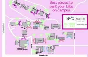
For my artifact map, I chose to create one that would benefit people on campus who ride bikes. The map shows the school campus and where all the bike racks are, and the shaded areas that surround them. This was made to benefit the students to show them where the can lock their bike that is closest to their class with the most room on the bike racks and with the most shade. In this project, we had to collect information in order to make the map while also designing with an audience in mind. This project will be a benefit to me because it shows the importance of gathering information and being able to put that information to good use.
Symbol Methodology


The process of creating a symbol is anything but simple. The amount of iterations and the length of the process make this project one of great importance. We used a method of process where we started out tracing a picture, then we made illustrations of our ideas, then we made abstract symbols and then combined all three steps until we came up with many variations.
Wikipedia Reader
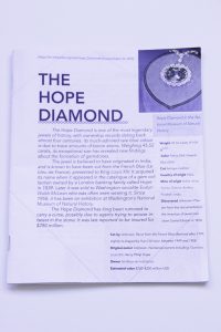
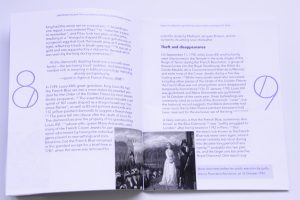

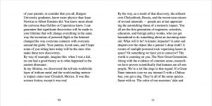
The Wikipedia reader was a second step to the grid booklet, using what we learned about margins, borders, space and type, and designed an even text heavier book while integrating pictures into it. We put our own design work into the booklet, creating a uniquely designed book about the topic of choice. Since I chose the topic of the Hope Diamond, I chose a blue color scheme and also a misplay typeface that mimicked the look of sharp diamond corners. We also had to work with many different tiers of a font, choosing different fonts, italicizing, bold, and changing the sizes to represent different parts of the book, such as titles, body text, and page numbers to name a few.
Proportional Grid Booklet Bill Nye Grad Speech

This project was an introduction to Adobe InDesign by making us create a book with large amounts of text. In this project, we learned about all of the things that go into designing a book. We looked how to format our books to keep in mind borders, create guidelines, work within a grid, use space, while at the same time working with large amounts of type.
Type Specimen Poster


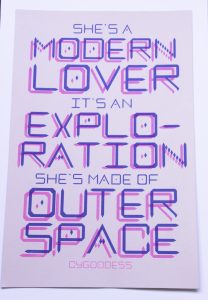
This was the last step in my working with creating a typeface. The specimen poster was a chance to showcase my typeface, CyGoddess in ways to show its effectiveness. The project also allowed me to work with a risograph printer.
Display Typeface

We were given a short phrase, and were challenged to create an entire font that is representative of it. The phrase I was given was “I would rather be a cyborg than a goddess.” My typeface is robotic and geometric, relating to the word “cyborg” in the phrase. This project was an introduction to the creation of type, making me keep in mind all of the elements that go into a font, along with keeping every letter similar.
Monogram

The monogram project paved my way of understanding into the typographic world and introduced me into the complexities of a font. By giving us a limited range of shapes, along with only a few ways we can change it all while being intentional. We were made to look more into the shape, construction and elements of a font. With being given a small amount to work with, the creativity that was produced was even greater than if we had freedom. I created mine to look futuristic and modern, with sleek lines in varying weights and geometric shapes.
Monogram
The monogram project paved my way of understanding into the typographic world and introduced me into the complexities of a font. By giving us a limited range of shapes, along with only a few ways we can change it all while being intentional. We were made to look more into the shape, construction and elements of a font. With being given a small amount to work with, the creativity that was produced was even greater than if we had freedom. I created mine to look futuristic and modern, with sleek lines in varying weights and geometric shapes.
Program Plan of Action
Table of contents:
- Intro- ED (full page)
- Intro to Fullbright (about, what they do, etc… 2 pages)
- Lists/special thanks(1/2 page)
- Map, fold out and perforated with schedule on the back
- People profiles w/ summary, pictures, titles, info about the speakers. (10-15 pages)
- Another schedule (full page spread)
Plan of action:
- Theme: Coming together from all parts of the world for the same reason, to “meet world challenges” head on… I like the idea of making a sort of pattern system to know what things are going on. The different patterns are all representative of whatever the page’s contents are. The different patterns and colors represent all of the different people even from all over the nation and the world, who all come together for the same reason.
- Color Scheme: Colorful, for the patterns to be distinguishable. Could play with shades of 2 colors, like orange and blue, or blue and green, etc. Must be interesting and understandable.
- Type: Interesting sans serif font for titles, numbers, etc. More normal sans serif font for main body text, must be legible so text size is normal for page size, (8-12 point for body depending on typeface).
- Layout: typical design layout. Keep in mind amount of pages I can use, so will use as much of the page layout without making it look too cluttered or making the type too small. Average borders and margins.
https://www.pinterest.com/shelbyshelbs97/program-inspiration/
The Mystery Project Guess
The Mystery Project
Since we are becoming more and more proficient using After Effects, I am assuming we are going to continue to use the application. Seeing as there is so much content we are given, and with my experience with Jimmy’s project I think we are going to be making either a video with the information being given, or we are going to make something like the User Interface project we did for Jimmy. If we go in that direction, I think we would end up making like a website User Interface, where all of the information is in the file and we make it so that we have to hypothetically navigate through a website that has all of the information in it.
Mid term assessment
Shelby Charette
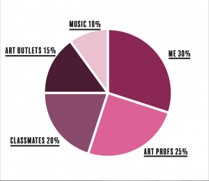
I declared that I wanted to do at least 10 hours per week and I greatly exceeded that, just working on the video we made. I probably worked about 3 to 4 hours a day each day that I worked on it. I would probably keep my goal around 10-20 hours per week, that will give me plenty of time to work on this classwork and develop as a designer, but also allow me enough time to work on my other class assignments. I do definitely put priority on my design classes when it comes to putting time in.
I still believe that sophisticated work is well revised, it is better than the work you did before, and it grows in strength. I definitely saw significant improvement starting from the beginning of the project to where I ended up. I started to be able to do more and learn to do new things in After Effects. Problem solving was definitely a strength in this project, because there were so many things that needed to be done in it, that if there was an issue, being able to figure out the problem and find an effective solution was absolutely necessary or else your video would be a mess. I believe that working on the weather report made made my work more sophisticated because I had to make sure that every single detail, from the design to the movements and choreography was perfect, so I definitely think attention to detail helped in making my video more sophisticated.
The assignment we had to do for Image Methodology on the user interface definitely prepared me a little bit for the weather assignment. It made it easier to navigate already having previous knowledge, seeing as After Effects is a complicated application. Also, knowing things about color choices, typography, and design added to my videos effectiveness and it allowed me to create a more cohesive and effective design.
I would still like to work in After Effects, because there is still so much to learn. I hope to just work on new techniques and improve on my work.
This project is very valuable because it taught us basically how to use a brand new application we have never used before. I talked to a design intern for Margin Walker, and the first thing he asked was if I knew how to use After Effects. He said it was extremely useful and a lot of people do not know how to use this application. The 2 projects I believe relate in some way to this project is the user interface and the map projects we did in GDES I. They both have similarities, seeing as I had to use typographic, color and design in order to create a successful design. Then the user interface relates to it with the movement and using of After Effects. This project is rated higher, because I was able to use very many design qualities.
7 Ask me or express something, you feel like you can’t in class or even my office: http://tunarice.tumblr.com/ask (Links to an external site.)
Weekend in Japan
In this project, I worked in After Effects to make a hypothetical, futuristic representation of an interactive weather map. I feel like I definitely made immense improvement in my after effects skills. In the beginning it was a slow process making just one of the LATCHs, but towards the end, I saw that my pace was changing, and it became easier to do as time went on. I challenged myself in this project. And for sure, one thing that is definitely important is the little details, and knowing why you make every design decision that you did. I knew before hand that organization was important, but when you are working with over 100 layers, you learn to organize your stuff better to make your life easier. Definitely a life lesson there. I learned how important a type face is to the design, like how the design of the things around the typeface go well with the typeface and what you are trying to portray. Your work has to be cohesive, and flow nicely. I believe my After Effects skills have improved dramatically in using this project. There was so much that went into this project, and I believe it made me a better designer in so many ways.
Goal Expert Hours
how much a week = 10 hours a week
what should be the mid-term total = 70
what should be the semester total = 140
(your current grand total = 1,000-1,500 )