Display Typeface

We were given a short phrase, and were challenged to create an entire font that is representative of it. The phrase I was given was “I would rather be a cyborg than a goddess.” My typeface is robotic and geometric, relating to the word “cyborg” in the phrase. This project was an introduction to the creation of type, making me keep in mind all of the elements that go into a font, along with keeping every letter similar.
Monogram

The monogram project paved my way of understanding into the typographic world and introduced me into the complexities of a font. By giving us a limited range of shapes, along with only a few ways we can change it all while being intentional. We were made to look more into the shape, construction and elements of a font. With being given a small amount to work with, the creativity that was produced was even greater than if we had freedom. I created mine to look futuristic and modern, with sleek lines in varying weights and geometric shapes.
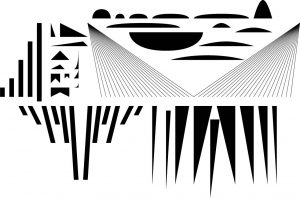
Monogram
The monogram project paved my way of understanding into the typographic world and introduced me into the complexities of a font. By giving us a limited range of shapes, along with only a few ways we can change it all while being intentional. We were made to look more into the shape, construction and elements of a font. With being given a small amount to work with, the creativity that was produced was even greater than if we had freedom. I created mine to look futuristic and modern, with sleek lines in varying weights and geometric shapes.
12