Wiki Reader
Creating a multi-page reader was definitely an eye opener on how typography is way more complicated than one may think. In the creation of my Egyptian wiki book I learned something new every day from seeking information, organizing and de-formatting, moving it into InDesign, then re-formating. In its creation I learned a lot about the tools of InDesign but many tips I wish I had figured out at the beginning instead of at the end. Overall I’m pleased with the designs cohesiveness and structure but as I look back can find many things I wished were refined. Areas like typeface, grid layout, and photo implications.
Graduation Booklet
working on the graduation booklet was a real insight on the complexity and abilities of Indesign and designing text heavy booklets.
I wish when I was working on this project I’d pushed myself a little harder to create something more unique. While working on the project I was more worried about the text and its properties that I neglected the design element that goes along with it.
(below pictures have some type errors due to old file capability)
Type Posters
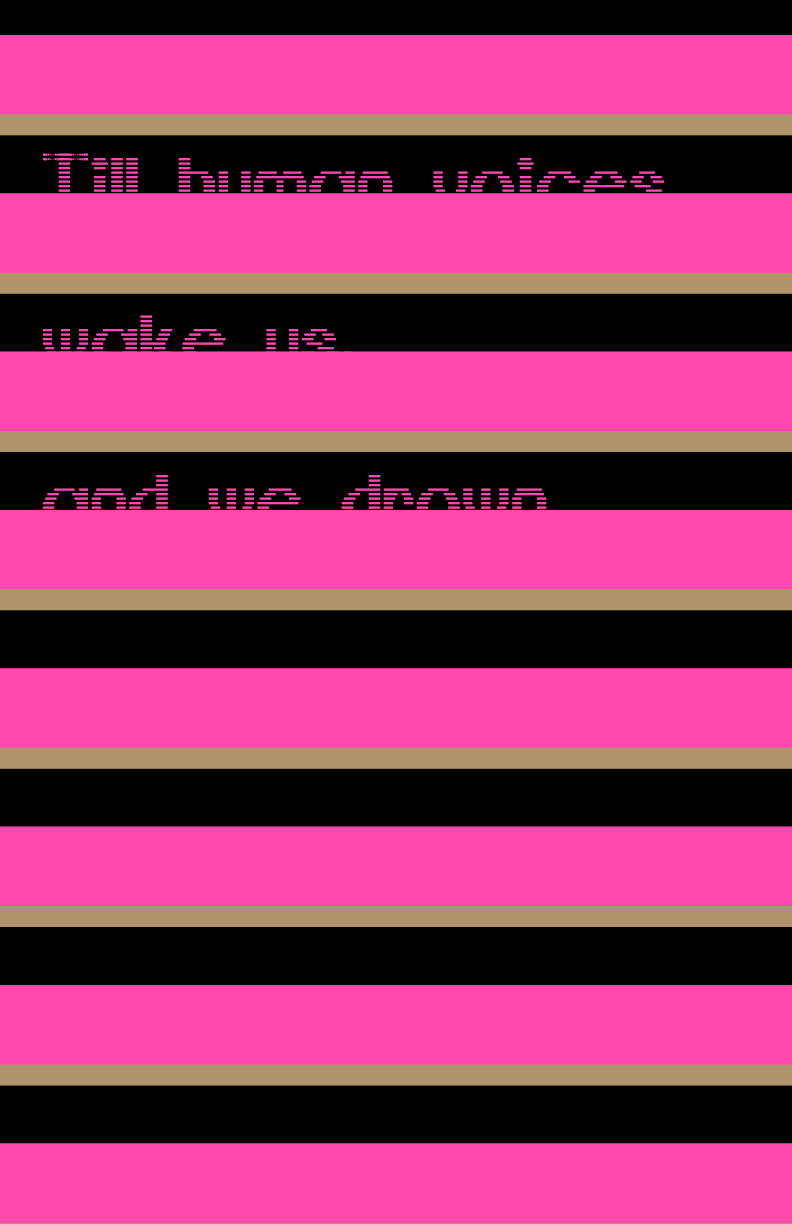
It’s one thing to make a typeface and it’s another to use it for design, both equally hard and require unique approaches. In taking my typeface I had a lot of design direction challenges. In the end I chose to pine back to it’s original inspiration, a quote from T.S. Eliot’s The Love Song of J. Alfred Prufrock.
From here I pulled out quotes found near the end of the lengthy poem and from there designed two sets. The high contrast is meant as a symbolic to my personal impression of the poem. The love song is a long rather encrypted story. While reading it I found it hard to really hard to find a single story running all the way through but instead it felt pieced together. However, the style and mood confirmed that it was in fact, a single piece.
My posters were designed to take on this idea. Seemingly two separate pairs at first are actually a full set pulled together by the typeface and color. I do wish that I had refined on the design more. With this project I began to learn just how important time management is and my lack of time left me feeling like my posters lacked.
Custom Typeface
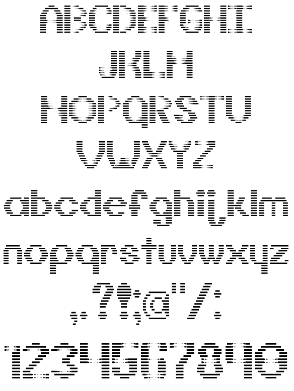
The creating of my own type face was a very interesting and informative experience. Given the quote “do I dare disturb the universe,” I had a lot of ideas on how to interpret it into a designed typeface. I ended with the type design I called GraySpace. The design stems from wanting to take the normal and mess it up, or “disturbed” the natural order
Monogram
The creation of my monogram design started off frustrating. The tight restriction and limited pallet really forced me to be creative in new ways. while working I had to find a new way to create from my usually from scratch, unlimited possibilities, strategy. My first few attempts at the project left me unsatisfied and so I kept reinventing.
The most rewarding part of this project was at the end. Being one of the first design project, I was having to face I didn’t know what to expect from myself or others in my class. Upon revealing our works to the class I realized just how far and different everyone’s creative viewpoints were. Despite feeling throughout the project that the design was highly limited and that most peoples would look the same, everyone was completely different. This project reviled to me that there is always multiple ways to accomplish a design and on top of that you can always push it further.