ADV Type 2018 End of the Year Wrap Up

I think my design would be better if I worked on neatness and sticking to a cohesive color palette throughout a system. I plan to improve my quality of neatness by working on time management and buying the adobe programs. I plan on improving my eye for colors by using the color guide more, waiting to add color after structure and asking for outside advice.

Self Critique: time management, sketch/plan more, color guide, neatness

SourceMindmap (2) (1)-16ig0m0

Weather Report

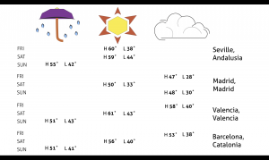
he weather report highlighted highs and lows, weather conditions and days of four cities. The focus of design was to use meaningful motion in order to emphasis three L.A.T.C.H. concepts. My report transitioned from emphasizing category to time, and finally location. After sketching each L.A.T.C.H. spread I decided that it would be best to progress from a table form to convey the category of weather conditions to time, which also was displayed in a similar table format, to a map lay out to emphasis location. My best transitions have a simple pattern of movement that are concise and “appear” from other elements already cemented in place. My worst transitions look messy because there is too much movement of text scrambling into place with no connection to other points of information already displayed.

https://stedwards.box.com/s/2aig4jf2s4a3rsogmluwv0xiqz172e6z


Mapping Project: Information

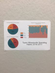
The purpose of turning raw data into a visual representation was to practice making choices that consistently matched the needs of the type of information. Symbol making, understanding infographics and legends were some components that went into creating the Information Map. Using Tuan’s spending habits that documented purchases going several years back, I decided to make a pie chart and a bar graph that displayed three categories of Price Range.

Mapping Project: Personal Geography

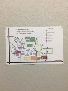
The geography map needed “richness” and details to represent a likeness to its reference, but it was important not to clutter the map. Unnecessary icons would make it confusing to a reader to assign meaning and recognize the literal landmark from the abstract symbol. I decided to make my symbols more abstract than literal and to include a key and color code distinct buildings found along the road that goes through St. Edwards. Buildings and landmarks not visible from the road should be removed in order to de-clutter the map and not overwhelm the reader with unnecessary information.

Mapping Project: Cognitive Map

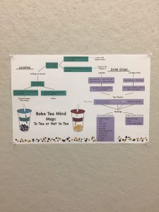
Mapping a decision and following the path of options that go into making a choice was difficult since you had to think like an outsider discovery a nuanced topic. I mapped the decision of ordering boba tea for a first time drinker. I think my icon for boba tea and the choice to border the map with tapioca brought the map together with color and and balance. Since the map had two major and separate paths of decisions, the border and complimenting colors brought the map together.

Display Typeface

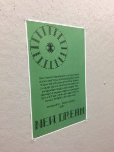
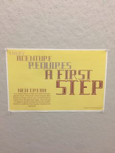
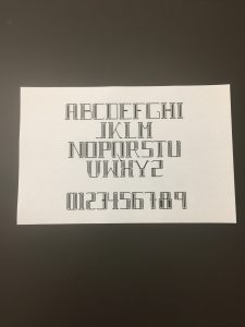
The challenge of creating a completed typeface was keeping the chosen style and ensuring all letters looked similar as if part of a collection. I picked a block-like humanist look and tried to establish a pattern especially for rounded letters. Once the alphabet was completed I tweaked ratios (some letters are bigger but look the same size as the collection) and “filled in” the inside of each letter because the open space made the letters look unbalanced.


Monogram

The Monogram Project required us to make three letters from Jimmy’s designated lines, circles and other shapes. The limitation was that we could not alter the elements in any way or scale them to a size that would “fit” better.  I decide that all letters should be capitalized and that order of “NAG” was not going to be important to me. At first I made really complicated parts, like corners and slanted sections that I tried to piece together to make whole letters, then I changed my approach and wanted the letters to be simple, natural and angular. These decisions made it easier to work with the Jimmy’s shapes which were already “clunky” and the more simple monogram looked more elegant that the complicated ones.