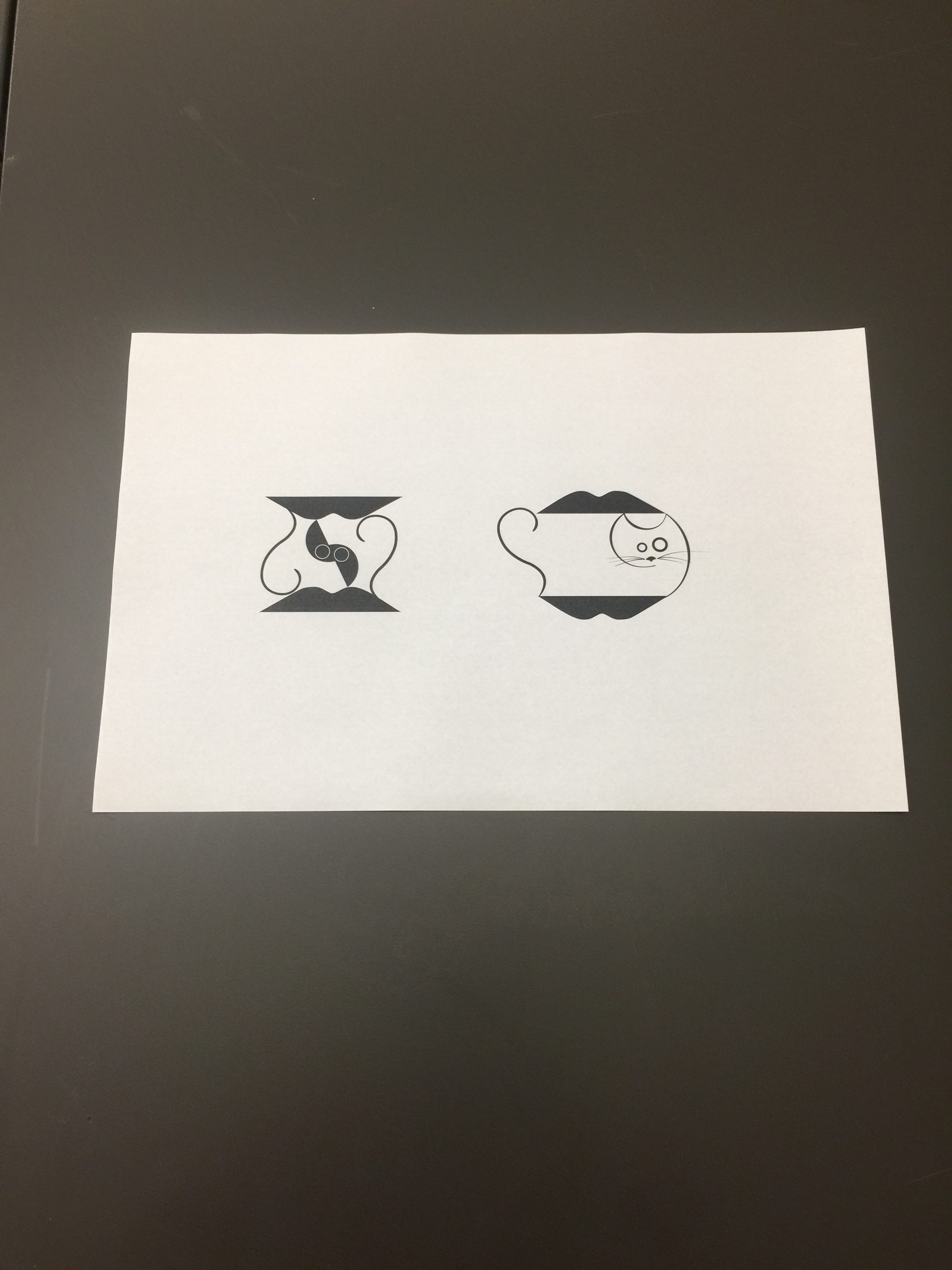
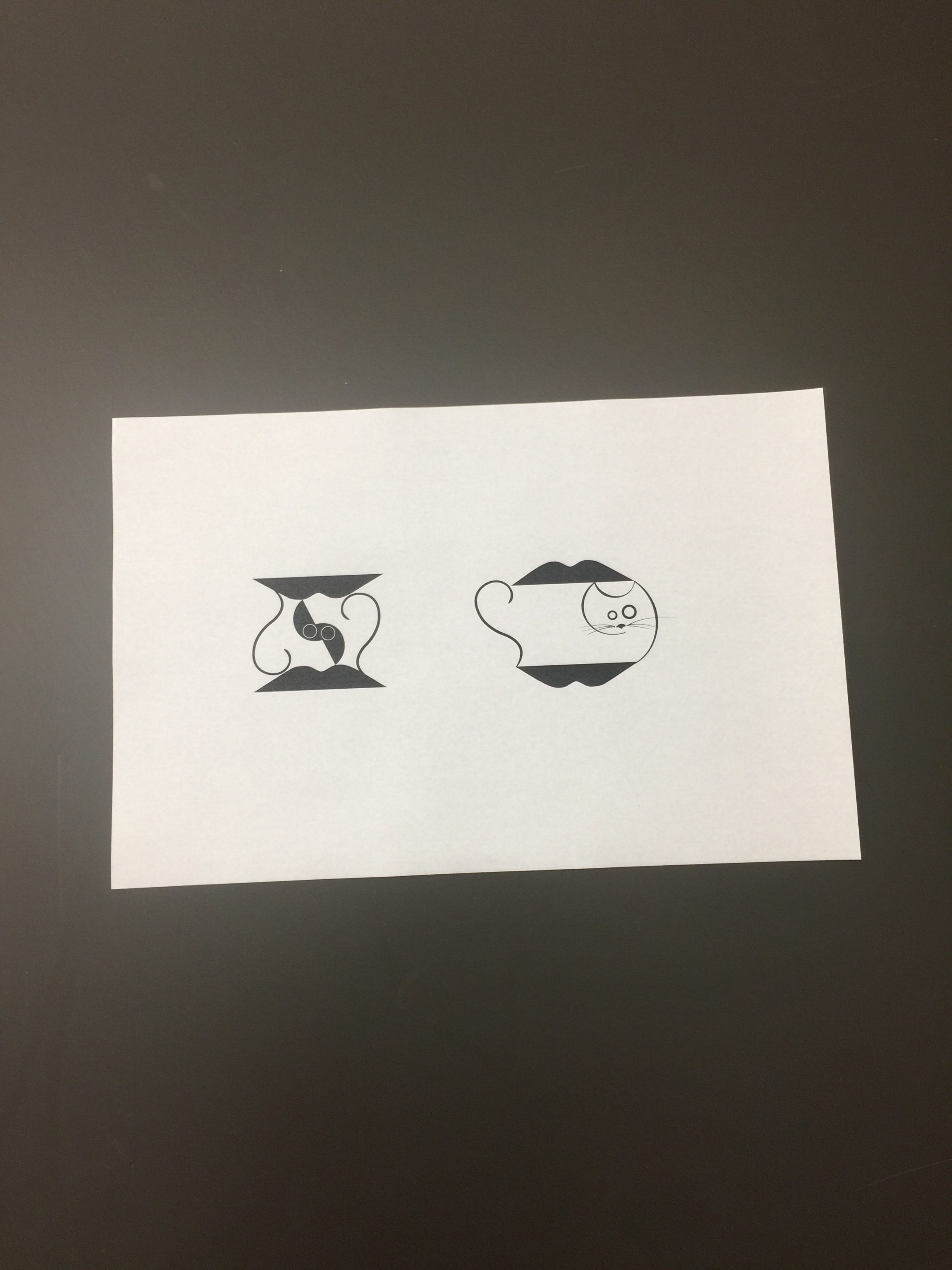
In order to make a symbol that clearly communicates a message the design should be simple with touches of detail, try to play off universal themes and have depth so it does not look flat or boring. This project was more about learning from the process of preparing, sketching, critiquing and improving based of feedback. Something I struggled with while designing my symbol was connecting elements that looked seamless and immaturely “squished together.” My rough sketches look too literal, but my final project improved as I used different stroke weights to balance the image.