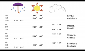
he weather report highlighted highs and lows, weather conditions and days of four cities. The focus of design was to use meaningful motion in order to emphasis three L.A.T.C.H. concepts. My report transitioned from emphasizing category to time, and finally location. After sketching each L.A.T.C.H. spread I decided that it would be best to progress from a table form to convey the category of weather conditions to time, which also was displayed in a similar table format, to a map lay out to emphasis location. My best transitions have a simple pattern of movement that are concise and “appear” from other elements already cemented in place. My worst transitions look messy because there is too much movement of text scrambling into place with no connection to other points of information already displayed.
https://stedwards.box.com/s/2aig4jf2s4a3rsogmluwv0xiqz172e6z


