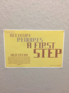
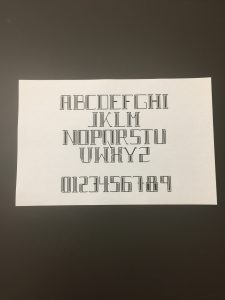
The challenge of creating a completed typeface was keeping the chosen style and ensuring all letters looked similar as if part of a collection. I picked a block-like humanist look and tried to establish a pattern especially for rounded letters. Once the alphabet was completed I tweaked ratios (some letters are bigger but look the same size as the collection) and “filled in” the inside of each letter because the open space made the letters look unbalanced.
Month: September 2017
Monogram
The Monogram Project required us to make three letters from Jimmy’s designated lines, circles and other shapes. The limitation was that we could not alter the elements in any way or scale them to a size that would “fit” better. I decide that all letters should be capitalized and that order of “NAG” was not going to be important to me. At first I made really complicated parts, like corners and slanted sections that I tried to piece together to make whole letters, then I changed my approach and wanted the letters to be simple, natural and angular. These decisions made it easier to work with the Jimmy’s shapes which were already “clunky” and the more simple monogram looked more elegant that the complicated ones.
Symbol Methodology
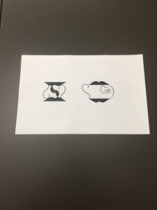
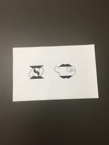
In order to make a symbol that clearly communicates a message the design should be simple with touches of detail, try to play off universal themes and have depth so it does not look flat or boring. This project was more about learning from the process of preparing, sketching, critiquing and improving based of feedback. Something I struggled with while designing my symbol was connecting elements that looked seamless and immaturely “squished together.” My rough sketches look too literal, but my final project improved as I used different stroke weights to balance the image.


