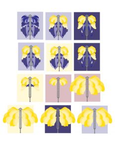
The assignment was to make a series of visual marks. This specific instance was for the midpoint critique of the “Mark” project for GD II. I researched and pulled from late 1960s hand lettering. I used abstract organic shapes to show light and protection, as for this project, my place I was creating an identity for was the Austin Moonlight Towers. This project was difficult because the Moonlight Towers are objects more than places, so creating an identity of place was difficult. I fulfilled the project requirements by creating a series of marks that function as inkblot designs. I wanted to show that the Moonlight Towers are versatile. The Identity I was working with was one of protective, timeless, guardians of Austin. The process I followed was one of trial and failure. I made over 15 iterations of this mark, pulling from 1960s hand-lettered psychedelic art. I made these decisions in my design to show the timeless nature of the Moonlight Towers. My design embodies the ideas in my concepts the Austin Moonlight Towers have stood over the city for over a century, having watched the growth of the city from decade to decade, making them timeless and allowing the ‘60s inspiration to hold purpose. My design enhances the content by allowing the Moonlight Towers to read as different and organic even though they are manmade metal giants. The Inkblot nature of my mark-iterations is versatile in how the viewer sees them.

