VISU 1100: Blog Post #12
-Part 1-
Kim Garza- I really enjoyed Kim’s presentation because she, like the other graphic design presenters, have shown me that there is a vast range of careers for graphic designers, something that puts my mind at ease when I think about what it is that I really want to do with my degree. I liked how she showed us the process of her projects, specifically her collaboration process with the Eventurist app. I look forward to having her as a professor.
Tammie Rubin- My sister is currently interested in ceramics (although she prefers clay to plastic), but I thought it was very interesting to hear Tammie’s process of creating her work and the purpose behind each piece of hers. I like how her art comes from more abstract connotations of words such as “chimera” and “nature”, and how she thinks of her art as 3D collage more than simply a piece of functional pottery.
James Scheuren- I enjoyed looking at James’s photos. You could clearly see the thought behind the work, the meaning behind each piece. I liked his initial statement that photos were indexes of what had already been. I always find images more appealing when they are spontaneous instead of staged, so I liked how that was James’s focus when he took the photos of the things that had just happened because of human interaction with objects.
-Part 2-
Overall I enjoyed this class. You guys were all funny, but you also had serious, important points that I enjoyed listening to and I feel that they helped put my mind at ease and made me feel more secure that my major, graphic design, really is what I want to be doing. If I had to give any critical feedback, I think the only feedback I could give is for Bill to not get sick again?? Haha.
VISU 1100: Blog Post #11
-Part 1-
Tuan: I enjoyed Tuan’s presentation, because some of the things he has done are similar to what I have done; specifically the use of his designs for “gift” art for family and friends. Several times my family members or close friends have approached me and asked me to conceptualy design a poster or a t-shirt for them. Only a handful of these have actually been put to use, but at least they serve as practice.
Hollis: I liked Hollis’ use of artwork to depict memories. Since my maternal grandfather’s passing and my maternal grandmother was diagnosed with Alzheimer’s, I’ve become more and more fascinated with memory and our emotional relationships to them, especially the polar opposites that are joy and grief. Having personally experienced these, and watched my mother experience them for her parents, there’s always a part of me nagging to express my comment on these emotions through my artwork.
Bill: I liked how Bill described the “pathway” of his career, and how there were high points and low points. I think about this often, and wonder what my own career will look like in future years with high points and low points of my own.
-Part 2-
Year 1: Find a long-term internship position that hopefully turns into a paid full-time job.
Year 2: Continue the internship or full-time job.
Year 3: Have a full-time job as a graphic designer, hopefully for advertising or book-cover design.
Year 4: Promotion within job, or seek a new job with higher pay?
Year 5: Have a high paying career as a professional designer. Preferably for book-cover or advertising.
My long term goal, as far as having a degree from college is concerned, is to have a long-term job that I love and where I can do what I love. In order to do this, I will have to be able to be flexible with my skills and improve them in any way that I can in order to “polish my resume” and be noticed for my work and what I am capable of as a prospective designer.
VISU 1100: Blog Post #10
Below are the two most recent works I’ve done; assignments for my Visual Studies 1311 class.
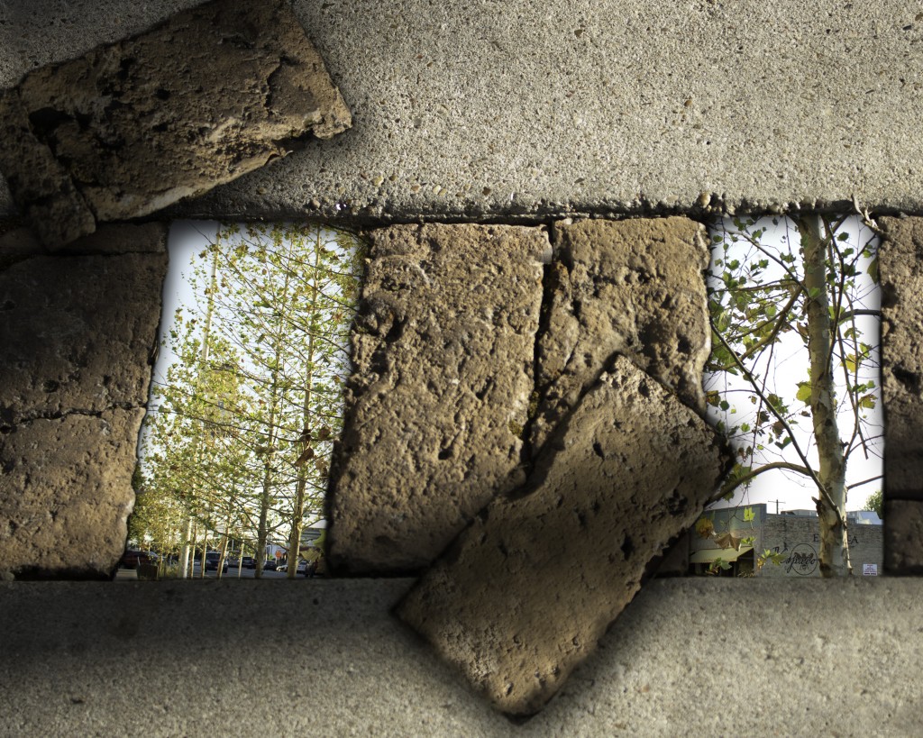
©2015, Loren Gamez
Harmony 1 of 5
Digital collage, 10″ x 8″
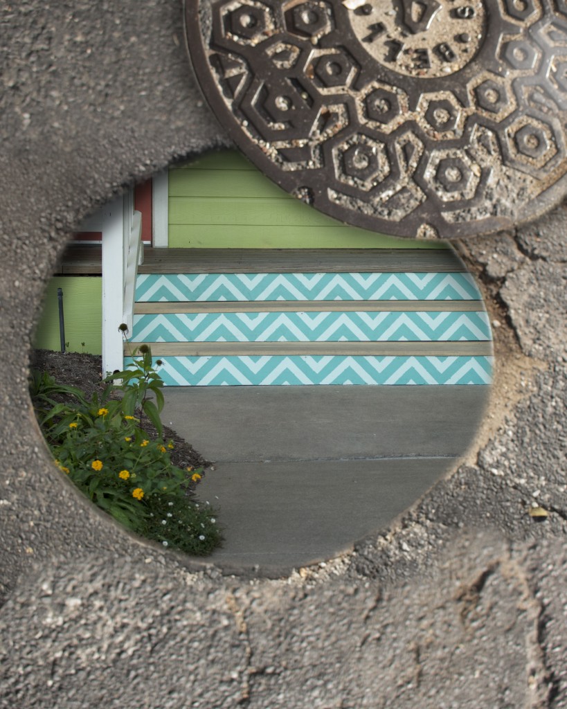
©2015, Loren Gamez
Harmony 2 of 5
Digital collage, 8″ x 10″
These two images are part of a collection of five digital collages that I created for the second project, “Harmony”, in my other Visual Studies class. Out of the five collages I did, I think I liked these the most because of the overall effect they had. My theme for the project was “portals”, and I felt that these two images conveyed that idea the best. Below are links to the other collage images and their descriptions:
-Collage 3
-Collage 4
-Collage 5
VISU 1100: Blog Post #9
-Part 1-
Lynne: I enjoyed Lynne’s presentation of her photography, and I liked her point that it is important to figure out how to make your work in your everyday life. I liked how true this was, because we can’t be college students with free time for the rest of our lives, so its important to get into the habit of finding ways to work while you’re busy and how to balance your work life with your art life.
Miranda: I loved Miranda’s “diagram” kind of outlook on graphic design careers. As a graphic design major, I thought it was extremely helpful, and she helped to answer some of the questions I’d been having as far as what kind of career I might pick up with my major.
Dustin: I loved Dustin’s photography, and his powerpoint with diagrams of lighting was also very helpful as a visual. His insight on wedding photography, and photography careers in general, was very interesting to hear. I like his idea of word of mouth referrals and its something I could see myself using.
-Part 2-
Internship #1: http://www.internships.com/graphic-design/Graphic-Designer-I9989357
Internship #2: http://hire.jobvite.com/CompanyJobs/Careers.aspx?k=Job&c=q419VfwT&j=oNOY1fwk&s=Indeed
Internship #3: http://www.glassdoor.com/job-listing/graphic-design-intern-sage-environmental-holdings-JV_IC1139761_KO0,21_KE22,49.htm?jl=1566535808
VISU 1100: Blog Post #8
It might be nerdy, yes, but as the Tenth Doctor once remarked: “People assume that time is a strict progression of cause to effect, but actually from a non-linear, non-subjective viewpoint, it’s more like a big ball of wibbly wobbly…timey wimey…stuff.” Sure, that was a statement in a work of fiction, but perhaps the Doctor (or the writers of the show??) were on to something. To the Vietnamese language, time doesn’t really exist at all. There are no verb conjugations for time the way there are in languages like Spanish, or Russian. Instead, time is only gleaned from context of the conversation.
It was this idea that sparked Father Martin Nguyen’s interest in his latest art exhibit, Drawing/Painting TIME (using portraits). Father Nguyen is an associate professor at the University of Notre Dame, but also an artist. He has a few exhibits in Indiana, California, and now he has a temporary exhibit here at St. Edward’s. I stopped by this exhibit this morning after my first visual studies class, and was simply astonished by the amount of portraits that Nguyen had completed for the exhibit. There were many faces, hundreds, and each one was strikingly unique, as people are. Every shade of skin was highlighted throughout the exhibit, and every color of hair (or lack thereof, in some cases). Additionally, some of the portraits were completed in grayscale. There was also a related set of images that were all depicting a single young girl over the course of a year; there were exactly 365 portraits of this girl.
I think the thing that stood out the most when I saw these pieces was the uniqueness. Unlike the precise, identical nature of machine works, you could truly see Nguyen’s work as an individualized piece, and if you get close enough, you can see the thoughtful brushstrokes. I think it made it more real, in a way. I think the natural shape of each portrait’s facial structure is common, but only in a way that it is used to guide your eye around the whole face and separate each one from another. They are all related because of their “snapshot” sense of time, and yet each is unique because of the person that they represent. The variety of each portrait depends primarily on genetics, through skin tone and the color of each person’s hair. However, to me this wasn’t at all distracting. As I stated before, it makes the portraits, and exhibit, seem more real. The grid-like rhythm of the portraits’ spacing between one and the next is consistent, and adds to the overall balance of the exhibit as a whole.
While the title of the exhibit alludes to a study of the progression of time, I think it is more than that beneath the surface. It’s about people. I am an introvert, and I’d rather be alone than in a crowded room socializing with people. But that doesn’t mean that I don’t appreciate each person individually. In some ways, I feel that this exhibit is similar. Nguyen has focused on each portrait individually; they have each had their own “fifteen minutes of fame” (although I’m sure it took much longer to paint each portrait). But together, the effect is quite different and yet also admirable. As for the portraits of the single young girl, I found them intriguing because I also found them comical. In my mind, I was creating a story from the young girl’s point of view and from her expressions in each of the images. I can only imagine that she would have become very bored or annoyed to have her portrait drawn over and over again, at least once a day (or at the very least, having her picture taken every day). I feel as though I would have had similar expressions to the ones that the young girl had if I were the subject of such a lengthy process of working. Similarly, every single image that Nguyen created has a different expression. Some faces are even turned to the side, or hidden completely. It fascinates me at the vast range of expression that we as humans are capable of, and I admired the way that Nguyen was able to capture so many.
Initially, I honestly did not think that I would be so drawn to Nguyen’s artwork. My first impression was it’s just a bunch of portraits over time. What’s the big deal? Now, though, I look back on that impression as laughable. I think that going to the exhibit in person allowed me to open my mind and really admire the work. And of course, I realized that there’s no way that I would probably have the patience to do something like Nguyen, and definitely not with the skill that he had. While I might not hang one of these portraits in my home, I don’t think that that was Nguyen’s purpose, and it doesn’t cause me to like the work any less. As stated before, I personally admire Father Nguyen’s exhibit primarily because of its element of uniqueness and personalization. Additionally, I like the parallel that while you can see the subjects’ passage of time, especially with the pencil portraits of the one young girl, you can also see the dedication of time that Nguyen himself had (and the patience) to make his artwork possible in the first place.
Word count: 897
VISU 1100: Blog Post #7
I enjoyed Nick’s presentation because I was able to see where my college education can take me, and that my college education and personal experiences can turn into a great endeavor. It got me thinking about the different ways I can use my graphic design major, such as packaging design.
I enjoyed Rebecca’s presentation because of her emphasis on internships and to keep trying. I agree that it’s important to be able to use internships to explore your options and see what you do and don’t like, and I can’t wait to get started with doing that myself.
I enjoyed Alex’s presentation because what he does is perhaps the closest to what I want to do with my degree; independent graphic design work. I liked his comment on using what designs are selling well on the shelves, and to use that knowledge to influence your own work so that it can be ahead because of its recognizable appearance.
I enjoyed Taylor’s presentation because, like Rebecca, she stressed that internships (and volunteer opportunities for that matter) are essential for experience. I also look forward to opportunities to study abroad.
I feel like I most related to Alex, because I agree that knowing what is already doing well in the markets helps with design choices for future things, and that a graphic designer should be versatile in their style. I don’t know who I was most surprised by…maybe Nick, because while his career doesn’t relate directly to his degree, it still influenced what he did. I think the most valuable piece of advice I heard was Taylor’s advice to take accounting/business related classes as something to fall back on if it becomes necessary.
VISU 1100: Blog Post #6
For each class ask yourself the following:
VISU 1311
- My greatest strengths in this course include: Following directions and taking notes
- For greater success in this course, I need to: Open myself to be more “creative” and loose with my blog posts/assignment interpretations
VISU 1100
- My greatest strengths in this course include: Finishing blog posts early and listening attentively to class discussions
- For greater success in this course, I need to: Take more notes, maybe
FSTY (R&C)
- My greatest strengths in this course include: Taking notes and getting essays done (mostly) on time; making sure that my essays are “professional” and free of errors.
- For greater success in this course, I need to: Procrastinate less and get eassays done earlier
FSTY (60s)
- My greatest strengths in this course include: Taking good notes, attending required films, and reading required readings
- For greater success in this course, I need to: Study more for test material
ARTS 1316
- My greatest strengths in this course include: Drawing straight lines and making shapes proportional
- For greater success in this course, I need to: Work on darker line quality
Computer skills:
- My computer skills include: Advanced in Photoshop and Illustrator, as well as most Microsoft Office programs
- I still need to learn: Become more familiar with Mac/Apple computers/programs; I prefer PC/Microsoft
Research & writing skills:
- My greatest strengths as a researcher/writer include: Being able to write sufficiently and professionally about my topic
- I need to work on these aspects of research and writing: More thorough research; finding solid research sources
- I learn best & accomplish most when: I know more about my research topic, when I have a quiet room to brainstorm/write in
Action Plan
In my VISU 1311 class, I can improve my performance by:
1) Being more creative
2) Giving myself project guidelines
3) Set deadlines
4) Don’t procrastinate
5) Think outside the box
6) Go outside comfort zone
7) Be open to new ideas
8) Use a sketchbook to brainstorm project ideas
9) Spend more time on composing a project
10) Buy a digital camera so that I don’t limit the images I can get
VISU 1100: Blog Post #5
-Part 1-

© 2015, Loren Gamez
Space Awaits Us
Digital painting, 612 x 792px

© 2015, Loren Gamez
Sound the Sirens
Digital painting, 612 x 792px
1) The goal of these assignment were to create a “Future” themed poster design and a “Fairy Tale” themed t-shirt design, as part of contests that Command G is having in the fall (poster) and spring (t-shirt).
2) For the first, I had no clue what I wanted to do. I started playing around with geometric shapes. Then I heard on the news that there was possibly evidence of water on Mars, so I turned Mars into the focus of my image, with its habitation being the future aspect. For the second, I knew that I wanted to do mermaids, because I find them fascinating (the darker, eviller ones, that is). So I started playing around with some ideas, and came up with a silhouette, underwater version.
-Part 2- (critique on the Sound the Sirens piece)
1) I think the strongest aspect of this piece is the illusion of depth given by the different opacity of the figures, and the change of opacity of the background.
2) I think the mid-section “fins” on the mermaids detracts from the image because when I look at the image from a distance, there seems to be an illusion that they have two sets of arms, or two sets of tail fins. This will probably be removed in the final piece before submission to the contest.
3) As stated above, the composition can be improved by editing the mermaid figures to be smoother around their mid-sections. Additionally, I might play around with the opacity of the image to see if darker opacity improves the illusion of depth.
4) Conceptually, I might play around with the mermaids’ poses and proximity to see how to improve the illusion of movement and depth. I might also see how it looks in different colors, like a dark blue/green.
5) Technically, I might edit the mermaids’ forms to see in what ways their shapes can be transformed so that each is unique.
6) No additional notes.
VISU 1100: Blog Post #4
-Part 1-
Rachel Broussard: I really enjoyed Rachel’s advice to go out and see other artwork. I have never really taken the time to do so. Now that I’m so close to many different galleries and have the time to go, it’s something I hope I will learn to do often.
Caelan Navarrete: I enjoyed how Caelan stressed the need to make work outside of the art classes, and it’s something that I have done before, but I feel like I should be doing more. I agree with Caelan that work outside of the class, perhaps more than work inside class, helps to really refine an artist’s personal style.
Shelby Savage: My favorite piece of advice from Shelby is to find your passion. I agree that if you can do what you love, then you will absolutely be motivated to the work. I love graphic design, ergo I can’t wait to see what I can do with my degree so that I may do what I love as my career.
Paul Young: I like Paul’s suggestions to “hustle” and that mobility is important. While it might seem like a good idea to spend a long amount of time on one piece, it’s just as important to do as much as you can in as much time as you can so that you can constantly improve.
Crissy Smith: Considering that my first art project in my Visual Studies class is due on Wednesday, I liked Crissy’s advice to learn how to talk about your work. It’s one thing to make art, but it’s another case when you have to defend your purpose and help others see your art the way that you do so that the work’s purpose can become clear.
Juliana Ramirez: My favorite piece of advice from Juliana is to keep a sketchbook for basically everything. I’ve never been great at keeping a single journal or sketchbook for all of my reminders and ideas, but I can see how it would be a very useful tool to have for various reasons, and I hope it’s a habit that I can grow into soon.
-Part 2-
Website 1: http://www.endzeit-ausstellung.de/
Even though it’s written in a different language, and one that I don’t understand, I found this website compelling because of the simplicity of its design. There isn’t too much going on to distract the viewer, and you can be straight to the point with what you’re searching for here. Of course, the website also has a really neat way of giving the viewer the illusion of 3D through the way that the image on the home page follows the cursor across the screen. Additionally, you can scroll down seamlessly through the pages, or click them individually on the right, which I hadn’t seen before.
Website 2: http://www.c-roots.com/
I found this website to be compelling because the design of the page is quite reflective of the agency’s ‘mission’, as described on their main page.Throughout the website’s pages, there is a maintained sense of creativity, but it is refined in a way that is still easy to navigate. I also loved how even though the company is based in Amsterdam, they have an option to view the website in English or in Dutch, which is very user friendly.
Website 3: https://nest.com/
This website is different from the others, but I chose it because even though I have no immediate interest in Nest’s products, I still found the website itself appealing. It is simple, image-heavy for easy understanding, and just overall attractive. There is plenty of information, but the way that it is provided through interactive graphics instead of just text is a lot more welcoming to viewers.
Website 4: http://thesocietyinc.com.au/
I found this website to be compelling because the background is very unique. It has a hand-crafted feel in contrast to the modern, photographed style of the other layouts I picked. It adds to the character of the business, while also making it aesthetically appealing as a web design.
VISU 1100: Blog Post #3
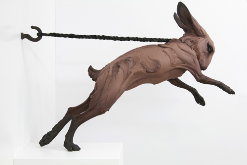
Clay sculptures have always intrigued me, although I have never personally developed an aptitude for it. When I was looking through Beth Cavener’s gallery, I couldn’t help but be amazed at how seamlessly she places human emotion into animal body language. Beth herself is dedicated to this idea that her sculptures mold human and animal behaviors together, as you can read about here.
Specifically, the piece below caught my eye over her others. I first admired the use of a monochromatic color scheme. The dark colors are deceiving; brown is often associated with warm colors, but in this instance, the brown creates a feeling of tension and a physical attachment to the rope that binds the rabbit in place. The addition of the taut rope and the uneven, swirled movement that the clay causes the observer to empathize with this trapped animal. There is a strain both physically and mentally when one is trapped, and both of these are expressed in Cavener’s sculpture through the straightness of the rope that holds the rabbit, as well as the animal’s body language indicating some kind of stress or agitation (this blog discusses signs of agitation in rabbits–backward facing ears and upright tails included).
In 2012, Cavener did an interview with the blog Gessato in which she discussed how she takes her inspiration from all kinds of people that she examines on a daily basis. She talked about how her work is the result of how she interprets different human emotions, and then portrays them onto animal figures. I think what I find most inspiring about her work is how much detail she is able to convey into these pieces. There is an ample amount of story behind each layer of clay or each stroke of a brush, and the longer that you look at each piece, the more you can see and the more emotional the piece as a whole becomes. I find it remarkable at how well Cavener is able to observe human emotions, and even more remarkable that she is able to translate these onto an animal subject, whereas I still have trouble drawing a stick figure’s face.
VISU 1100: Blog Post #2
-Part 1-
After using the TimeTracker document to keep a record of how my time was spent during this past week, I found that I naturally create a schedule for myself. It is important to me that I have a ‘regimen’ of when I do things so that I can stay focused on each individual task. And then, like I can see most weekends being for people, the structure goes away and I have time to relax from the last week and prepare for the next week simultaneously. During the weekends I make much more time for me to do non-school related activities, and to stay in touch with family.
-Part 2-
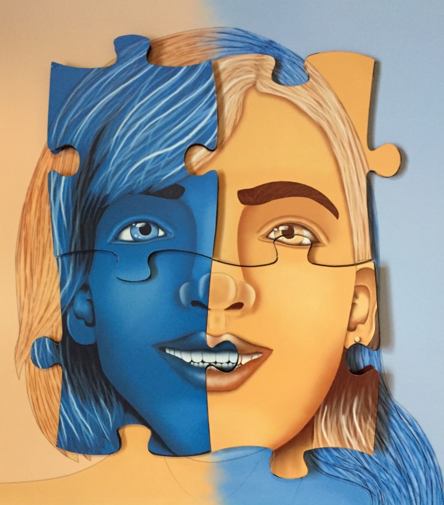
©2015, Loren Gamez
THE RESEMBLANCE IS PUZZLING
Digital print, 20 x 20 inches
This piece is a personal accomplishment for several reasons. The first of which is that it is a portrait of my twin sister and I (myself on the left and her on the right), and shows how we are both similar and different in our own unique ways, and how I feel as though we are two parts of a whole and complete each other in many aspects. This was also the largest project that I had done at the time, so getting it finished on time was important. Additionally, I think this piece reflects my point of view because I embrace my sister’s disability, as well as the entire community of people with special needs, and that is very important to my family and I. It also reflects my interests because I am devoted to improving my artwork, and I believe that this piece (compared to previous digital works) shows how much I have learned since my interest in graphic design began.
VISU 1100: Blog Post #1
-Part 1-
1) The first article’s main point is that artists are as important in the business world as any other kind of entrepreneur, and that all businesses can learn things from them. Artists are successful entrepreneurs especially because of their nature to be innovative and to persevere, something that all entrepreneurs could use to be successful. The second article’s main point is to enforce the idea that artists are entrepreneurs because they have a passion for what they do and don’t let many things get in the way of their vision, but they occasionally lack the support of others to turn their visions into a reality.
2) Artists can learn to think of their passion as a “team sport” and to accept the support they might need to turn a fantasy into a reality and to flourish.
3) I do feel as though artists are entrepreneurs, primarily because they embrace what is sometimes intangible, and they find a way to make it tangible through their art. Like entrepreneurs, they can take things that don’t exist, or things that exist only in the mind, and show them to the world in a unique, often nostalgic way.
4) While I agree with most of the characteristics of artists, the one that stands out the most is the ninth, the one that says that “artists are great storytellers”. The inspiration for an artist’s work is almost always as important, and occasionally more important, than the finished product itself. “It is the journey, not the destination” goes the saying, and this can be applied to an artist’s work as well as an entrepreneur’s innovation.
5) I would add that artists are motivated because of their passion, and this motivation leads them to high performances and perseverance. Likewise, entrepreneurs need to be motivated to turn their ideas into a reality.
6) No additional notes.
-Part 2-
1) I do have grit according to the test, and I believe it is because I work hard and I set personal goals for myself.
2) To increase my grit I could remain dedicated to projects that are important to myself and/or others, regardless of how much time they may take. Additionally, I could refrain from any distractions that might take my attention away from being successful and meeting my goals.
