End of Semester Wrap Up [AdvType]

I honestly don’t really feel overly self-critical about myself. I certainly take others’ criticisms of my work with a grain of salt and I work to improve my projects, but I don’t let myself get hung up on the negative stuff or the things I don’t like about a project. If I don’t like something, I ask other people what they think. I try to figure out what the most disliked parts are, and then I go fix it. Or I scrap the whole thing (rather, save it as a draft and start with a fresh canvas for a new approach). Perhaps though, if my OCD and perfectionist tendencies could be seen as faults, it would be because I tend to spend longer on certain parts of a project to get it to a point that I’m satisfied with it. Overall, though, I see those as good things that make me strive to do good work that I’m happy with and that I know I’ve spent effort on, and I still make sure that I have projects done by their due dates.
Advanced Type: Assignment 4: The Mystery
1. What is the “thing”?
After looking at the files that were inside the mystery folder, the “thing” looks to be a conference for the Fulbright program and scholars. Many of the logos in the folder come from universities that probably offer opportunities for the Fulbright program, and other logos that are not from universities are probably business sponsors of the program. Also within the mystery folder is a subfolder with images of people. I think that these people are previous and/or current Fulbright scholars.
2. What can I design for the “thing”?
For the Fulbright celebration/conference, the first thing I thought of that could be designed for it would be a poster. The poster would most likely be sent through digital platforms such as emails or social media, but a print version could also be made in addition to digital ones.
3. What is the order or process to design the “thing”?
First and foremost, I would need to know basic direction information for the conference. Things like the physical venue and the date and time. From there, any particularly important guest speakers would need to have their names on the poster, as well as the sponsors for the conference. Because the conference is for the Fulbright program, the Fulbright program logo will definitely need to be shown. Once the necessary information is gathered, I will need to figure out the hierarchy of putting it on a poster design. What is placed at the top, in bigger text? At the bottom in smaller text? What goes in the middle? An image? A series of images? Whatever I choose will have to be interesting, but clean for the sake of a quick read.
4. How granular? What’s the big picture? What details to include?
As a notification for a conference, I imagine that there should be quite a bit of information included on the poster so that recipients know what to expect. At the same time, it should look clean and easy to read, not cluttered and busy. For example, is the venue a well known location, or will a map thumbnail need to be included? Can the time and date be represented through an icon, or does it need to be spelled out in text? How many guest speakers? What is the color palette, even? It should match the theme of the event, the location, and/or the Fulbright program’s official logo, that much I know.
GDES 3304 Mid-Term Assessment
For my expert hours at the beginning of the semester, I said I was around 4500 and wanted to gain around 100 more by mid-semester. I certainly spent many hours learning new methods in After Effects (after spending hours doing something the long way). Additionally, I used several hours to iterate the graphics that I created for the animation in Illustrator before and during I worked with keyframes in After Effects. I would definitely say that my hours are enough.
I think that my definition of sophisticated work is still the same, but I think that this weather project made me work harder at a more sophisticated end product. This included making sure that each element of the animation is cohesive. Specifically, I had to pay much more attention to making sure that the style of of animations that I used for the elements on screen were consistent and harmonized.
Coming into the semester, I already had experience with creating graphics in Illustrator, such as the symbol and maps projects from GDES I. This made the process of creating icons and text for the weather report a quicker process, and in fact the quickest process of the project. I also had some experience with After Effects through the Interface App assignment in Image Methodology. However, the knowledge I had was very basic, so I grew much more comfortable with the application after using it extensively for this weather report project. Additionally, I was able to use the LATCH technique to work around the problems of keeping elements on the screen at the same time while making their movements cohesive and not cluttered. This I think can even be useful for static graphics and layouts outside of animations; how to be aware of space between objects and the hierarchy of how the eye perceives them.
I think that I’m still curious about how I could make the animation more appealing if I used different LATCH methods, or if I went about it in the most effective way. There was a conversation last class about what the best order of LATCH structures would be for these animations. I suppose I’m most curious to know if there would have been a better way to rearrange the structures that I came up with.
I think that as far as value goes, this project is the most valuable. In comparison to the maps that I did in GDES I, I was able to take what I learned on making sophisticated icons and put that knowledge to use to make effective weather icons and other related graphics for the animation. After years of iterating various symbols and icons, I’ve become very comfortable with using them. In comparison to the Interface App project in Image Methodology, this assignment is much more fluid and polished as an animation. I have had more time to understand how After Effects works. I can now easily dictate to the program what I want to happen, rather than letting the program dictate what I can do because I didn’t previously know enough about it. Overall, this weather report assignment is a culmination of learning experiences that is thus far the most valuable to me because of how much I learned from it.
Lastly, I would say that my own work and self-growth has contributed at most 40% toward the overall growth and creativity of my project within class. I tend to use my life’s experiences to influence how I might resolve a problem I come across, or as a starting point for what direction I want to take a project. I would say that quite a bit of feedback from my peers during class, my friends, and my family has contributed toward the other 60% (and below is a visual representation of such). I use their critiques and outsider perspectives to think differently about whether or not the things I make are coming across to other viewers the way that I want them to. And if not, I am able to discuss with other people how to make it more clear, and highly value their opinions.

Weather Report
The weather report project helped to relate type to motion, and to do this studied the L.A.T.C.H. system for making effective animations. I decided to choose a capital city in a country close to each corner of a map where the Atlantic Ocean is in the center, and used the weather conditions in those cities over my birthday weekend for the animation. I used latch, time, and category structures to convey the weather information in different layouts, while keeping everything on screen. I was able to use previous knowledge with After Effects as well as new methods I learned in class to create a smooth animation with clean transitions between L.A.T.C.H. structures. The most difficult part of this assignment was figuring out how to animate the transitions in a way that wasn’t too crowded on the screen, but I am pleased with the final results.
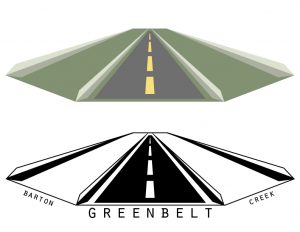
Visual Identity: Mark
The mark project required me to make a logo for the public space that I had researched, and be able to represent a preexisting or new idea about the space through the mark. The final mark that I ended up with for this project is a reflection of my impression of the Greenbelt through the lens of both able-bodied individuals and those who have trouble traversing such difficult terrain as what the Greenbelt offered in many places. I sought to create a mark that could signal a change in this challenge. This mark represents a (hypothetically) improved Barton Creek Greenbelt with accessible trail options for people who don’t want to, or physically cannot, tackle more natural terrain. It puts inaccessible and accessible trail options on equal, shared ground and becomes an invitation for everyone to visit the Greenbelt. When integrated as a system, the objects within the mark (in this instance, the trail) can be replaced with other objects to represent other landmarks of the Greenbelt trail, such as side paths that lead to the water, or trails that lead one back out to the main road/entrance.

Main mark/Rough Terrain
-

- Creek Access
-
- Main Road/Access Point
-

- Smooth Terrain
Process Work/Research
For this assignment, I chose to study the Barton Creek Greenbelt in Austin. One of the five methods for collecting research on a public space in Austin was to collect existing maps of the space, and then create a unique map of my own to represent a new idea, or update a previous one. When I visited the Greenbelt, I went with my family. I thought it would be a great way to spend the day in fantastic weather while getting homework done at the same time. It quickly struck me that although I, and other able-bodied individuals, enjoyed what the Greenbelt had to offer, my sister, who is wheelchair-bound, could not. I chose to make a map that highlighted which parts of the trail that I covered would be accessible and which parts wouldn’t be. I divided the Greenbelt’s terrain into three categories for feasibility of access: easy, difficult, and nearly impossible. Then I proceeded to assign these categories to the main trails that I walked over throughout my several visits to the trail, and added in other landmarks to the map for readability. 
-

- Official Map
-

- Minimalist Map
-

- Access Points
-
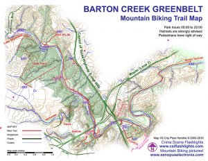
- Mountain Biking Trails
Expert Hours Goal Sp2017 – Loren
For this class specifically, I hope to have at least an hour and a half, or more, outside of class each day for projects in this class, for an average of 10-14 expert hours gained per week.
By mid-term, I hope to have at least 100 expert hours gained. My goal is that as I learn more in class, I spend more time practicing each new thing I learn outside of class, thus increasing my expert hours per week. By the end of the semester, I would like to have reached at least 175 expert hours, or better yet even closer (or over) 200.
As of now, considering all of the years that I have spent learning and practicing various graphic design techniques, I probably have nearly 4500 expert hours (going off of my estimations from last semester’s blog post).