VISU 1100: Blog Post #5
-Part 1-
© 2015, Loren Gamez
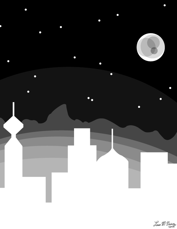
Space Awaits Us
Digital painting, 612 x 792px
© 2015, Loren Gamez
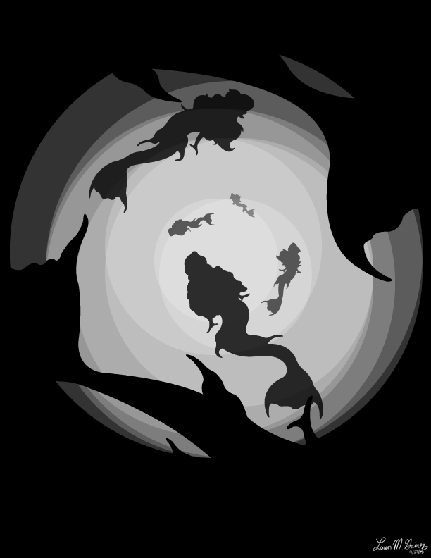
Sound the Sirens
Digital painting, 612 x 792px
1) The goal of these assignment were to create a “Future” themed poster design and a “Fairy Tale” themed t-shirt design, as part of contests that Command G is having in the fall (poster) and spring (t-shirt).
2) For the first, I had no clue what I wanted to do. I started playing around with geometric shapes. Then I heard on the news that there was possibly evidence of water on Mars, so I turned Mars into the focus of my image, with its habitation being the future aspect. For the second, I knew that I wanted to do mermaids, because I find them fascinating (the darker, eviller ones, that is). So I started playing around with some ideas, and came up with a silhouette, underwater version.
-Part 2- (critique on the Sound the Sirens piece)
1) I think the strongest aspect of this piece is the illusion of depth given by the different opacity of the figures, and the change of opacity of the background.
2) I think the mid-section “fins” on the mermaids detracts from the image because when I look at the image from a distance, there seems to be an illusion that they have two sets of arms, or two sets of tail fins. This will probably be removed in the final piece before submission to the contest.
3) As stated above, the composition can be improved by editing the mermaid figures to be smoother around their mid-sections. Additionally, I might play around with the opacity of the image to see if darker opacity improves the illusion of depth.
4) Conceptually, I might play around with the mermaids’ poses and proximity to see how to improve the illusion of movement and depth. I might also see how it looks in different colors, like a dark blue/green.
5) Technically, I might edit the mermaids’ forms to see in what ways their shapes can be transformed so that each is unique.
6) No additional notes.
VISU 1311: Creativity Blog Post #8
I really liked Dan Phillips’ talk. He had a lot to say, and I found it easy to agree with him. I also found it fascinating the way that he was able to recycle used home items to make something new and unique. This is similar to the art of collage, and the question of how harmony is created in an image.
In the way that Dan Phillips talked about repetition and patterns when he reuses materials in his homebuilding, photo collages use repetition and patterns to create new images themselves. In Phillips’ homebuilding, he often takes an object’s design and repeats it throughout the house (this is especially true for his Budweiser house). In photo collages, a single image can be ripped or cut into parts, and these parts can be reused as a whole in the new image, but in a different pattern than before, thus creating something new from something old.
Dan Phillips also discusses an interesting point that people act differently when they are alone than they are when they are surrounded by other people. In a way, photographs can be like this. A single photograph has a different effect than a collection of photographs. Furthermore, a piece of a photograph in a collage has a different effect than a whole, untorn photograph. Thus, the purpose of placement in a collage is almost always different than the purpose of a photo that is left alone. Both have their strong points and weaknesses, but they serve completely different purposes. I think this concept is one of the most interesting ones about artistic principles. There are certain expectations for photographs, and there are certain, different expectations for collages. And the purpose of these things, and the process of creation that leads to the final product, is the harmony created as a product of these expectations and the artists’ interpretations of those expectations.
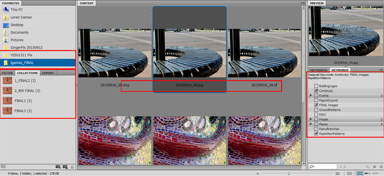
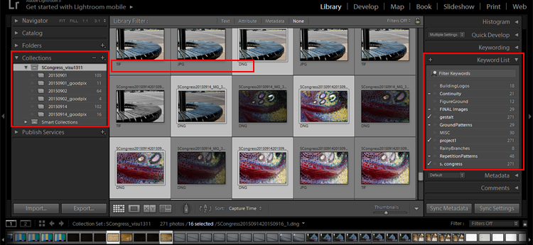
Project 1 Screen Captures
Below are screen captures of my favorites folders, collections, different file extensions, and keywords in both Bridge and Lightroom, although Bridge was primarily used for the project.
VISU 1100: Blog Post #4
-Part 1-
Rachel Broussard: I really enjoyed Rachel’s advice to go out and see other artwork. I have never really taken the time to do so. Now that I’m so close to many different galleries and have the time to go, it’s something I hope I will learn to do often.
Caelan Navarrete: I enjoyed how Caelan stressed the need to make work outside of the art classes, and it’s something that I have done before, but I feel like I should be doing more. I agree with Caelan that work outside of the class, perhaps more than work inside class, helps to really refine an artist’s personal style.
Shelby Savage: My favorite piece of advice from Shelby is to find your passion. I agree that if you can do what you love, then you will absolutely be motivated to the work. I love graphic design, ergo I can’t wait to see what I can do with my degree so that I may do what I love as my career.
Paul Young: I like Paul’s suggestions to “hustle” and that mobility is important. While it might seem like a good idea to spend a long amount of time on one piece, it’s just as important to do as much as you can in as much time as you can so that you can constantly improve.
Crissy Smith: Considering that my first art project in my Visual Studies class is due on Wednesday, I liked Crissy’s advice to learn how to talk about your work. It’s one thing to make art, but it’s another case when you have to defend your purpose and help others see your art the way that you do so that the work’s purpose can become clear.
Juliana Ramirez: My favorite piece of advice from Juliana is to keep a sketchbook for basically everything. I’ve never been great at keeping a single journal or sketchbook for all of my reminders and ideas, but I can see how it would be a very useful tool to have for various reasons, and I hope it’s a habit that I can grow into soon.
-Part 2-
Website 1: http://www.endzeit-ausstellung.de/
Even though it’s written in a different language, and one that I don’t understand, I found this website compelling because of the simplicity of its design. There isn’t too much going on to distract the viewer, and you can be straight to the point with what you’re searching for here. Of course, the website also has a really neat way of giving the viewer the illusion of 3D through the way that the image on the home page follows the cursor across the screen. Additionally, you can scroll down seamlessly through the pages, or click them individually on the right, which I hadn’t seen before.
Website 2: http://www.c-roots.com/
I found this website to be compelling because the design of the page is quite reflective of the agency’s ‘mission’, as described on their main page.Throughout the website’s pages, there is a maintained sense of creativity, but it is refined in a way that is still easy to navigate. I also loved how even though the company is based in Amsterdam, they have an option to view the website in English or in Dutch, which is very user friendly.
Website 3: https://nest.com/
This website is different from the others, but I chose it because even though I have no immediate interest in Nest’s products, I still found the website itself appealing. It is simple, image-heavy for easy understanding, and just overall attractive. There is plenty of information, but the way that it is provided through interactive graphics instead of just text is a lot more welcoming to viewers.
Website 4: http://thesocietyinc.com.au/
I found this website to be compelling because the background is very unique. It has a hand-crafted feel in contrast to the modern, photographed style of the other layouts I picked. It adds to the character of the business, while also making it aesthetically appealing as a web design.
VISU 1311 Project #1: Loren_Gamez
Below are the images that I selected to use for my Gestalt project. These images focus on the Gestalt principles of continuity and repetition. I used the natural curvatures of the subjects to draw the viewers’ eyes from one side of the piece to the other. The use of the mosaic tiles, triangular stones, and metal rungs of the seat help to provide the eyes with a natural sense of movement and continuity, and they also provide repetition as a guiding force for said movement. Additionally, if these images were to be placed horizontally next to each other, the movement from left to right would still exist across the span of the images. [Link to screen captures]

©2015, Loren Gamez
Gestalt Project 1 of 3
Photograph

©2015, Loren Gamez
Gestalt Project 2 of 3
Photograph

©2015, Loren Gamez
Gestalt Project 3 of 3
Photograph
VISU 1311: Creativity Blog Post #7
I’m going to be honest here. I listened to The Medium is the Message 3 times over the last week, and it still makes no sense to me. The background noise was distracting me from trying to listen to the words of the main speaker.
Part of me wonders if this is the point, but I hate trying to think of some abstract reason about how that’s the point, or the “message” of the podcast. Part of me says yes. Part of me feels as though this is the idea behind it. The idea is that we often try to focus on the intent rather than how something was made, and we often don’t appreciate what is simply in front of us.
But in the end, I feel as though I’m just pulling at straws. So I don’t know…maybe I was on to something. But I’m still at a loss of what that is.
However, the reading made some sense. The reading claims that the medium used to create something is just as important as the finished product. I believe that each medium has a different effect, and feel as though a scene that is painted is not the same as the exact scene drawn with pencils. Therefore, the intent of the artist to use paint rather than pencils is selected on the basis of what effect it will give. In my case, I find painted landscapes more appealing to my eyes than landscapes drawn in grayscale with pencils. This could be opposite for other people. But in either case, the artist had the final say and it is up to the viewer to decipher the intention of the work based on its medium and message.
VISU 1100: Blog Post #3
Clay sculptures have always intrigued me, although I have never personally developed an aptitude for it. When I was looking through Beth Cavener’s gallery, I couldn’t help but be amazed at how seamlessly she places human emotion into animal body language. Beth herself is dedicated to this idea that her sculptures mold human and animal behaviors together, as you can read about here.
Specifically, the piece below caught my eye over her others. I first admired the use of a monochromatic color scheme. The dark colors are deceiving; brown is often associated with warm colors, but in this instance, the brown creates a feeling of tension and a physical attachment to the rope that binds the rabbit in place. The addition of the taut rope and the uneven, swirled movement that the clay causes the observer to empathize with this trapped animal. There is a strain both physically and mentally when one is trapped, and both of these are expressed in Cavener’s sculpture through the straightness of the rope that holds the rabbit, as well as the animal’s body language indicating some kind of stress or agitation (this blog discusses signs of agitation in rabbits–backward facing ears and upright tails included).
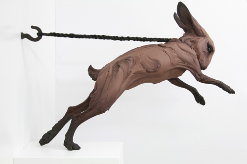
©2015, Beth Cavener
KEPT
Mixed media sculpture, H 24 x L 12 x W 28 in

©2015, Beth Cavener
KEPT
Mixed media sculpture, H 24 x L 12 x W 28 in
(closeup)
In 2012, Cavener did an interview with the blog Gessato in which she discussed how she takes her inspiration from all kinds of people that she examines on a daily basis. She talked about how her work is the result of how she interprets different human emotions, and then portrays them onto animal figures. I think what I find most inspiring about her work is how much detail she is able to convey into these pieces. There is an ample amount of story behind each layer of clay or each stroke of a brush, and the longer that you look at each piece, the more you can see and the more emotional the piece as a whole becomes. I find it remarkable at how well Cavener is able to observe human emotions, and even more remarkable that she is able to translate these onto an animal subject, whereas I still have trouble drawing a stick figure’s face.
VISU 1100: Blog Post #2
-Part 1-
After using the TimeTracker document to keep a record of how my time was spent during this past week, I found that I naturally create a schedule for myself. It is important to me that I have a ‘regimen’ of when I do things so that I can stay focused on each individual task. And then, like I can see most weekends being for people, the structure goes away and I have time to relax from the last week and prepare for the next week simultaneously. During the weekends I make much more time for me to do non-school related activities, and to stay in touch with family.
-Part 2-
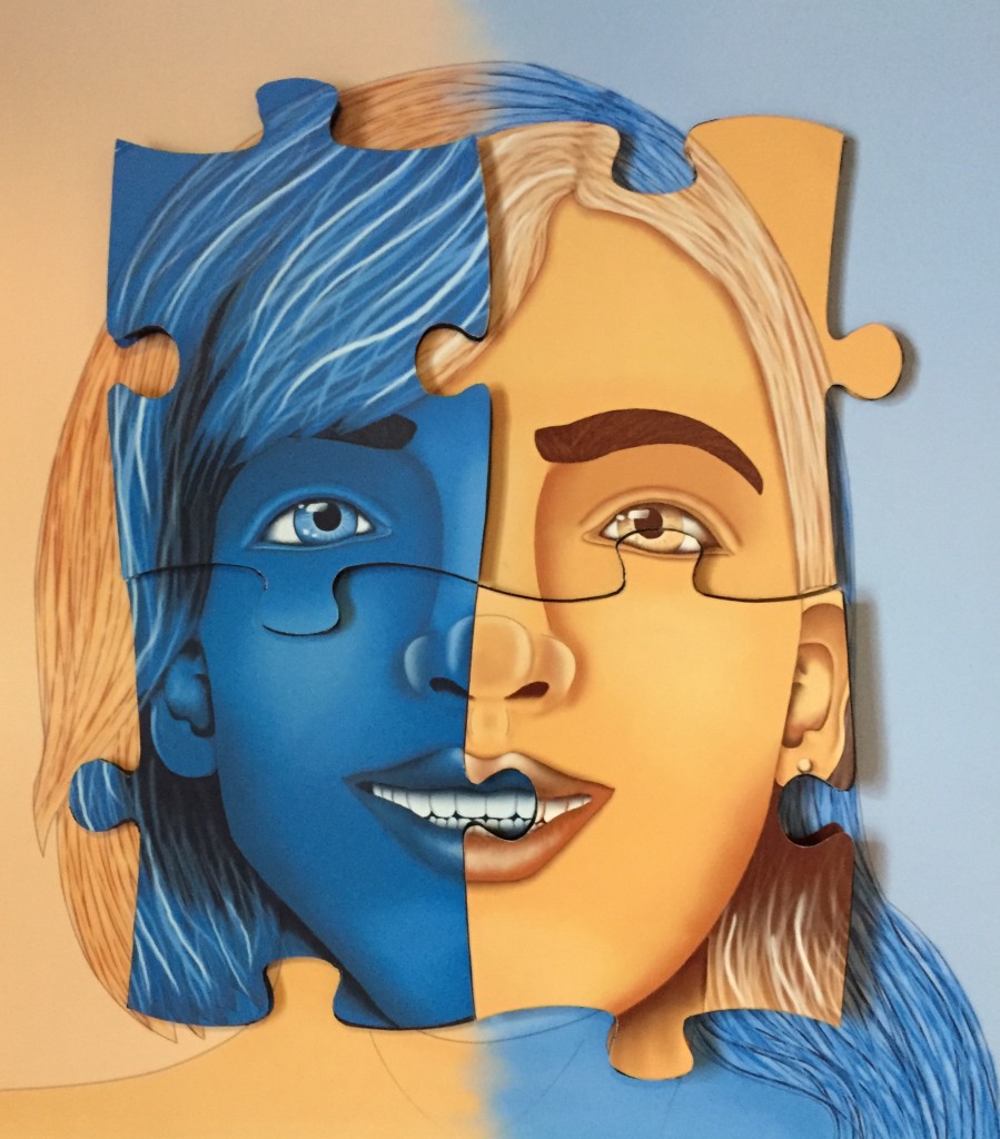
©2015, Loren Gamez
THE RESEMBLANCE IS PUZZLING
Digital print, 20 x 20 inches
This piece is a personal accomplishment for several reasons. The first of which is that it is a portrait of my twin sister and I (myself on the left and her on the right), and shows how we are both similar and different in our own unique ways, and how I feel as though we are two parts of a whole and complete each other in many aspects. This was also the largest project that I had done at the time, so getting it finished on time was important. Additionally, I think this piece reflects my point of view because I embrace my sister’s disability, as well as the entire community of people with special needs, and that is very important to my family and I. It also reflects my interests because I am devoted to improving my artwork, and I believe that this piece (compared to previous digital works) shows how much I have learned since my interest in graphic design began.
VISU 1311: Creativity Blog Post #6
Exploring the Gestalt principles in music is certainly something that I hadn’t thought about before listening to Spoon. However, once I did listen to the podcast and to the song (several times), it began to make sense how there are specific Gestalt principles that can be heavily applied to music.
Firstly, there was the element of repetition. The drummer, Jim Eno, points out that they played around with different types of music, but with each beat, there is a specific repetition to it. There is also a distinction between the repetition during the chorus and during other parts of the song. There are different types of music that get repeated at different parts, but in the end, it creates a sense of unity in the song because there is an overarching drumbeat continuous in the background.
Additionally, there is a sense of continuity in the song. While there are different types of music in the song, the transition from one beat from another is seamless, and doesn’t break up the song and cause the words or meaning of it to become lost.
I feel that these two Gestalt principles in general are what drive most forms of music to be considered art. We as humans are always looking for patterns, and repetition + continuity is a pattern that is, well, music to our ears.
VISU 1311: Creativity Blog Post #5
I’ll admit it. I didn’t understand Stan Brakhage’s video at all. For at least the first three times I watched it. But then I started to ask myself why the video was 2 1/2 minutes long, why he would compose the images in that way, and why he titled the video “Stellar”.
I did a bit of Googling on Brakhage’s films when I was stumped the first time, and I found a wiki archive that listed several of the films he had done, and their lengths. To answer the last question first, I think there’s a point to why that particular video is nearly 2 1/2 minutes long. It tells a story. The film begins very slowly, and I believe this is a parallel to the beginning of time, or life. The span of time between images is long, as is the amount of time that you see any specific image. However, as it progresses, the time between images shortens and the images flash by faster than the viewer can keep up with. I think this parallel is a signal of how time progresses and seems to pass us by so quickly near the end that we do not take the time to enjoy the things we see.
Secondly, I was unsure how the video related at all to the Gestalt principles. The grouping of images seems random at first, but when I paid closer attention to ways that they could be categorized, I noticed that they had predominantly cool, dark colors. This of course is reflective of our perceptions of what the universe looks like beyond the atmosphere of the earth.
Additionally, the proximity of images changes. Like I mentioned before with time, the images seem more distant from each other in the beginning, but by the end of the video they are nearly split seconds apart.
Brakhage’s choice of composition still confuses me, and watching other videos of his doesn’t help, but I eventually opened my mind to the abstractedness of the work and was able to appreciate his unique creativity and composition.
VISU 1311: Creativity Blog Post #4
I found Amy Tan’s talk on where creativity comes from to be an interesting insight on the matter, and I liked the way that she addressed the matter as something that can vary depending on each individual life experience. She points out the way that outside forces are at work constantly in a person’s life, and each thing that happens influences how someone goes about expressing their creativity. I agree with her that there is an element of ambiguity to being creative or having an inspiration for a creative expression.
However, I don’t agree with her when she says that ambiguity is necessary. I believe that it can be a useful tool for expression, but I believe that any work can be done just as well without ambiguity. Personally, I find things easier to understand if the meaning is clear on the surface, not muddled with ambiguity, causing someone to search for the meaning. In my life, I can draw inspiration more from the things that I can easily understand than the things that confuse me.
Aside from that, I do agree with her when she states that there is more than “random luck” at work. The outside forces that influence a person’s life also influence their understanding of the world, and a person can always draw upon these coincidences as guidance or assurance for their work.
Overall, I do believe that it is important for an artist to draw their inspiration and creativity from many sources, both of the supernatural nature and in the world we live in today. I think that creativity depends on the kind of life that a person chooses to live, and that their experiences will almost always reflect onto their work.
VISU 1311: Creativity Blog #3
I thought that Hara’s article gave some interesting insight to the evolution of design. She has an abstract idea that all design is descended from sticks and vessels, and that an eye for complex design is assumed to equal power. I found these two ideas to be quite interesting, although the idea that all design is descended from sticks and vessels to be a little far-fetched. But I do agree with Hara that we as humans have come to see people who are capable of creating complex designs as powerful, in a sense. We admire their skills because many of us are not capable of accomplishing something like that, and thus we hold them in higher esteem than the “normal” people around us.
Additionally, the article makes clear that design is essential to consumers of the “modern” society, to the economy. I also find this to be true. Who wants something that is simply generic over something with an attractive design to go with its usefulness?
And it makes another point that there are many types of design, some that go overlooked. It almost seems overwhelming to me just what the word ‘design’ encompasses, and how many styles there are. It’s a neat thought, though, that design is everything and everywhere, and it just depends on who uses it and for what purpose. It can vary depending on the time, on the country, and even on what is used to create the art (ie. a paintbrush and canvas versus a computer program).
Overall, the article enhances the idea that “beauty is in the eye of the beholder”, or that a design depends on the designer. And there are many to choose from, take influence from, or stray away from to create something new and original. The possibilities, it seems, are endless.
VISU 1311: Creativity Blog #2
I liked reading Daniel Pink’s article “High Concept, High Touch” because I feel as though he breaks down the everyday mind into parts, but also emphasizes how success is drawn from people who utilize both parts to create a cohesive whole. People who learn to balance their creativity with their intelligence can make a greater impact for their profession, and are able to work on a higher level.
Pink separates the left brain and the right brain and discusses how they are separately essential to a person’s abilities, but when they are used together, a phenomenal result occurs. Someone who is an “L-Directed” thinker can think logically, and are often seen as essential to the economy or work force. Being “L-Directed Thinking” is preferred in many businesses. However, people who are “R-Directed Thinking” are often overlooked and underestimated when it comes to their performance. Contrary to what many people think, the creative “R-Directed Thinking” people are just as essential because they are able to open their minds up to options that an “L-Directed Thinking” person might not see as logical, but are options worth trying. In fact, as Pink points out, there are studies that say that being an “R-Directed” thinker can sometimes be more influential in the present work force because of their innovative natures. Sure, it’s good to be able to think logically or calculate difficult sums, but being an enjoyable personality and to be innovative, as most “R-Directed Thinking” people tend to be, is just as important.
Another interesting point he makes is that a person’s IQ or SAT score has nothing to do with their performance in the work force. I find myself agreeing with this quite strongly. I know personally that some people are just not capable of performing well on a test, but they are quite intelligent individuals. Without delving into the controversial standardized test, I do believe that the criteria for a person’s success should be something other than a test score. I absolutely love Professor Sternberg’s “Rainbow Project”, because it does just this. It takes the “L-Directed Thinking” preference out of the equation and instead allows for the “R-Directed Thinking” personalities to shine and demonstrate their capabilities.
Lastly, I agree with Pink’s conclusion that “L-Directed Thinking” is necessarily, but it is not all that there is, and that we need to better understand the “R-Directed Thinking” to provide for a better whole, instead of settling for the better half.
VISU 1311: Creativity Blog #1
I found Flusser’s “The Photograph” article to be very intriguing. It uses the point of view of an artist to dissect photographs into a very complex work of art that many, especially those who are not artists, do not quite understand. I found myself agreeing with much of what he was saying, especially about how a photograph is more than it seems at first and often requires ‘decoding’.
Flusser seems to emphasize that a photograph, in itself, is not simply a matter that is black and white. A photograph is an expression that allows for a complex subject to be broken down into a more understandable method of observation. A photograph allows for both a simple understanding in the form of an image on the surface, as well as a more complex, deeper story that an artist tells through the setting of the captured photograph. I find this to be very true as I think back on the photographs that I have seen, whether professional or taken by a family member. They are more than something to admire on the surface. They scream for your attention through the artist’s style, and how the subjects of the image are placed. Some are used for memories, good and bad, and others are used to propel one’s critical thinking.
Additionally, Flusser makes the point that color photographs are more ‘abstract’ from a black-and-white photograph. I feel as though he thinks that the color in the photograph distracts from the true intent of the photo and its story, and makes the viewer have to think more deeply about it in order to truly understand the artist’s purpose. He goes on to say that a black-and-white photograph is more ‘true’ than a color photograph, and perhaps it is for this reason alone. Without color to distract the viewer, one can question why the artist chose to take that photo and what the artist wants the viewer to really see.
Overall, the article discusses Flusser’s analysis of how the point of view of an artist is something that is complex and often requires for one to really think critically about the purpose of the work, especially in the case of ‘decoding’ photographs, and I admire his point of view.
VISU 1100: Blog Post #1
-Part 1-
1) The first article’s main point is that artists are as important in the business world as any other kind of entrepreneur, and that all businesses can learn things from them. Artists are successful entrepreneurs especially because of their nature to be innovative and to persevere, something that all entrepreneurs could use to be successful. The second article’s main point is to enforce the idea that artists are entrepreneurs because they have a passion for what they do and don’t let many things get in the way of their vision, but they occasionally lack the support of others to turn their visions into a reality.
2) Artists can learn to think of their passion as a “team sport” and to accept the support they might need to turn a fantasy into a reality and to flourish.
3) I do feel as though artists are entrepreneurs, primarily because they embrace what is sometimes intangible, and they find a way to make it tangible through their art. Like entrepreneurs, they can take things that don’t exist, or things that exist only in the mind, and show them to the world in a unique, often nostalgic way.
4) While I agree with most of the characteristics of artists, the one that stands out the most is the ninth, the one that says that “artists are great storytellers”. The inspiration for an artist’s work is almost always as important, and occasionally more important, than the finished product itself. “It is the journey, not the destination” goes the saying, and this can be applied to an artist’s work as well as an entrepreneur’s innovation.
5) I would add that artists are motivated because of their passion, and this motivation leads them to high performances and perseverance. Likewise, entrepreneurs need to be motivated to turn their ideas into a reality.
6) No additional notes.
-Part 2-
1) I do have grit according to the test, and I believe it is because I work hard and I set personal goals for myself.
2) To increase my grit I could remain dedicated to projects that are important to myself and/or others, regardless of how much time they may take. Additionally, I could refrain from any distractions that might take my attention away from being successful and meeting my goals.
12