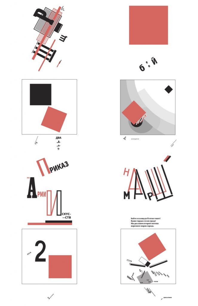
El Lissitzky Catalog
I selected Russian designer El Lissitzky to create a catalog of his work and life as a designer. I have always been drawn to his style, and that of other Russian constructivists, and I was thrilled to create a catalog about his work. Rather than letting the catalog just be about his work, I decided to incorporate some of his pieces and mimic his style in nearly all of my design choices. From the beginning, I knew that a style that only incorporates two colors would be absolutely perfect to be printed on the Risograph, and so I carefully used this as the basis of setting up the catalog design. I only used two Riso-compatable color swatches, and the catalog is sized to be printed on a Risograph at St. Edward’s University, then folded down to the correct booklet format. This can be seen in my imitation of the interaction of squares (yes, another project with squares — completely incidental, I promise!) made of text blocks. I recreated some of my favorite pieces from his About Two Squares series and a collaboration he did with Vladimir Mayakovsky and for the publication For The Voice as vectors. The intent with these pieces is that they display some of Lissitzky’s compiled work that can be pinned up as a poster once the catalog is un-folded. This post will be updated with new images once they are printed on the Riso! For now, here is the interior spread of written information about Lissitzky and his life as a designer, plus the final image of compiled vectorized work to be printed.
Invitation to Republic Square
Shown below is a bit of an “untraditional” invitation. It was created with the intent to bring new visitors to Republic Square to take part in the farmer’s market hosted there each weekend. I really wanted it to have a very simplistic, mass-produced feel as something that could be given out at the vendor booths to advertise what visitors can expect to find that weekend. User experience played a very influential role in the layout of the invitation. The final size was the result of a play on the word square as an element of production rather than the location and helps to repeat the idea of square in a user-friendly, interactive way.
- Front Cover
- Inside Spread with Cutout
- Back Cover


