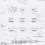
The interface was a layout design of a writing app that would be used on a phone for specific groups of people. I chose to work towards teachers and make the design simple and easy to create things on the go. My design focused on having big simple icons and nice pre made templates that can be accessed for easy development. My design also incorporated color and the neutral blues that are inviting and stress free for the user.
Graphic Design 1- Midterm Assessment Essay
Overall I feel that my two of my three vinyl cuts were presentable. My use of practice time during the process was uneven. I did a lot of work in class and about 2 hours in the lab Tuesday and Thursday when I did not have class. I also spent about an hour in the lab on Sundays. I brainstormed a lot with Pinterest and wordhippo.com to generate ideas for word selection as well as some basic ideas for designs. However, I feel like I should have spent even more time collecting expert hours. Like I said earlier, I feel that two vinyls out of three were presentable in the end. I felts that one of my vinyl’s was not finished and definitely could have been worked on more. As far as the vinyl cutter, it took some time to make sure that the cuts were good but in the end I was able to make sure that the cuts to my final was good and precise. I feel that the first critique that we got feedback for I did not really use because what I presented was not the best production. They were really basic and not well put together. I ended up making whole new designs that really did not go at all with the ones presented. The second critique I listened a lot more to the feedback that was given because I had “solid” designs that I was sure that I was going to continue to use and develop. I feel that the level of challenge that I gave myself was about medium. At the beginning I do not think I challenged myself enough to generate good, solid designs. As the project progressed, I became more judgmental about my designs and challenged myself to make them the best versions that they could. As far as other experiences go, I really only used the things we did in class. However, at the same time we were doing this project I was also working on designs for posters for the Students for Sustainability events that I made in illustrate. As far as social emotional development goes, I feel that I was in the middle or “young”. While doing the project I tried hard to stay focused and use others feedback to better my design. However there were times when I got stressed and angry when the design was not looking how I wanted it to; throwing a little internal temper tantrum about why I was unable to produce the product that I wanted. As for the last component, I feel that I contributed to the climate of the classroom when we did critiques by giving insight on some people’s logos and talking with the people around me in class. I definitely could have helped more by giving even more feedback to people and not just the same people that were around me. I also could have talked more when we tried to answer questions about the project and our views and ideas on them. Overall I feel like all of the components together and the final product will be equivalent to a medium or high C (74-79).
Symbol Methodology
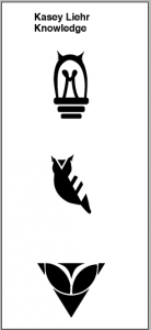
The symbols focused on our development overtime to generate interesting designs for a word that could be plotted from Illustrator. I focused on combining original elements that we had created earlier to make a clear point for my word. A big part was learning to plotter and how to make the designs come out with correct cuts.
Plotter
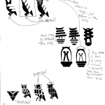
This Plotter Poster project was a tool to assist in learning about the plotter printer and how to correctly generate designs in Illustrator. My design was hard to generate because I had to follow “rules” generated from another classmate while still putting my own design idea and twist on it. I focused on creating recognizable creature parts while still trying to make the body parts proportional to the letters.
Current and Projected Expert Hours
The current number of hours I have are 9 hours 30 minutes. Four of these hours has come from being in class. During the week I need to do more design related things for my expert hours because the other hours came only from the weekend.
Aside from the class (4 hours), I believe that I need to put in around 12-15 hours additional outside. This can either be from physically working on things for class, researching designers, reading about design (modern or old), and working on designs for things outside of class (SFS graphic designer).
24*7=168 hours per week
168-49(sleep)=119-15(class)=114-20(work)=96-10(food)=86-15(other homework)=71
71-6(lab hours-bio)=65-18(chilling)=52hours a week of time that I can work on some type of design for my expert hours.
10,000/4(years)=2500/2(semesters)=1,250/2(visu classes)=625/15(per visu class)=41.66666
FA&D reading 4
This articles is not about how Warhol does not care about his work, but that he understands that not everything he creates will the a million dollar producing thing. He does art for fun and not for the money or fame. I think that this is relevant to the last project because we need to realize that even if the project we are working on is not for a bigger purpose (making money) that we should still do it to the best of our abilities and for ourselves because that is what are is.
I know that personally I become self-conscious of my ideas. I am always afraid that they are not good enough to be seen by people. I think that every thing has to be perfect but I am slowly learning that nothing is every perfect. I think that this idea of nothing-to-lose is interesting. It is a pro because it lets you just thing about the art and create what every you want, no matter what anyone says. On the other hand, if art is your living and you do not sell anything, you will not be living for long. You have to have money in this day and age to get supplies to make what you love so the art has to sell.
FA&D reading 2
These readings and the idea of art and design are all very opinionated. As Amzalag says in the Interview “Royal College of Art” (pg194), “This division between art and design is very recent.” In the past, art was design and design was art. Today’s idea of art and design are highly opinionated by people and museums. Amzalag states “The problem for us at the moment is that museums are so motivated by popularity that they have become places of consumerism” (pg 194). In this way, artist/designers approach their decisions in making the same because they live in a world of consumerism. Artist produce pieces that museums will pay for, not always what they want. Designers, as well, will produce workers based on the person who has hired them, even if they know what will be better for the customer.
I think that my decisions on what I work on are based on things that I find interesting or tat encourage me. At the same time, I feel that by being in a class, we are restricted to please the teacher. They may say they want to see our work that we want to produce but in the end our grades for school are down to the professors opinion on how we did the work.
Even so, I feel that a project is”good” or works when it portrays a topic or idea to the viewer. f the work doesn’t then you recreate it or shift your personal focus so that the end product illustrates what you (the artist/designer) wants.
Type Specimen Book
The purpose of this was to educate ourselves on different fonts and how to use them to your advantage in different layouts. For this project I focused on presenting the readability of my type and the different weights available. I decided to have the whole book rotate around these bright light colors to make the text pop and pleasing to the eye. I wanted the text to be readable and have its different features presentable without pointing it out obviously to the audience.
Shelter Evaluation
How did your group approach the concept of shelter? Was it successful? Why?
We approached this project by making a geodesic dome out of rolled up paper rods. This design was nice not successful because the paper rods were not able to hold the weight of itself up. When we made the full model, the middle just collapsed because there was no weight to hold it.
What was the group budget for the project? Where did you source your materials and how did they cost?
For the group budget, we each gave 10-15 dollars which we used to buy fabric, newspaper, stables, tap, and PVC pipes. In the end, I think we spend about $50.
Was the workload equal? Explain.
I think overall the physical workload was equal. Isabel and Devin did a bit more because they went out to buy the supplies that we needed since I couldn’t. We did the project when we were all together and we worked to get the rods made and the design up all together.
What was the strength that you added to the group, your weakness?
The strengthen that I added to the group was my determines to get the next portion of the project started and to update the google docs with our progress. My weakness was that I was never able to go and get supplies because I did not have a car to get anywhere. I ended up just giving Isabel money so that she could go buy supplies.
What role did you find you played in the group dynamic:
I think that we kind of divided the dynamics between us all. Isabel was the more of the leader because it was her project and Devin was more the spokesperson. I was more of the recorder/secretary because I updated the google docs on supplies, work accomplished and problems we ran into.
What advice would you give to the next group that must complete this project?
The advise that I would give the next group is to start making your shelter early on the idea that it will fall apart that way you can find the mistakes and fix them before the last day.


