October 17, 2016

GDES 1 Midterm

Consistent/Uneven. I worked quite diligently at my work. I’m not sure that my consistency was the best though. Of course, since design is quite a process, I don’t expect to finish my work in one setting, but it is very difficult for me to want to design in small increments. Sometimes I feel like I’m too aware of how much time we have left in class to work and really don’t focus on working on my work as much. Outside of class though I try to allow enough time to get plenty of work done. I would say that I am in between consistent and uneven with my use of practice time.


High. I think with this project, I wanted to be too sophisticated, to the point where I aggressively restylized many of my initial designs so that my logos achieved this modern professional quality. Of course, this took a lot out of me (sleep) but I was very pleased with my final outcome. I would say that I was consciously aware of the decisions I made in order to get a sophisticated trio of logos.


Useful. I think it is hard for me to measure how well I received feedback because I was a little behind in pinups and didn’t really get too much feedback. I was really my own worse critic in this project but when I did get critiques I did make sure that I tweaked my work in a way that I thought made sense. I have a tendency to be quite hubris in my work but try to diminish that ego in order to further improve my work. I’ve come quite a long way.


Intense. I challenged myself quite a bit. I really am my own worst enemy. I think I am quite sadomasochistic towards myself—I enjoy punishing myself. I beat myself up harshly trying to be good. I don’t allow myself to take the easy road, which I suppose is not bad but I think I often bite more than I can chew. I spent many long hours up at night trying to find a way to get a good product. It was quite taxing.


Lots of Extra Stuff. I am friends with the owners of a gallery and a studio so I get pretty involved with the work that they do. I hang out with a few of them to see how they work and practice their crafts. I do some modeling for this studio and I am really good friends with the professionals of that studio and I get to hang out with them, party with them, go to their workshops, and watch their creative process. I really aspire to work with them regularly. They recently found out that I am a graphic design major so I think I opened that door a bit. I also am trying to work on my own identity, but school (especially liberal arts school) doesn’t make that easy for me. I want to get into graffiti but I just do not have the time. I’m also working on making videos but time is not on my side.


Mature. I think for the amount of hours I’m taking and my activity within the organizations I’m involved with, I’m doing a pretty good job at managing my time. The only thing is I feel as though I may have some sort of bipolar trait I’m trying to work with. I don’t take medication and I have to work really hard to stay grounded but I feel that I coping with these emotional influxes well enough so that I can produce work. But I tend to live in extremes.


Warm. As for the climate, I feel like I’m talkative enough to contribute to the atmosphere. I really cannot say too much about this, I’m kind of oblivious to the impact that I have on a class.

February 23, 2016

Line Inventory

Line Inventory

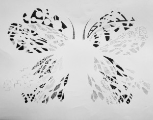
In the reading, the author, talks about what defines a good design, and he seems to establish parameters around this concept. However, as an inspiring designer, the prompt regularly passes through my thoughts. I come to realize that I would probably define a good design by its ability to communicate or function at a high level using the least amount of elements. We live in a minimalist society, and I am really attracted to function. A butterfly is so beautiful due to its structure—a structure that allows it to function quite well in its environment.

December 1, 2015

X-tra Blog Post: Keith Haring

The 80s seemed like a very crucial time for America., especially in New York. Here, there were plenty of commentary from groups and demographics that did not seem to have a voice in America. The loud and proud 70s mentality seemed to bleed over into the unapologetic era of the 80s . The feminist movement in America grew more powerful in the 1980s alongside with LGBTQ voices that wanted the same rights as heterosexual citizens in America. And still yet… there was racism that needed to addressed during this era. The art world in the 80s still had this very stark diverge from more colloquial art. However artists were changing that–artists from the streets of New York.

Keith Haring was a street artist after he dropped out and became integrated back into the art world, which is very interesting. He was dealt with political issues. He worked with motion lines and bright primitive shapes and colors.

November 30, 2015

X-tra Blog Post 1

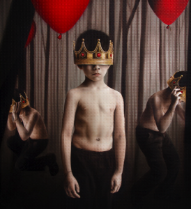
As I anticipated the release of Rihanna’s new soon to be release album, Anti, I came across a very intriguing artist named Roy Nachum. He is the artist behind the album cover of this upcoming album, and I was very stunned by actual artwork placed on an album cover. Word on the street is that Rihanna was in an apartment owned by the very famous couple, Jay-z and Beyonce, and some of Nachum’s work was hanging on their wall, which is caused Rihanna to reach out to the artist so that he may design her album cover.

He is an artist born in Jerusalem but went to Copper Union School of Art in New York City where he currently resides. He is classified as a painter, sculptor and an installation artist. He is known to want his audience to also touch his work. He experimented with braille and now it is apart of his aesthetic. He wishes to communicate to not only through sight but also through hearing and touching. He deals with human perception and his work seeks to open people’s eyes. “The whole idea behind the braille is that people who have sight are sometimes the people who are blindest,” Rihanna.

I was really intrigued by the use of color. It was like a new take on regality and monarchy–a more modern simple way of conveying royalty. But that is not his focus. In the piece “If They Let Us”, he talks about his work not in regard to regality but liberation. This piece is Rihanna’s album cover and he depicted her as a child holding a balloon to represent the freedom a child feels–the freedom of a balloon filled with helium air.

If They Let Us If They Let Us

Taishi Hosokawa


untitled


sources:

Rihanna Enlists Artist Roy Nachum to Design a Bizarre Braille Album Cover

https://en.wikipedia.org/wiki/Roy_Nachum

https://www.roynachum.com

November 30, 2015

VISU-1100-01 Blog Post 12

Part 1:

Kim Garza was the graphic design presenter–of course, but I wasn’t so interested in her work so much. The idea that graphic design is an investment into liberal arts for life was very interesting to me–the idea that you’re constantly learning about other filed is interesting, that is. But I really was rocked to sleep by her work. Perhaps I didn’t get enough sleep (but that’s not the point). I suppose I really appreciate more dynamic graphic work but the repetition of the film and music really bored me.

Ms. Tammie Ruben, the sculptor, really interested me. She really demanded my attention. I really enjoyed listening to the way she viewed the way she grew up and the reasoning behind how that effected her work. Her move and my move from our hometowns did put into perspective the way we view nature and I dig that, even though the outcomes of our mindsets are opposite. And even though I do not plan to have showcases of sculpture work, I really got interested in this medium.

James Lanshuren’s work seemed almost mundane but I really enjoyed that. I like the idea of finding beauty in everyday life and forced perspective and the idea of finding beauty in fault. His photos were really funny in some sense and the situations that caused the circumstances were really interesting to hear about. The quote “having been there”, the tense of photography, really captures his work, and I enjoyed that.

Part 2:

I really enjoyed this seminar. I really felt on fire after almost every class to dive into my field even further: get internships, do some outside work, get a job. I felt like i got a better grasp of what I want to do career wise. The only critique i have about the class is its length. I feels so long and it’s on a Monday at the end of the day.

November 16, 2015

VISU-1100-01 Blog Post 11

Part 1

Throughout all of the professor’s presentations, I gathered that the common thread is development. I felt like all three of them, explicitly or implicitly, advised to develop certain aspects of your work in order to get better–do not be afraid to practice, make a mistake, or explore something about yourself and?or your work.

I feel like Tuan’s presentation just taught me to not be afraid to just work. He really worked himself by working for his father. He experimented with different ideas and conceptualized a lot of ideas, and although a few of them were not put into use, he still found value in creating, working, and developing his style in many different types of mediums.

Hollis’s presentation really got me to think more about myself. Throughout her artwork, one could see her voice clearly, and throughout time that voice became more definite it seems. I think that I should really study what’s my drive to work (what am I try to say through my work). And I feel like that the more I explore my interests, and learn more about myself, my voice will become clearer.

Bill taught me to just do what I want to do. He was making commercial work–work that seemed to provide himself with reliable source of money, but he abandoned that in order to explore different means of work. He developed a style through extracting color and shape to make new images. He developed a technique. I feel like in order to do any work, especially if you want to do something that isn’t done before, you have to refine and develop a technique in order to do so.

Part 2

My goal beyond college is to possibly go to graduate school for design. I ultimately want to work with fashion and/or concerts. I especially like dealing with motion and live performances so concert performances and runway shows are ideal. I’m still learning the conventions of how one gets integrated in designing visuals for those type of shows but in order to be marketable and attractive to employers in this work field, I would probably want to work with motion graphics, continue to work for the school’s fashion magazine, probably the Sorin Oak review as well in the future, get internships in dealing with performance, graphic design, and/or fashion, explore the Adobe Suite, just continue to make and display work, and ultimately develop my voice.


November 9, 2015

VISU-1100-01 Blog Post 10


This is my work for Visual Studies I–dealing With collage and harmony.

Collages

Collage #1

Collage #2

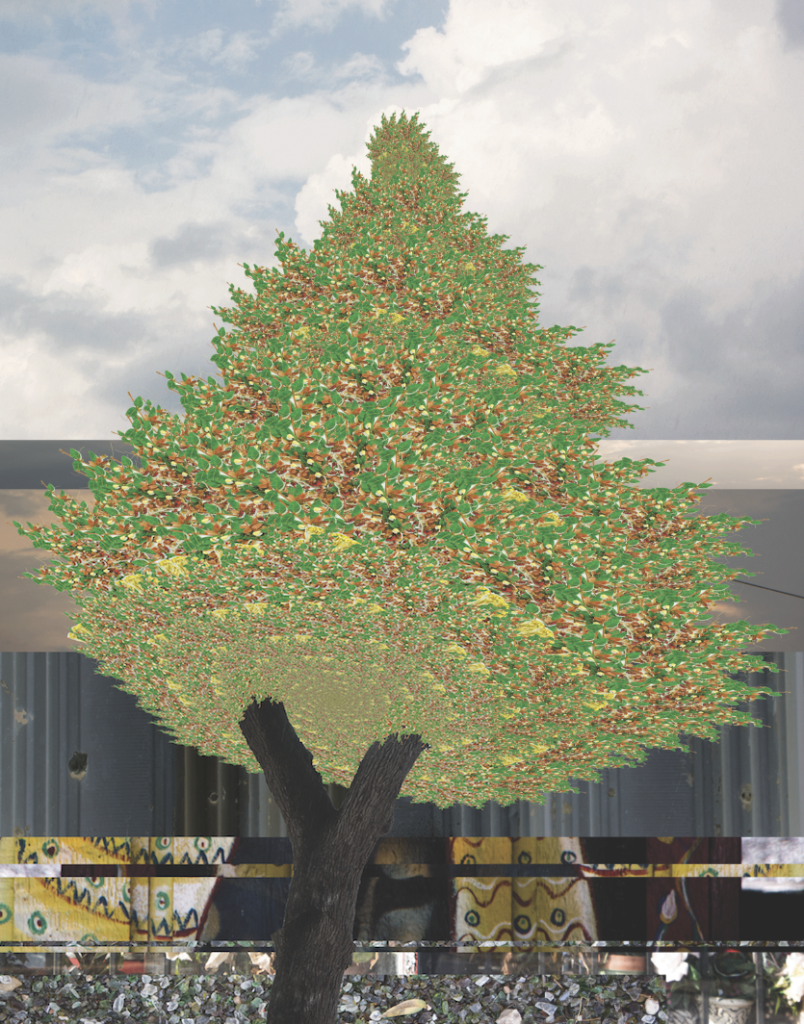
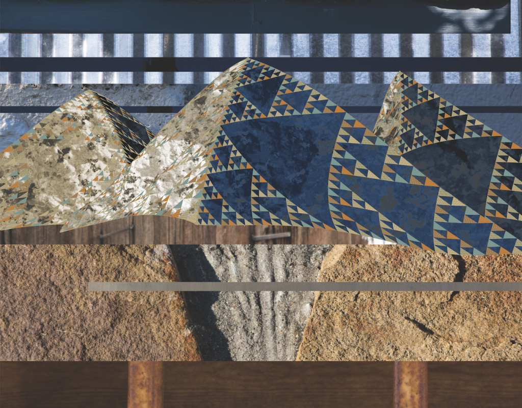
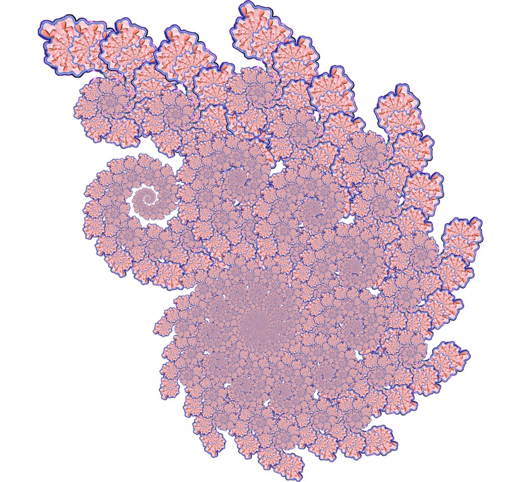
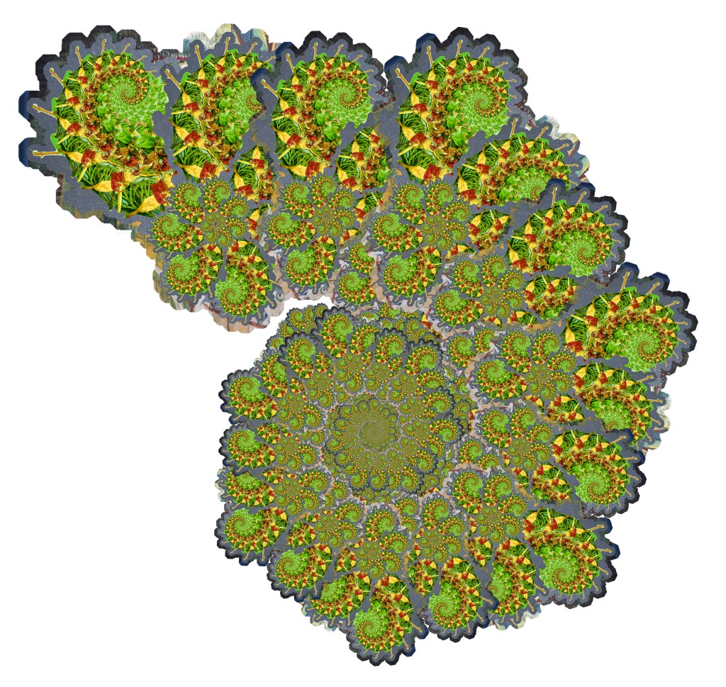
From the beginning of this project I was infatuated with the idea of a building block, and this idea relates back to my theme in the Gestalt project. Nature has it’s very complex and unique set of building blocks that differ from man’s constructs. Even though man is a product of nature, his constructions are not as intricate or complex as nature. I demonstrated this idea by using fractals to form natural constructs. I scanned rocks and plants I found on S Congress, put them into a pattern, and produced a figure that resembles something in nature– collage 1 being a tree (scanned plants) and collage 2 being a mountain (scanned rocks).


November 2, 2015

VISU1311 Project #2 Collage Jamaal Tribune

Collages

Collage #1 Collage #2

From the beginning of this project I was infatuated with the idea of a building block, and this idea relates back to my theme in the Gestalt project. Nature has it’s very complex and unique set of building blocks that differ from man’s constructs. Even though man is a product of nature, his constructions are not as intricate or complex as nature. I demonstrated this idea by using fractals to form natural constructs. I scanned rocks and plants I found on S Congress, put them into a pattern, and produced a figure that resembles something in nature– collage 1 being a tree (scanned plants) and collage 2 being a mountain (scanned rocks).

Practice

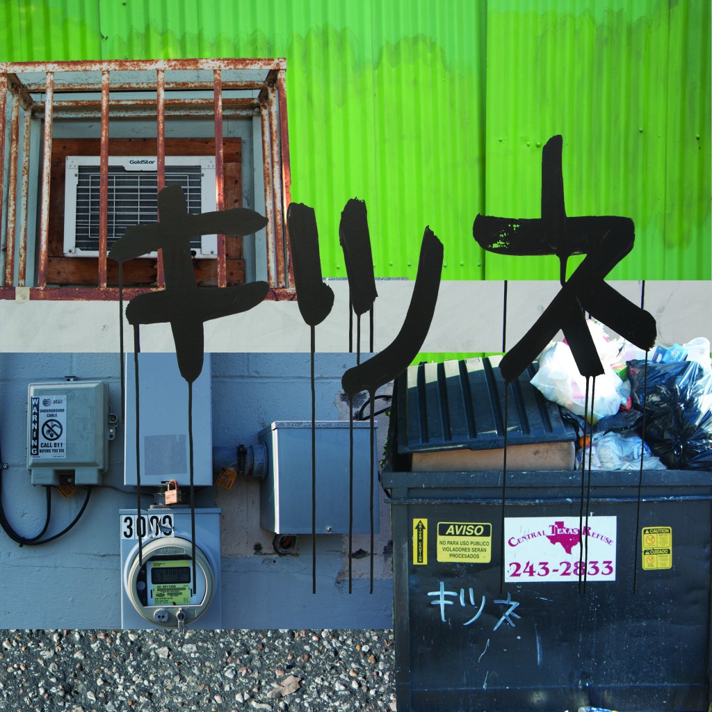
Rubbish Collage spiral 2 spiral 1Process

Screen Shot 2015-11-04 at 4.32.42 AM

October 18, 2015

VISU-1100-01 Blog Post #7

Who did you most relate to? and why?

I related Alex the most because he was a fellow graphic design major, and he was working towards a very interesting project. However, his style greatly contrasted the aesthetic I want to develop. He appreciated making very vintage, crafted piece while I am really interested in more modern looking designs. I checked out the Preacher project and I was interested in getting involved somehow. I tried to get in touch and somehow work with Mr. Roka but he was unaware about the amount of first years in the lecture so I was shot down–I even suggested doing some cleaning work…but no. Shot down.

Who surprised you? and why?

I surprised by Ms. Rebecca Marina because of that grand entrance she made. Also, because I later figured out that she was the late one and I was really hoping that I’d only have to hear 3 presentations, but I was really interested in her work. The fact that she got to work with NASA was pretty amazing. She was also pretty interesting when I spoke to her. She was really vocal about what she was involved in and happily informed and invited the crowd around her to volunteer and check out her work, which was amazing.
What was the most valuable piece of advice you heard today?

The most valuable piece of advice I heard is a very repetitive one–just persevere. Even if it is not explicitly said, through many of the speakers anecdotes, I gather that they had to persevere. They have to dedicate time to invest in themselves, in their craft, be patient, and possibly hear “no” a million-one times before a door of opportunity opens.

October 11, 2015

VISU-1100-01 Blog Post #6

SKILLS INVENTORY

  1. My greatest strengths in Visual Studies I include: My note taking skills and my retention.
  2. For greater success in this course, I need to: Practice the computer skills, time management
  3. My greatest strengths in Rhetoric and Composition I include: My creativity
  4. For greater success in this course, I need to: Read the material more attentively, time management
  5. My greatest strengths in Sex, Drugs, and Counterculture include: Study skills
  6. For greater success in this course, I need to: Take more notes
  7. My greatest strengths in Visual Studies Seminar include: Doing the work, listening in class
  8. For greater success in this course, I need to: Try to apply the habits and skills shown in class
  9. My greatest strengths in Spanish III include: Doing the homework, listening in class
  10. For greater success in this course, I need to: Participate more, speak more
  11. My greatest strengths in Drawing I include: Participating, doing the classwork
  12. For greater success in this course, I need to: Practice the skills, spend more time on homework

Computer skills:

  1. My computer skills include: Adobe Photoshop, Adobe Illustrator, typing
  2. I still need to learn: The Adobe Suite more extensively

Research & writing skills:

  1. My greatest strengths as a researcher/writer include: language used when writing, creativity
  2. I need to work on these aspects of research and writing: time management
  3. I learn best & accomplish most when: I get enough sleep

ACTION PLAN

Sex, Drugs, and Counterculture

  1. I can take better notes.
  2. I need to get better rest before this class.
  3. I can review the material after each class.
  4. I can go to the professors’ offices.
  5. I can sit closer.
  6. Be more attentive.
  7. Ask questions.
  8. Check for homework more avidly
  9. Keep an agenda.
  10. Study more