November 30, 2015

X-tra Blog Post 1

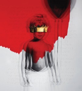
As I anticipated the release of Rihanna’s new soon to be release album, Anti, I came across a very intriguing artist named Roy Nachum. He is the artist behind the album cover of this upcoming album, and I was very stunned by actual artwork placed on an album cover. Word on the street is that Rihanna was in an apartment owned by the very famous couple, Jay-z and Beyonce, and some of Nachum’s work was hanging on their wall, which is caused Rihanna to reach out to the artist so that he may design her album cover.

He is an artist born in Jerusalem but went to Copper Union School of Art in New York City where he currently resides. He is classified as a painter, sculptor and an installation artist. He is known to want his audience to also touch his work. He experimented with braille and now it is apart of his aesthetic. He wishes to communicate to not only through sight but also through hearing and touching. He deals with human perception and his work seeks to open people’s eyes. “The whole idea behind the braille is that people who have sight are sometimes the people who are blindest,” Rihanna.

I was really intrigued by the use of color. It was like a new take on regality and monarchy–a more modern simple way of conveying royalty. But that is not his focus. In the piece “If They Let Us”, he talks about his work not in regard to regality but liberation. This piece is Rihanna’s album cover and he depicted her as a child holding a balloon to represent the freedom a child feels–the freedom of a balloon filled with helium air.

If They Let Us If They Let Us

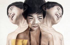
Taishi Hosokawa


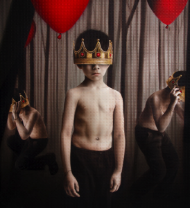
untitled


sources:

Rihanna Enlists Artist Roy Nachum to Design a Bizarre Braille Album Cover

https://en.wikipedia.org/wiki/Roy_Nachum

https://www.roynachum.com

November 30, 2015

VISU-1100-01 Blog Post 12

Part 1:

Kim Garza was the graphic design presenter–of course, but I wasn’t so interested in her work so much. The idea that graphic design is an investment into liberal arts for life was very interesting to me–the idea that you’re constantly learning about other filed is interesting, that is. But I really was rocked to sleep by her work. Perhaps I didn’t get enough sleep (but that’s not the point). I suppose I really appreciate more dynamic graphic work but the repetition of the film and music really bored me.

Ms. Tammie Ruben, the sculptor, really interested me. She really demanded my attention. I really enjoyed listening to the way she viewed the way she grew up and the reasoning behind how that effected her work. Her move and my move from our hometowns did put into perspective the way we view nature and I dig that, even though the outcomes of our mindsets are opposite. And even though I do not plan to have showcases of sculpture work, I really got interested in this medium.

James Lanshuren’s work seemed almost mundane but I really enjoyed that. I like the idea of finding beauty in everyday life and forced perspective and the idea of finding beauty in fault. His photos were really funny in some sense and the situations that caused the circumstances were really interesting to hear about. The quote “having been there”, the tense of photography, really captures his work, and I enjoyed that.

Part 2:

I really enjoyed this seminar. I really felt on fire after almost every class to dive into my field even further: get internships, do some outside work, get a job. I felt like i got a better grasp of what I want to do career wise. The only critique i have about the class is its length. I feels so long and it’s on a Monday at the end of the day.

November 16, 2015

VISU-1100-01 Blog Post 11

Part 1

Throughout all of the professor’s presentations, I gathered that the common thread is development. I felt like all three of them, explicitly or implicitly, advised to develop certain aspects of your work in order to get better–do not be afraid to practice, make a mistake, or explore something about yourself and?or your work.

I feel like Tuan’s presentation just taught me to not be afraid to just work. He really worked himself by working for his father. He experimented with different ideas and conceptualized a lot of ideas, and although a few of them were not put into use, he still found value in creating, working, and developing his style in many different types of mediums.

Hollis’s presentation really got me to think more about myself. Throughout her artwork, one could see her voice clearly, and throughout time that voice became more definite it seems. I think that I should really study what’s my drive to work (what am I try to say through my work). And I feel like that the more I explore my interests, and learn more about myself, my voice will become clearer.

Bill taught me to just do what I want to do. He was making commercial work–work that seemed to provide himself with reliable source of money, but he abandoned that in order to explore different means of work. He developed a style through extracting color and shape to make new images. He developed a technique. I feel like in order to do any work, especially if you want to do something that isn’t done before, you have to refine and develop a technique in order to do so.

Part 2

My goal beyond college is to possibly go to graduate school for design. I ultimately want to work with fashion and/or concerts. I especially like dealing with motion and live performances so concert performances and runway shows are ideal. I’m still learning the conventions of how one gets integrated in designing visuals for those type of shows but in order to be marketable and attractive to employers in this work field, I would probably want to work with motion graphics, continue to work for the school’s fashion magazine, probably the Sorin Oak review as well in the future, get internships in dealing with performance, graphic design, and/or fashion, explore the Adobe Suite, just continue to make and display work, and ultimately develop my voice.


November 9, 2015

VISU-1100-01 Blog Post 10


This is my work for Visual Studies I–dealing With collage and harmony.

Collages

Collage #1

Collage #2

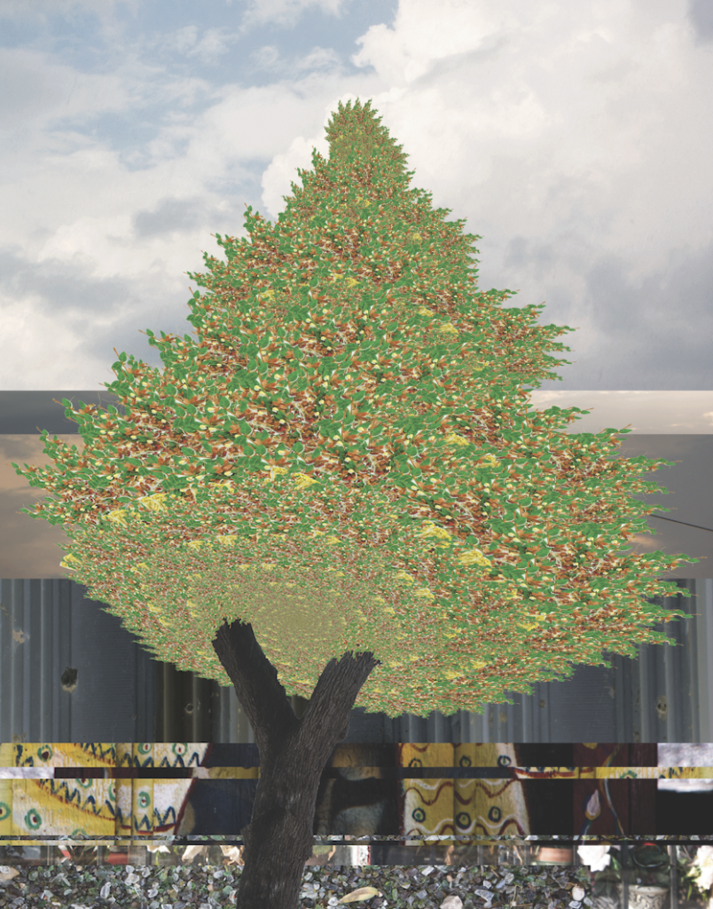
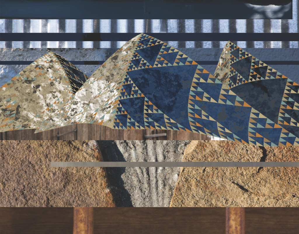
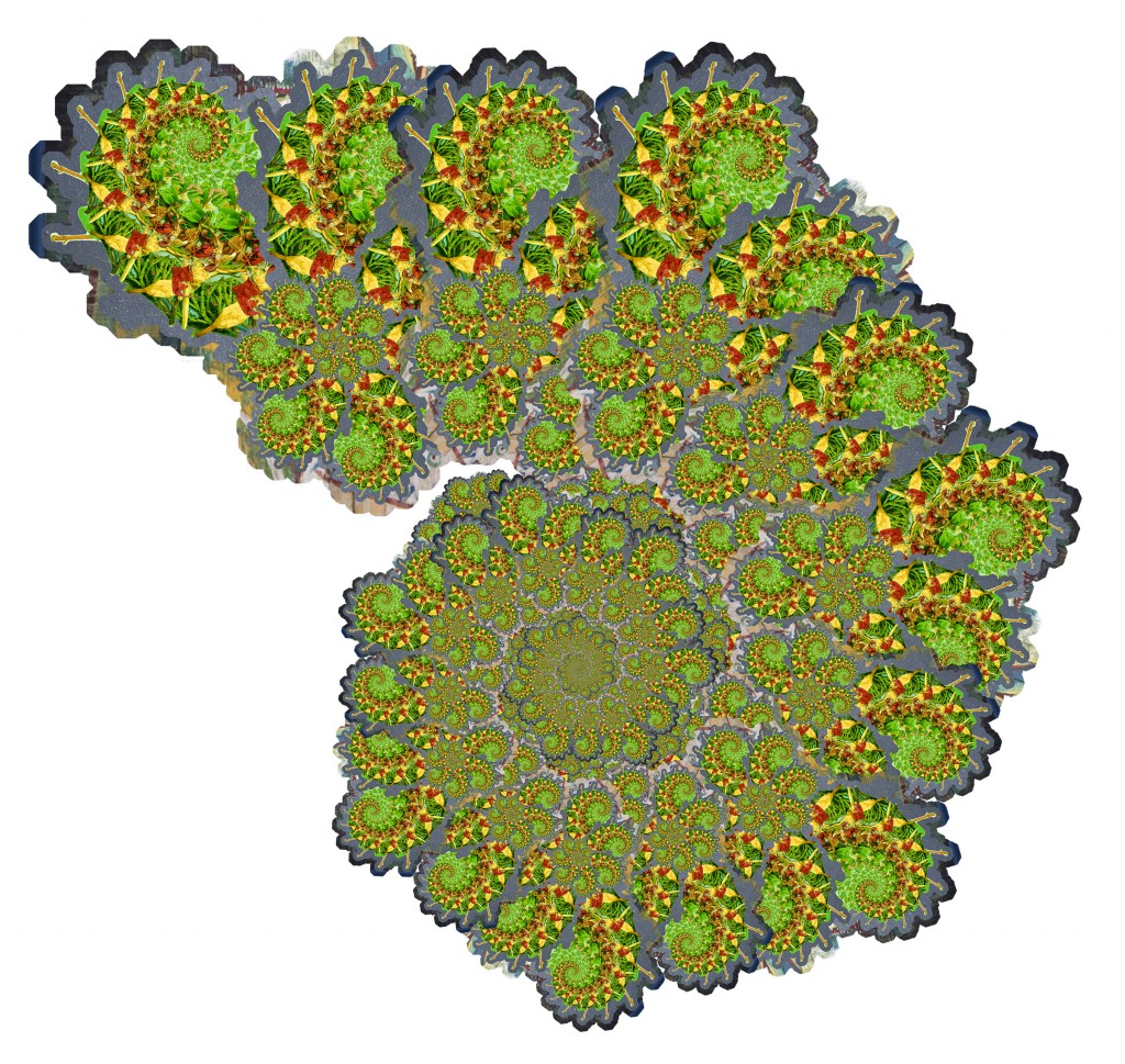
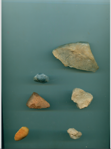
From the beginning of this project I was infatuated with the idea of a building block, and this idea relates back to my theme in the Gestalt project. Nature has it’s very complex and unique set of building blocks that differ from man’s constructs. Even though man is a product of nature, his constructions are not as intricate or complex as nature. I demonstrated this idea by using fractals to form natural constructs. I scanned rocks and plants I found on S Congress, put them into a pattern, and produced a figure that resembles something in nature– collage 1 being a tree (scanned plants) and collage 2 being a mountain (scanned rocks).


November 2, 2015

VISU1311 Project #2 Collage Jamaal Tribune

Collages

Collage #1 Collage #2

From the beginning of this project I was infatuated with the idea of a building block, and this idea relates back to my theme in the Gestalt project. Nature has it’s very complex and unique set of building blocks that differ from man’s constructs. Even though man is a product of nature, his constructions are not as intricate or complex as nature. I demonstrated this idea by using fractals to form natural constructs. I scanned rocks and plants I found on S Congress, put them into a pattern, and produced a figure that resembles something in nature– collage 1 being a tree (scanned plants) and collage 2 being a mountain (scanned rocks).

Practice

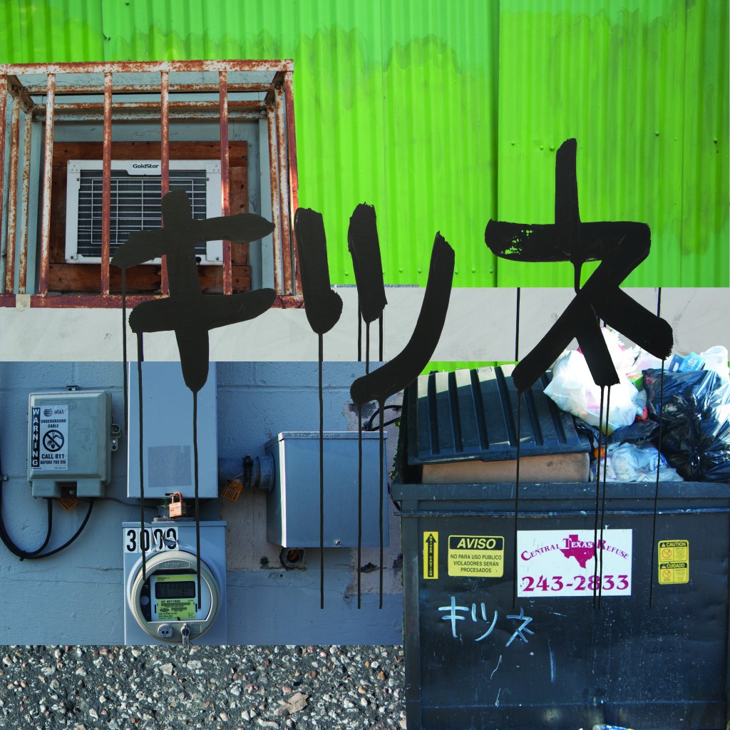
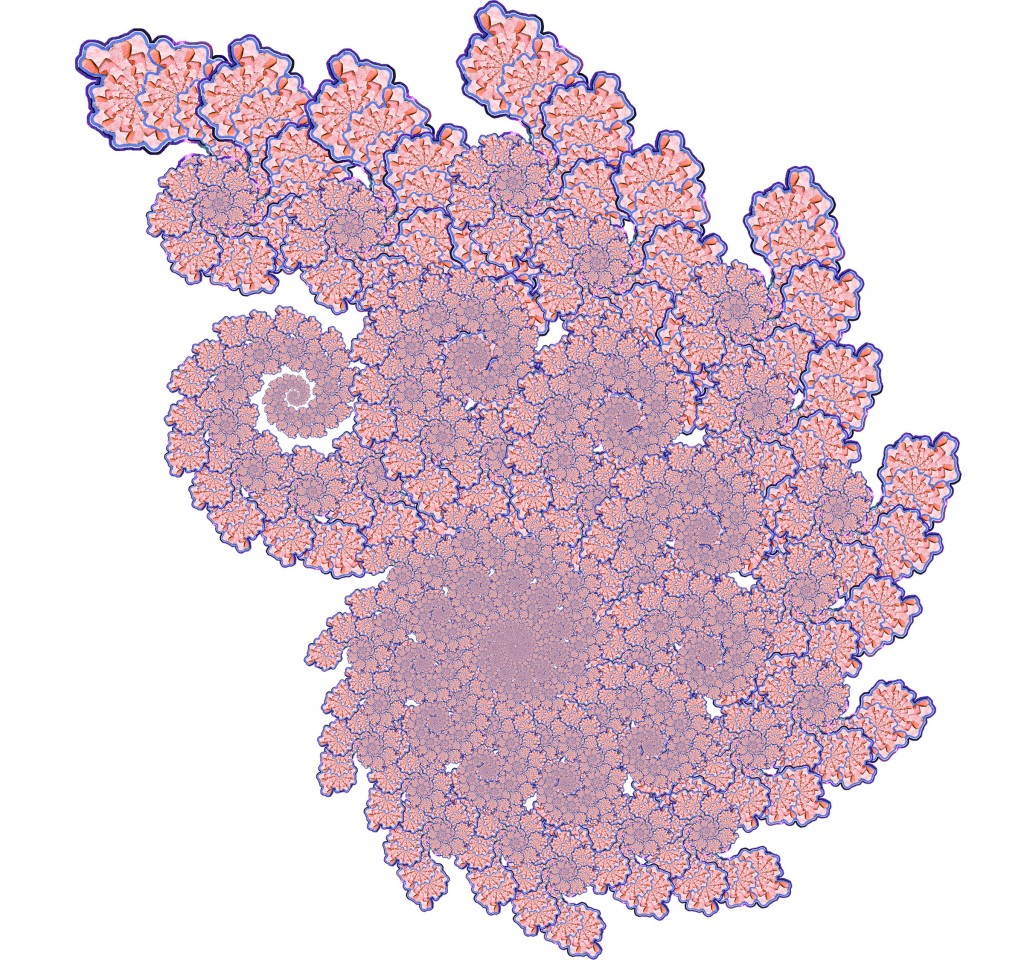
Rubbish Collage spiral 2 spiral 1Process

Screen Shot 2015-11-04 at 4.32.42 AM