Part 1:
These images are two of the photos from my Gestalt project from my Visual Studies I class. The prompt was simply, ‘how do you make an image?’. My transition from Hāwala, Honolulu, HI to Austin, TX allowed me to notice, more clearly, the clutter of manmade constructs but also how they mimic nature. So I based my project on the idea of an ‘urban forest’ or a ‘concrete jungle’. I shot photos like I would shoot nature, and I focused on how figures directed the viewers eye around the photo and how figures framed negative space.
Part 2:
My Gestalt Project:
GESTALT
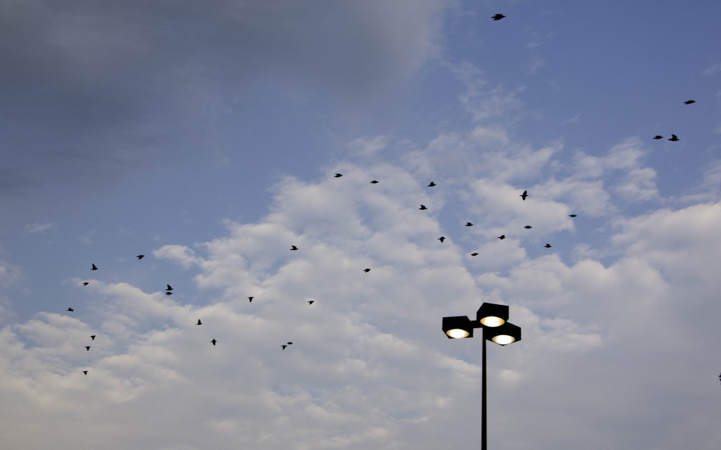
The birds in this photo create continuity through their formation, leading one’s eye diagonally across the photo. There is also similarity and repetition between many of the birds as some have birds have similar forms to other birds in this photo while the flock as a whole showcase the many forms of a bird in mid-flight.
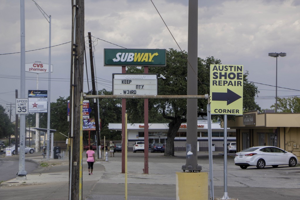
The intersecting lines in this photo frame the negative space within the photo contributing to figure ground. There is also repetition of upward constructs and symmetry between the the two bigger poles towards the foreground and the poles upholding the Subway sign in the background.
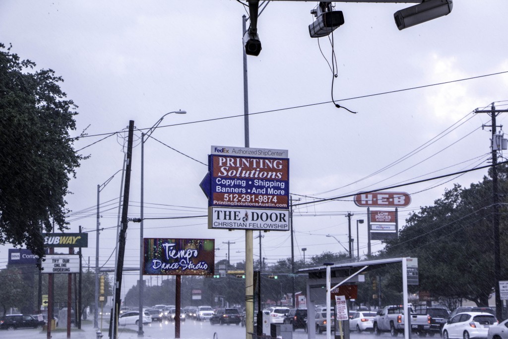
The upward constructs in this photo create repetition, and the many cluttered figures in the photo like: the busy traffic, the power lines, or the security cameras lead the viewers eyes all around the image.
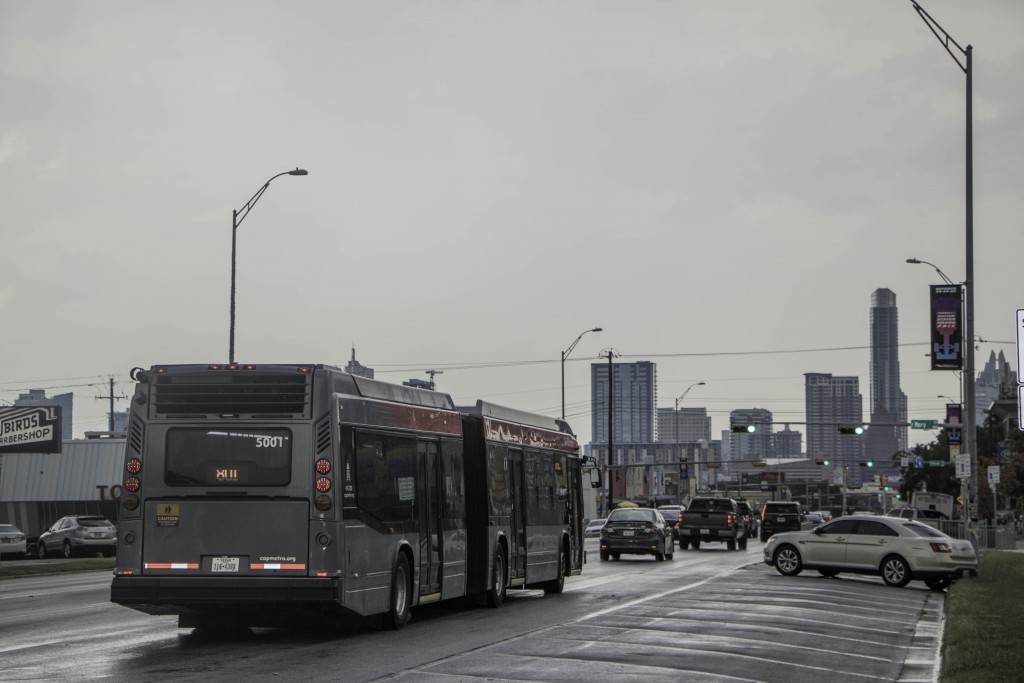
The bus leads the viewer’s eye towards the skyline, and the buildings are in close proximation to each other, which creates a new shape…ergo skyline.
The poles in this photo get smaller in size and the proximity from one construct to the next get closer, which reminds me of the golden ratio.
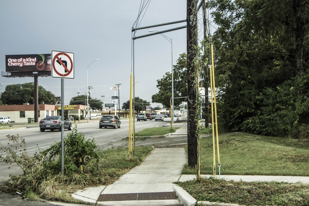
The poles and wires in this photo frame the negative space, and the negative space create various linear shapes. The figures in this photo are also in various proximities of each other.
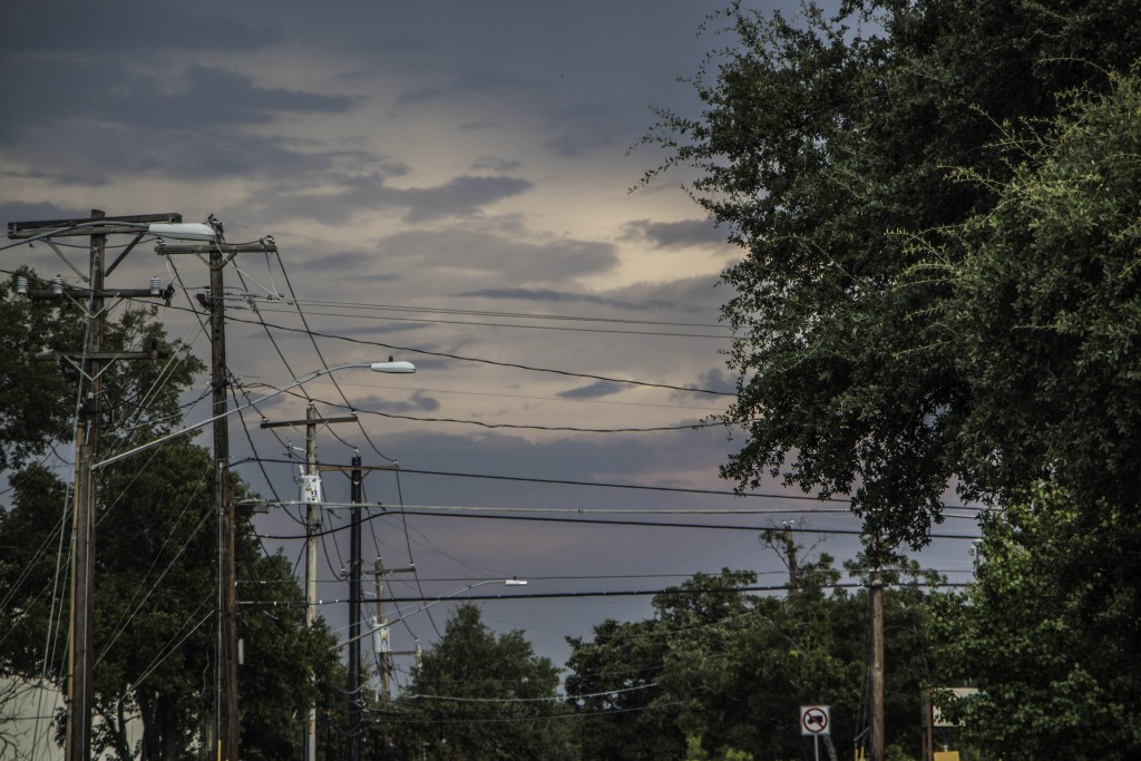
The utility poles in this photo repeat into the background, and the web of converging power lines lead the eye into the background as well as across the photo. The trees frame sky as the the power lines form shapes out of the negative space in the sky.
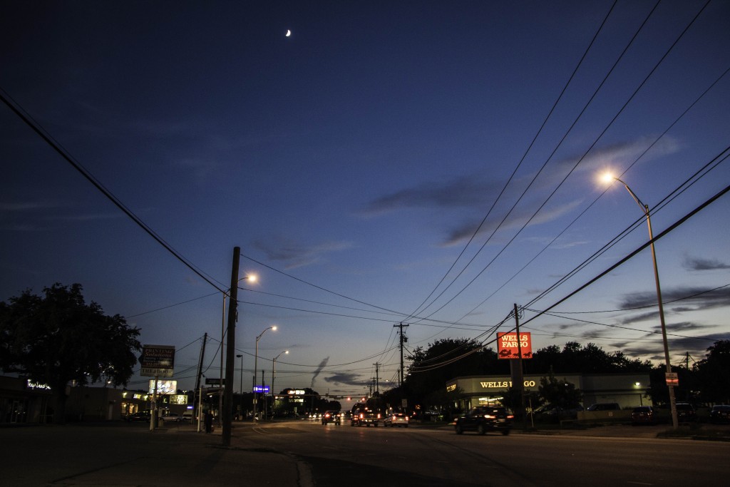
This photo displays the continuity; the power lines guide the viewer’s eyes back into the photo.
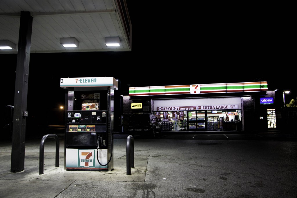
In this photo, the gas pump is one of the main focal points: it’s illuminated by light, it’s in the foreground, and it is one of the bigger objects. However, its lines and the lines of the roof above it point towards the convenient store. The focus then leads towards the illuminated top of the store which has lines that lead to the seven. Continuity.
Self-Critique:
The strongest aspect of this piece is my purpose for all the photos. Although some photos are more pleasing and engaging than others, I would argue that all my photos showcase the intellect of a developing artist. The weakest aspect, I would say, would be lack of emotion connectivity. Some photos do appeal to the audience’s emotion but it’s not consistent throughout the collection which would have made my project stronger. These photos, however, were intentionally taken from a more intellectual standpoint. I thought that my composition was pretty good already. The only way I could think of having better composition is to make more apparent comparison between nature and human construction in an urban setting, which is how I could also conceptually make this project better. Technically I could have edited my photos a bit more. Even though some the photos I took weren’t necessarily bad, Joe is weary of seeing a good looking gas stations. I could be a bit more original and creative I suppose.


