September 30, 2015

VISU 1311 Project #1: Jamaal_Tribune

GESTALT
2015. JAMAAL TRIBUNE. GESTALT.

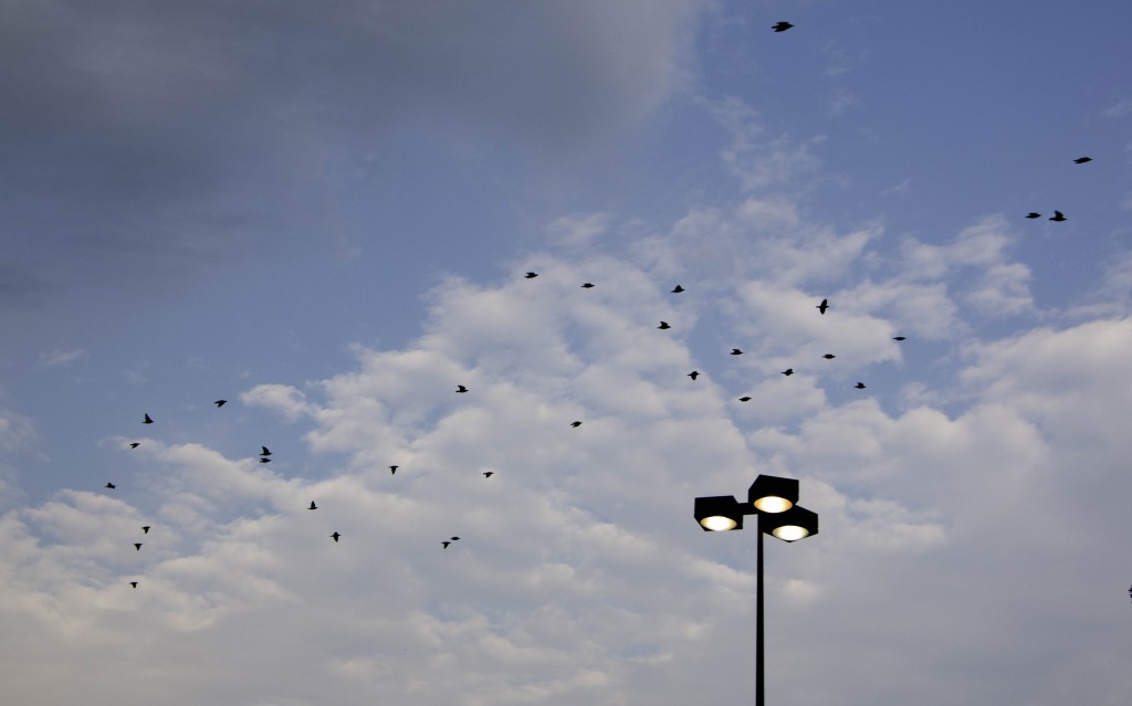
The birds in this photo create continuity through their formation, leading one’s eye diagonally across the photo. There is also similarity and repetition between many of the birds as some have birds have similar forms to other birds in this photo while the flock as a whole showcase the many forms of a bird in mid-flight.
2015. JAMAAL TRIBUNE. GESTALT.

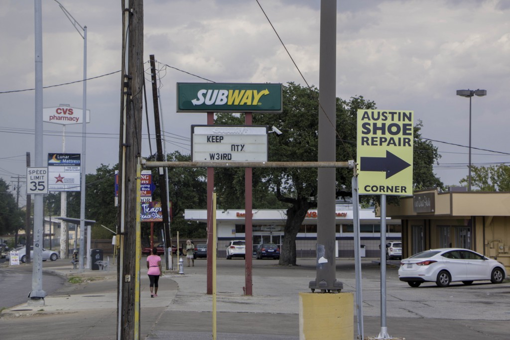
The intersecting lines in this photo frame the negative space within the photo contributing to figure ground. There is also repetition of upward constructs and symmetry between the the two bigger poles towards the foreground and the poles upholding the Subway sign in the background.
2015. JAMAAL TRIBUNE. GESTALT.

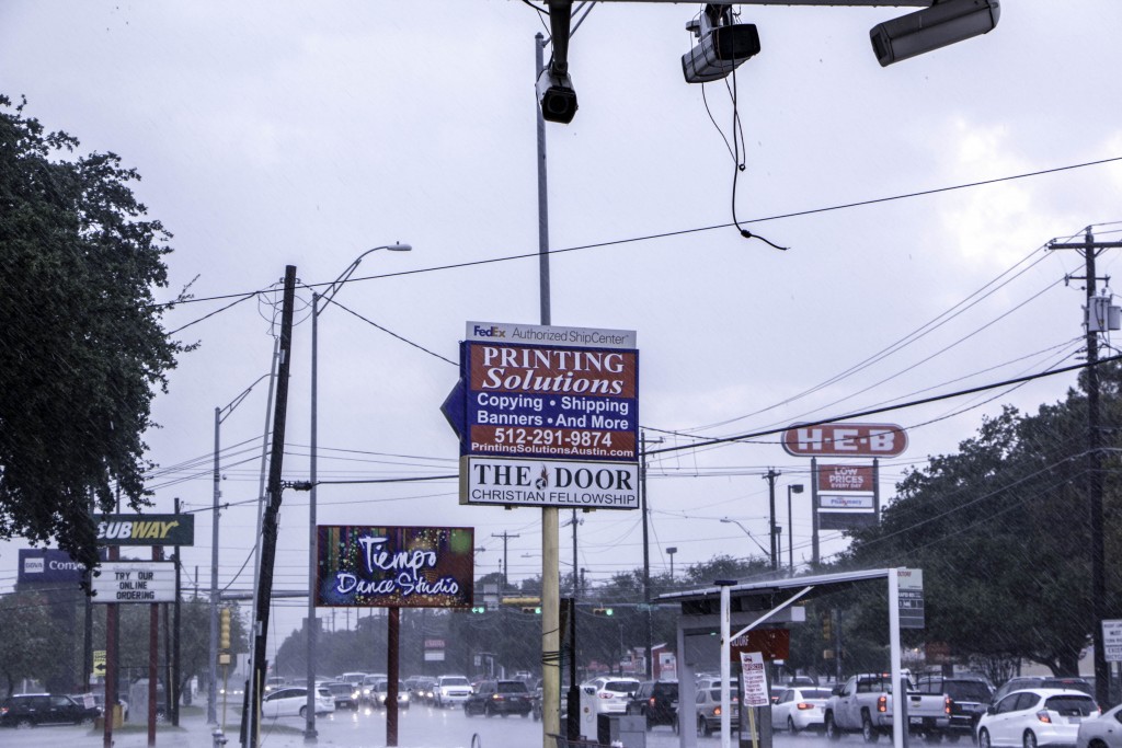
The upward constructs in this photo create repetition, and the many cluttered figures in the photo like: the busy traffic, the power lines, or the security cameras lead the viewers eyes all around the image.
2015. JAMAAL TRIBUNE. GESTALT.

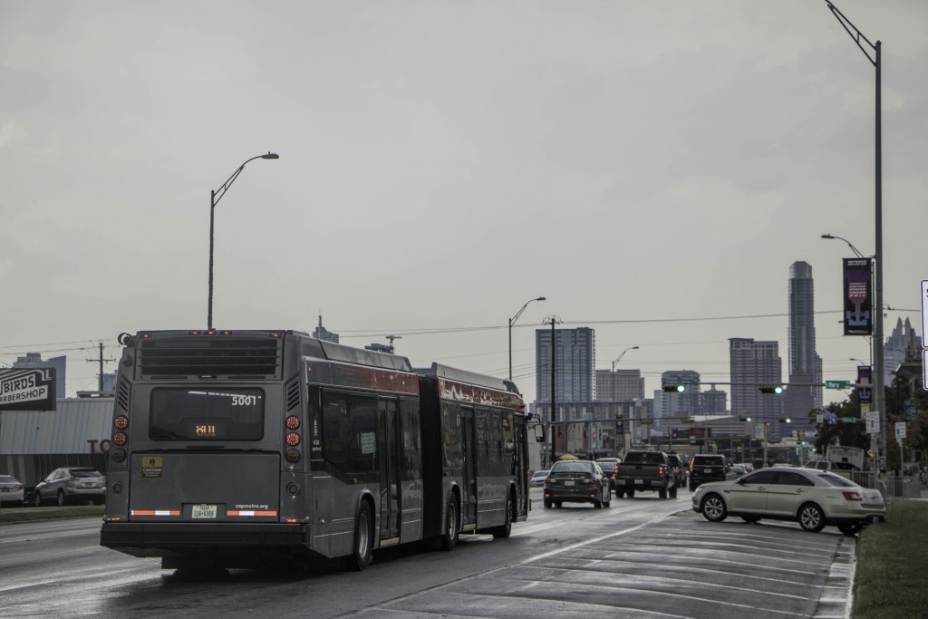
The bus leads the viewer’s eye towards the skyline, and the buildings are in close proximation to each other, which creates a new shape…ergo skyline.
2015. JAMAAL TRIBUNE. GESTALT.

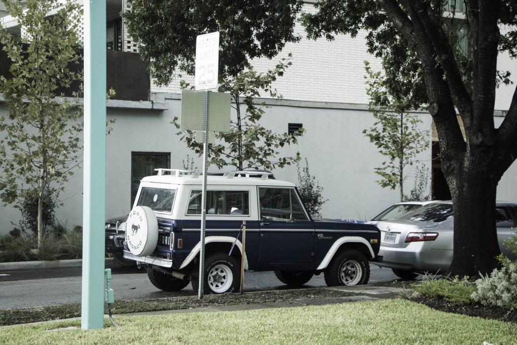
The poles in this photo get smaller in size and the proximity from one construct to the next get closer, which reminds me of the golden ratio.
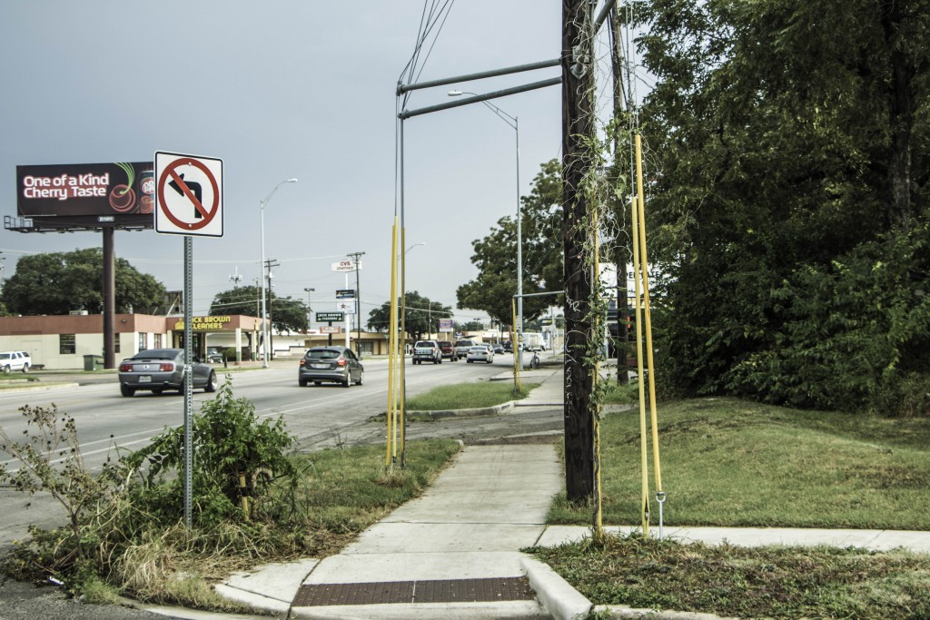
2015. JAMAAL TRIBUNE. GESTALT.

The poles and wires in this photo frame the negative space, and the negative space create various linear shapes. The figures in this photo are also in various proximities of each other.
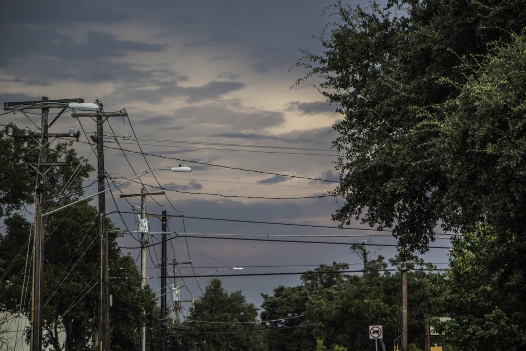
2015. JAMAAL TRIBUNE. GESTALT.

The utility poles in this photo repeat into the background, and the web of converging power lines lead the eye into the background as well as across the photo. The trees frame sky as the the power lines form shapes out of the negative space in the sky.
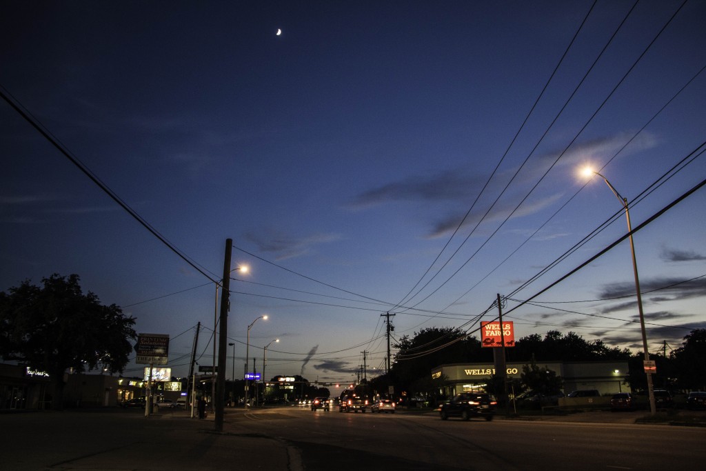
2015. JAMAAL TRIBUNE. GESTALT.

This photo displays the continuity; the power lines guide the viewer’s eyes back into the photo.
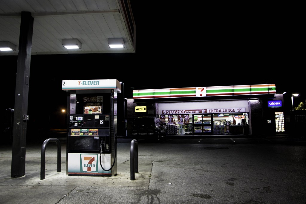
2015. JAMAAL TRIBUNE. GESTALT.

In this photo, the gas pump is one of the main focal points: it’s illuminated by light, it’s in the foreground, and it is one of the bigger objects. However, its lines and the lines of the roof above it point towards the convenient store. The focus then leads towards the illuminated top of the store which has lines that lead to the seven. Continuity.

THIS ENTRY WAS POSTED IN PROJECT 1: WHOLE & PARTS. BOOKMARK THE PERMALINK.
September 28, 2015

VISU-1100-01 Blog Post #4

Part 1:

One of the biggest pieces of advice I got from the speakers is to dive into my field right away. Although I may not have a totally complete assortment of skills, I can still involve myself by taking on minor internships and going to many different galleries. There are various opportunities, on and off campus, that can fulfill my need to get more exposure in graphic design and promote my success.

Rachel Broussard does not show much of her own input on her blog but more of her inspirations. But nonetheless it’s still interesting to see the how many different elements make up an artist.

Caelan Navarrete’s blog is more analytical of different artists and their work and she’s being critical about it.

Shelby Savage’s blog is more about her growth as a graphic artist, and she explains her past projects and her style. He enjoys simplistic and systematic styles of design and it definitely shows in her work.

Paul Young IV has a posted his portfolio online and it seems very good. He likes to play around with text and his design are a bit more dynamic as he toys with text and pattern.

I’m a bit impressed that Crissy Smith has her name as her web domain. She is a photo and communications major and her latest focus were firefighters. In this collection she showed their rugged and selfless occupation.

Juliana Ramirez also has her name as her web domain. This is also more of a portfolio. Her photos are loud and striking.


Part 2:

I liked Caelan’s blog: https://sites.stedwards.edu/cnavarr7/ because it is a critical of other’s art, and I get to see a critical outlook on art.

Paul’s portfolio, paulyoungiv.squarespace.com, displays a style of design I admire. There is excitement, pattern, texture, and color, but there is also a simplistic edge to his work.

Crissy’s portfolio, http://www.christinfsmith.com, is striking because of how naked she seems displays her environment.

Juliana’s blog, http://www.isabeljuliana.com/, is more conceptual photography and I love it. Her images seem less conventional and more attractive to me. I like her use of form and color. It greatly attracts my eye.

September 23, 2015

VISU1311: Creativity Blog #7

This week’s reading and audio seemed really spastic. There seemed to be a discontinuity between each subsequent thought and idea. However, I did receive, especially from the reading, that media is a very influential means of expressing ideas. All aspects of our lives, more so today, in the post-modern world, are affected by the use of media, but not only that, the medium also affects how we perceive the information. The audio seemed to be a bit less pleasing than the reading. The reading provided pictures that helped me to stay attentive and alert. I suppose if I feel lost or confused, I rather see confusion rather than hear confusion. I also picked up that through the changing world, we can recreate narratives by deconstruction and reconstruction of different elements.

September 21, 2015

VISU-1100-01 Blog Post #3

Ruslan Khasanov is a Russian born designer (1987-). The basis of his work involves motion, color, and melody. I am very intrigued by harmony of those elements combined with various structured and organic shapes, movements, and patterns. There seems to be duality between structure and organicity. At first, I thought about man and his constructs and how man opposes nature when looking at his video art, “Warm up”, but then I thought about how nature is structured and how man’s constructs mimc nature. Telephone posts tower like trees, slanted rooftops work like leaves when deflecting rain, and the Village Hall on campus looks like a geode. The harmonious relationship betwixt the elements used in this video remind me that nature is strong yet supple.

September 14, 2015

VISU-1100-01 Blog Post #2

Part 1:

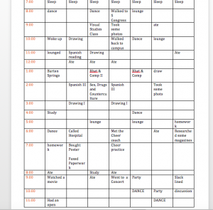
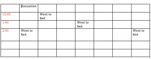
I suppose I’m semi-productive when it comes to school. I get a bit of work done here and there but it does seem that dancing is a huge part of my day.

Screen Shot 2015-09-14 at 12.49.46 PM Screen Shot 2015-09-14 at 12.50.08 PM

Part 2:

High school I took a graphic design class, my artwork became based around a few projects I did in high school. One can definitely see my appreciation for shape and texture. I suppose that statement describes my dancing as well. I really appreciate body shapes and form when dancing. Old school voguing interests me. Magazines, models, and how models communicate mood and emotion intrigues me. I think a good dancer has various textures in his movements. Contrast causes visual interest.


Screen Shot 2015-09-14 at 2.00.50 PM Screen Shot 2015-09-14 at 2.03.16 PM Screen Shot 2015-09-14 at 2.03.50 PM

September 9, 2015

VISU1311: Creativity Blog #6

I find this podcast to be very relevant to the ideas that we are discussing in class. The Gestalt ideas are not unique to visual but also auditory forms of expression and I’m glad that this was appointed to me. These musicians are discussing the make up of “Inside Out” and there are different parts that make a whole. The drums, the melody, the sampling are all components of the songs. They may or may not sound pleasing when listened to separately, but when they are together, the sound is one and each component functions properly in order to create an entire song in the same way different visual components make up the arrangement of a photograph or painting. I think this idea is pretty cool.

September 9, 2015

VISU1311: Creativity Blog #5

The name Stellar reminds me of space. I definitely saw that when I watched the video. There was an array of flashing blotches of color, which was really interesting. The colors were dim but saturated. There were a consistency of white circles that kept appearing that resembled stars in the night sky. The flashes of color create dynamism. I also noticed that the video was silent. I thought about the voidness of space and its loneliness. However, the quick changing images seem to create a rhythm and in my mind it creates a sort of artificial sound.

But I’m not completely sure why anyone would find any great interest in this piece.

September 9, 2015

VISU1311: Creativity Blog #4

Amy Tan really related to me, and I bet with a vast number of other artisans, when she spoke of the connection between a natural predisposition for mental illness and creativity. I have been diagnosed with depression and anxiety along with BPD (borderline personality disorder). One thing that is really typical of people with BPD is that they daydream a lot, and when there is a high level of stress fantasy becomes real and our perception of reality of distorted. In extreme cases, a person with BPD seems psychotic but really isn’t. These untypical perspectives while in a crisis state, I think, contributes to creativity. Art, when it’s expressed clearly and well, communicates and convinces the audience of the existence of almost a different realm. This typically makes people with mental illness more equipped for that specific since they’re perception of reality is obliviously different than someone without mental illness.

She also speaks that creativity is derived from past experience. Inspiration and drive come from the key factors of one’s life. Each person’s experience as a human is different. This equips an artist with a unique perspective, thus adding towards his creativity.