Advanced Typography: Weather Report
This assignment required me to think about hierarchy. I had to think about information relationships as well as spatial ones to best convey the information I was given. Conveying hierarchy successfully as well as utilizing AfterEffects proved to be a difficult task, and in the video you can see that the beginning started off strong, but the end design is a little weaker. This is perhaps due to my frustration with AfterEffects and its laborious nature, however, I am happy with the result and what the project taught me. I came away from the assignment with a greater understanding of information relationships, which are crucial things to understand to function in this era of information.
GDES III: Locating Place, Book
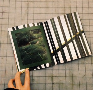
For the book project, I tasked myself with the challenge of trying to emulate a more experimental and modern aesthetic. After looking at countless blogs and tumblrs for inspiration, I felt that making a book with experimental grids and varying color palettes was feasible. What I learned, however, is that even highly minimal and seemingly haphazard design is even harder to execute than I had imagined. To create successful, punchy spreads, one must be extremely sensitive to white space, colors, positioning, and the overall mood of the book. Although I think I could’ve gone further with the design, given the time limitations, I’m pretty happy with the end result.
GDES III: animated gifs
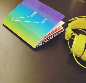
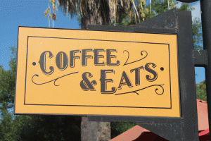
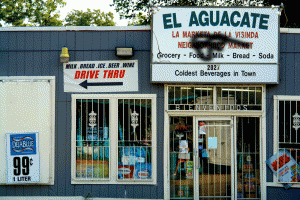
This project was both simple and complex. Gifs are simple in makeup, yet hard to do successfully due to the nature of how they are composed by static images. Keeping this in mind, I wanted to make simple gifs that did not overemphasize the medium itself, rather, the content. After several iterations, I decided on drawing attention to the typefaces seen in east Austin and how they interact with each other– where they diverge and where they intersect. My findings were exciting. While I had expected many of the “typeface mashups” to be out of place, many of the older typefaces I chose to superimpose on newer, more urban typefaces seemed to fit in flawlessly, which indicated that many of the new typefaces we are seeing in east Austin currently are just reinvented versions of older, classic type forms.
GDES II: Place Video
For the “place” video project, I chose an outdoor location I had never been to called Walnut Creek. Because I was unfamiliar with filming and editing, the project proved to be challenging as I had to learn new techniques and concepts that required me to pay more attention to nuances such as cuts, music, and mood. Although the filming of my video isn’t professional grade, I think I gained a greater understanding of the various facets that go into portraying a place, its environment, and its mood by paying greater attention to details. In the end, I think my video succeeded in portraying an overall sense of delight and happiness, which is what I aimed to convey.
GDES II: T-shirt Design
The T-Shirt project was a challenge in that we had to collaborate with a group that was not of our choosing in addition to coming up with a design that could be executed in a single color (due to the screenprinting limitations). On the first day, our group spontaneously came up with the idea to be team “Zetus Lapetus,” because we quickly found we all shared a fondness for the 90s cult Disney classic. Going with the theme of outer space and childhood nostalgia, we looked to vintage NASA posters for inspiration. Many of them were intricate and integrated solar systems or constellations into the design. Due to our limitations, our designs could not be nearly as complex. After several iterations and several screenprinting tests, we decided that minimal and clean is better than intricate and messy. Our final product came out clean and emphatic, as we chose a bright blue ink set against a black t-shirt.
Graphic Design II: Instructions and Memento Packaging
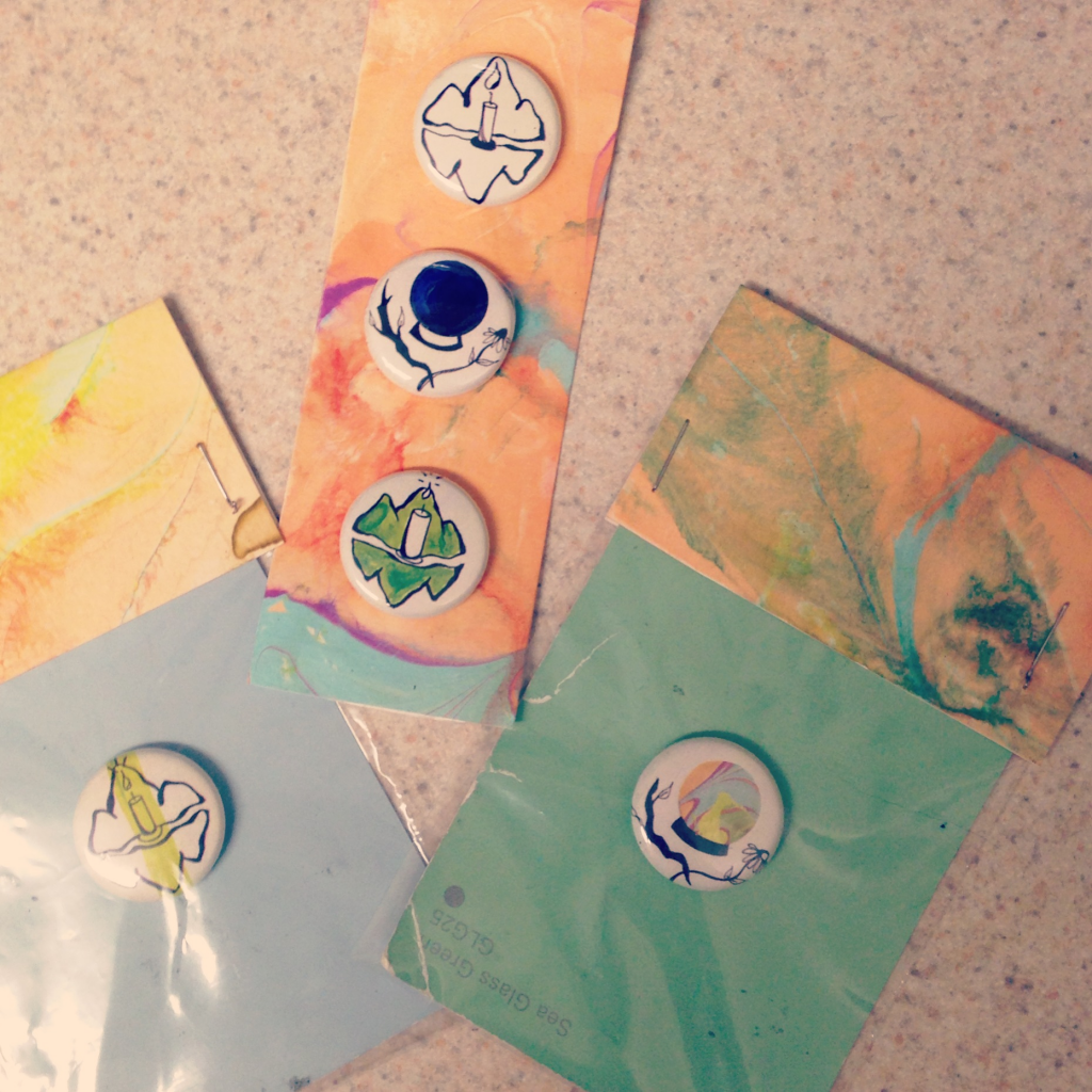
This project was fun in that it combined an unfamiliar process (button-making) with iconography. To articulate a concept in icon form is a difficult task and much of my process centered on drawing a multitude of iterations as well as considering how their packaging would facilitate and complement the design of the buttons.
Graphic Design II: Backpack
https://drive.google.com/file/d/0B0Bi3wZdYoRCU2wtMF9QSFVOdmM/edit?usp=sharing
(I apologize for the link, I’m currently in New York on emergency and my friend doesn’t have InDesign on her computer for me to convert it to a png or pdf)
This project was intended to challenge our sense of spatial design by organizing ordinary items found in one’s bag. Technical aspects were also flexed such as photography skills, photoshop skills, and concepts of size and perspective.
