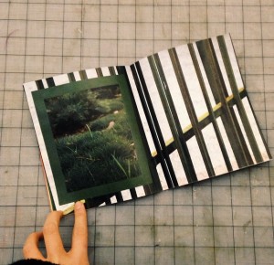
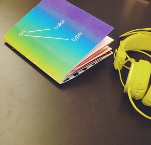
For the book project, I tasked myself with the challenge of trying to emulate a more experimental and modern aesthetic. After looking at countless blogs and tumblrs for inspiration, I felt that making a book with experimental grids and varying color palettes was feasible. What I learned, however, is that even highly minimal and seemingly haphazard design is even harder to execute than I had imagined. To create successful, punchy spreads, one must be extremely sensitive to white space, colors, positioning, and the overall mood of the book. Although I think I could’ve gone further with the design, given the time limitations, I’m pretty happy with the end result.


