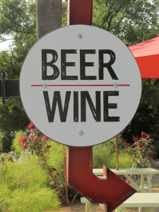
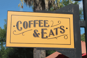
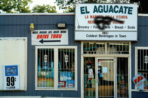
This project was both simple and complex. Gifs are simple in makeup, yet hard to do successfully due to the nature of how they are composed by static images. Keeping this in mind, I wanted to make simple gifs that did not overemphasize the medium itself, rather, the content. After several iterations, I decided on drawing attention to the typefaces seen in east Austin and how they interact with each other– where they diverge and where they intersect. My findings were exciting. While I had expected many of the “typeface mashups” to be out of place, many of the older typefaces I chose to superimpose on newer, more urban typefaces seemed to fit in flawlessly, which indicated that many of the new typefaces we are seeing in east Austin currently are just reinvented versions of older, classic type forms.


