Blog Post #10
The speakers we had last week were Nate and Anne Austin who have their own video game startup. Their talk was interesting, to say the least. I learned that making a video game was hard and that you need a detailed plan or structure to generally stick too otherwise you’ll burn. But it was nice to see them go through the steps of development and hear their struggles. And their game looks pretty nice.
The question I have for the faculty presentations is that ” If you could go back and change one about your career, what would you change? Your actual career, a certain mistake, etc.
Blog Post #9
For the Alumni Presentations, I enjoyed them. Especially the last one. I found her art style, especially in her paintings to be aesthetically pleasing to my eye and I really liked her style. It was also nice seeing where they all ended up at, and how that has influenced me in some ways to either work for a company full time or go full freelance. I understand how important non-profit work is, but to work in a team that size and try to meet deadlines without killing myself would be a pain.
3 internships – As I’m also minoring in digital marketing I want to might do some internships in that field as well
Blog Post #7
1. My major in art will help my career in the future as art is what I want to do with my life. Either solo or combining with another subject such as marketing (visual marketing) or becoming an art teacher. My backup major is Fashion Merchandising, which is sadly not at St. Edwards, so I would have to transfer to Texas Women’s University


2. As you can see I do have a minor in digital marketing, as in the future I might want to go into the marketing filed as social media manager for an arsty – farsty company or even making ads for a company. But right now I actually do not think I want to go into marketing but teaching as hearing in the visual studies seminar that all the art kids who took a teaching minor got jobs is making me want to switch. Considering I also want to get my masters in fine art and another bachelor degree in Fashion Design and Fashion Merchandising, it would be nice to have a job.
Blog Post 6
SKILLS INVENTORY
My greatest strengths in Writ and Comp include: Never giving up, even though I constantly do not know what is happening
For greater success in this course, I need to: Go to the writing centre more often and not waiting until the day of to do essays
My greatest strengths in Printed Page and Silver Screen include: doing the homework, actually watching the movies, and having an interest in film
For greater success in this course, I need to: Not procrastinate the homework so much
My greatest strengths in Drawing 1 include: Knowing how to draw, being a perfectionist, knowing my strengths when it comes to art
For greater success in this course, I need to: Plan out my time more, do less of my style and more what is required
My greatest strengths in Visual Studies include: My willingness to learn about these concepts I may or may not use in the future
For greater success in this course, I need to: Apply myself more to think outside of the box
My greatest strengths in Visual Studies Seminar include: Being open-minded about others art and having a want to learn about others inspiration. And I do the homework on time
For greater success in this course, I need to: Ask questions to the visiting artist
My greatest strengths in Honors Seminar include: Taking great notes
For greater success in this course, I need to: Do the responses earlier
Computer skills:
My computer skills include: Knowing Google docs and their system, very little photoshop, and how to procrastinate with youtube
I still need to learn: More photoshop and other Adobe systems
Research & writing skills
My greatest strengths as a researcher/writer include: Knowing where to look and how to fake it
I need to work on these aspects of research and writing: My grammar mainly
I learn best & accomplish most when: I know what I need to do and enjoy it
ACTION PLAN
The class I could do better in is Drawing 1
- Take more time to draw in my free time and build up my skills
- But less of my style in the drawings
- Try not to get so annoyed
- Follow the drawing rules that work for me
- Take more pictures of the subject from different viewpoints
- Work on geometric drawings
- Shade better
- Work on sizing of the object
- Also on composition
- Work faster
Blog Post 5
PART ONE
- I really enjoyed seeing Clara’s landscape work. She has an eye for detail, and her photos from Europe were wonderfully done. When she commented on how she did not mesh well digital camera’s and I sympathize with that. I am a traditionalist artist so photoshop and all this digital stuff are weird to me. I like using my hands and having material in front of me. I can understand where she is coming from.
- Michelle’s work was amazing. It is childlike but without being childish. Her style is very popular nowadays, with its whimsical lines and nonproportional body. Definitely, something you would see on one of those kids shows that a bunch of adults like. Like Steven Universe for example. While it is not my style of art, I can still appreciate it and her work ethic.
- Hanna’s typography was very nice and I adored her typeface she made with leaves and flowers. It’s very kitschy and something people would use for their mommy blogs or Esty ventures. Which is still good, if she charges for use of it she could make some money. I think her designs were cute, slightly vintage and overall very nice.
- I actually quite liked how Alexis focused on more job and overall skills needed in the workforce. It was a nice change of pace compared to everyone who just showed their art. It showed her character values, and how she overall wants success for people here in her major. I respect her for that.
PART TWO
- https://www.designerhelen.com/
- I love the layout with the links on the side of her main header with her name. It is very sleek, simple but you can tell that she is an actual fashion designer and not into the fast fashion world. Her pictures of her collection are clear and the photos are well done. I like how small they are so you can see all of her collection without having to scroll forever. And her for her shop link, she has a picture of her size chart for ease of use.
- https://www.avanirui.com/
- I like the gif she has displaying some of her work when you open up her website. The website is very easy to venture through and use. I personally love her portfolio and how she has them all grouped together by project. Instead of how others just dumped everything onto one long page. The fonts she used are eye-catching and follow the theme and aesthetics she has.
- https://www.latexlucifer.com/
- His website is simplistic, minimalist with works with his art as it is loud, gory, and out-there. Instead of the website being the main focus, the photographs are.
- http://www.marisaellison.com/
- Same with the latexluicifer website, it lets the work talk without any other extremities. The size of the photos are big, so you can see the photographs without squinting or missing details. Also, she has put the photos together to the point where your eye goes to every photo and not skip over some. Finally, she puts what magazine, website, etc. the photo was in below it for ease of searching.
Blog Post 4


- The goal of the assignments was for the first one, draw one of two bags realistically an accurately. As you can see I am not finished with the drawing. And the second was for Visual Studies Harmony project. It is one out of two of the analogue collages. You had to create something that had harmony, from the use of colour, line, dots, etc; while leaving artistic intent at home.
- For the first project, it is not finished but right now I feel like I am going in the right direction. For the second one, I bought a couple of black and white postcards that went together. And I cut them out in a way to get harmony as well as balance out the different tones of black.
Self Critique – On Collage
- The strongest aspect is the colours and the balance between the lighter pink toned greys in front and the darker sepia tones in the back. It makes it more eye-catching and your eye lingers on the way the colours shift and blend into one another.
- The design is the weakest aspect. I should have done a more interesting shape and layered the pictures over one another in a more strategic and pleasing way.
- Changing the overall design, cutting out different parts of the ladies other than their upper parts.
- Technically, I would change my cuts as I am not used to using an x-acto knife, so my cuts are not as exact as they could be. And I would have printed on better paper either ultra premium matte or lustre.
- Additional I would maybe change my use of postcards. There were these Mexican colourful postcards that showcased movie posters. I was thinking of doing a face with those postcards but the naked ladies just caught more eye.
Blog Post #2
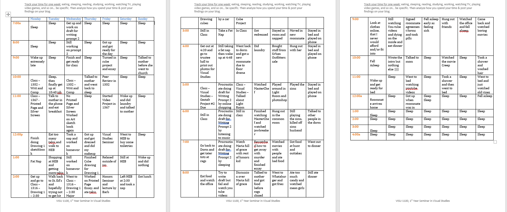
Looking back on my time sheet made me realize how much I procrastinate my school work and how I honestly do not have a social life. I very much am a homebody, and I’m usually stressing to get my homework completed, especially if it is an essay or a draft. Part of me wants to kick those habits in the butt but then realistically I know that will probably never happen as I’ve been doing and procrastinating everything and anything since 3rd grade. It’s a habit that I am used too. And I wished I had more a social life but what can you do.
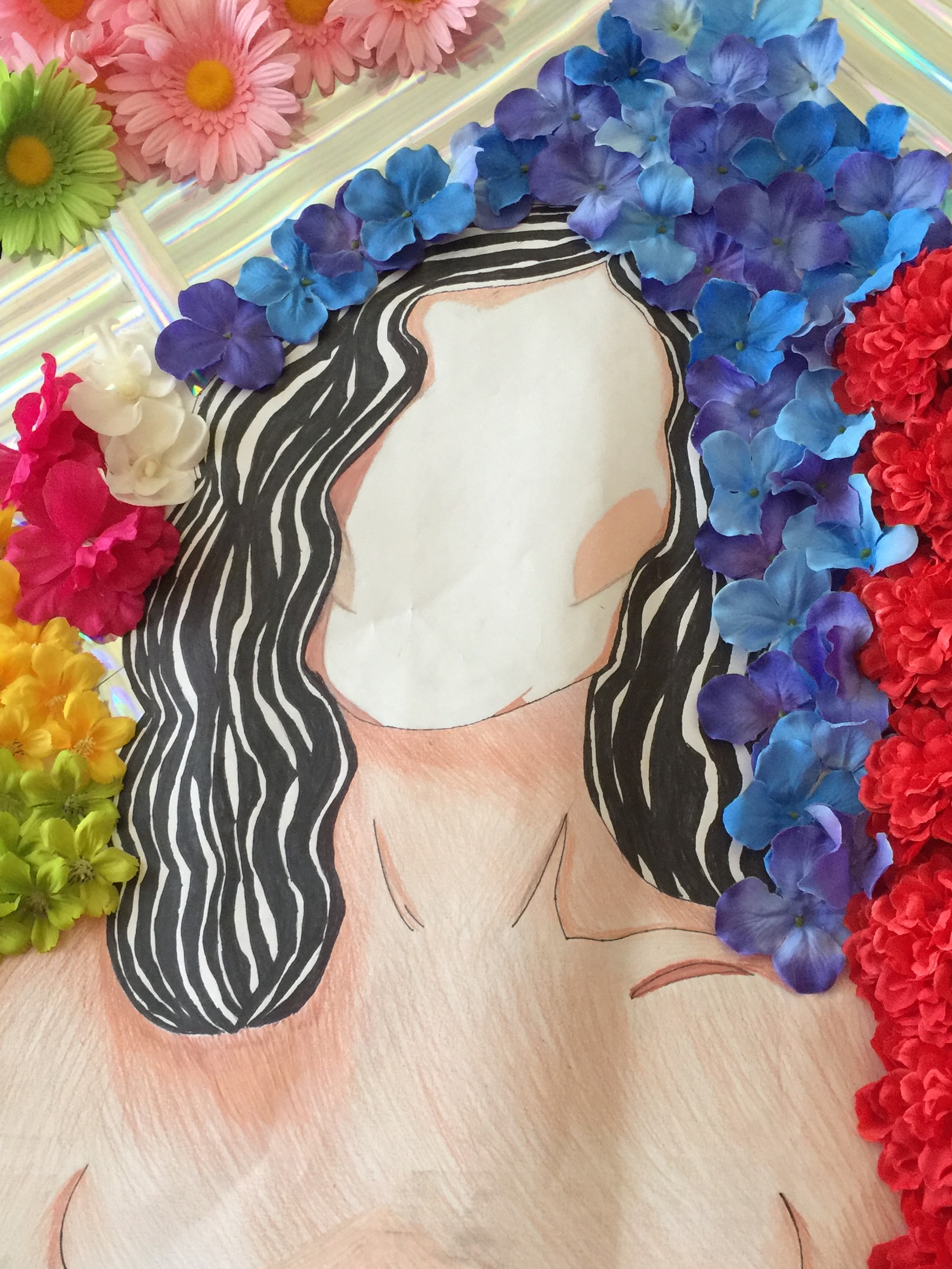
Mother, prismacolour pencils with flowers and holographic paper added, 2015-2016
I did this piece in my Art 3 class in 2015-2016, and it is very much my favorite art/drawing I have ever done. It defiantly represents my interests in nature, involving different techniques and art styles in my art, and my style. As I love drawing the body but not so much the face. Part of it is the face is hard to get proportional compared to the body which is in a way easier. And I love shading, which this has in shades.