Spatial Analysis on the Concentrations of Air Pollutants in Basra Province (Southern Iraq)

The study takes place in the Basra province, located in Southern Iraq. This area is rich in oil and therefore contains many industrial and anthropogenic activities related to it such as petrochemical plants, refineries, power stations, and more. This activity has led to alarming pollution levels that has led to multiple research conducted to analyze the effect of the pollutants on human health. The objectives of this study are to spatially analyze the geographic distribution of pollutants, project the pollution levels on a map to determine its spatial variation, and to recognize the area with higher pollutant concentrations within Basra province.

Seventeen sampling stations were chosen taking into consideration human activity and variety of local environments. Sampling occurred on the same at day and time at every station with a portable detection instrument. At these stations CO, CO2, NOx, SOx, H2S, HCs, CH4, HCHO, and O3 were measured.

With the air pollution concentrations collected at each site, each pollutant was analyzed separately to see is spatial variation and geographical distribution ( Figure 4.)

The maps showed that the pollutants were spatially varied over all, showing a random pattern. However, a pattern could be identified using the indexes of each station. The index is the sum of every pollutant concentration at the site and then divided by the number of pollutants. A map was made to analyze this pattern ( Figure 5. ) and it shows that the pollution levels are higher on the western region. The highest values of pollution concentration were in Burchesya and Sebba where there has been constant oil exploitation.

The authors noted that the stop emissions in these areas is urgent. They also recommended to install fixed monitoring stations and further research.


Citation:

Al-Hassen, S. I., Sultan, A. A., Ateek, A. A., & Al-Saad, H. T. (2015). Spatial Analysis on the Concentrations of Air Pollutants in Basra Province (Southern Iraq). Open Journal of Air Pollution, 2015,4, 139-148. http://dx.doi.org/10.4236/ojap.2015.43013


Spatial analysis to understand how does land management practices are associated with house loss in wildfires

Peri-urban communities in fire-prone region around the world are at increasing risk from wildfires due to increase in population growth and climate change. In this article, the authors study that what land management practices are more effective to reduce the house loss during the wildfires. There is no evidence yet the effectiveness of fuel reduction treatments. Houses are a critical asset to protect during wildfires and are easily destroyed when exposed to flame. To protect houses commonly used fuel reduction practices are grazing, clearing, prescribed burning and mechanical removal of biomass from area near to these houses.

In this article, authors carry out the empirical (observation) research using GIS within the boundaries of three wildfires that ignited in the state of Victoria, in south-eastern Australia. Figure 1.

To collect data they sample they allocated 499 points randomly to the study area in GIS and number of sample allocated were proportional to the area of each of three strata. Then the house is selected nearest to each point using fine-scale high aerial imagery (35 cm to 50 cm pixel resolution). If two houses were in same sample area they did only select one house to study, with 40 m area around it to measure several variables. 24 potentially variable were recorded at each home reflecting three main driver; weather condition which was measured as Forest Fire Danger Index (FFDI) it incorporate all weather component; humidity, temperature, drought factor and wind speed; terrain was measured as slop, tropical position, and aspect; fuel was measured (a) as within 40 m of centroid of house which is maximum distance wooden structure will catch fire (b) percentage of landscape in upwind direction from each house to nearest wildfire boundary (c) distance from house to fuel variable in upwind direction. They also measure another variable such as cover of trees and shrubs within 40 m, number of building or structure in upwind direction from the house, upwind distance from houses to public forest land.

individual effects of fuel variables

The result shows that greater proportion of houses were lost where there was higher % cover of trees and shrubs within 40 m; where the vegetation was dominated by remnant instead of plants; there was more building within 40 m; group of trees and shrubs were closer in the upwind direction as shown in above figure. It is predicted that all fuel reduction treatments will work more effectively if these treatments carried out closer to the house rather than at distant from house.

Urban Watershed Management Mystery

In urban environments, water quality and quantity must be carefully monitored and maintained to prevent shortages or contamination. Several important influences of watershed maintenance are relatively well-researched—riparian habitat fragmentation, forest degradation, and impervious surfaces—but researchers still found inexplicable differences in water quality among watersheds that were comparable with these three main characteristics. The authors of this study hypothesized that a combination of these factors and unrecognized variation in land cover contributed to the unexplained difference in water quality.

The authors picked a rapidly expanding urban area with almost 50% tree cover to do their study. GIS data delineating small streams in the area was used to identify watersheds that were 20-30% degraded—that is, surrounded by impervious surfaces, which are roads, parking lots, and driveways. Once they identified the degraded watersheds, they used USDA high resolution aerial land cover maps to create detailed classifications of each watershed. Each was classified based on the percent cover of trees, impervious surfaces, buildings, grass, water, and bare earth using a spatial statistics tool from the USDA Forest Service.

The authors found that even among these previously similar looking watersheds, four major groups emerged that had many features in common. They called one group “Suburban lawns” due to the high percentage of pavement uncovered by trees and numerous small buildings. Another group was “Semi-city living” for its numerous large buildings and extensively connected forest patches—reminiscent of a commercial area with parks. “Shaded urban homesteads” contained buildings further apart, and roads and buildings both more shaded by trees, indicating a more dispersed residential pattern. “Well-drained” watersheds contained significantly more storm water runoff infrastructure than any of the other groups, indicating a highly urbanized area that would require more water management than the other area classifications.

The authors utilized GIS data to select 32 watersheds that initially looked more or less identical. Once aerial maps and further GIS statistical analysis took place, a very different picture emerged. The authors concluded that some of the unexplained variation in water quality between regions could absolutely be due to variation in land cover patterns, particularly due to installation of grass and pavement in urban areas.

“Beyond Impervious: Urban Land-Cover Pattern Variation and Implications for Watershed Management.” Environmental Management 58:15-30. Scott Beck, Melissa McHale, and George Hess. 2016.

Presentation #1: Satellite Tagging Tiger Sharks

Tiger shark (Galeocerdo cuvier) movement patterns and habitat use determined by satellite tagging in eastern Australian waters.

This study was designed to determine which areas of Eastern Australian Coast line that tiger sharks are inhabiting. They wanted to determine whether the sharks were sticking mainly to one location but with seasonal shifts or if they were migrating out into unprotected waters.

In order to track these animals, satellite tags are necessary because the sharks move around a lot and swim to depths that would be very difficult for humans to follow. The researchers used two different types of tags; PAT(pop-up archival tag) and SPOT5 tags(Smart Postioning and Temp. Transmitting Tag). The study used the satellite tags to track the path, depth and temperature that the sharks were swimming at. This information was then broken down into representative graphs of percentage of time spent at certain depths and temperatures.

Graphs shown above.

The two figures above are a combination of the data that the researchers collected ontop of a bathymetry map, which displays the depth of the water in the areas of interest. By mapping the paths of each tiger shark, the researchers were able to figure out where these animals were spending a majority of their time.

The graph shown above is another bathymetry graph but instead of the individual paths of the sharks, this graph shows what percentage of time that the sharks spent as a group in the areas around east Australia. With this information the researchers were able to determine whether the sharks were entering unprotected waters, like those off of the NSW(New South Wales) coast, where sport fishing and commercial fishing threaten tiger sharks every summer.

Citation of Journal Article: Holmes, B., Pepperell, J., Griffiths, S., Jaine, F., Tibbetts, I., & Bennett, M. (2014). Tiger shark (Galeocerdo cuvier) movement patterns and habitat use determined by satellite tagging in eastern Australian waters. Marine Biology, 161(11), 2645-2658.

“Station location optimizing of bike-share programs”

In the past few years there has been a substantial increase in urban planners implementing bike share programs to decrease vehicles on roadways.  The data being used  frequently does not aid people living in city as much as it does tourists.  This group looked at a few different methods to better serve their own urban population with GIS.  Specifically they sought to propose a GIS based method to determine optimal locations for bike-share stations, main characteristics and accessibility of each station.

In their work they had 5 different models – 100, 200, 300, 400 and 500 fixed ratios of stations per 1000 inhabitants, but also had 52 set stations no matter which model was being tested near the train and Metro stations. They layered the GIS to include populations of work buildings, pedestrian traffic and neighborhood populations to maximize bike station accessibility.

Their proposed method was applied in Madrid to work with local MyBici proposed project. They showed their results with the 5 different models – ranging from 100-500 stations and when the usage changed.  They found in a maximize coverage model that accessibility to stations increases significantly until the 100-200 station mark when the stations become saturated and accessibility drops to less than 8% between the next model.

“Optimizing the location of stations in bike-sharing programs: A GIS approach.” Applied Geography (35):235-246. J.C. Garcia-Palomares, J. Gutierrez and M. Latorre (2012).

Spatial analysis methods for understanding environmental characteristics in the urban “matrix”

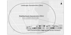
Residential yards comprise a substantial portion of urban landscapes, and the collective effects of the management of many individual yards may ‘‘scale up’’ to affect urban biodiversity.  In this paper, the authors studied the relative importance of environmental variables at multiple spatial scales for native bird diversity in Chicago, Illinois.  Specifically, they analyzed environmental variables at the yard scale, the neighborhood scale, and the broader landscape scale.

For yard-scale analysis, the authors linked information from a social survey to individual address locations to calculate environmental variables such as the percent of yards with bird feeders or with insecticide use.  For neighborhood-scale analysis, the authors created a 50m buffer around each study site and then used GIS data layers from two sources (QuickBird satellite imagery and LiDAR) to calculate the percent vegetation cover and percent canopy cover within each buffer.  For the broader landscape-scale analysis, the authors created a 1km buffer around each study site.  They used GIS data layers from three sources (LiDAR, Esri, and CMAP) to calculate the values of three landscape-scale environmental variables, including percent canopy cover within 1km, amount of open space within 1km, and distance of each study site to the nearest river.

The authors conducted a model selection analysis to determine the relative importance of environmental variables at each spatial scale for native bird species.  They found that the environmental characteristics at the yard scale were the best predictors of native bird species richness, which suggests that the collective effects of individual yard design and management decisions are very important for urban bird biodiversity.


figure-2_buffers-aggregated-yards_120213

“Having our yards and sharing them too:  the collective effects of yards on native bird species in an urban landscape.”  Ecological Applications 24(8):2132-2143.  J.Amy Belaire, Christopher Whelan, and Emily Minor.  2014.