Wastewater Outfalls and Elevation Relevance to E. coli in Wild Basin Nature Preserve

There are two data sets that I chose for their relevance to my research topic, which is studying the persistence of Escherichia coli (E. coli) within the streams of Wild Basin Nature Preserve (WBNP) in Austin, Texas. These data sets compare the location of Wastewater Outfalls in Texas (specifically focused on the Wild Basin region,) as well as the location of creeks, rivers and watersheds, shown below in Figure (1).


Figure 1

The second dataset I incorporated was an analysis of the elevation/contour lines, in comparison with the location of Wastewater Outfalls, creeks and rivers, as shown below in Figure (2).


Figure 2

These two data sets are relevant for a variety of reasons. Firstly, E. coli is a ubiquitous microorganism and common subject of ecological and public health hazards. They are used as an indicator organism; in this case to indicate the efficiency of disinfection in wastewater treatment. In an ideal world, the effluent released from these outfalls would be free of E. coli, however if they aren’t properly disinfected and treated, they could serve as a possible source of contamination within Wild Basin and other streams. Furthermore, analyzing the elevation/contour lines can give us an understanding of the paths that water can take as well as understanding the possible routes of contamination, but also hopefully locating probable sources.


If interested in the location of Wastewater Outfalls, (as well as the location of other water characteristics,) you should visit the site below!

https://www.tceq.texas.gov/gis/download-tceq-gis-data/

NTAD: Bureau of Transportation Statistics

The Bureau of Transportation Statistics (BTS) is an independent statistical agency within the Department of Transportation (DOT). Their mission is to be an objective source of timely, accurate, and reliable information regarding the U.S. transportation system and its movement of people goods and various other factors which may impact the economy, environment, and society. BTS gathers their information from a variety of sources, including its own data collection. This agency compiles information from its surveys and other governmental agencies and provides them to the public as mandated by congress. Of particular notice is the National Transportation Atlas Database (NTAD).

The NTAD transposes transportation data onto maps with geospatial data on the transportation network, its uses, and its relationships to communities and the natural environment. This database features transportation facilities, networks, and infrastructure in 3 various formats (points, polygons, and polylines). The point files show specific points across the entire United States of specific locations such as the location of airports, dams, crash sites, railroad crossings, and alternative fuel sites. The polygon files show geographical features within a particular area of the Earth’s surface such as US county boundaries, hydrographic features, state boundaries, and national park system boundaries. The polyline files are connected sequences of line segments created as a single object such as the hazardous materials routes, the railway network, and the navigable waterway network. All examples listed (and more) for each file type can be found in the NTAD from the years of 2011 to 2015.

For my most near approaching project, Estimating Heavy Metal Runoff Concentrations from Bridge Decks: A Rainfall Simulation Study by A. Bussel, N. Gonzalez, and L. Roberts, my group plans to focus on three bridges; Bull Creek Bridge, Southwest Parkway Bridge, and the Loop 360 bridge over Barton Creek. This site could be extremely useful for my study as it contains files pertaining to the hazardous materials route, and the urbanized area boundaries. The hazardous materials would be useful as we could overlay the routes on our bridges (also provided in the site) and see if the routes potentially have a positive or negative effect on heavy metal concentrations. The urbanized boundaries would also be useful as we are comparing data from 2017 to data from 2005 to see if the rapid population growth and urbanization in Austin, Texas has affected contamination on bridges and if an increase is to be expected.


To access the files located in the NTAD and learn more about BTS, please visit:

https://www.rita.dot.gov/bts/sites/rita.dot.gov.bts/files/publications/national_transportation_atlas_database/index.html


Water Footprint Network: What is a water footprint?

Water Footprint Network: What is a water footprint?

This subject does not directly apply to my Final Project, but is a concept I like learning about and is in my wheelhouse. My undergraduate study is in water resource management (hydrology) and I was introduced to this concept of “virtual water” or “water footprint” as a way of understanding how precious our water resources are. The earth is a planet almost overflowing with water, but has a limited amount of freshwater. Only 2.5 percent of the world’s water is fresh and only 1 percent of that is available (not tied up in glaciers). We consume exuberant amounts of water without even knowing it and tie up some of that 1 percent available in goods and services.

Population growth, rapid increases in food production and energy consumption have changed land use and its hydrology forever. Scarcity of water and pollution plague many regions of the world. The water footprint is a measurement of how the world’s freshwater is disbursed and polluted. The consumption of this water happens directly by drinking it from the faucet or indirectly from eating an apple, producing goods or providing services we use daily, such as electricity. It is broken down into three components: blue, green, and grey.

The blue water footprint is the amount of groundwater and surface water required to make a product (evaporated or used directly) such as irrigated agriculture or domestic water use. The green water footprint is the amount of precipitation stored in the root zone of the soil and evaporated transpiration and incorporated by the plants (water cycle). Grey water is the amount of freshwater needed to mix and dilute pollutants enough to maintain water quality standards. The water footprint concept gives everyone a frame of reference on how we can be more efficient with our water use. The data I will show today is the National Consumption and National Production uses by the world for industry and agriculture. So, the next time you have a cheeseburger, fries and a diet coke think about how much blue, green and grey water was consumed to produce that meal before you even ate it and how someone in Africa might would have liked to have had access to that water.

Website and Dataset Reference: http://waterfootprint.org/en/

Austin Geology: It’s the karst’s fault

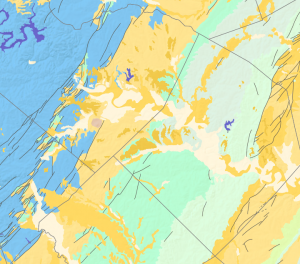
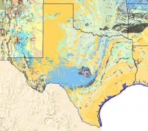
The USGS Texas Geologic map dataset, available at https://mrdata.usgs.gov/geology/state/state.php?state=TX, is an excellent resource for geologic mapping of the state of Texas. It includes csv and shapefiles for the geological attributes, geologic units, faults and lithology. The colors used are easy to observe and paints a useful portrait of the state’s surficial geology. I am able to analyze our tract of land for our research project at Onion Creek. The land between Onion Creek and Barton Springs where we will be collecting samples has an extensive network of karst features that enables groundwater flow which has been modified and altered by faults and extensional geological impacts. This information has already been mapped and compiled by the city of Austin which we are using along with well locations to select the best receptor points. However, we can use this GIS data to create our own maps in our final report. The dataset also includes hydrologic units and aquifers which will be useful when creating our final groundwater flow maps as well.

Map of Texas geologic units:

Map of Austin geologic units and fault features:

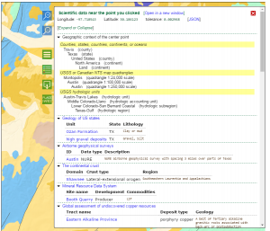
Any selected point on the map will have information about the point’s latitude and longitude, geographic context including county, state, country, continent or ocean; USGS quadrangles; underlying hydrologic units and regions, geologic formations and deposits with detailed lithology (clay, silt, gravel, etc.); airborne geophysical surveys with data type and description; continental crust type (lateral-extensional orogen), domain and region; mineral resource data including local quarries and commodities; assessment of unexploited mineral resources; energy resource assessment reports; national geologic map database references; and lastly, any USGS publications citing this dataset. This information is conveyed in a pop-up window on the website shown below:

Lithology polygon colors used for the map can be accessed here: https://mrdata.usgs.gov/catalog/lithclass-color.php

EPA Outdoor Air Quality Data

The data source I choose is EPA Outdoor Air quality data for Austin. EPA has air quality data for most of the cities in the United States from 1980 to present. EPA collects data for Austin using three monitors (Figure 1). EPA calculates the AQI for five major air pollutants regulated by the Clean Air Act: ground-level ozone, particulate matter, carbon monoxide, sulfur dioxide, and nitrogen dioxide. For each of these pollutants, EPA has established national air quality standards. AQI has a yardstick that runs from 0 to 500. There are six categories to measure air quality; good (0-50), moderate (50-100), unhealthy for sensitive groups (100-150), unhealthy (150-200), very unhealthy (200-250) and hazardous (above 200). The higher the AQI value, the greater the level of air pollution. I selected Ozone data, AQI is an index use by EPA to report daily air quality. This report gives concentration of ozone pollutant for every day of the year, daily maximum ozone concentration (ppb), daily AQI value and number of observation each day. Source: https://www.epa.gov/outdoor-air-quality-data/download-daily-data . Data for three monitors in Austin is available in KMZ file. KMZ files contain placemarks featuring a custom name; the latitudinal and longitudinal coordinates for the location. KMZ files can be opened by Google Earth. You can download daily data report or data summary of one year, the data is available in spreadsheet and pdf format. You can also download data in visualize form. Source: https://www.epa.gov/outdoor-air-quality-data/air-data-aqi-plot

We will use ozone data from EPA to analyze air quality for different time period e.g. before drought and wildfire and after drought and wildfire and compare it with vegetation cover in Bastrop during this time period. Our main purpose will be to see the correlation between the vegetation cover and concentration level of ozone in Austin. For example, during the wildfire September 2011, the concentration of ozone in Austin was high (above 150 ppb) as shown in figure below and air quality was declared unhealthy.

Link: https://www.epa.gov/outdoor-air-quality-data/air-quality-index-report

Data Set:  TCEQ Edwards Aquifer Regulatory Boundary

This Texas Commission on Environmental Quality (TCEQ) dataset listed on the Texas Natural Resources Information System (TNRIS) represents the boundary layer location of transition, contributing, and recharge zones as well as contributing zones within the recharge zone that comprise the regulated area identified in the Edward’s Aquifer Protection Program.  Data is available in shapefile, geo-database, and KML (Google Earth) formats.  Key features include the boundaries, area, and perimeters of each zone.  Original data is sourced from 90 USGS 7.5 minute quadrangle hard copy maps available through an Open Government Partnership (OGP).

Using Dye Tracing methods, our team seeks to answer the question of what impact karst excavation and drought in the Central Texas Onion Creek watershed has on facilitating the recharge of the Edward’s Aquifer.  This dataset may be used in an initial site analysis to determine overall boundary locations and can serve as a baselyaer to plot, measure and analyze the distance between the initial dye injection sites and the well and spring monitoring locations as well as the proximity of our test area and flow paths to designated zones within the Edward’s Aquifer. 

More information and the ability to download this dataset can be found at https://tnris.org/data-catalog/entry/tceq-edwards-aquifer-regulatory-boundary/.

-Chris Enders

Texas Commission of Environmental Quality’s Air monitoring geospatial data

The Texas Commission of Environmental Quality (TCEQ) has geospatial datasets available (Link below) for download as shapefile, file geodatabase, or Google Earth format. The data available, just like everything in the TCEQ website is divided in water, land, and air. One of datasets that would be useful for the topic I’m interest in doing my project in would the Air Monitoring Sites file. This file contains the location for every active air monitoring station in Texas and a few across the border in Mexico that affects Texas’ air quality. Each station contains information related to the location but not the air pollutants that it monitors. There are other data sets that contain the air monitoring sites by type. Each file contains sites that measure a specific pollutant.

This data can be used to relate the active stations in Texas to their compliance status. Usually areas that struggle to be under compliance have more monitoring sites.  Comparing their compliance status and pollutant concentrations to the monitoring stations could point out if there has been any progress since they installed the monitoring sites.

Link: https://www.tceq.texas.gov/gis/download-tceq-gis-data/#air

Seagrass Beds of the Texas Coast: an Extensive View

Link: http://tpwd.maps.arcgis.com/apps/webappviewer/index.html?id=af7ff35381144b97b38fe553f2e7b562


This data set belongs to the Texas Parks and Wildlife and is a map viewer that allows you to see all of the sea grass beds on the Texas coast. It is a pretty extensive map that takes you from one end of the coast to the other and shows you where the sea grasses are, and the area of certain sea grass beds. This data would be useful for a site analysis of the chosen area for my applied research project, Redfish Bay. Red fish Bay is about 8km of continuous sea grass beds. Having spatial data for Redfish Bay would allow us to select research sites and also specific areas of interest for our research.

I found this data set to be relatively interesting because it fits what I needed for my project pretty specifically but also there is a lot that can be added to it, such as types of sea grass that exist, which would really help scientists pin point areas that specific species may be inhabiting. There is alot of things that I may be able to add to this map and tailor it to my needs. I have attached an aerial view of the map focused in on Redfish Bay, so that you can see our research site.

Map of Seagrass Beds in Redfish Bay

Understanding Texas Water: GIS Data from the Texas Water Development Board

Texas Water Development Board GIS Datasets

http://www.twdb.texas.gov/mapping/gisdata.asp

The Texas Water Development Board provides GIS datasets in two categories: natural features, and administrative boundaries. The first category is primarily composed of water features in the state of Texas, but some land features are also included. Rivers, major and minor aquifers, precipitation, and hillshade data are a few of the shapefiles provided. Texas wells and well districts are also included. Administrative boundary shapefiles on the website include groundwater conservation and management areas, regional water planning areas, and river authorities, among others. Many of the shapefiles are derived from data collected by the TWDB, but the data may come from other federal agencies as indicated by the file description. These data combined furnish a relatively comprehensive overview of the Texas water landscape.

In order to characterize the location of our bridge runoff study, we will use river and aquifer datasets from the TWDB. This will be some of our background data for our study introduction and justification. We will also use precipitation data in our study analysis—we need to know average annual and monthly precipitation levels to extrapolate our pollutant findings to the region. If we discover any alarming pollutant levels, we can locate our water conservation district on the TWDB site in order to report our findings to the appropriate authorities.

Hydromet Rainfall Geospatial Data

The Lower Colorado River Authority is a Texas nonprofit created in 1934 by legislature.  Their mission includes providing energy, water and wastewater treatment, water quality and stewardship through public education and community service.

The overall LCRA Hydromet is a database system of more than 275 automated river and weather gauges throughout the lower Colorado River basin in Texas. The Hydromet provides near-real-time data on stream flow, river stage, rainfall totals, temperature and humidity.

The central Texas LCRA area rainfall map will be useful to John and I’s project because our project mentor would like us to correlate sample data and precipitation on a yearlong graph (rainfall Y by month X).  This map gives me two fairly close data points to pull from – the Westlake HS one and Barton creek one to average together to start the data for our graph and expound from there.

If any of you would like any further information, the main link is below.

http://hydromet.lcra.org/coa/coa.aspx#